The network for creativity
Join 1.25M professional creatives like you
Connect with clients, get discovered, and run your business 100% commission-free
Creatives on Contra have earned over $150M and we are just getting started
Back to feedPost

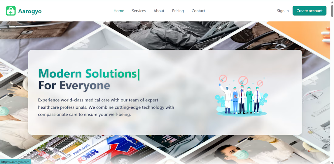
I wanted to build something that could make the boring parts of healthcare a little less boring.
That idea turned into Aarogyo, a healthcare management system where doctors, staff, and admins can manage appointments, patient records, billing, diagnoses, and prescriptions from one place.
Then I thought, why should someone manually read every uploaded medical report and type everything again?
So I added Google Gemini and Tesseract OCR to let Aarogyo read uploaded reports, extract the useful information, and turn it into structured diagnoses and prescriptions.
Started with an idea to simplify healthcare management. Ended up building a system that can actually read the paperwork too.


The network for creativity
Join 1.25M professional creatives like you
Connect with clients, get discovered, and run your business 100% commission-free
Creatives on Contra have earned over $150M and we are just getting started

Challenges
View all


Related posts

I'm doing some A/B testing on a hero and would like some extra eyes and thoughts.
Please and thanks. 🙏🏾
14 voted
42%

19 voted
58%

33 votes
Closed

I like the warmth and flow of option 2.

Project Showcase: Brand Identity Design for Burger Lover 🍔🎨
As a designer working with small businesses, I recently led the visual identity design for Burger Lover, a fast-casual restaurant looking to establish a distinct, memorable presence in a competitive market.
My focus was on translating the brand’s core personality into a clean, cohesive visual system that bridges the gap between digital marketing and physical packaging.
Key Design Deliverables
Logo & Visual Identity: Crafted a modern, scale able mark built for high legibility on everything from app icons to storefront signage.
Packaging & Touch points: Designed branded takeout boxes, custom burger wraps, and sticker seals engineered to create an elevated unboxing experience.
Color Palette & Typography: Paired appetite-stimulating primary tones with strong display typography to establish instant visual recognition.
Social & Marketing Assets: Developed structured templates to ensure consistent visual hierarchy across digital channels.
I’d love to get feedback from fellow designers! How do you feel about the packaging layout and visual balance? Any insights on the typographic hierarchy would be greatly appreciated.


Sick 🔥

When all crypto brands keep doing it the same way, we went the other way with blink.
Our approach was to create a brand, a website and a trading exchange that feels like a lifestyle brand.

Good Work!

