The network for creativity
Join 1.25M professional creatives like you
Connect with clients, get discovered, and run your business 100% commission-free
Creatives on Contra have earned over $150M and we are just getting started
Back to feedPost
Taste Test

I'm doing some A/B testing on a hero and would like some extra eyes and thoughts.
Please and thanks. 🙏🏾
14 voted
42%

19 voted
58%

33 votes
Closed

I like the warmth and flow of option 2.
Thanks, Korbin!

Option 2 has the clearer rhythm—the warmer stage and single focal subject give the headline room to breathe. I’d keep an eye on how the darker background performs on mobile, where contrast can shift quickly.

I think Option 2 it´s better, but be careful with the text contrast
Noted. Thanks, Renzo!

I like option 2 more.
Thank you, Syed!

What a beautiful project. A perfect example of mastering the balance of construction combined with design and creativity.
Appreciate the kind words!

I like option 2
Thank you!

I'm for Option 2, the image is more premium imo! 😍
Sounds good to me. Thanks, Tan! 🫡

Went with 2. The warmer lighting and that low angle shot make the space feel real instead of stocky, and it matches "practice for bodies in motion" better than the flatter option 1 crop.
Duly noted. Thanks for the helpful feedback!


Superb design !
Thanks, Sahil!

zGoing eith Option 1
Thanks for voting, Bolu!

Option 2 looks great! ❤️
Thanks for the recommendation! 😎

Option 1 is much better than option 2; it easily scans the content without distraction from the background.Whenever you use text so ensure not mixup with background .
Good point! Thanks for the detail, Amit!

Going with Option 1, but i'd just move the image a lil to the right to balance it out
Subtle, but effective. Thanks, Leena!
Option 1 has the clearer first read—the darker background lets the figure and CTA feel more immediate. Option 2 has a richer mood, but I’d keep its warmer imagery while borrowing Option 1’s headline contrast.
Definitely will take this into account. Thanks, Rohan!

Option 1's primary CTA is "Join Now" while Option 2 leads with "Book a Class" — for a first-time visitor that's a much lower-commitment ask, and probably matters more to conversion than the mood shift.
Hey that's actually a great point. I appreciate the feedback, Mark!

It's a really tough choice—I'm 50/50. I chose No. 1 because of its colors.
Imagine secretly being the tiebreaker lol. Thanks, Mark!

Legibility of the left with the composition of the right. Space below the text on the right makes it hard to read.
Thanks for the feedback!
Welcome, it isn't big, but might be helpful.
The network for creativity
Join 1.25M professional creatives like you
Connect with clients, get discovered, and run your business 100% commission-free
Creatives on Contra have earned over $150M and we are just getting started







Related posts

A luxury property deserves a presentation that does it justice.
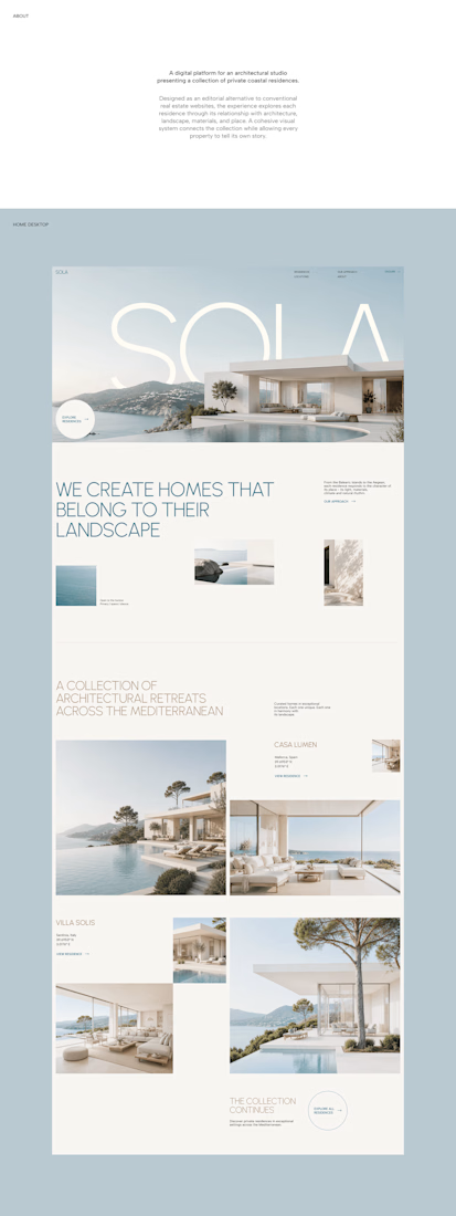
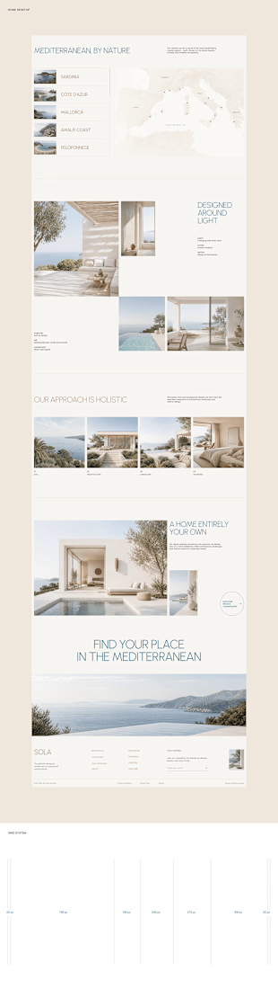

With SOLA – Architecture Studio & Luxury Real Estate, I wanted to bring the beauty of modern coastal architecture into the website itself.
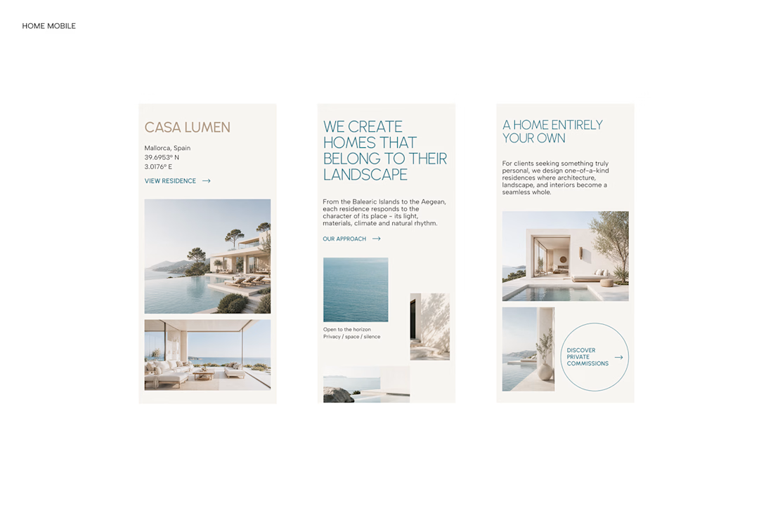
From the large property images and soft blue tones to the clean layout across desktop and mobile, every part of the design helps create a calm, premium feel while making the homes the centre of attention.
I like how the website brings architecture and digital design together, giving visitors a chance to explore the properties before making an enquiry.
If you were looking for a luxury home, would a website like this make you more interested in the property?
#WebDesign #Architecture #LuxuryRealEstate


Incredible work, you transformed SOLA into a premium property brand.


Every element feels perfectly placed! 👏

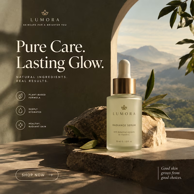
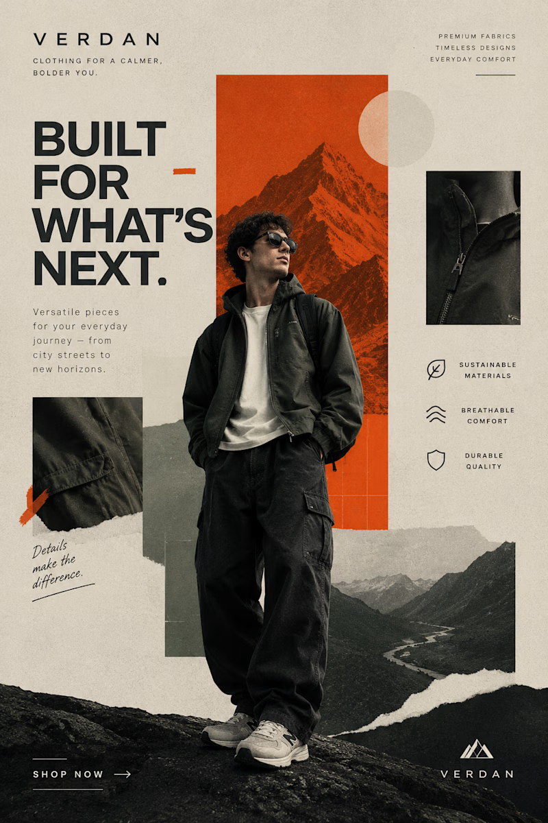
Two Brands. Two Completely Different Creative Directions. 🎨
A brand’s visual identity can change everything about how its products are perceived.
✨ Option A: Cinematic Minimalism — elegant, refined, and luxurious.
🔥 Option B: Modern Editorial Collage — bold, expressive, and adventurous.
Both styles tell a different story, but which one captures your attention?
Vote A or B in the poll and tell me what makes your choice stand out!
Need eye-catching advertisement designs for your brand, product, or social media campaign? I create custom ad creatives tailored to your brand’s identity, audience, and goals.
Have a project in mind? Explore my services on Contra and let's bring your ideas to life.
1 voted
14%
6 voted
86%
7 votes
Closed
