The network for creativity
Join 1.25M professional creatives like you
Connect with clients, get discovered, and run your business 100% commission-free
Creatives on Contra have earned over $150M and we are just getting started
Back to feedPost


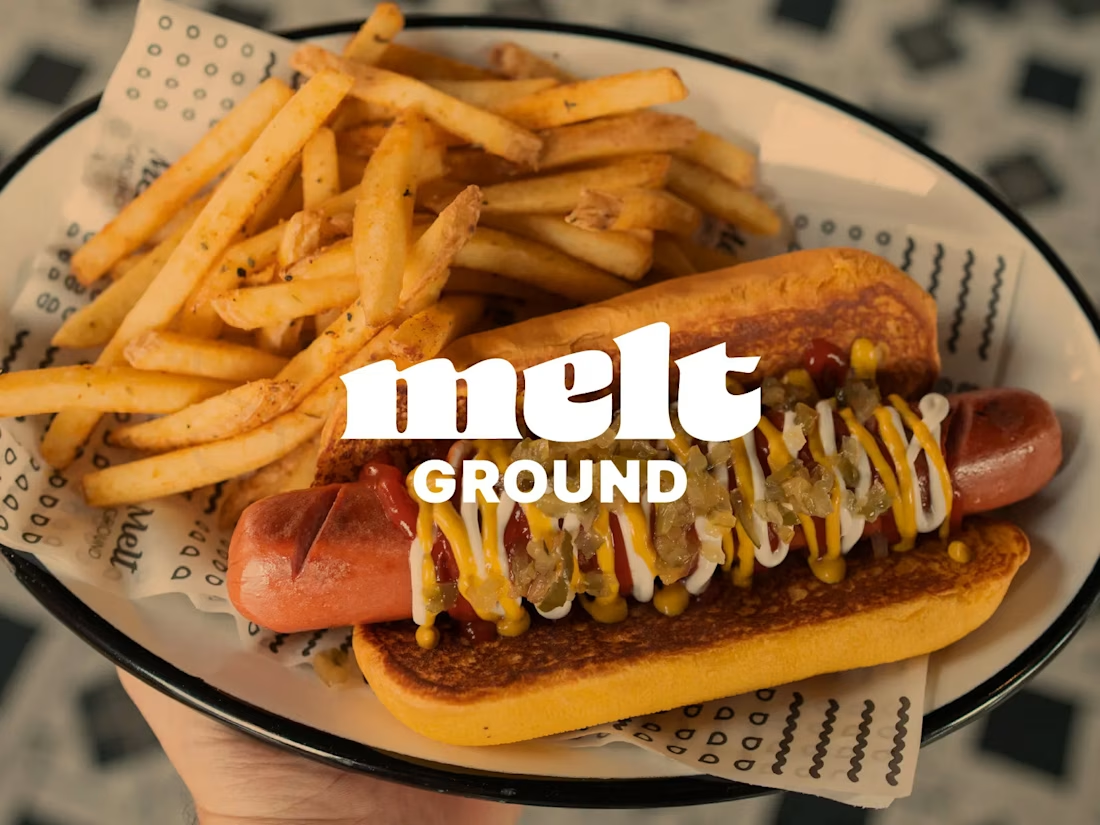
The dripping melt effect on the wordmark is so on-the-nose in the best way, it reads as cheese before you even parse the letters. Overlaying it right on the product shot is the detail that makes this identity stick in your memory.
The network for creativity
Join 1.25M professional creatives like you
Connect with clients, get discovered, and run your business 100% commission-free
Creatives on Contra have earned over $150M and we are just getting started





Related posts


A bold, modern landing page for a creative agency, built around immersive visuals and strong typography. We’d love to hear your thoughts!


Ovéa — care with character.
One skincare identity across bottles, jars and tubes. I designed the wordmark, pink-and-cobalt packaging system, campaign applications and digital mockups, then brought the collection into motion.
A consistent visual language, with room for each product to feel individual.
View the full case study. Building a skincare brand? Let’s talk about your identity and packaging.

Love the colour direction and the visual language. Everything feels so well thought out. The overall look is beautiful.

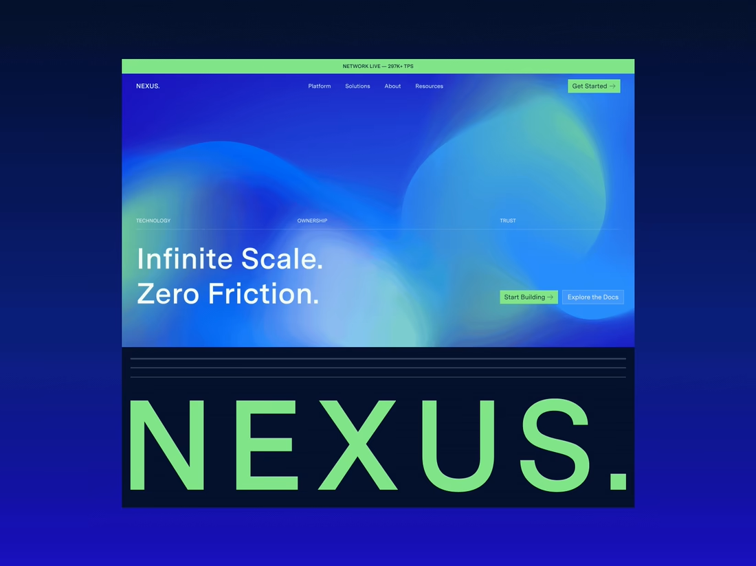
Happy to finally share the full NEXUS project 🙌
A few days ago I posted a small motion teaser. Now the whole thing is live on my profile: 12 pages designed in Figma, a design system, and a homepage I built in HTML, CSS and JS with every interaction working.


12 pages in Figma plus a design system, then hand coding the homepage with every interaction working is a great way to show the concept holds up, Sofiia. Nice to see the teaser turn into the full project.