The network for creativity
Join 1.25M professional creatives like you
Connect with clients, get discovered, and run your business 100% commission-free
Creatives on Contra have earned over $150M and we are just getting started
Back to feedPost
Taste Test

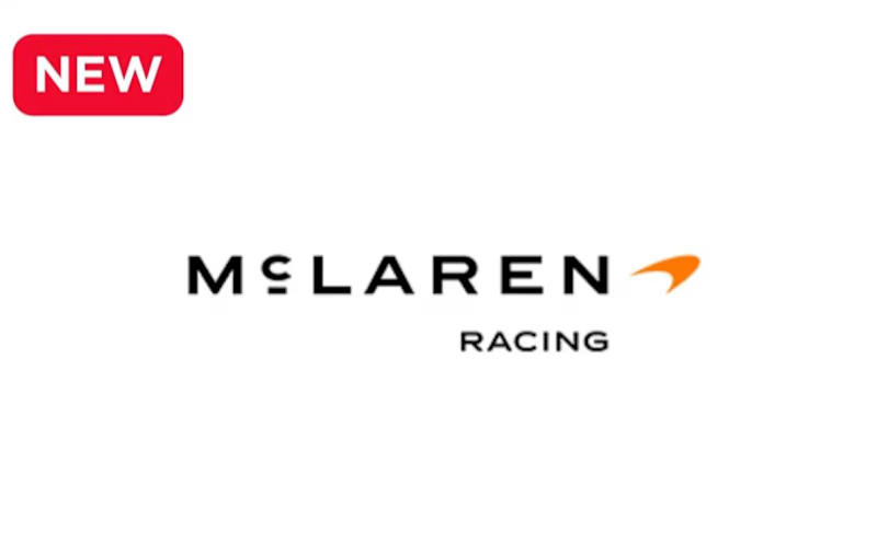
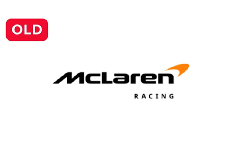

The old one still looks great.
The main features of the logo are clearly evident.

I believe old logo was way better than the new one.

I think the previous one had a distinct personality, but the new one doesn't.


I think with the new one they tried to do what Instagram did :D

I feel like this is perfect reference to "it'll grow on me"

Old for me. The previous mark has more of that unmistakable racing character and feels more energetic at a glance. The new one is interesting from a heritage perspective, but the old identity has stronger visual personality.


The new version is okay

Team old, honestly. The chrome and the tighter kerning gave it more character on track livery. What do you think is driving the flattening, motion and app consistency, or just everyone chasing the same minimal look right now?
The network for creativity
Join 1.25M professional creatives like you
Connect with clients, get discovered, and run your business 100% commission-free
Creatives on Contra have earned over $150M and we are just getting started







Related posts

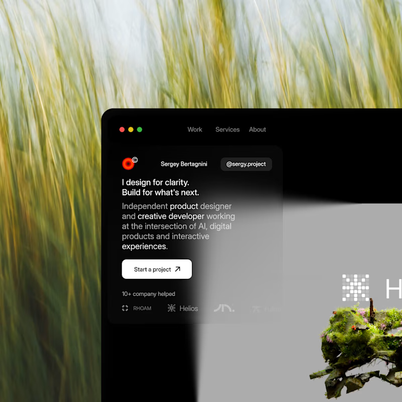
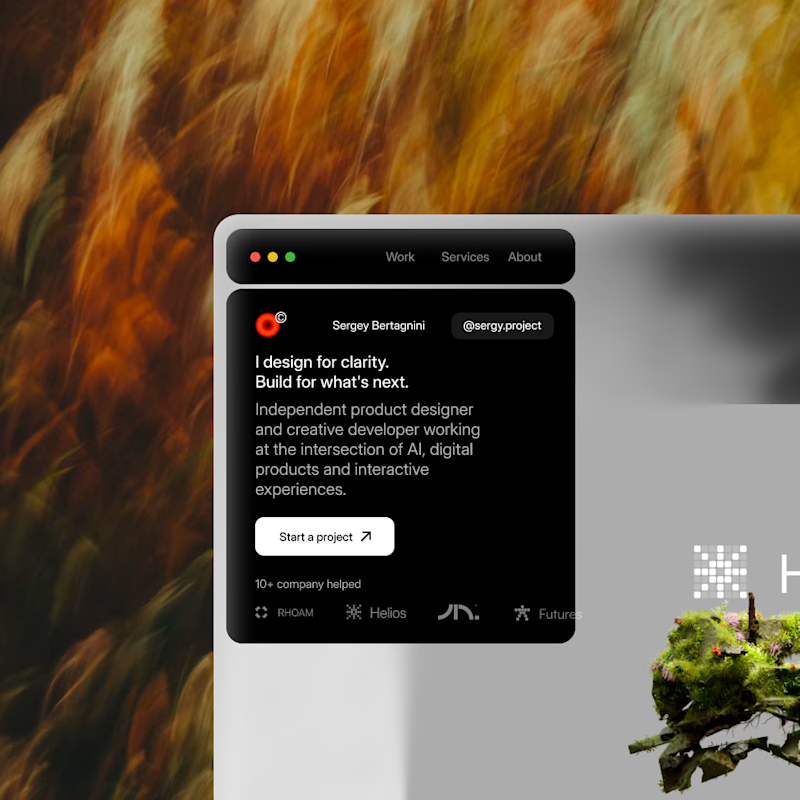
A or B?
Same site, two moods.
My new portfolio is still in progress, and I am stuck on one call.
I have stared at both for so long I lost all objectivity, so I am handing this one to you.
Drop left or right in the comments, first instinct, no overthinking.
Whichever wins, you basically art directed my site today.
26 voted
35%
48 voted
65%
74 votes
Closed


Which one would you pick?
The first is flat red on pure black. Soft edged forms drift and swell around a bold white FLUID set dead centre, each shape a single saturated tone with the falloff doing all the shading. Nothing in between, just colour and dark.
The second is the same motion in violet and magenta. The shapes carry a gradient within them, cooler at the edges and hotter where they catch light, and the black lifts into deep plum. The contrast drops and the whole frame reads softer.
One hits like a poster. The other moves like light.
👇 #motiondesign #colorgrading #typography
5 voted
71%
2 voted
29%
7 votes
Closed
Bro, you played a game with our eye. appreciate for the creativity

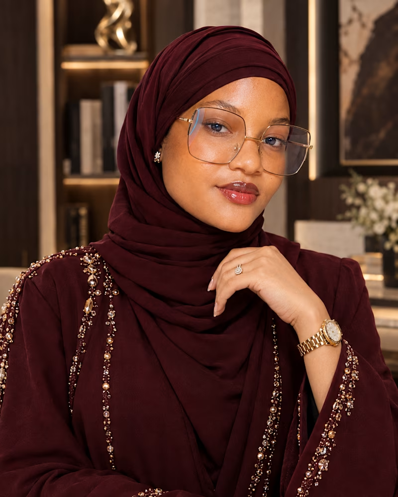
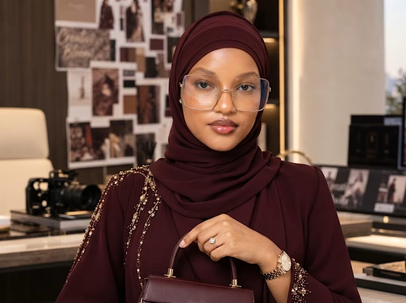
Lol, I wanted to create myself in a sophisticated Burgundy Abaya wears. Looking all elegant and beautiful 😂🤗
I gave Chatgpt and Nanobanana in Google Flow to create this with my image. But I guess one tool delivered a bespoke and well detailed result.
It actually followed my prompt more than I expected..... The skin texture, and realism is unbelievable 🔥🔥🔥
Guess the Ai tool👇👇👇👇
4 voted
67%
2 voted
33%
6 votes
Closed

ChatGPT look closer to it