The network for creativity
Join 1.25M professional creatives like you
Connect with clients, get discovered, and run your business 100% commission-free
Creatives on Contra have earned over $150M and we are just getting started
Back to feedPost
Taste Test
Which one would you pick?
The first is flat red on pure black. Soft edged forms drift and swell around a bold white FLUID set dead centre, each shape a single saturated tone with the falloff doing all the shading. Nothing in between, just colour and dark.
The second is the same motion in violet and magenta. The shapes carry a gradient within them, cooler at the edges and hotter where they catch light, and the black lifts into deep plum. The contrast drops and the whole frame reads softer.
One hits like a poster. The other moves like light.
👇 #motiondesign #colorgrading #typography
5 voted
71%
2 voted
29%
7 votes
Closed

Red look amazing

Purple's the one for me, that gradient makes it feel like it's actually moving instead of just sitting flat on the page. Did you land on that softness on purpose to contrast with the poster punch of the red version, or did it come out of testing color separately?

Bro, you played a game with our eye. appreciate for the creativity
The network for creativity
Join 1.25M professional creatives like you
Connect with clients, get discovered, and run your business 100% commission-free
Creatives on Contra have earned over $150M and we are just getting started







Related posts


Which grade would you keep?
The first runs cold. Violet rim light on the planet and the moons, blacks pushed toward indigo, a cyan core that blooms outward as the camera pushes in. Everything outside the centre falls away into shadow.
The second is the same shot regraded warm and dirty. Olive and grey across the rock, pale crescents on the moons, the core burning red with a green haze drifting over its surface. The highlights sit softer and the texture reads harder.
One grade makes it feel distant. The other makes it feel close enough to burn.
👇 #motiondesign #colorgrading #3danimation
4 voted
50%
4 voted
50%
8 votes
Closed

Which background would you keep?
The first sets the scene on a fine dot grid. Two green beams sweep across a dark field, catching SPOTLIGHT letter by letter as they pass, the dots only showing where the light falls. The texture stays quiet, more surface than structure.
The second is the same sweep over a line grid. The squares read clearly even in shadow, so the beams cross something measured, and the type sits inside a frame that feels drawn rather than lit.
One gives the light a surface. The other gives it a stage.
👇 #motiondesign #typography #lighting #aftereffects
5 voted
56%
4 voted
44%
9 votes
Closed
Dot Grid look excellent

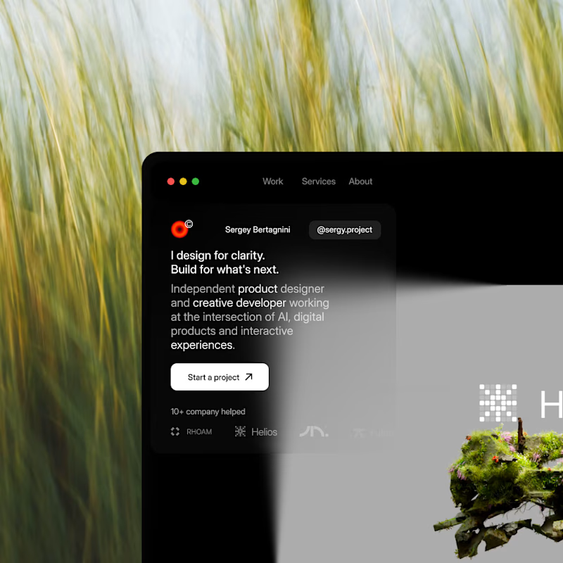
A or B?
Same site, two moods.
My new portfolio is still in progress, and I am stuck on one call.
I have stared at both for so long I lost all objectivity, so I am handing this one to you.
Drop left or right in the comments, first instinct, no overthinking.
Whichever wins, you basically art directed my site today.
26 voted
35%
48 voted
65%

74 votes
Closed
