The network for creativity
Join 1.25M professional creatives like you
Connect with clients, get discovered, and run your business 100% commission-free
Creatives on Contra have earned over $150M and we are just getting started
Back to feedPost
Taste Test


Which background would you keep?
The first sets the scene on a fine dot grid. Two green beams sweep across a dark field, catching SPOTLIGHT letter by letter as they pass, the dots only showing where the light falls. The texture stays quiet, more surface than structure.
The second is the same sweep over a line grid. The squares read clearly even in shadow, so the beams cross something measured, and the type sits inside a frame that feels drawn rather than lit.
One gives the light a surface. The other gives it a stage.
👇 #motiondesign #typography #lighting #aftereffects
5 voted
56%
4 voted
44%
9 votes
Closed


Dot Grid is good one.

line grid

Dot Grid look excellent
The network for creativity
Join 1.25M professional creatives like you
Connect with clients, get discovered, and run your business 100% commission-free
Creatives on Contra have earned over $150M and we are just getting started







Related posts

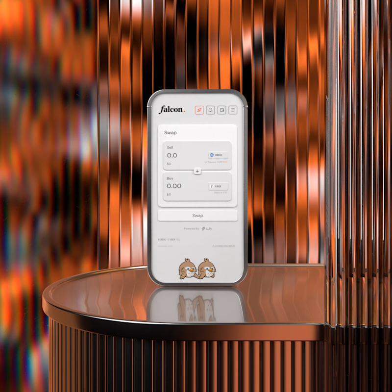
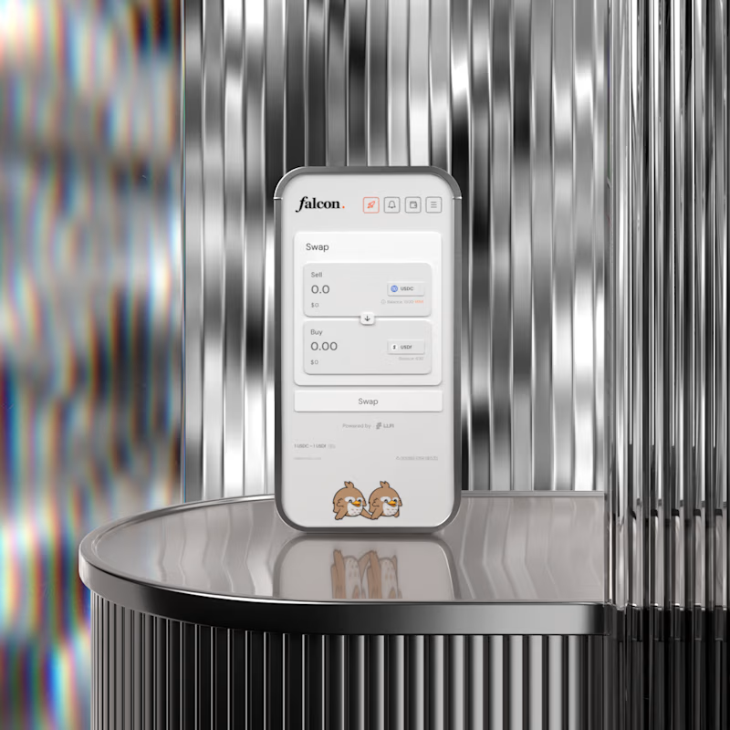

A for me. The warm copper gives the product some heat and makes it feel premium rather than clinical. B is cleaner but silver on silver almost hides the device, the copper actually frames it. Wild that this is no AI.

2 same animations, different format. Which one do you like? Why??🤔
28 voted
50%
28 voted
50%
56 votes
Closed

The horizontal frame gives that line chart more room, but the square crop makes the red-to-blue type shift hit harder. Both feel tight.


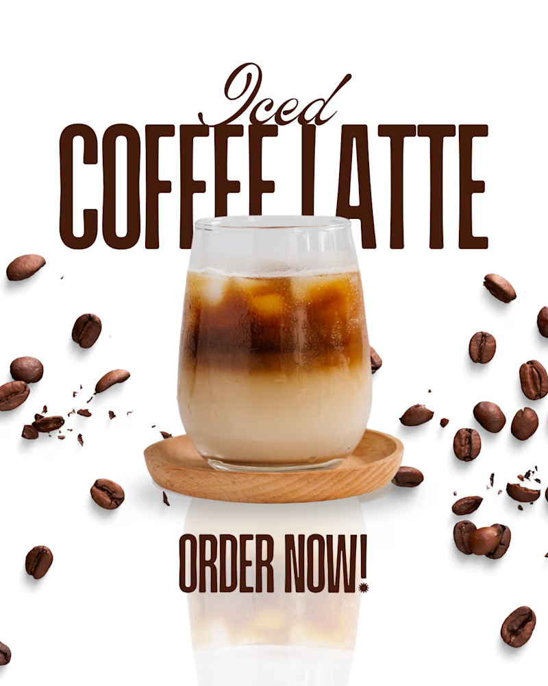
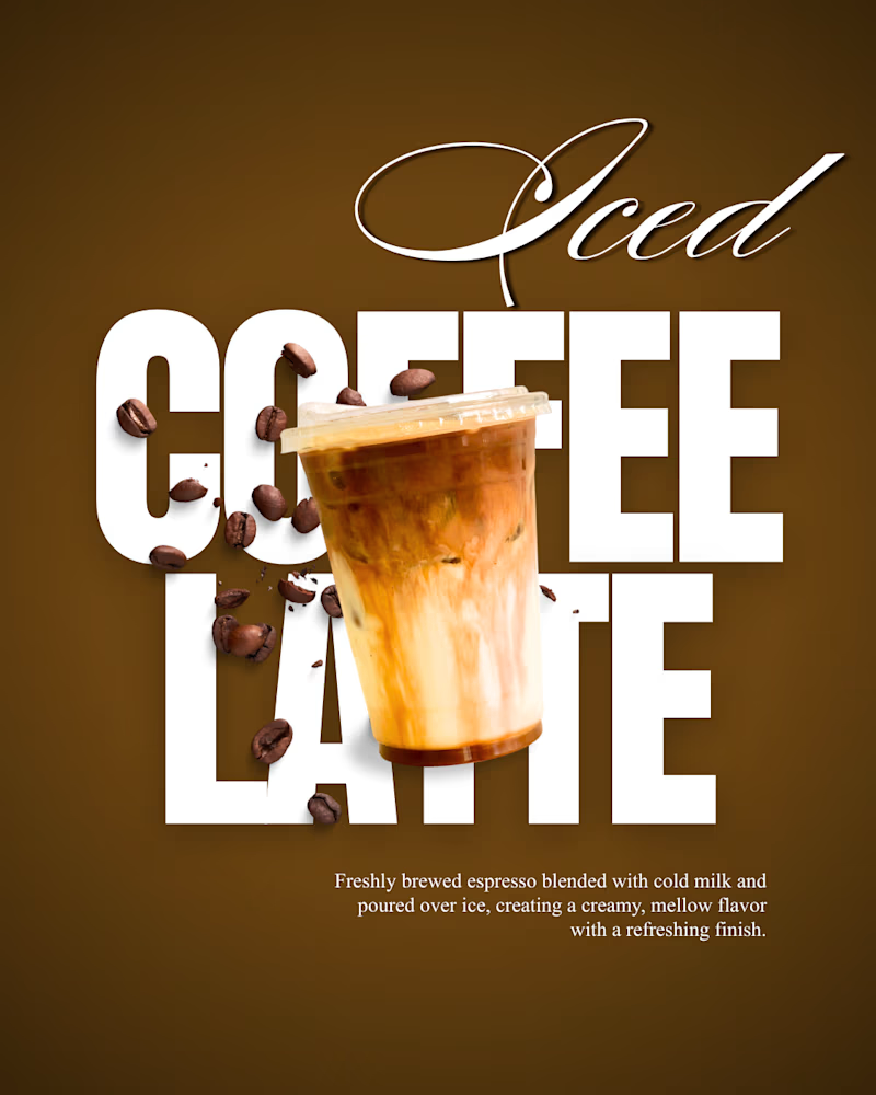
I’ve created two different coffee designs, and now I want to know which one you like more.
Take a look at both and cast your vote in the comments! 👇
Which design catches your eye? Which one gives you the better coffee-shop vibe?
3 voted
60%
2 voted
40%
5 votes
Closed
