The network for creativity
Join 1.25M professional creatives like you
Connect with clients, get discovered, and run your business 100% commission-free
Creatives on Contra have earned over $150M and we are just getting started
Back to feedPost
Taste Test
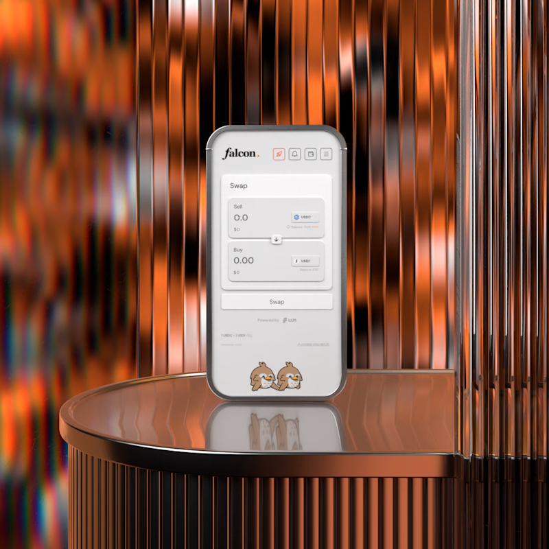
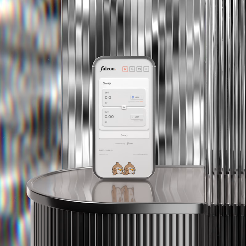

A is the best

A has more visual contrast and the phone looks way more clear!

The Colour of A environment make the Mobile Phone stands Out

A for me. The warm copper gives the product some heat and makes it feel premium rather than clinical. B is cleaner but silver on silver almost hides the device, the copper actually frames it. Wild that this is no AI.

Thank you!

First I was wondering why everyone liked A, then I realized you named them reverse. Me too, like A

The mobile phone and its design stand out better on Background A than on Background B, where the phone and design blend into the background color.

I prefer option A

A is more clear and clean.

A, no contest. The warm light makes the metal actually feel warm too, B reads a bit clinical by comparison. What's the lighting setup behind that copper glow?
The network for creativity
Join 1.25M professional creatives like you
Connect with clients, get discovered, and run your business 100% commission-free
Creatives on Contra have earned over $150M and we are just getting started

Challenges
View all


Related posts

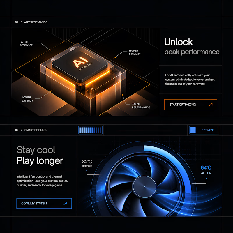
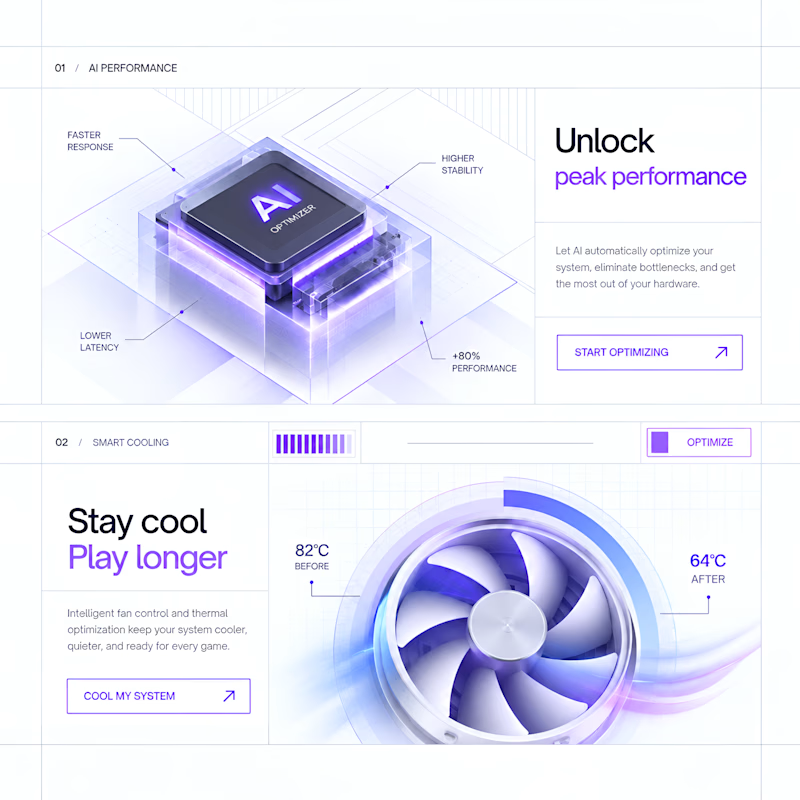
Exploring Dark vs. Light with AI
Exploring two visual directions for the same product experience. Testing how color, contrast, and lighting can completely change the feel of a design.
Which one would you choose?
5 voted
63%
3 voted
37%
8 votes
Closed

The dark direction has the stronger product-story arc for me—the warm chip glow against the cool blue controls gives the hierarchy more depth and energy.

Client’s choice vs. Designer’s choice 👀
I’m currently working on a branding project for Massage & Mocktails — a concept built around couples learning massage together in a relaxed, social atmosphere.
These are two early, black & white directions from Stage 2 of my branding process, before moving into color, typography, and the full visual system.
The interesting part?
My client chose Concept 1. I chose Concept 2.
Now I’m curious what other creatives think.
Which direction would you choose — 1 or 2? And why?
Sometimes the most interesting part of branding is seeing how differently a client and a designer respond to the same brief.
21 voted
44%
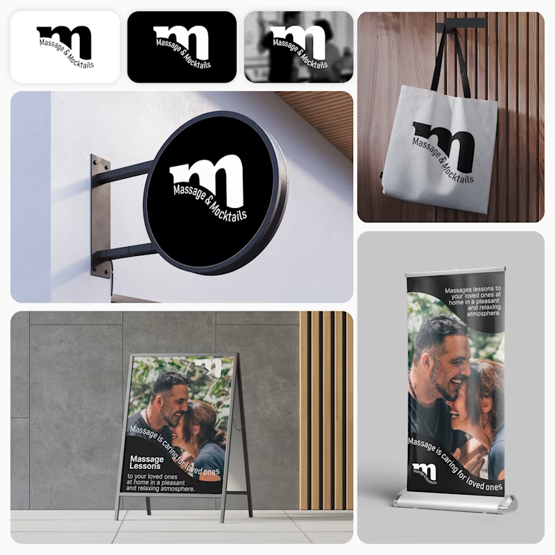
27 voted
56%
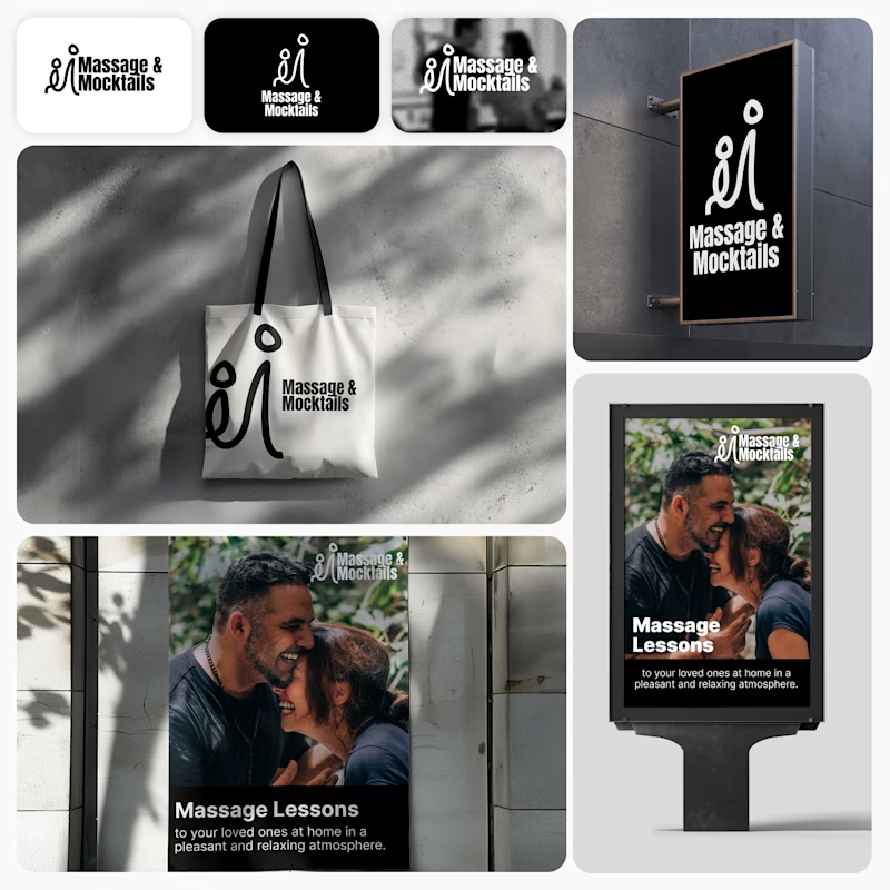
48 votes
Closed

Concept 2 for me. That interlocking figure mark reads as two people meeting, which is the actual brief here, so it gives you more to build a system on. Concept 1 is the safer, more literal pick, which is usually why clients reach for it.

My previous poll showed unexpected results (I am very grateful to everyone who took the time to vote and comment 🤍).
Now I am curious about your opinion on the color mode for this hero section. I definitely like a light theme. What about you?
By the way, I made a nice animation for this design. You can see it on my profile

28 voted
54%
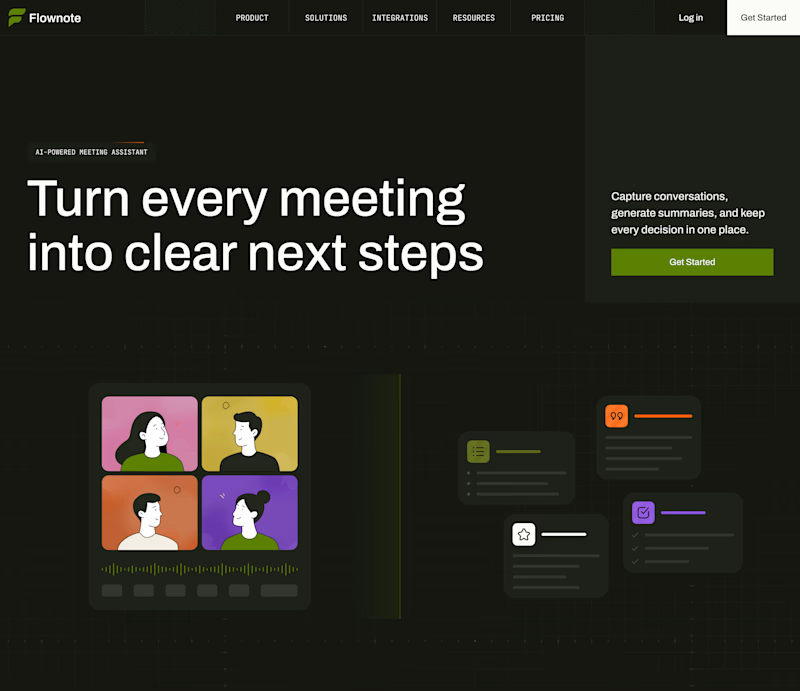
24 voted
46%
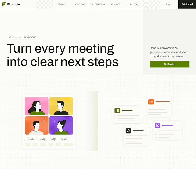
52 votes
Closed

To be honest the dark mode looks really good