The network for creativity
Join 1.25M professional creatives like you
Connect with clients, get discovered, and run your business 100% commission-free
Creatives on Contra have earned over $150M and we are just getting started
Back to feedPost

Rescued vegetables, painted like Flemish masters.
Oddly good is a snack brand where every pack is a trompe-l’œil still life: gilt frame, painted fly, a dewdrop you want to wipe off.
Still life. Still good.
Full case study: Check it out

The gilt frame around each pack makes the shelf read like a gallery wall. On the web side, does the frame stay as a constant, or does it step back once someone starts browsing?


The packaging concept is so clever. The classical artwork makes the brand feel distinctive and memorable.

This is absolute art Revolté! 🔥 Rescued vegetables painted like Flemish masters? What a brilliant concept! The trompe-l'œil still life with gilt frame and painted fly is next level storytelling for a snack brand. "Still life. Still good." - perfect tagline!
The network for creativity
Join 1.25M professional creatives like you
Connect with clients, get discovered, and run your business 100% commission-free
Creatives on Contra have earned over $150M and we are just getting started







Related posts


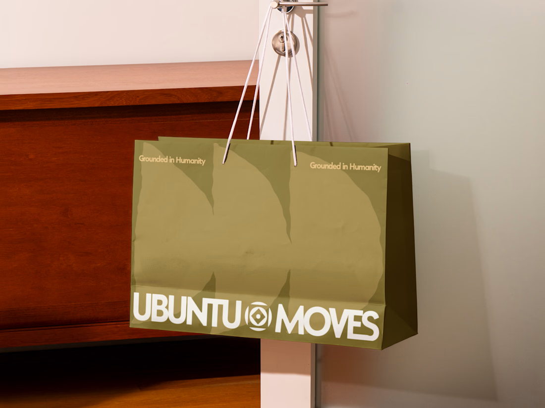
Grounded in humanity, made for movement.
Packaging and custom Framer website design for Ubuntu Moves, a wellness brand inspired by the belief that “I am because we are.”
Earthy colors, expressive patterns, and bold typography bring its sense of connection into the physical and digital experience.
Thanks @Can Girgin for the Framer development💫


The olive shopping bag with the wordmark split around that circular emblem looks great in the warm light, and the big tonal arches printed behind it add movement without shouting.

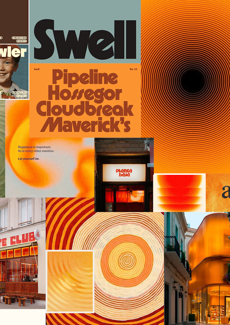
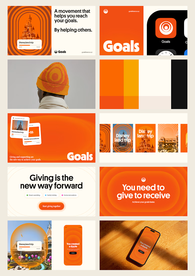
one of my favourite things about running a one-person studio is that nothing gets lost in translation.
the idea behind the brand is the same idea that shapes the website and the product.
no handovers, no starting from scratch, no trying to explain the vision to someone new.
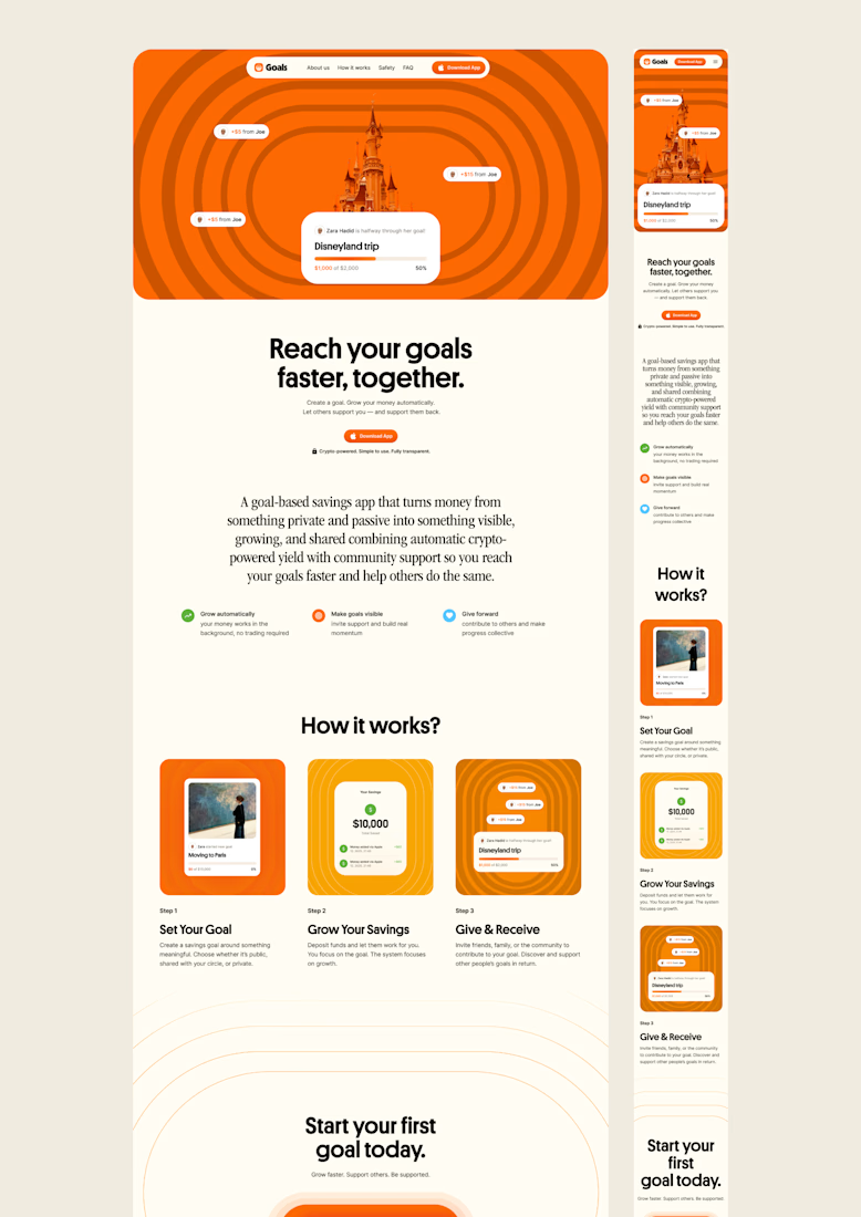
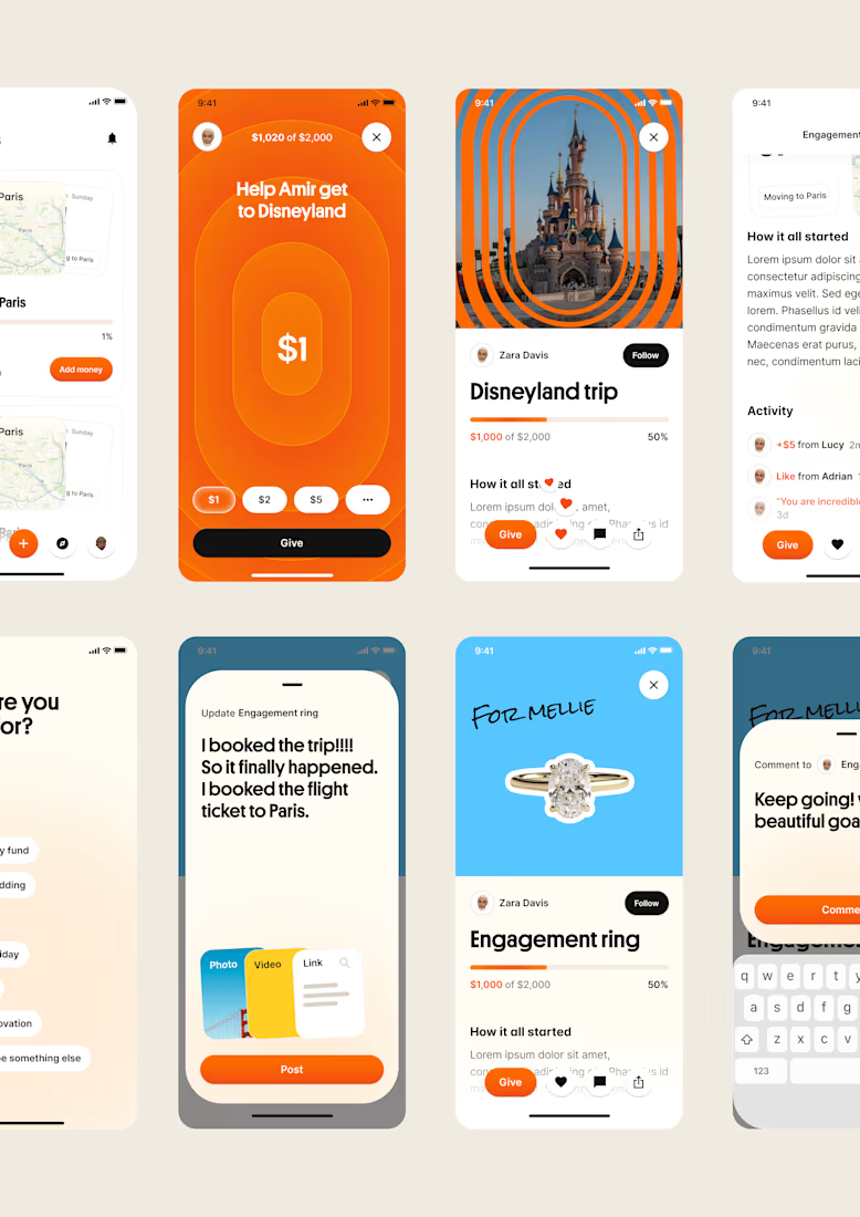
a little look at how that came together for goals, from the first moodboard to the app ↓

Love it!


Check it out
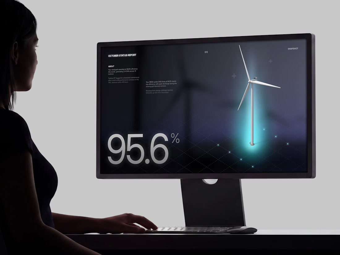
Just published: 0-1 design for an Energy Management System (EMS) ⚡
Designed a desktop platform monitoring wind turbines, PV parks, and battery storage across multiple sites. Keeping the interface mostly white, so green and red status indicators do the talking.
Operators managing critical infrastructure need to assess system health instantly. No visual noise, no cognitive overload. Just unmistakable state communication.


Cool work 👌