The network for creativity
Join 1.25M professional creatives like you
Connect with clients, get discovered, and run your business 100% commission-free
Creatives on Contra have earned over $150M and we are just getting started
Back to feedPost
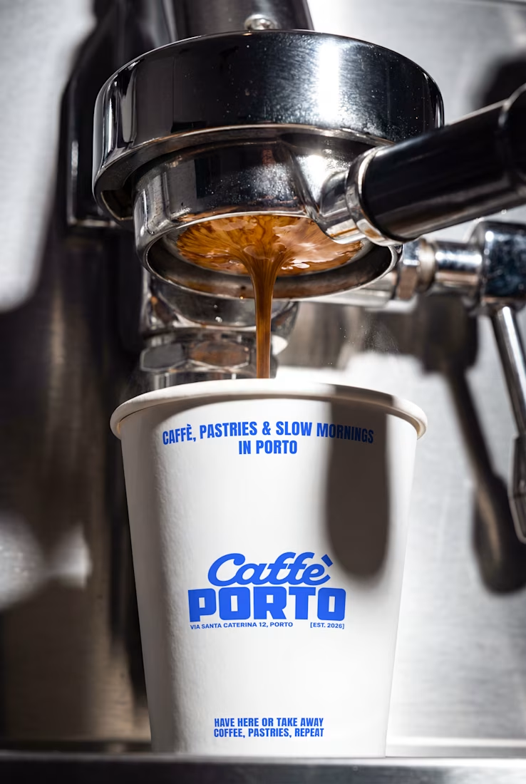
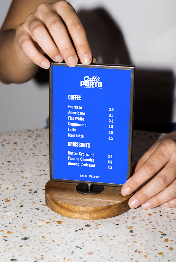
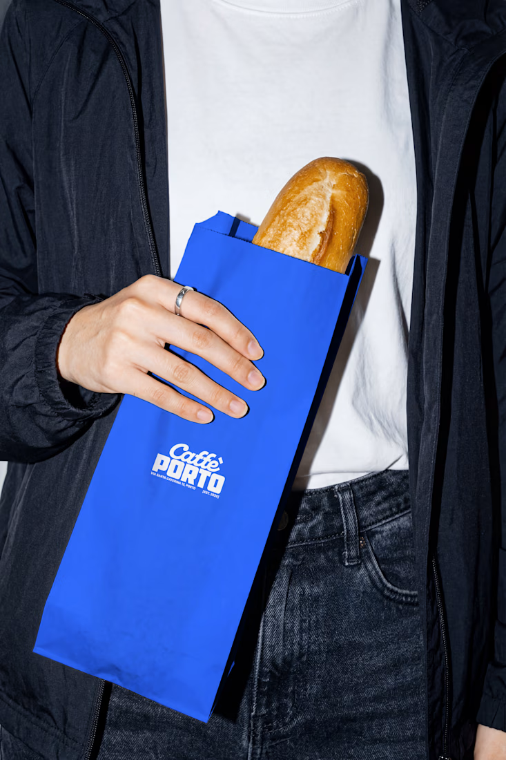
Caffè Porto — coffee & croissants in Porto.
Good coffee. No rush.


Thank You 😍

Love it!
Thank Youuu !!🙌

Sick!!
Thank Youuu!!😍

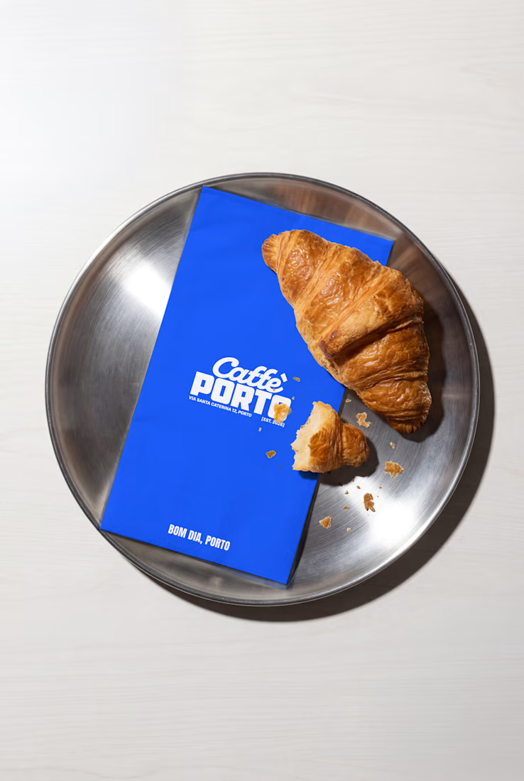
Good coffee, no rush is the whole brand in four words and that deep blue on the croissant shots looks good enough to eat. Coffee branding usually goes warm and earthy so this cool palette really stands out on a shelf.
Thank you so much! Really glad the cooler palette and “Good coffee. No rush.” came through that contrast was exactly what I wanted for the brand 💙☕️

That cobalt blue against the croissant is such a good pairing, it makes the whole thing feel calm instead of loud. Was "no rush" the brief from day one, or did the tone find you along the way?
Thank you! It actually found me along the way. Once the visual direction started coming together, “Good coffee. No rush.” just felt like the most natural expression of the whole brand. ☕️💙

Beautiful!
Thank Youuu!!

Creative thought
Thank You!!

Premium branding
Thank You!!
you are most welcome mate, is this an actual project?

Love this!
Direct flash is having a real moment in branding aesthetics
Thank Youuuu Hamza !! 😍
The network for creativity
Join 1.25M professional creatives like you
Connect with clients, get discovered, and run your business 100% commission-free
Creatives on Contra have earned over $150M and we are just getting started











Related posts

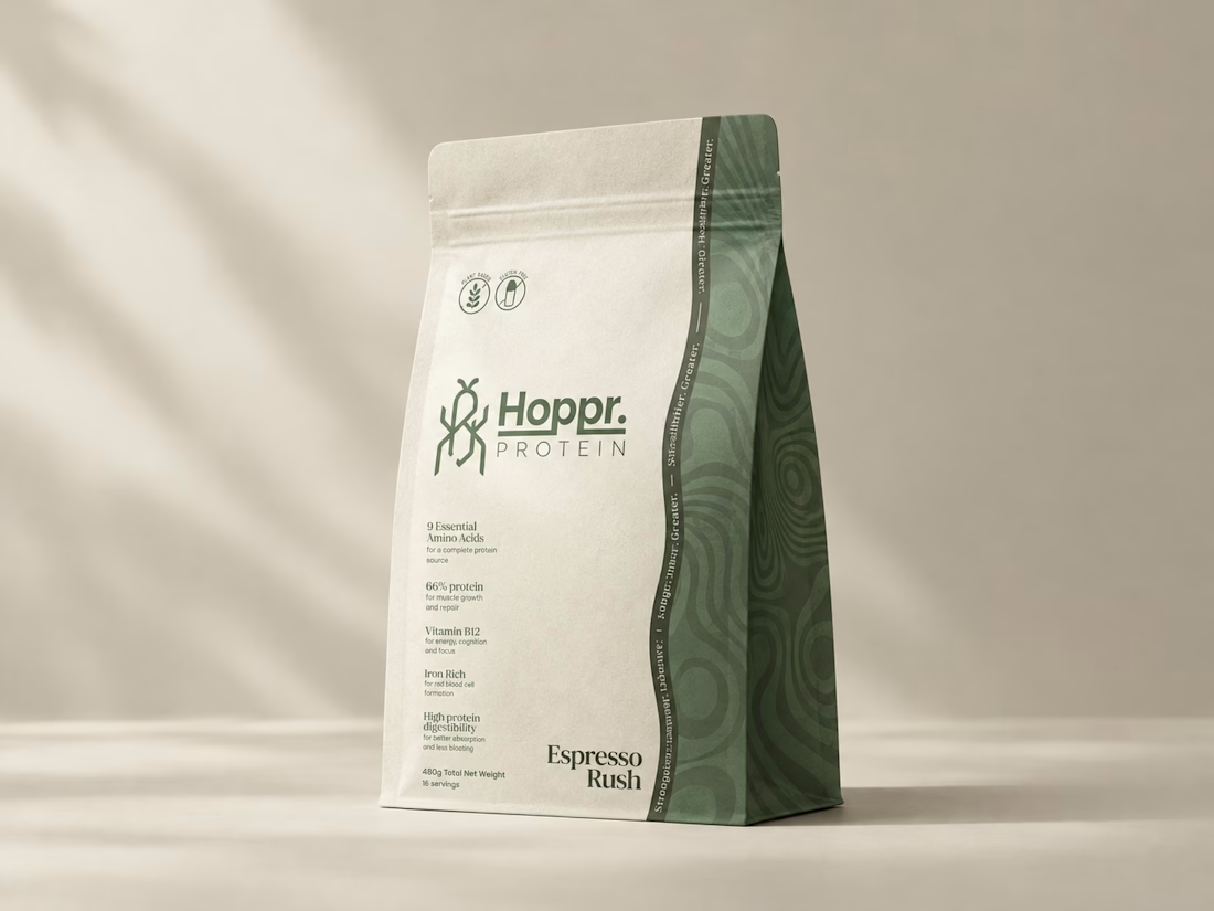
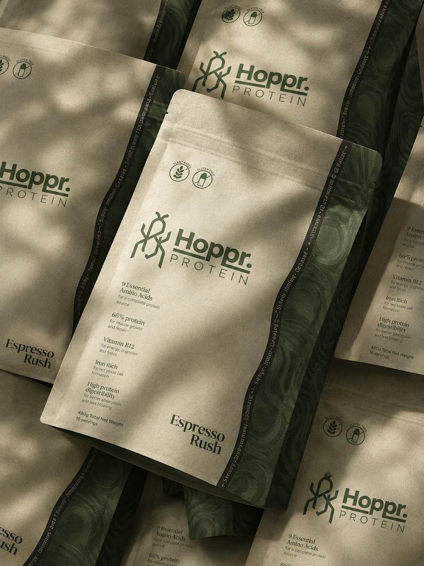
Not every client comes to me for a brand identity and not all my clients are skincare or cosmetic brands.
That was the case with Hoppr, a protein powder brand made from crickets. 🦗 YES, CRICKETS!
Sometimes the logo, colors, and visual system are already there and my job is to bring them to life on packaging and see how far I can push them.
I love projects like this because I get to play with typography, layout, and materials while working within an existing identity.
How much freedom do you think a designer should have when working with an established brand?


Great packaging work, nice job

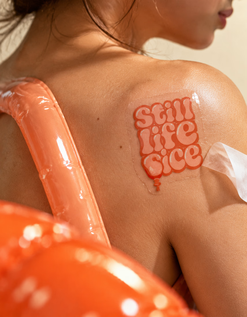
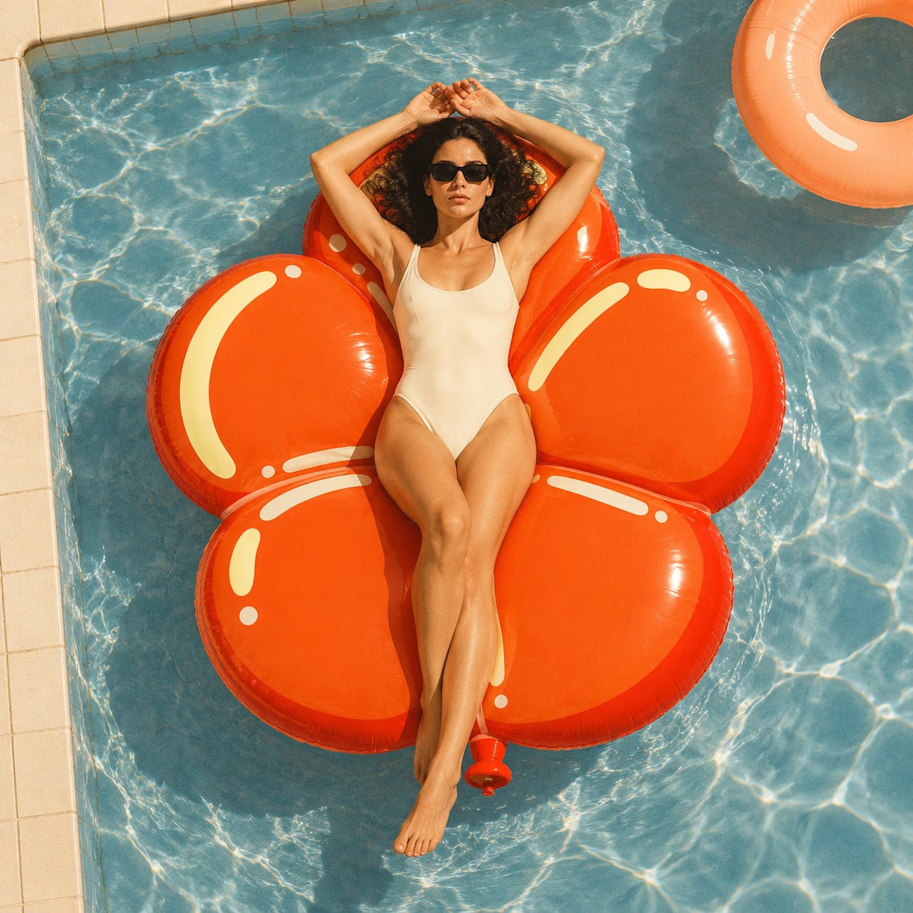
A flower that inflates arrives in the mail.
Next month, a phone made of shell.
STILL LIFE SERVICE. Case study dropping soon.
Which object earns your shelf? Reply below.
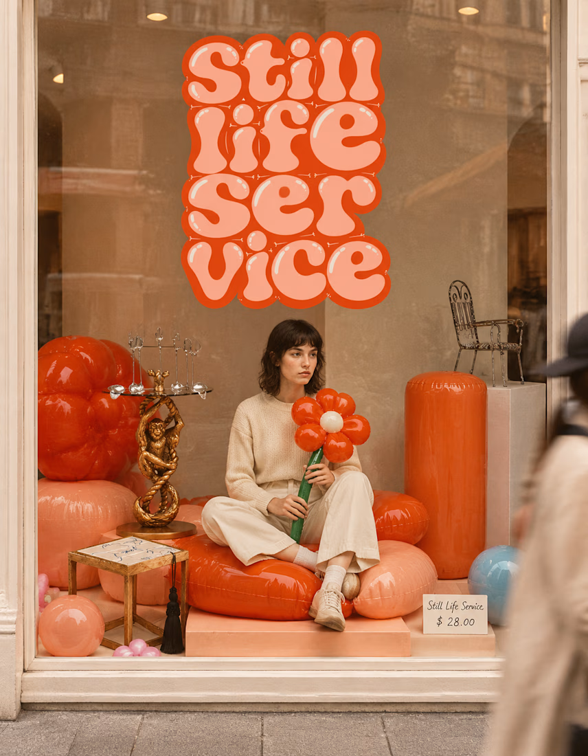

The inflatable flower. Only houseplant I'm guaranteed not to kill. Also, a new object every month is a sneaky good retention hook, people will stay subscribed just to see what's next.


Congrates!!