The network for creativity
Join 1.25M professional creatives like you
Connect with clients, get discovered, and run your business 100% commission-free
Creatives on Contra have earned over $150M and we are just getting started
Back to feedPost

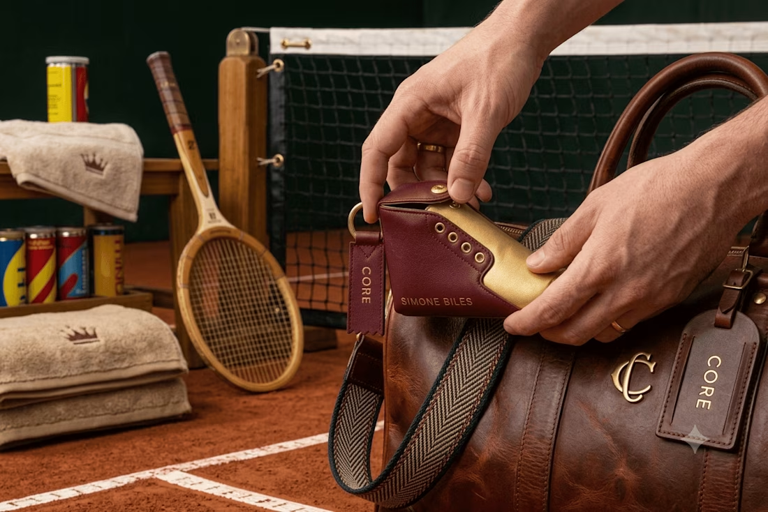
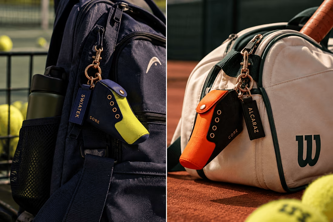
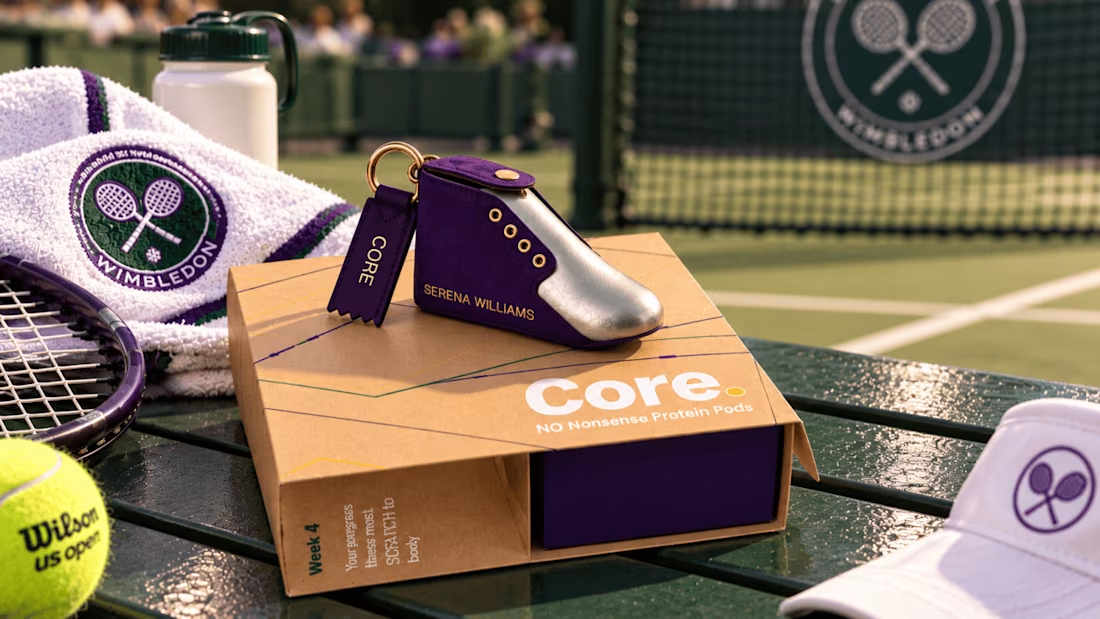
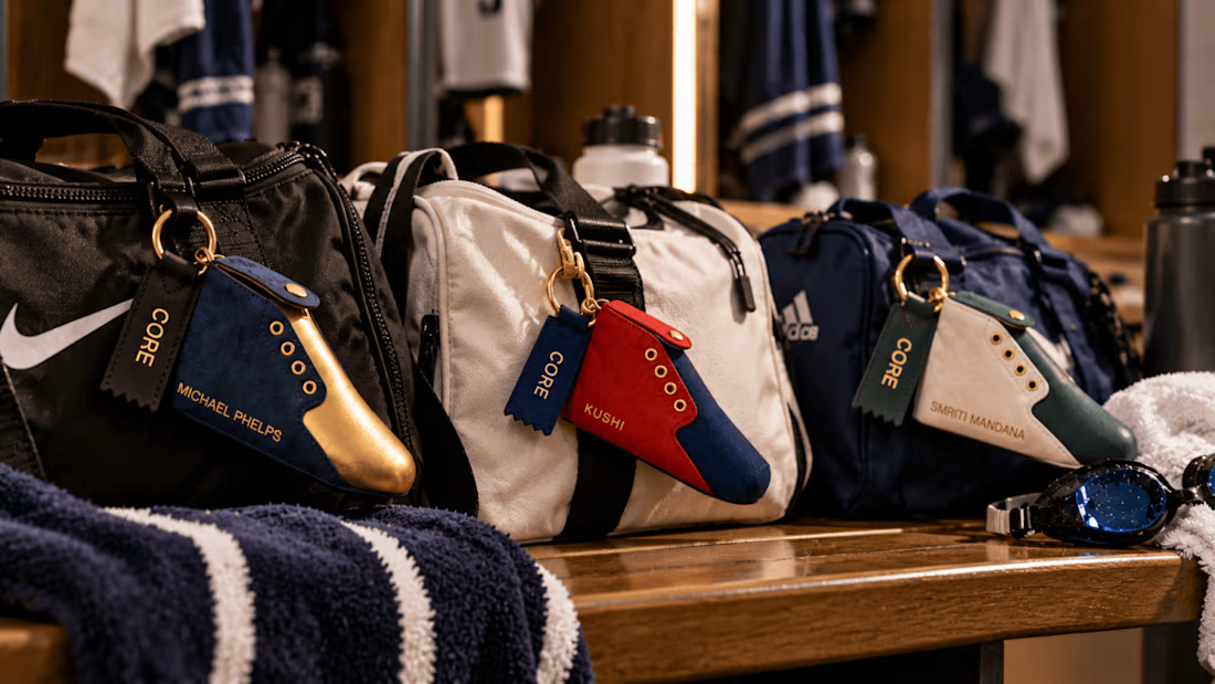
It's been a while since I was active so thought I'd start off by sharing one of my recent branding projects which started out as a can design for a quick collab and spiralled into creating a whole brand world! Let me know your thoughts!
Brand DesignGraphic DesignPackaging DesignAdobe IllustratorAdobe PhotoshoppackagingdesignexpertsKittlbranding


The branding is so cohesive — love how the whole world came together from just a can design!


super good
The network for creativity
Join 1.25M professional creatives like you
Connect with clients, get discovered, and run your business 100% commission-free
Creatives on Contra have earned over $150M and we are just getting started











Related posts

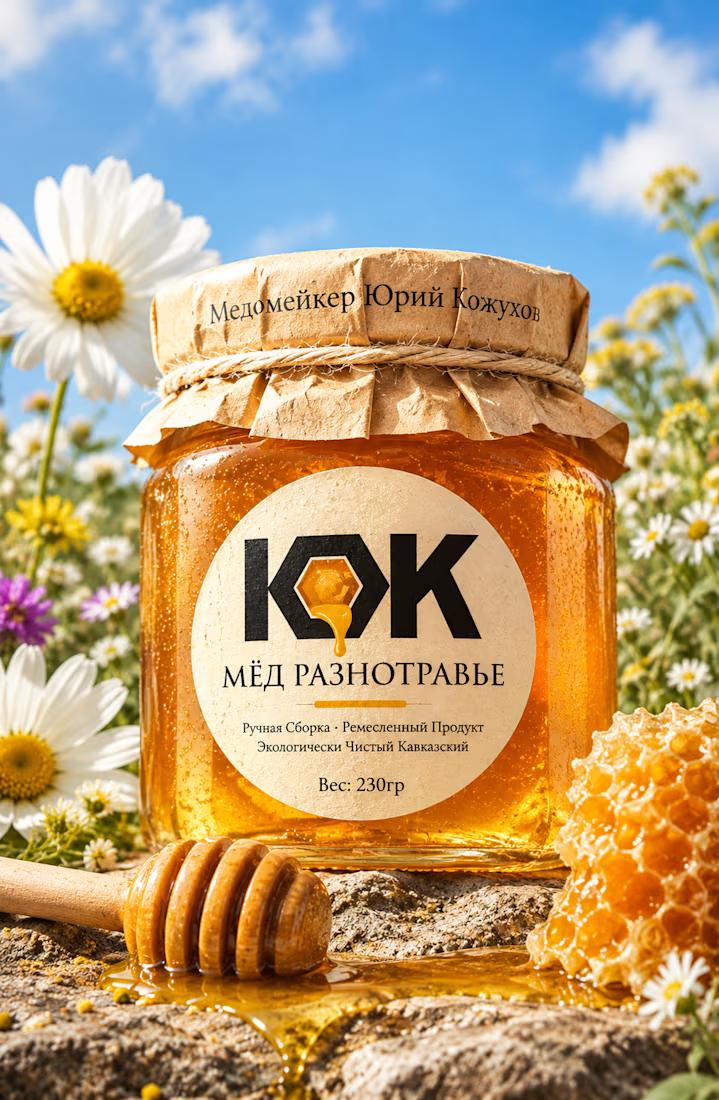
A natural and premium packaging concept inspired by the purity of wildflower honey and the beauty of nature. The design combines warm honey tones, textured paper, bold typography, and a clean label layout to create an authentic, handcrafted feel.


Exceptional work




Clean and confident work! The green gradient with the mark feels very modern for fintech - trustworthy but not boring. The app screens look really polished. Curious how you landed on this mark, does it represent growth / movement?

Pakeging Design Brand Design Product Design