The network for creativity
Join 1.25M professional creatives like you
Connect with clients, get discovered, and run your business 100% commission-free
Creatives on Contra have earned over $150M and we are just getting started
Back to feedPost
Renovate | Website Design
I'm currently working on several projects in parallel. I'm also working on several parts of the upcoming case study.


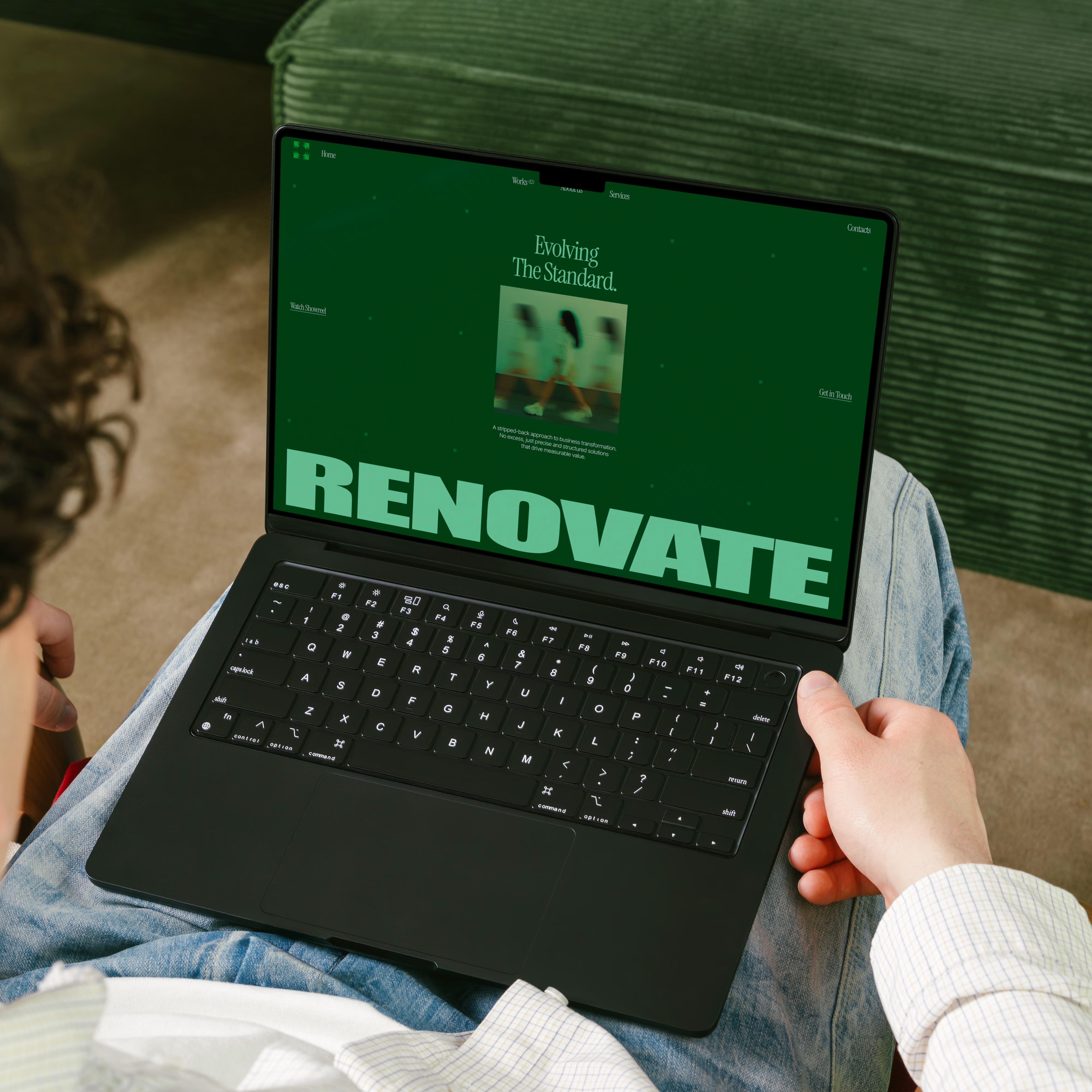
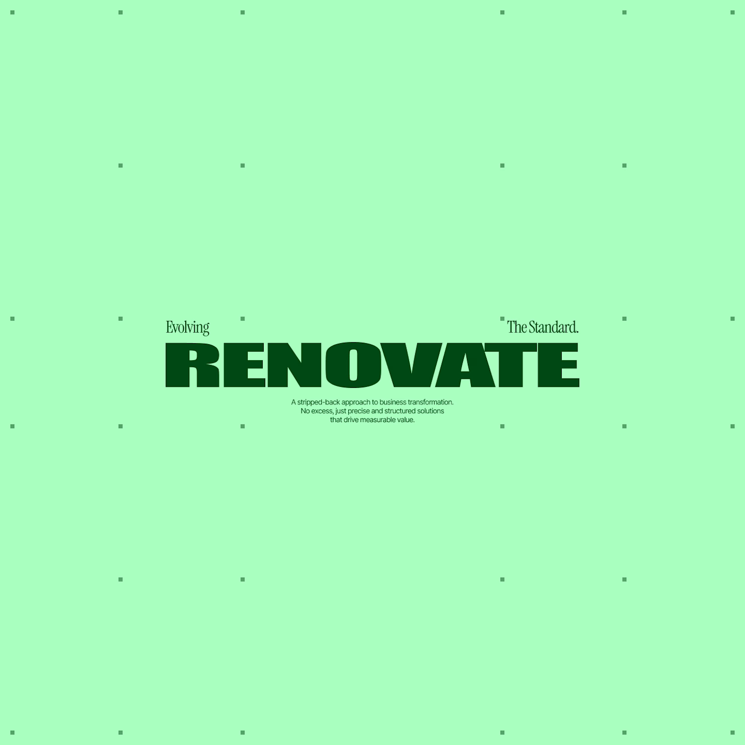
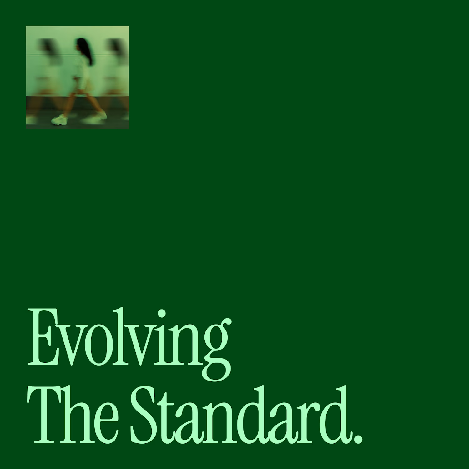

Love that heavy, blocky type...
It feels solid.


Thank you! @Tanaka Samukange 🚀


Nice work👏🔥🔥
Thank you! @Picto Design Studio 🔥


Its insanely good color contrast. High-end🔥❤️
Thank you! @Mahmudul Hasan Manik 🚀
You are most welcome. Mate! ❤️

amazing work
Thank you! @yassine siyassi 🔥

looks very good 🍏
Thank you! @Anton Radionov 🔥

Super Cool work!
Thank you! @Rico Pradana 🔥
The network for creativity
Join 1.25M professional creatives like you
Connect with clients, get discovered, and run your business 100% commission-free
Creatives on Contra have earned over $150M and we are just getting started











Related posts

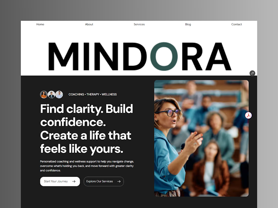
Introducing Mindora — a Life Coaching & Wellness Framer Template.
I designed Mindora for life coaches, wellness professionals, and personal growth brands looking for a calm, modern, and welcoming online presence.
Inspired by clarity, confidence, and meaningful growth, Mindora features a thoughtful layout, dedicated service sections, a blog for sharing valuable insights, and a clean visual style designed to help brands connect with their audience.
Built with Framer, it's a customizable starting point for creating a professional coaching or wellness website.
Explore Mindora and bring your next website idea to life.
Kindly check it out the template: https://www.framer.com/marketplace/templates/mindora-life-coach/



Great work

Exploring a clean, modern SaaS dashboard UI. Focused on simple layouts, smooth interactions, and a better user experience 🚀

i had to like this, it got my attention, very nice build mate.

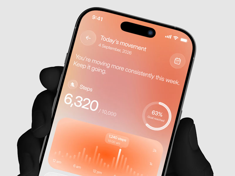
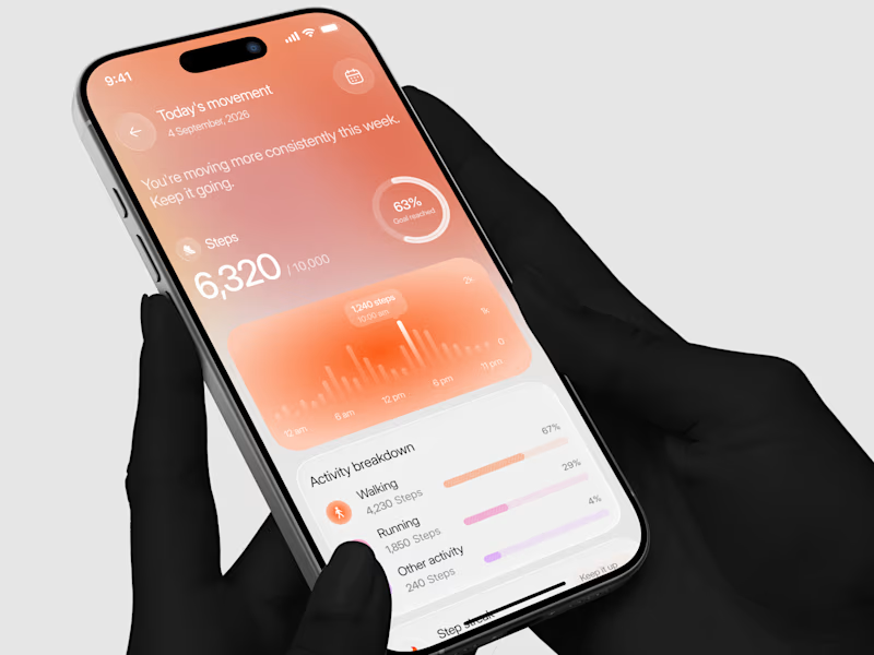
Designed a step tracking screen where you can see your daily progress and weekly trend in one glance.
Same screen, two shots. Which one would stop your scroll? 👀

11 voted
73%
4 voted
27%
15 votes
Closed
