The network for creativity
Join 1.25M professional creatives like you
Connect with clients, get discovered, and run your business 100% commission-free
Creatives on Contra have earned over $150M and we are just getting started
Back to feedPost

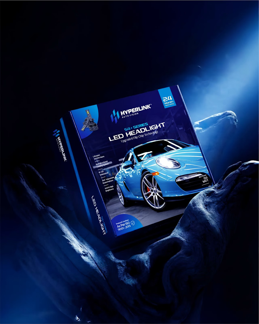
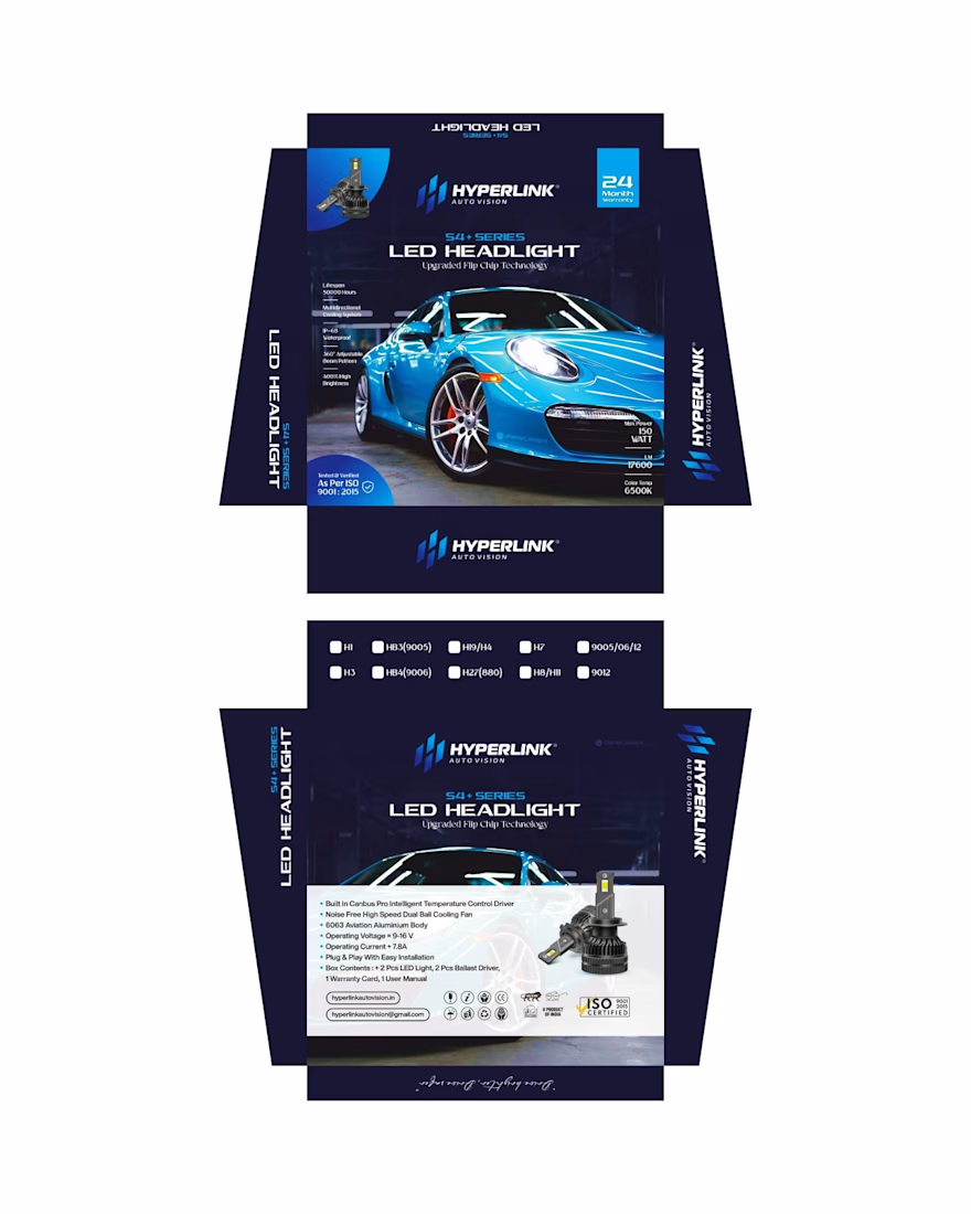
LED Headlight Packaging Design (220W) | Hyperlink Auto Vision
This is the 150W variant from the Hyperlink S4+ LED Headlight series, positioned between performance and precision.
A deep navy and electric blue palette creates a clean, contemporary feel while maintaining a premium automotive presence. The composition is kept minimal and structured, allowing the product and key specifications to remain the focus.
As part of a scalable packaging system, the design adapts across different wattages while maintaining a consistent and recognizable brand identity.
If you're building an automotive or tech product and need packaging that feels modern, clear, and scalable, let’s connect.
For packaging and branding projects:
📩 ahemad.design@gmail.com
📞 +91 73831 25219
Ahemad Designs
Brand Identity & Packaging Designer | Automotive Brands | India


The network for creativity
Join 1.25M professional creatives like you
Connect with clients, get discovered, and run your business 100% commission-free
Creatives on Contra have earned over $150M and we are just getting started

Challenges
View all


Related posts

More visuals from the rejected brand direction I shared earlier.
Really good to see this direction resonating with so many of you. It was one of our favourite explorations to build, from the narrative behind it to the visual world that brought it to life.
Great work doesn’t always make the final cut, and sometimes the reason has little to do with the quality of the direction.
Curious why this one was rejected? I’ve shared the story in the first comment✨


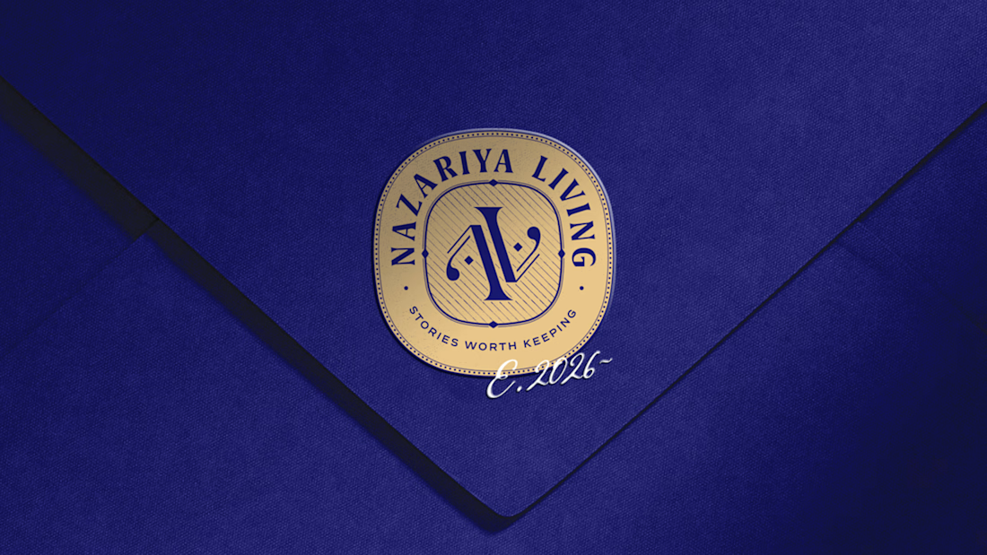
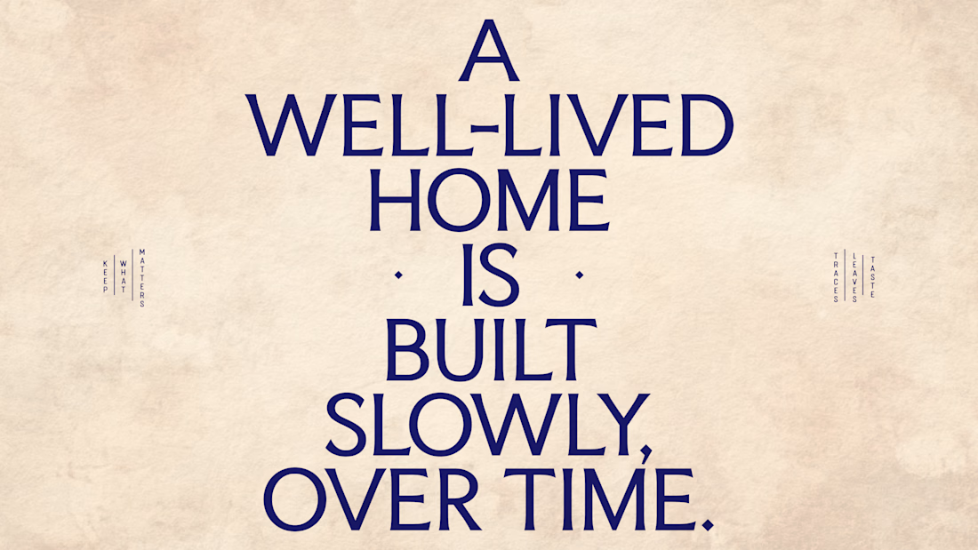
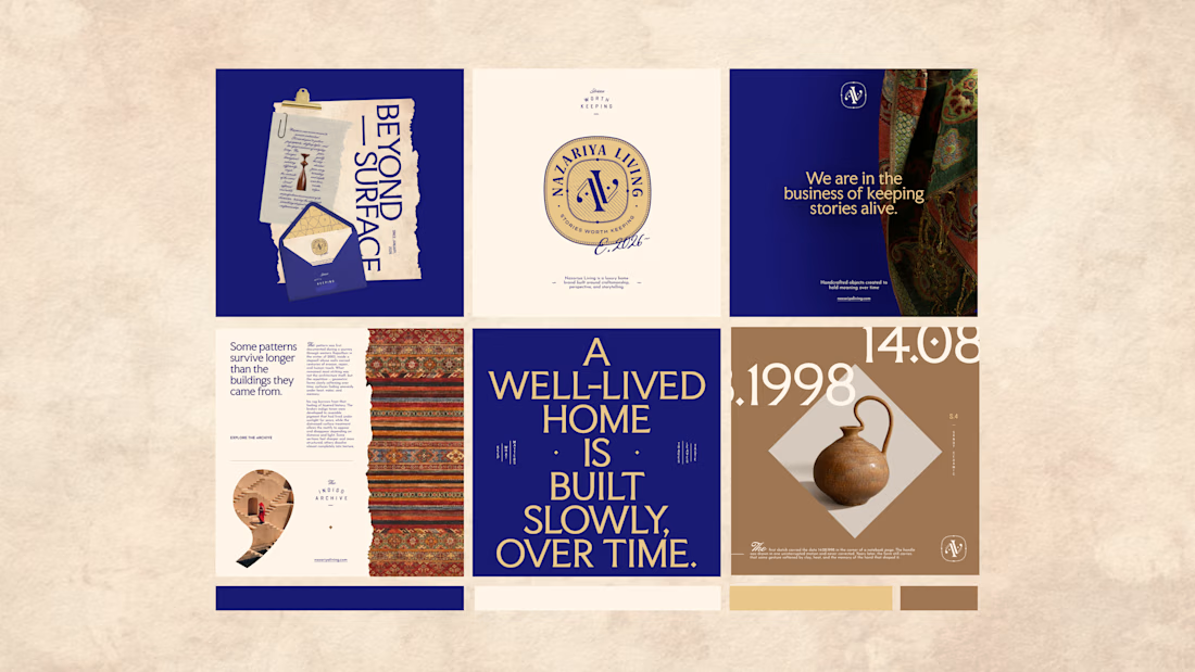
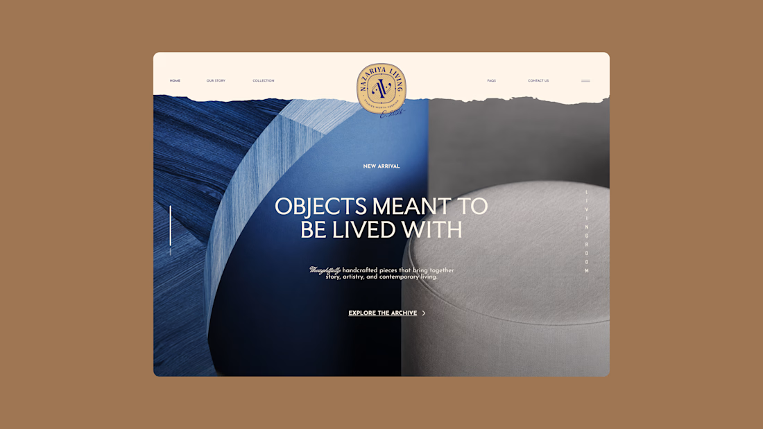
Nazariya Living is a premium carpet and home décor brand shaped by craftsmanship, culture and the stories objects carry into our homes.
This direction brought that idea to life through a seal-inspired logo, archival textures, unexpected colours and editorial typography, creating...

Brand identity design for Adventum Fitness, a fitness and personal development brand built around physical performance, mental fitness, and personal growth.
The challenge was to create a visual identity that could bring strength, movement, discipline, and personal development together without falling into the usual fitness branding clichés.
The identity was developed as a cohesive visual system across logo design, typography, color, graphic elements, and supporting brand assets, giving Adventum a distinctive and consistent presence across digital and marketing applications.
Full case study available on my Contra profile.
#BrandIdentity #BrandDesign #FitnessBranding #VisualIdentity #LogoDesign #BrandStrategy #GraphicDesign #BrandDesigner #FitnessBrand #PersonalDevelopment


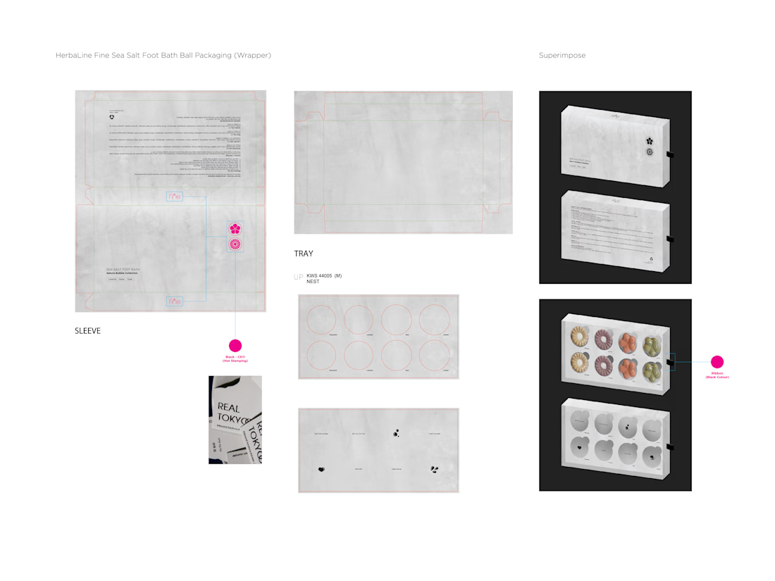
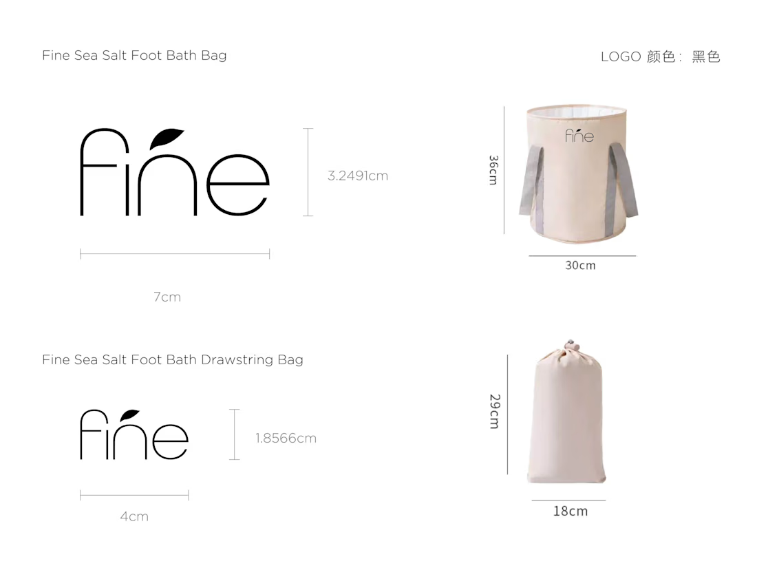
Sea Salt Foot Bath — Sakura Bubble Collection Packaging Design
Minimal & Refined
A clean white packaging system creates a modern, calming aesthetic that reflects the relaxing nature of a foot bath ritual.
Japanese-Inspired Aesthetic
The floral forms and Sakura-inspired concept introduce a subtle Japanese influence, giving the collection a delicate and sophisticated character.
Soft Colour Coding
Pastel tones differentiate each fragrance — Chamomile, Lavender, Rose, and Jasmine — while maintaining a cohesive visual identity across the collection.
Product Presentation
The structured gift-box layout presents each bath piece neatly and clearly, creating a premium unboxing experience while allowing the colours and sculptural floral shapes to become the main visual focus.
Clean Typography
Minimal typography and generous spacing reinforce the sense of simplicity, relaxation, and understated elegance.
Overall Concept
A packaging design that combines minimalism, soft botanical colours, and a spa-inspired aesthetic, transforming an everyday foot bath product into a refined self-care experience.
Credit: HWG
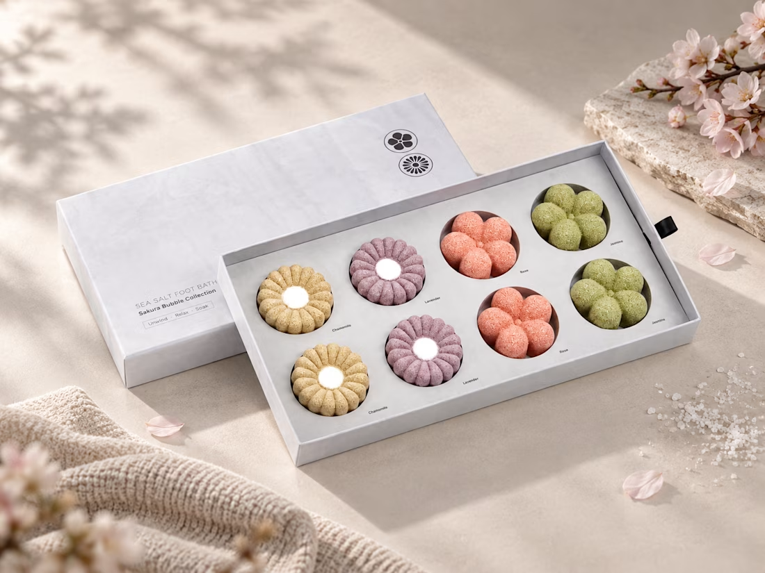
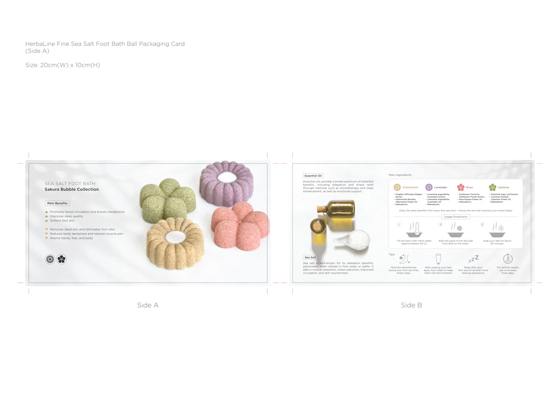

The pastel palette maps one color per fragrance across four boxes, so the shelf reads as a scent index before anyone touches a single box - the color-coding is doing the sorting work a label usually does.