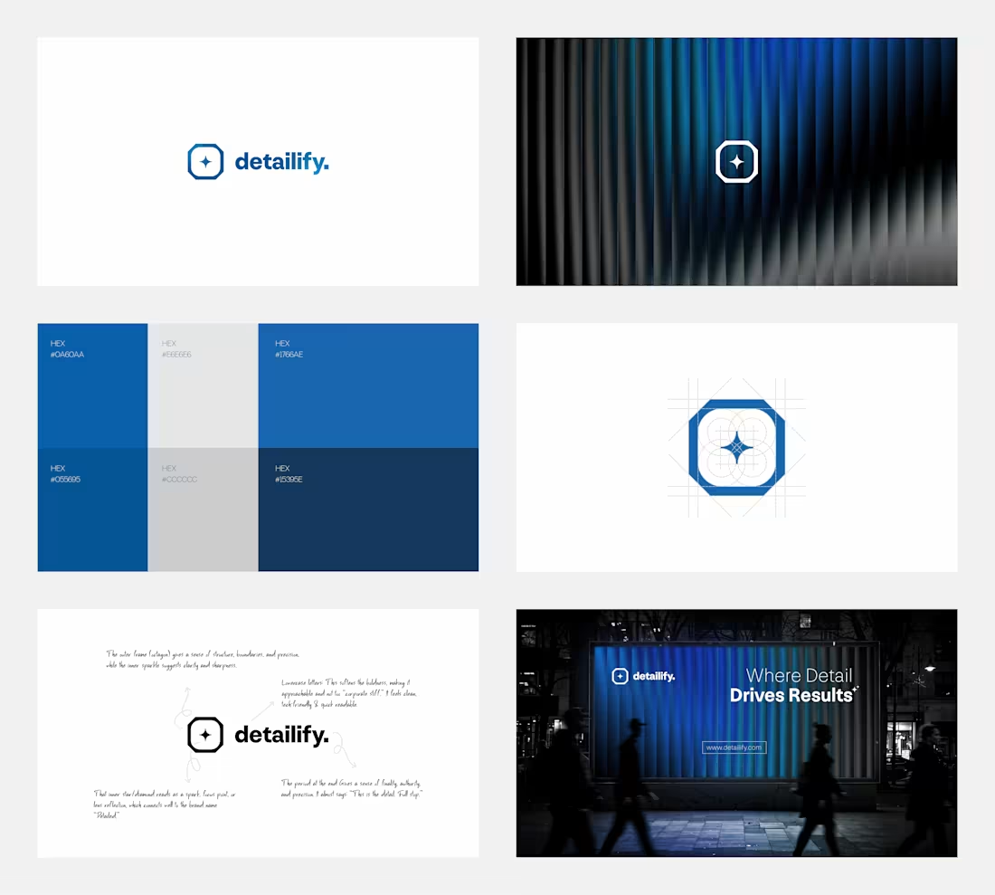
A name built on detail demands intentional design.
Detailify is a B2B growth and RevOps agency focused on GTM consulting - where clarity, structure, and precision are essential.
The identity is designed to reflect that thinking.
An octagonal form represents systems and controlled execution.
A central spark introduces the idea of insight and focused decision-making.
The period in “detailify.” adds a sense of authority and finality.
Every element is reduced to what matters - creating a brand that feels clear, structured, and reliable across all touchpoints.
If you're building a B2B or consulting brand and need a clear, structured identity, let’s connect.
For branding projects and inquiries:
📩 ahemad.design@gmail.com
(mailto:ahemad.design@gmail.com)📞 +91 73831 25219
Ahemad Designs
Brand Identity Designer | B2B & Consulting Brands | India
2
5
118
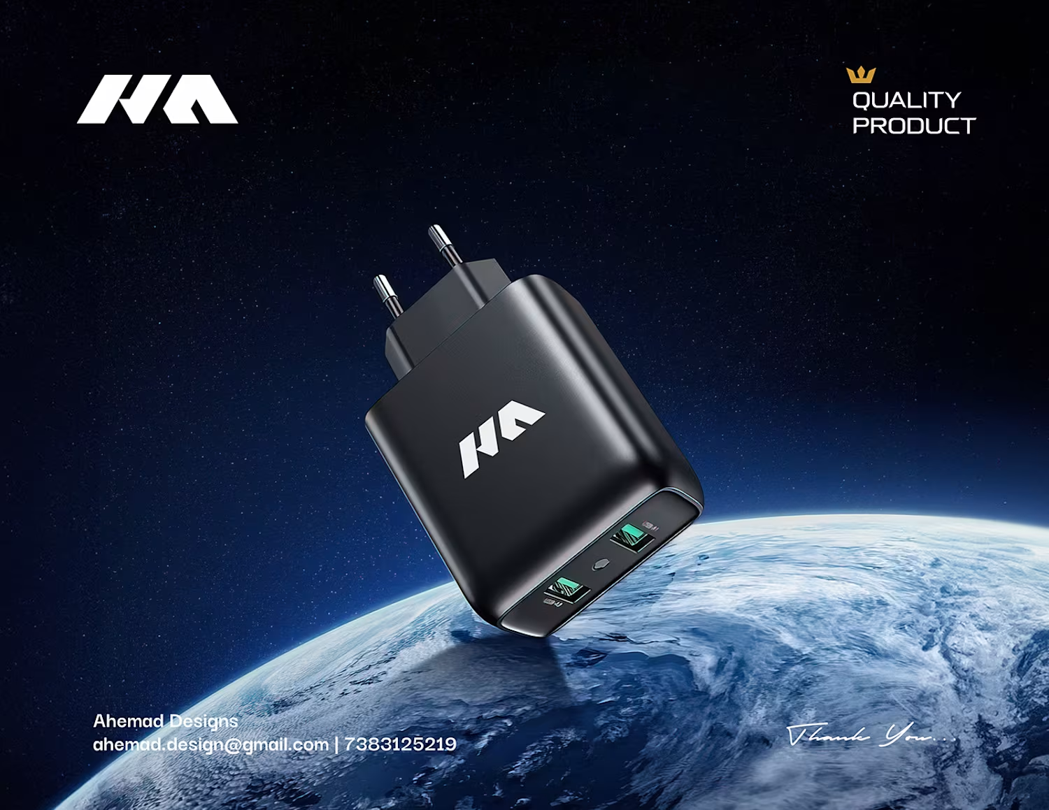
LED Headlight Packaging Design (220W) | Hyperlink Auto Vision
This is the 150W variant from the Hyperlink S4+ LED Headlight series, positioned between performance and precision.
A deep navy and electric blue palette creates a clean, contemporary feel while maintaining a premium automotive presence. The composition is kept minimal and structured, allowing the product and key specifications to remain the focus.
As part of a scalable packaging system, the design adapts across different wattages while maintaining a consistent and recognizable brand identity.
If you're building an automotive or tech product and need packaging that feels modern, clear, and scalable, let’s connect.
For packaging and branding projects:
📩 ahemad.design@gmail.com
(mailto:ahemad.design@gmail.com)📞 +91 73831 25219
Ahemad Designs
Brand Identity & Packaging Designer | Automotive Brands | India
1
42
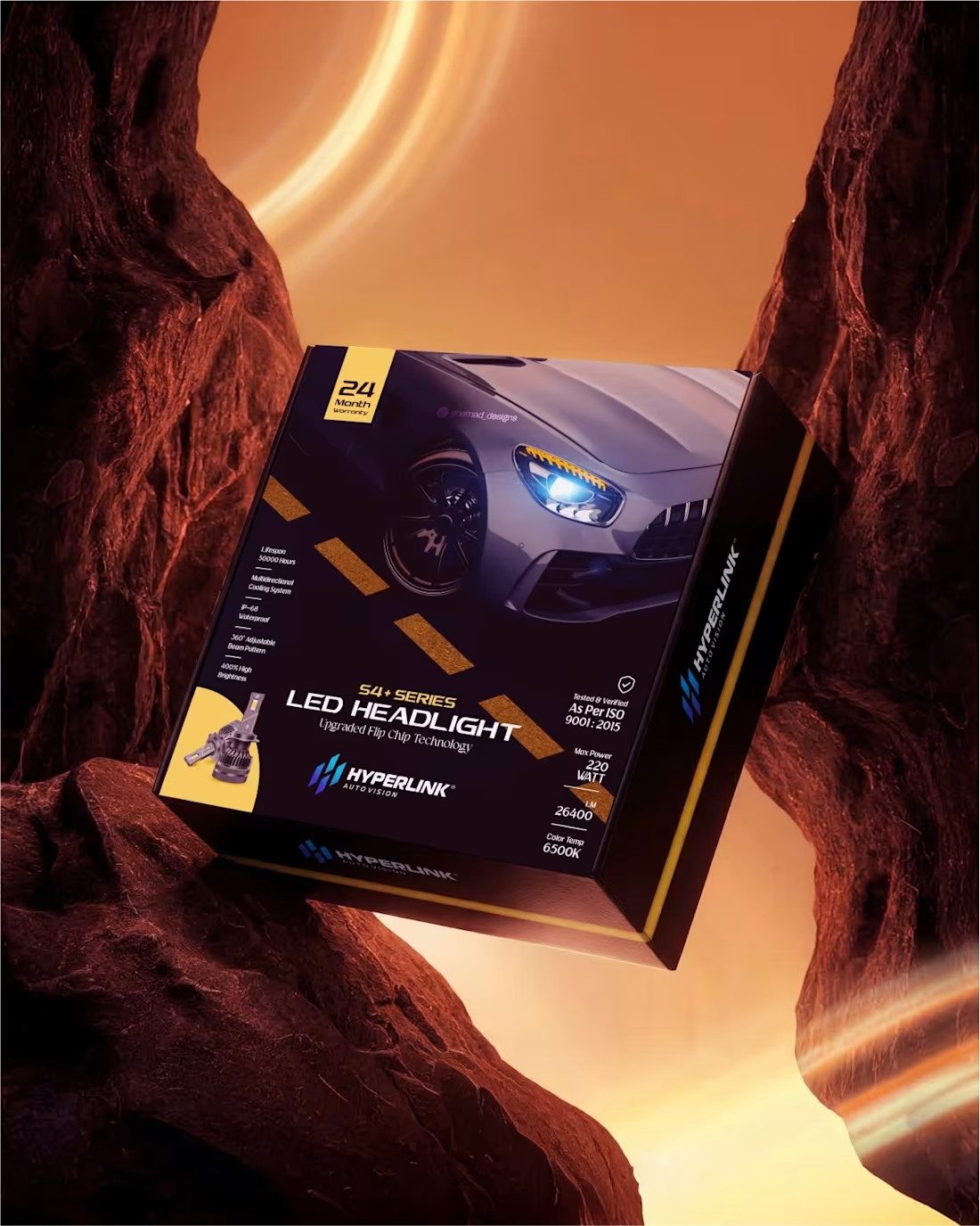
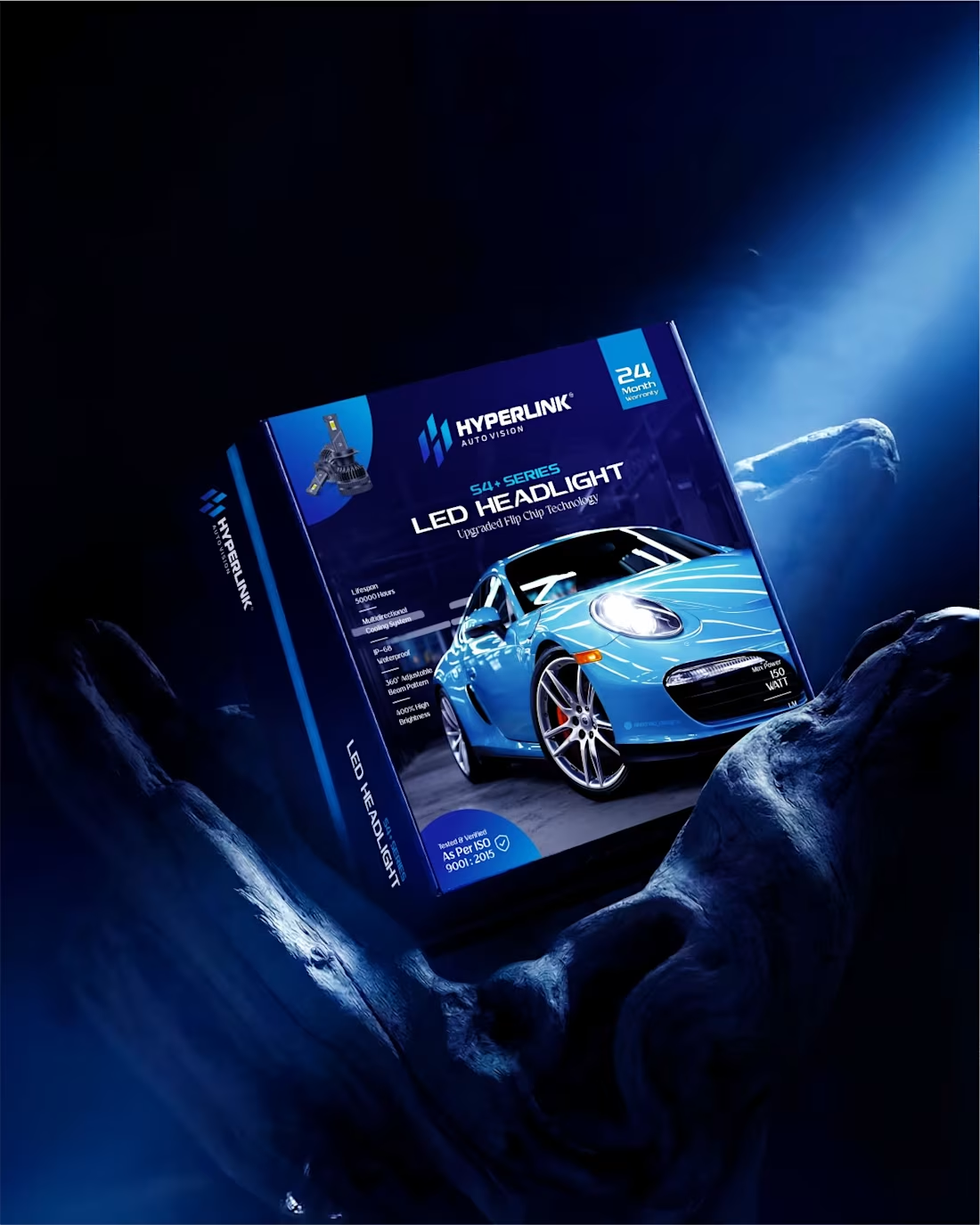
LED Headlight Packaging Design (220W) | Hyperlink Auto Vision
Designed to express maximum power and performance.
A black and yellow palette introduces high contrast and intensity, instantly signaling performance and energy. Chevron-inspired elements add a sense of motion, while the automotive visual reinforces a high-performance positioning.
Despite the bold direction, the layout remains structured and clear - ensuring key specifications are easy to read and quick to scan in a retail environment.
Within the larger packaging system, this variant stands out as the most powerful while still maintaining a consistent brand identity across the series.
If you're building a high-performance product and need packaging that communicates power and precision, let’s connect.
For packaging and brand identity projects:
📩 ahemad.design@gmail.com
(mailto:ahemad.design@gmail.com)📞 +91 73831 25219
Ahemad Designs
Brand Identity & Packaging Designer | Automotive Brands | India
2
60
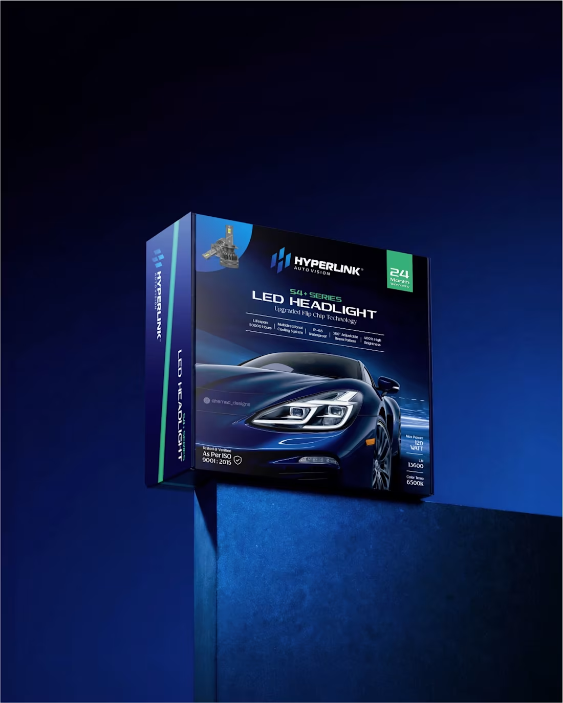
LED Headlight Packaging Design (180W) | Hyperlink Auto Vision
Built with a deep blue palette to communicate precision and control.
This is the 120W variant from the Hyperlink S4+ LED Headlight series, designed to feel balanced, refined, and engineered for consistency.
Where the 180W variant focuses on bold performance, this direction shifts toward clarity and precision. A sleek automotive visual, controlled lighting, and a structured layout ensure that key specifications are easy to scan without visual noise.
Every element is placed with intent - creating a clean hierarchy that improves readability while maintaining a premium, trustworthy feel.
If you're building an automotive or tech product and need packaging that feels sharp, clear, and scalable, let’s connect.
For branding projects and inquiries:
📩 ahemad.design@gmail.com
(mailto:ahemad.design@gmail.com)📞 +91 73831 25219
Ahemad Designs
Brand Identity & Packaging Designer | Automotive Brands | India
1
49
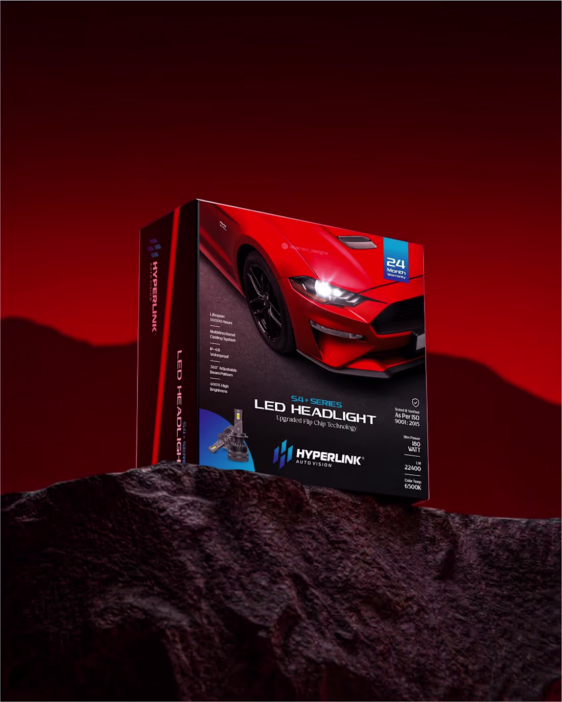
LED Headlight Packaging Design (180W) | Hyperlink Auto Vision
Built around a bold red palette to communicate performance and power.
This 180W variant for Hyperlink Auto Vision is designed to stand out instantly while keeping key information clear and easy to scan.
A strong contrast between red and black creates depth and intensity, while controlled lighting and sharp imagery reinforce a high-performance automotive feel.
The design is part of a larger packaging system, built to scale across multiple wattage variants while maintaining a consistent brand identity.
From concept to dieline to final print production, every detail is designed for real-world retail impact.
If you're building an automotive or tech product and need packaging that stands out and sells, let’s connect.
For product packaging and branding projects:
📩 ahemad.design@gmail.com
(mailto:ahemad.design@gmail.com)📞 +91 73831 25219
Ahemad Designs
Brand Identity & Packaging Designer | Automotive Brands | India
3
88
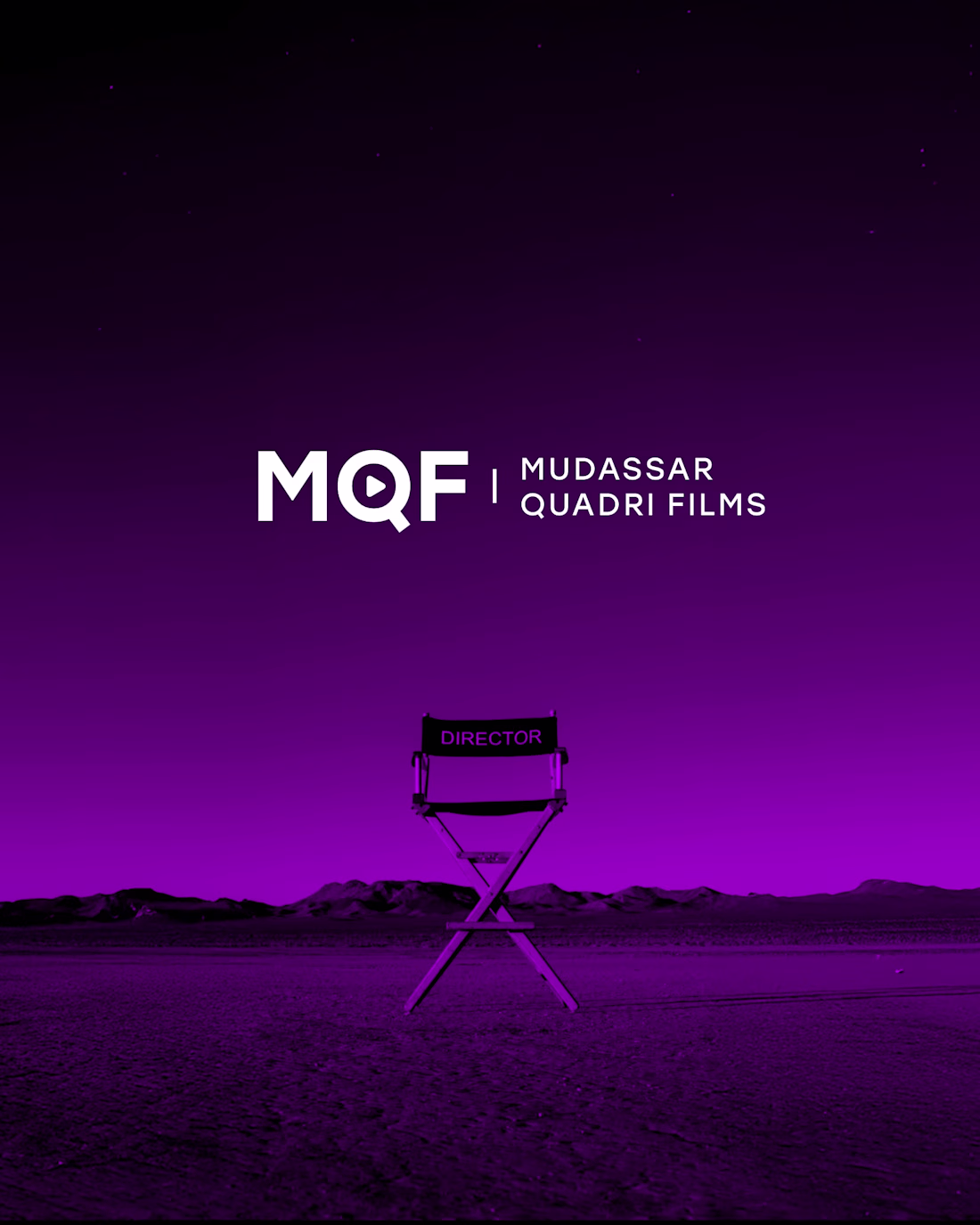
MQF | Film Production Logo & Brand Identity
For Mudassar Quadri Films, the goal was to create a mark that directly reflects the world of filmmaking. The “Q” integrates a play button, turning a simple letter into a recognizable and meaningful symbol.
A deep violet palette adds a cinematic mood while maintaining a refined and premium feel. It helps the brand stand apart while still feeling professional and grounded.
If you're building a film production brand and need a strong identity, DM to discuss.
For branding projects and inquiries:
📩 ahemad.design@gmail.com
(mailto:ahemad.design@gmail.com)📞 +91 73831 25219
Ahemad Designs
Brand Identity Designer for Film Production Studios | India
2
79
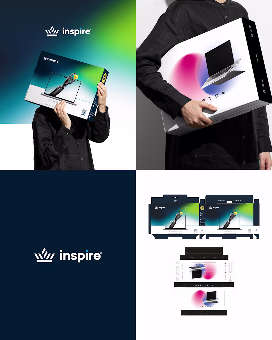
Inspire | Tech Packaging & Brand Design
Two packaging designs, one cohesive identity
A dark blue-green background paired with a robotic hand emerging from the screen creates a futuristic and premium feel.
A clean white background with soft pink and blue gradients and a floating laptop brings a light, modern and accessible contrast.
If you're launching a tech product and need packaging that stands out and sells, DM to discuss.
For packaging and branding projects:
📩 ahemad.design@gmail.com
(mailto:ahemad.design@gmail.com)📞 +91 73831 25219
Ahemad Designs
Brand Identity & Packaging Designer | Tech & Digital Products | India
2
61
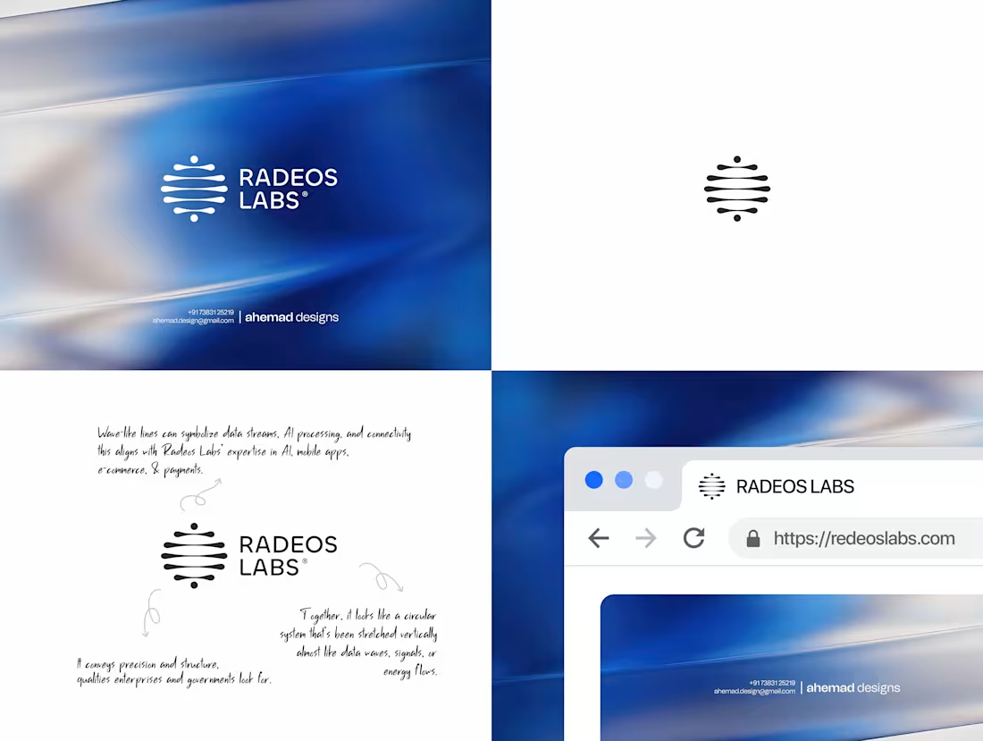
Radeos Labs is designed from the language of data, signal, and flow.
The identity is built using wave-like forms that represent data streams, AI processing, and connectivity. These elements come together into a vertically stretched system, creating a sense of precision, structure, and controlled movement.
The visual system is flexible and works seamlessly across digital platforms, helping the brand stay consistent and recognizable as it grows.
This identity is created for AI and technology brands that want to communicate clarity, intelligence, and structure.
If you're building a tech brand and need a strong, scalable identity, DM to discuss.
For logo design and brand identity projects:
📩 ahemad.design@gmail.com
(mailto:ahemad.design@gmail.com)📞 +91 73831 25219
Ahemad Designs
Brand Identity Designer | AI & Technology Brands | India
2
62
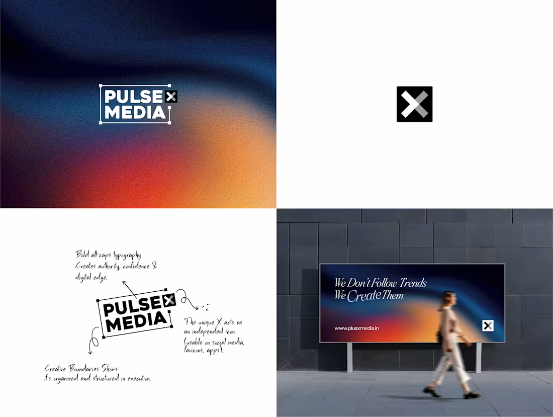
Pulse X Media is built for clarity, structure, and digital confidence.
The all-caps wordmark creates a bold and authoritative presence, while the framing system adds a sense of control and consistency. It’s not just visual - it communicates how the brand operates.
The “X” is designed as a flexible icon, making the identity instantly recognizable across social media, apps, and digital platforms.
A modern gradient palette adds energy and movement, helping the brand stand out in fast-moving digital spaces without feeling overwhelming.
If you're building a brand that needs clarity and a strong digital presence, DM to discuss.
For branding and design projects:
📩 ahemad.design@gmail.com
(mailto:ahemad.design@gmail.com)📞 +91 73831 25219
Ahemad Designs
Brand Identity Designer | Tech & Digital Brands | India
3
78
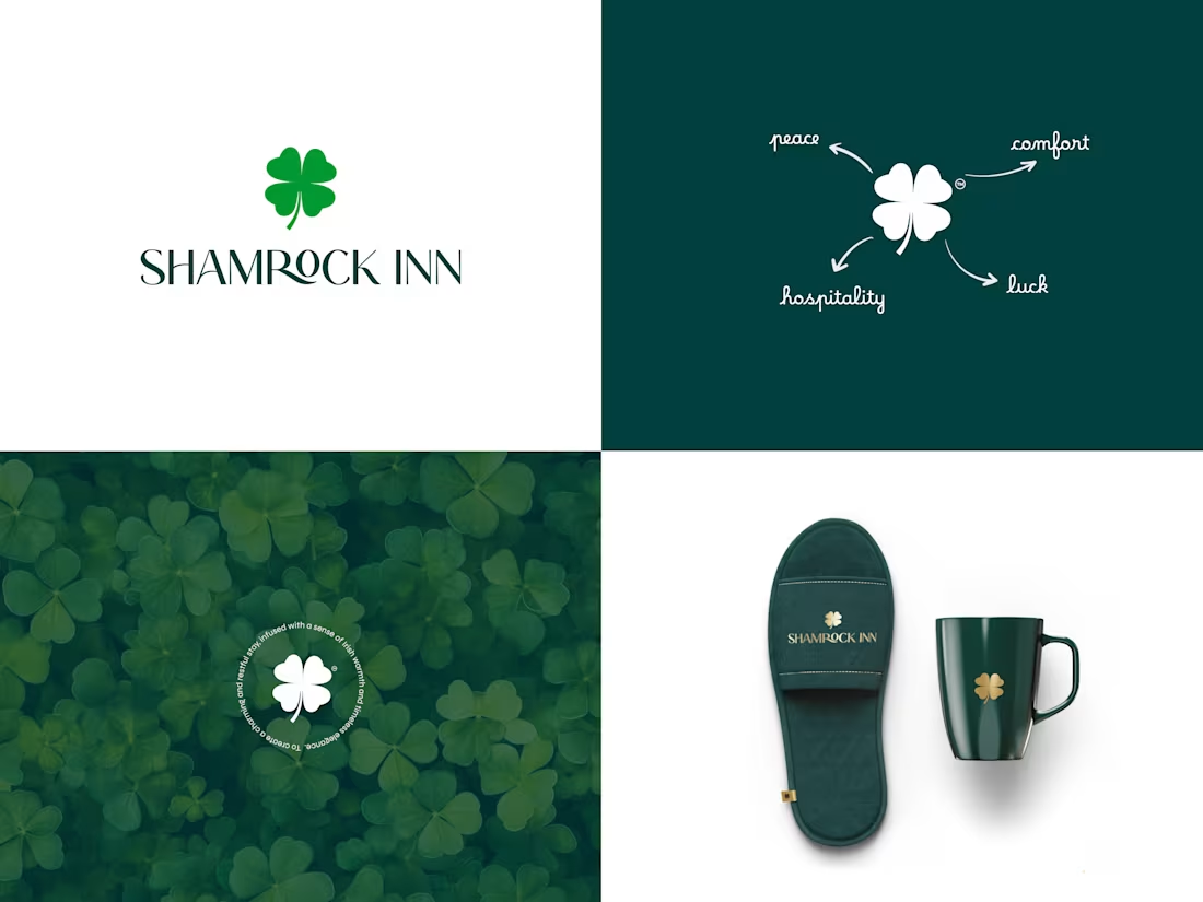
Designed to feel calm, welcoming, and effortless.
This brand identity for Shamrock Inn is built around a four-leaf clover - a symbol of peace, comfort, luck, and hospitality.
A deep green palette paired with soft neutrals brings a sense of nature, relaxation, and elegance. The typography keeps things timeless and easy to recognize, making the brand feel consistent across every touchpoint.
If you're building a hospitality brand and need a strong identity, DM to discuss.
For branding and design projects:
📩 ahemad.design@gmail.com
(mailto:ahemad.design@gmail.com)📞 +91 73831 25219
Ahemad Designs
Brand Identity Designer | Hospitality & Hotel Branding | India
3
59
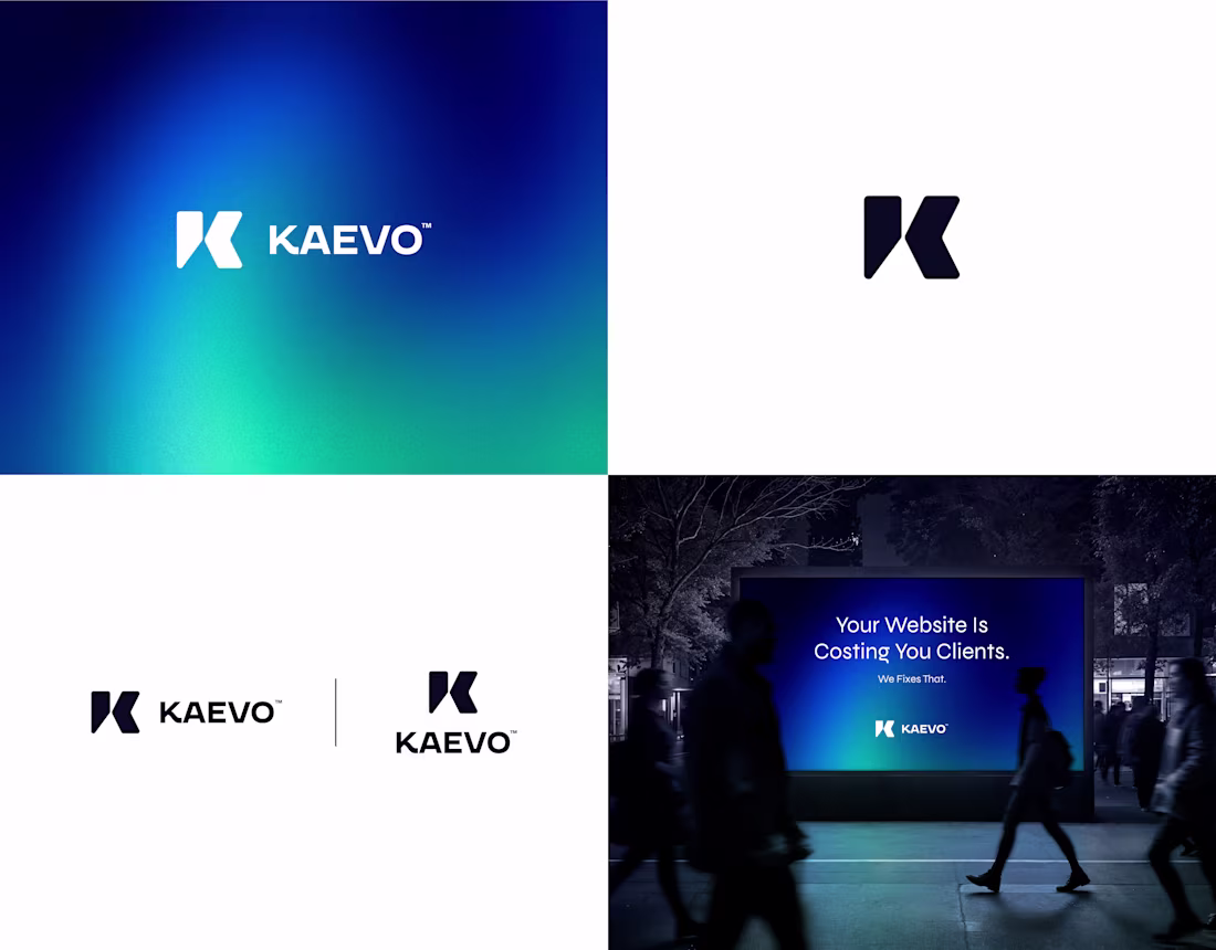
Kaevo - Tech Brand Identity & Logo Design
The stylized “K” uses sharp geometric cuts to create a sense of direction and movement. Paired with a strong sans-serif wordmark and a deep navy–green palette, the system stays clean, bold, and highly legible across digital applications.
Currently working with tech and digital-first brands
📩 ahemad.design@gmail.com
(mailto:ahemad.design@gmail.com)📞 +91 73831 25219
Ahemad Designs
Brand Identity Designer | Tech & Digital Brands | India
3
56
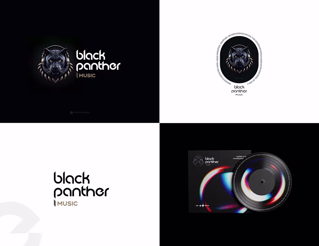
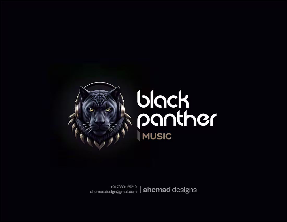
Black Panther Music - Premium Audio Brand Identity
The visual centers on a stylized panther with headphones - symbolizing power, precision, and immersive audio. The sharp, geometric wordmark adds a distinct and premium edge to the brand.
Open to branding for music, media, and creative ventures
📩 ahemad.design@gmail.com
(mailto:ahemad.design@gmail.com)📞 +91 73831 25219
Ahemad Designs
Brand Identity Designer | Creative & Entertainment Brands | India
3
58
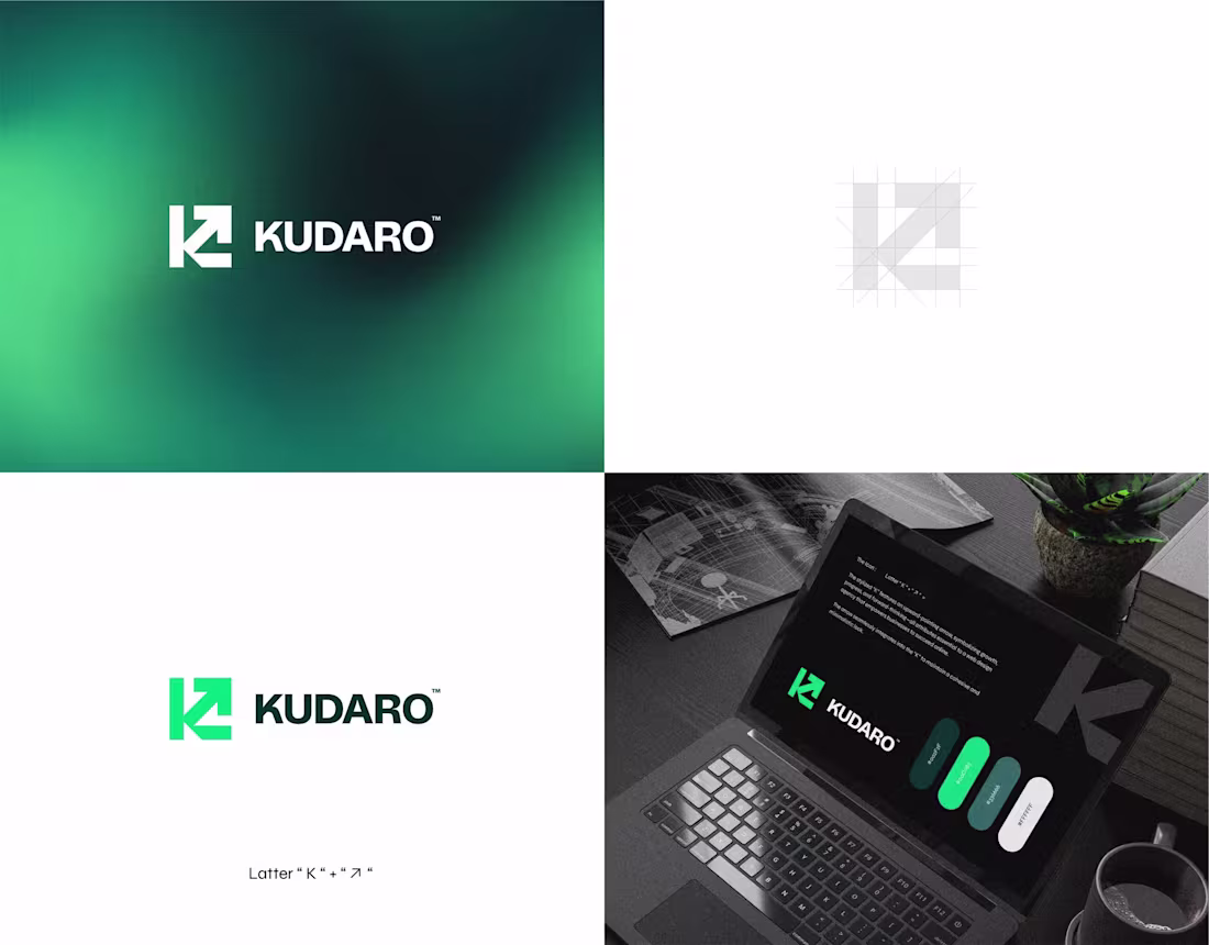
Kudaro - Growth-Focused Digital Brand Identity
The mark combines the letter “K” with an upward arrow, forming a single, clear symbol of growth and direction.
The bold sans-serif wordmark stabilizes the energy of the icon, while a sharp green palette brings a modern, tech-forward feel.
For Business branding & design inquiries:
📩 ahemad.design@gmail.com
(mailto:ahemad.design@gmail.com)📞 +91 73831 25219
Ahemad Designs
Brand Identity Designer | Digital & Tech Brands | India
2
3
73
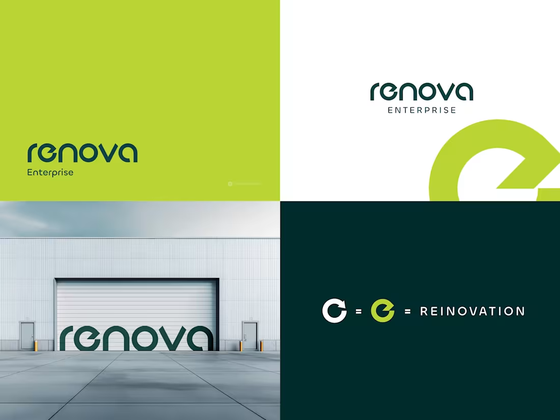
Renova Enterprise - Sustainable Brand Identity
A brand identity built around renewal and forward movement.
The “e” icon merges a circular refresh form with a forward arrow, capturing the idea of continuous transformation. A lime green and deep teal palette balances sustainability with trust, supported by a clean geometric wordmark for clarity and scalability.
For branding projects:
📩 ahemad.design@gmail.com
(mailto:ahemad.design@gmail.com)📞 +91 73831 25219
Ahemad Designs
Brand Identity Designer | Modern & Sustainable Brands | India
2
56
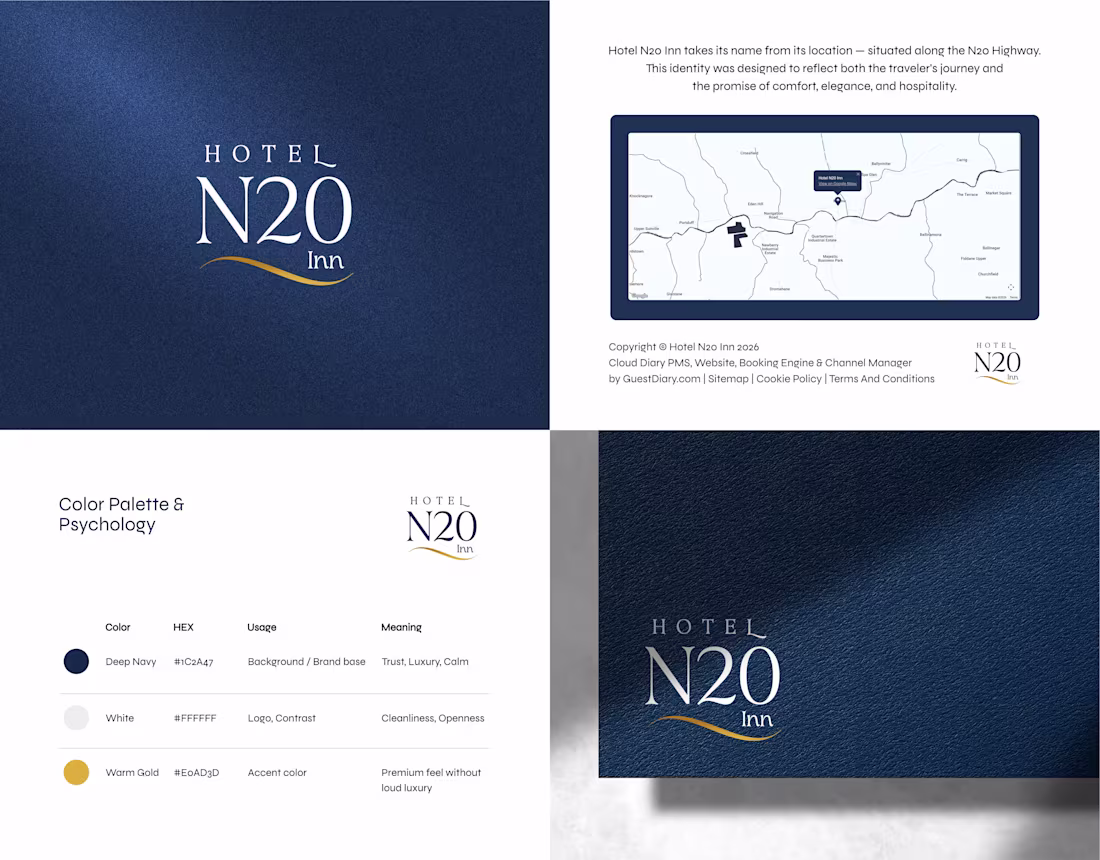
Hotel N20 Inn - Luxury Hotel Brand Identity & Logo Design
Named after the N20 Highway, the concept translates travel into a refined visual system. The serif typography adds a timeless presence, while deep navy and warm gold create a sense of trust and understated luxury.
For hotel and hospitality branding projects
📩 ahemad.design@gmail.com
(mailto:ahemad.design@gmail.com)📞 +91 73831 25219
Ahemad Designs
Brand Identity Designer | Hotel & Hospitality Branding | India
3
68
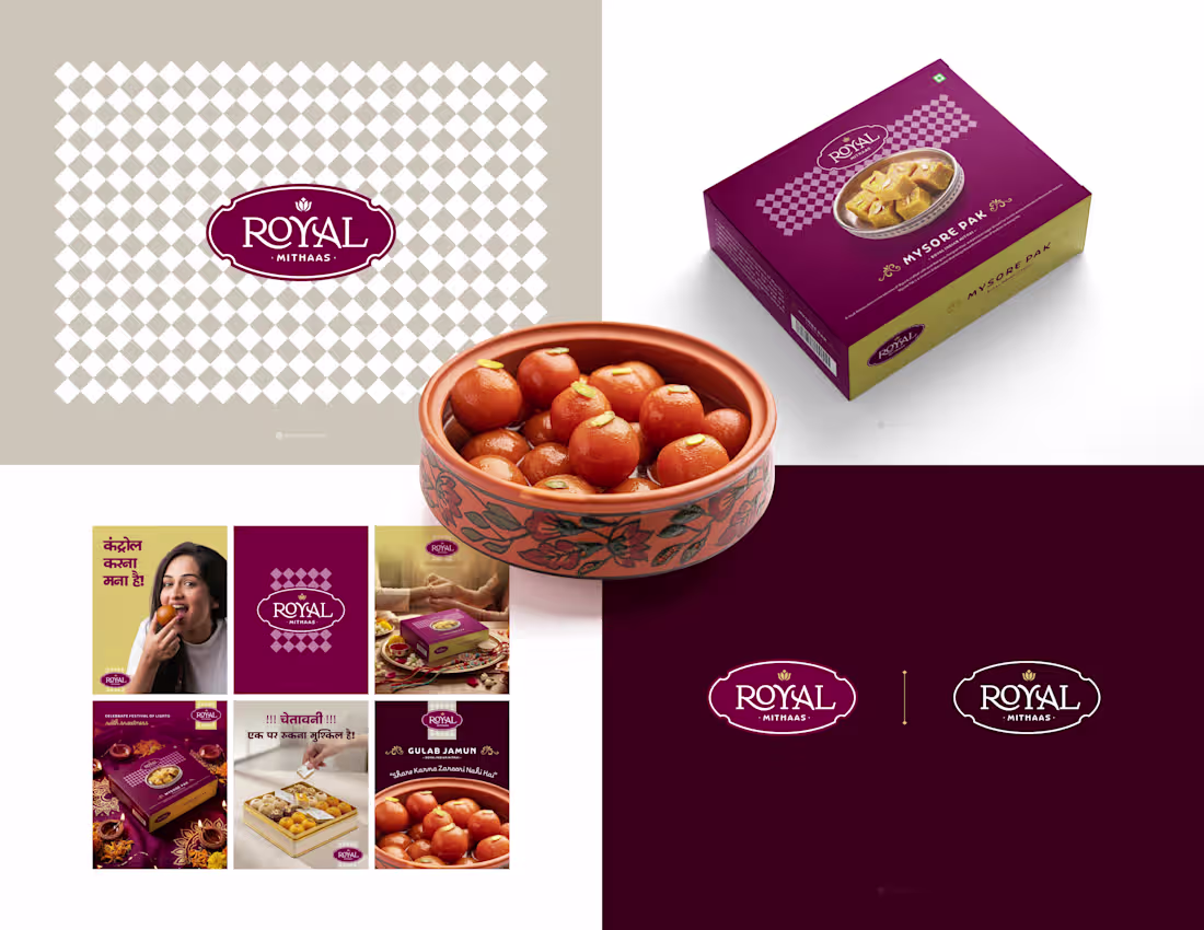
Royal Mithaas Sweets Packaging & Brand Identity
The logo draws from classic Indian forms, paired with a rich maroon and gold palette to create a premium, festive feel. Structured layouts and subtle traditional patterns extend the identity across packaging, ensuring strong shelf impact.
For Sweets and FMCG branding:
📩 ahemad.design@gmail.com
(mailto:ahemad.design@gmail.com)📞 +91 73831 25219
Ahemad Designs
Brand Identity Designer | Sweets & Dessert Brands | India
3
59
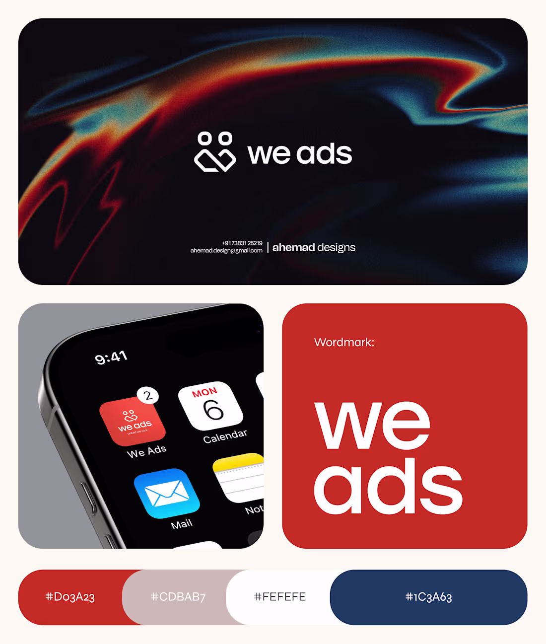
We Ads - Advertising Agency Logo & Brand Identity Design
The logo merges two human forms with an infinity loop - symbolizing long-term partnerships between the agency and its clients.
Designed for a digital-first world, the identity stays bold and clear across app icons, screens, and large-scale formats.
Open to branding for agencies and digital-first businesses:
📩 ahemad.design@gmail.com
(mailto:ahemad.design@gmail.com)📞 +91 73831 25219
Ahemad Designs
Brand Identity Designer | Marketing & Advertising Brands | India
2
40
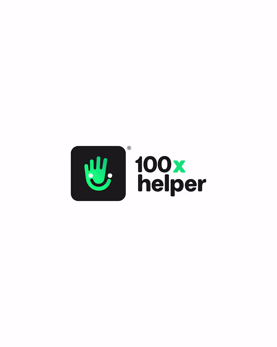
A logo designed to feel helpful at first glance.
For 100x Helper, the icon combines a hand gesture with a subtle smile - creating a symbol that communicates trust, ease, and accessibility instantly.
The fresh green palette reinforces positivity and reliability, making the identity feel approachable across digital platforms.
For logo design projects:
📩 ahemad.design@gmail.com
(mailto:ahemad.design@gmail.com)📞 +91 73831 25219
Ahemad Designs
Brand Identity Designer | Startup Brands | India
2
5
101
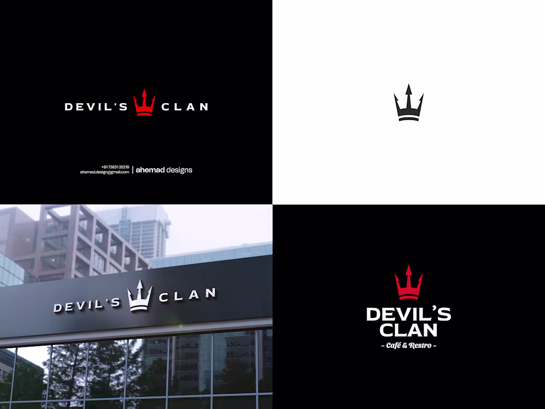
Devil’s Clan - Café & Restaurant Brand Identity
A sharp brand identity built for Devil’s Clan.
The logo centers around a trident-inspired crown, using precise geometry to create a bold and aggressive visual. The black and red palette adds intensity while keeping the identity clean and highly recognizable.
Designed to stand out - across signage, menus, and brand touchpoints.
Available for café and restaurant branding projects:
📩 ahemad.design@gmail.com
(mailto:ahemad.design@gmail.com)📞 +91 73831 25219
Ahemad Designs
Brand Identity Designer | Cafés & Restaurant Brands | India
3
51
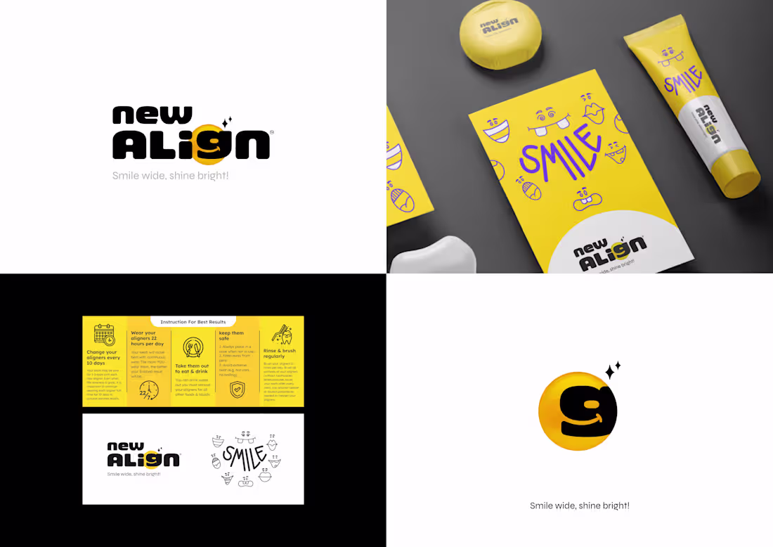
Brand identity designed for New Align, focused on making dental care feel approachable and positive.
The logo features a custom “g” shaped like a smile, turning a simple letter into a memorable brand element. A vibrant yellow palette brings warmth and optimism, while rounded typography softens the overall experience.
Built to shift perception - from clinical to friendly.
Open to healthcare and brand identity projects
📩 ahemad.design@gmail.com
(mailto:ahemad.design@gmail.com)📞 +91 73831 25219
Ahemad Designs
Brand Identity Designer | Dental & Healthcare Brands | India
3
52
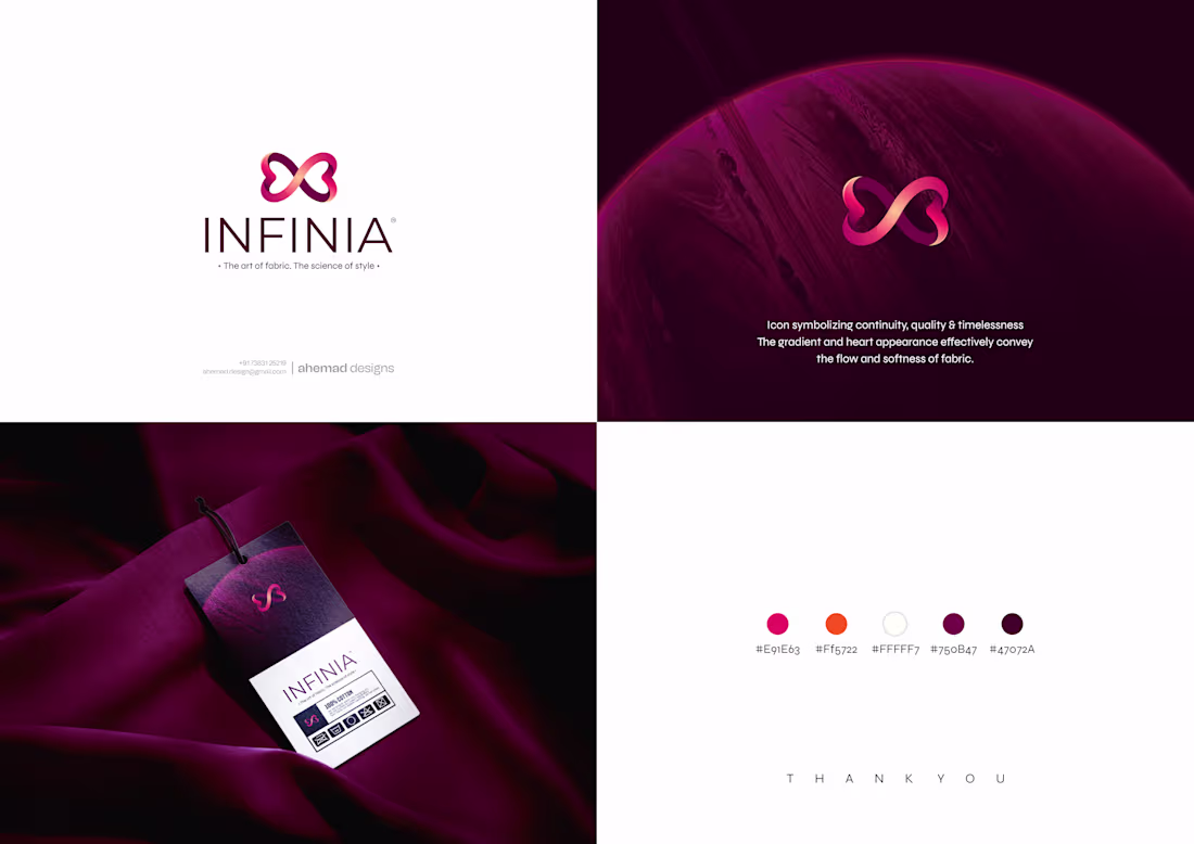
INFINIA - Infinity Inspired Fashion Brand Identity
A mark shaped by fluidity and infinite form.
INFINIA is built around the seamless movement of fabric and the idea of timeless quality. The infinity-inspired icon evolves into a soft, heart-like form - expressing continuity and emotional connection through a minimal visual.
Designed to feel smooth, premium, and enduring across fashion applications.
Currently taking on select brand identity projects
📩 ahemad.design@gmail.com
(mailto:ahemad.design@gmail.com)📞 +91 73831 25219
Ahemad Designs
Brand Identity Designer | Fashion & Lifestyle Brands | India
4
70
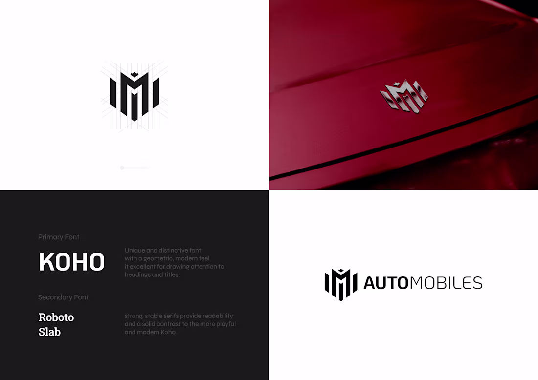
MMI Automotive Brand Identity & Logo Design
Monogram identity designed for MMI Automobiles, built on a precise geometric grid.
The letters MMI are merged into a single shield form, creating a strong and structured mark that reflects performance and reliability. A subtle crown detail adds a premium edge, while modern typography keeps the identity sharp and contemporary.
Available for brand identity projects
📩 ahemad.design@gmail.com
(mailto:ahemad.design@gmail.com)📞 +91 73831 25219
Ahemad Designs
Brand Identity Designer | Automotive Brands | India
1
32
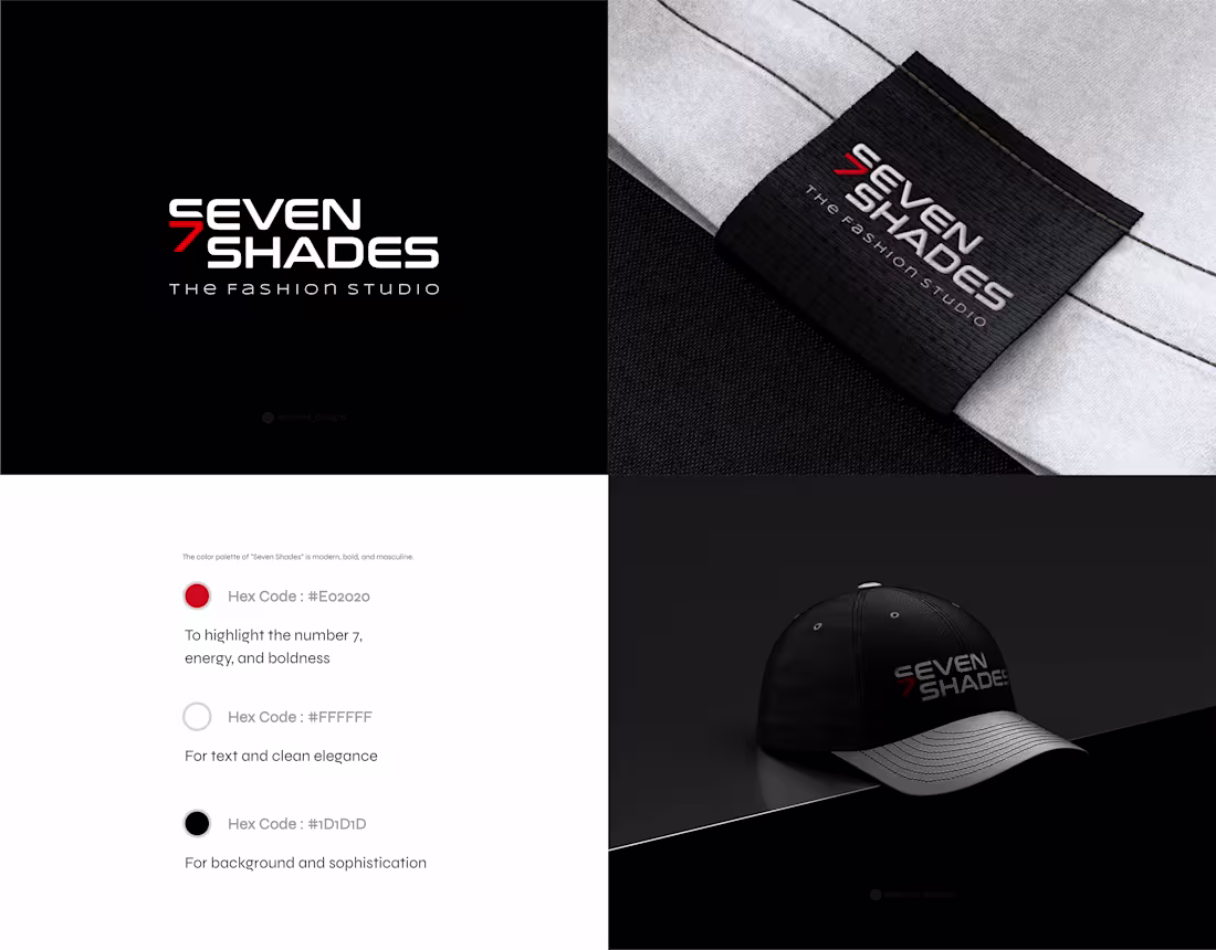
Seven Shades - Modern Fashion Brand Identity
The logo integrates the number 7 directly into the wordmark, creating a sharp, recognizable visual that captures the brand in a single glance.
A futuristic font paired with a high-contrast red and black palette builds a premium presence - designed to perform across apparel, tags, and lifestyle applications.
Open to fashion and lifestyle brand collaborations
📩 ahemad.design@gmail.com
(mailto:ahemad.design@gmail.com)📞 +91 73831 25219
Ahemad Designs
Brand Identity Designer | Fashion & Lifestyle Brands | India
1
26
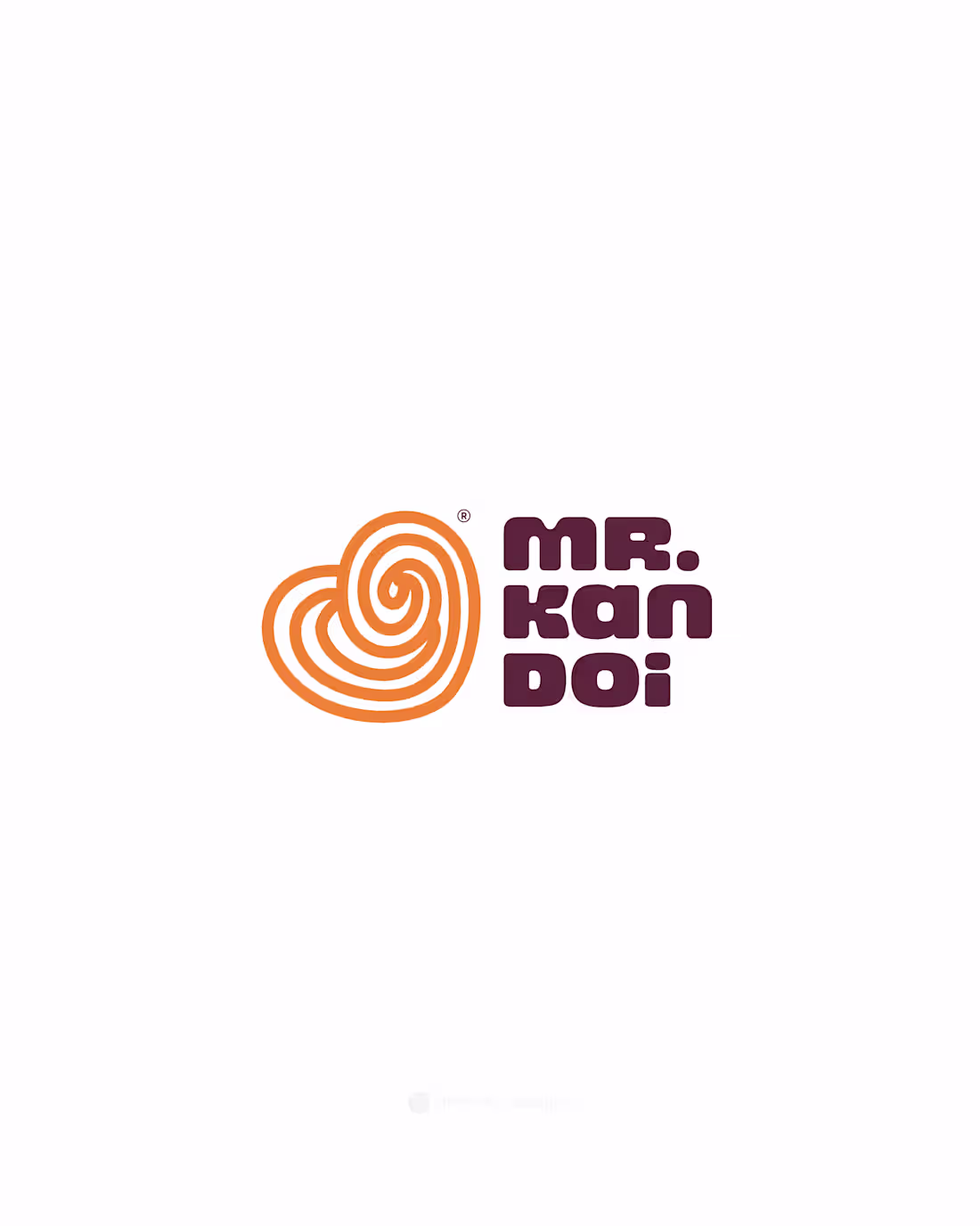
Mr. Kandoi - Indian Sweets Brand Logo Design
Brand identity designed for Mr. Kandoi, inspired by the familiar forms of traditional Indian sweets.
The logo is built using soft, rounded shapes that feel instantly recognizable and rooted in mithai culture. Paired with clean, bold typography, the identity stays simple, memorable, and easy to scale across packaging.
A minimal approach, designed to feel modern without losing its traditional connection.
Available for logo and brand identity collaborations
📩 ahemad.design@gmail.com
(mailto:ahemad.design@gmail.com)📞 +91 73831 25219
Ahemad Designs
Brand Identity Designer | Sweets & Dessert Brands | India
2
31
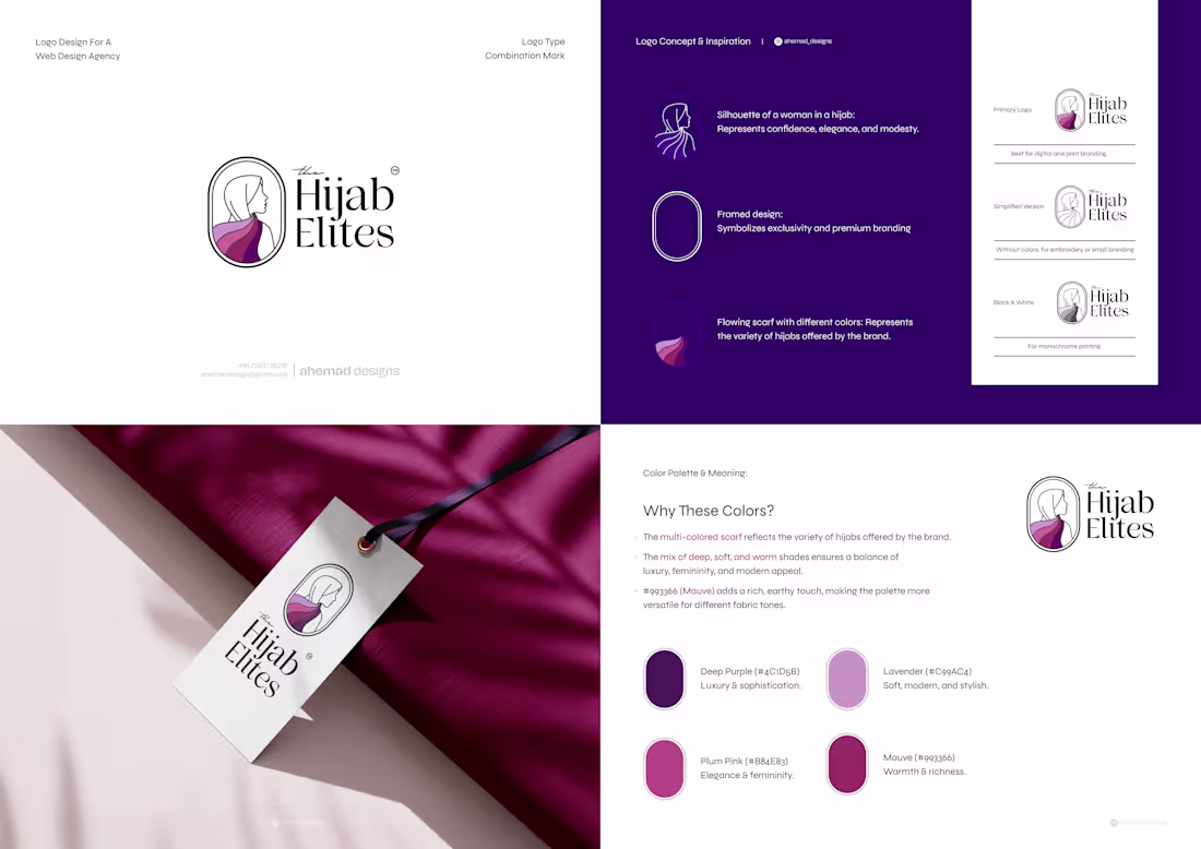
The Hijab Elites - Modest Fashion Brand Identity
Brand identity designed for The Hijab Elites, a modern modest fashion brand.
The logo features a clean silhouette of a woman in a hijab, creating a recognizable and elegant mark. The framed form adds structure, while the flowing scarf introduces movement and variation.
A mix of script and serif typography brings together personality and refinement, supported by a soft, balanced color palette.
For collaborations and brand identity projects
📩 ahemad.design@gmail.com
(mailto:ahemad.design@gmail.com)📞 +91 73831 25219
Ahemad Designs
Brand Identity Designer | Fashion & Lifestyle Brands | India
2
2
49
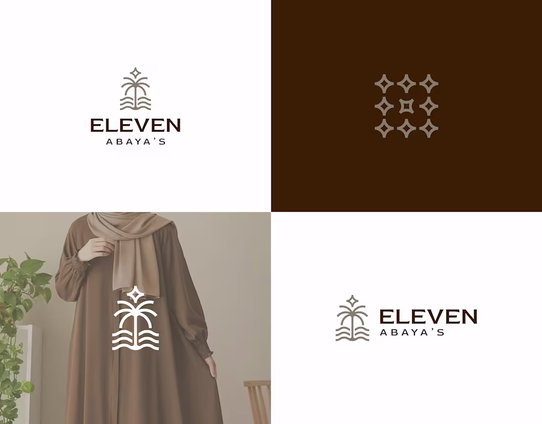
Eleven Abaya’s - Elegant Fashion Brand Identity
Brand identity design created for Eleven Abaya’s, a modest fashion brand centered on elegance and simplicity.
The logo blends a minimal palm form with flowing wave lines, creating a graceful visual symbol. The mark reflects natural beauty while maintaining a timeless look suited for modern modest fashion.
The identity system was designed to feel clean and adaptable across apparel branding and brand touchpoints.
For collaborations or brand identity projects:
📩 ahemad.design@gmail.com
(mailto:ahemad.design@gmail.com)📞 +91 73831 25219
Ahemad Designs
Brand Identity Designer | Fashion & Lifestyle Brands | India
2
3
50
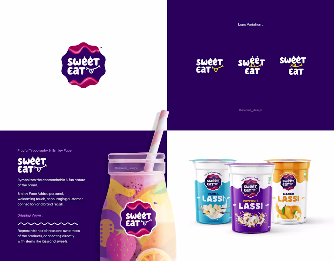
Sweet Eat - Lassi Brand Identity & Packaging
Sweet Eat is a lassi brand built around joy, flavor, and everyday indulgence.
The identity uses soft, playful typography with a subtle smile element to make the brand feel friendly and memorable.
The dripping wave shape reflects the richness of lassi and sweets, connecting the logo directly to the product experience.
A flexible identity system was developed to work across packaging, product cups, and brand visuals while keeping the brand instantly recognizable.
For collaborations or brand design discussions
📩 ahemad.design@gmail.com
(mailto:ahemad.design@gmail.com)📞 +91 73831 25219
Ahemad Designs
Brand Identity Designer | Food & Beverage Branding | India
4
44
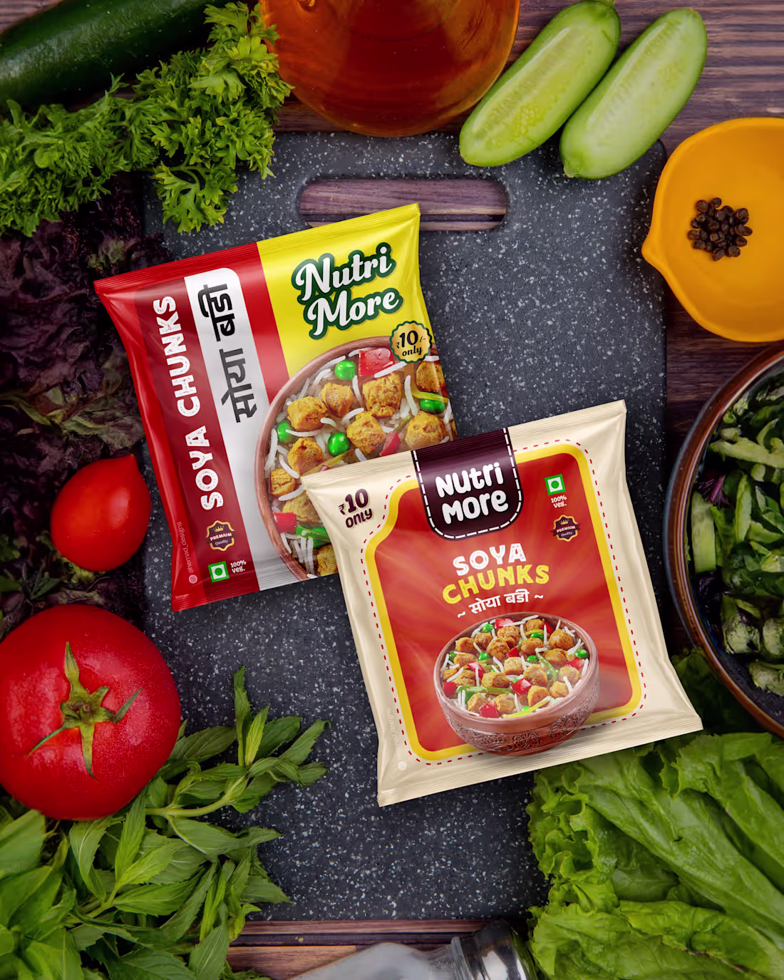
Nutri More Soya Chunks - Food Packaging Design
Packaging design created for Nutri More Soya Chunks, a protein-rich product for everyday meals.
The design uses strong typography and appetizing food visuals to create clear product communication and strong shelf visibility.
The project includes a complete packaging system with front pack design, back panel information layout, and production-ready dieline.
Open to packaging and food brand design work - feel free to connect or DM.
For project inquiries:
📩 ahemad.design@gmail.com
(mailto:ahemad.design@gmail.com)📞 +91 73831 25219
Ahemad Designs
Packaging Designer | Food Branding | India
4
67
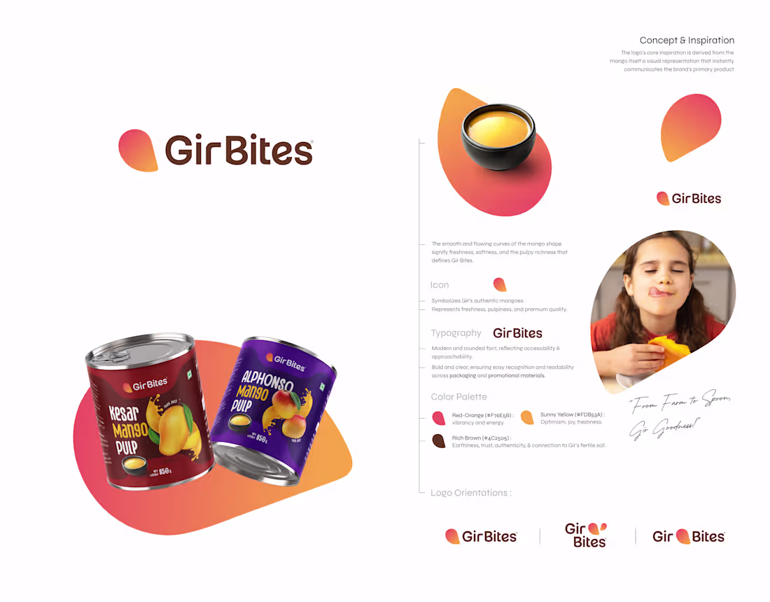
Gir Bites Brand Identity & Mango Pulp Packaging Design
Brand identity and packaging designed for Gir Bites, a mango pulp brand.
The logo is inspired by a simplified mango form, using smooth curves to reflect freshness and the pulpy richness of the product.
The packaging uses bold typography and vibrant mango visuals to clearly differentiate variants such as Alphonso Mango Pulp and Kesar Mango Pulp.
Ready to upgrade your brand identity?
Send a DM.
For Brand Identity & Packaging Design Projects:
📩 ahemad.design@gmail.com
(mailto:ahemad.design@gmail.com)📞 +91 73831 25219
Ahemad Designs
Brand Identity & Packaging Designer | India
2
2
68
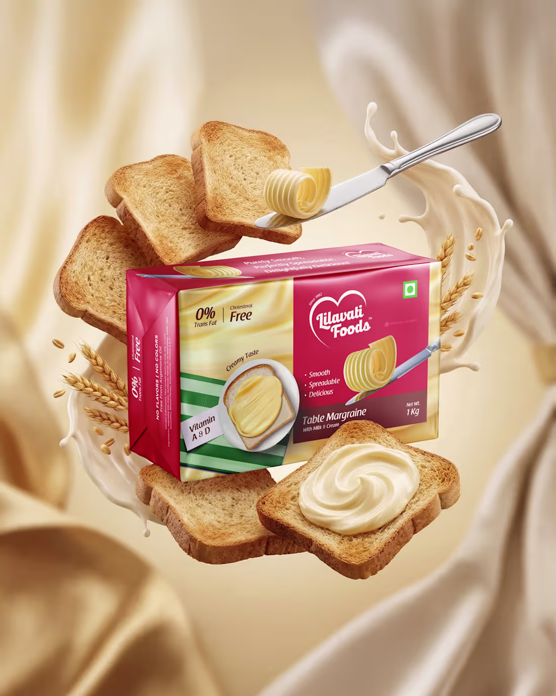
Butter Brick Packaging Design | Lilavati Foods
Packaging designed for Lilavati Foods Table Margarine, created to highlight the product’s smooth and creamy appeal.
The design focuses on clear product communication, appetizing visuals, and a strong shelf presence suited for the FMCG market.
Project scope included butter brick packaging and key product visuals.
Open to brand identity and packaging design work.
For brand identity and packaging design inquiries:
📩 ahemad.design@gmail.com
(mailto:ahemad.design@gmail.com)📞 +91 73831 25219
Ahemad Designs
Brand Identity & Packaging Designer | FMCG Brands | India
2
40
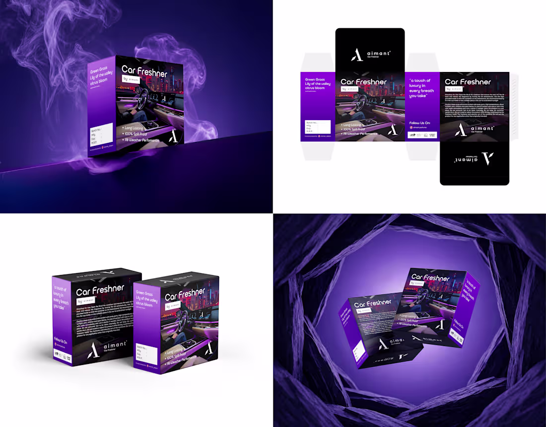
Car Freshener Packaging Design | Aimant Brand
Packaging designed for Aimant Car Freshener, a premium car fragrance product.
The design uses a deep purple palette to reflect the fragrance mood while maintaining a clean information hierarchy for retail clarity.
The project focused on creating a premium shelf presence while keeping the packaging practical for real-world retail.
Open to packaging projects - feel free to connect or DM.
For packaging and brand identity projects:
📩 ahemad.design@gmail.com
(mailto:ahemad.design@gmail.com)📞 +91 73831 25219
Ahemad Designs
Brand Identity & Product Packaging Designer | India
2
43
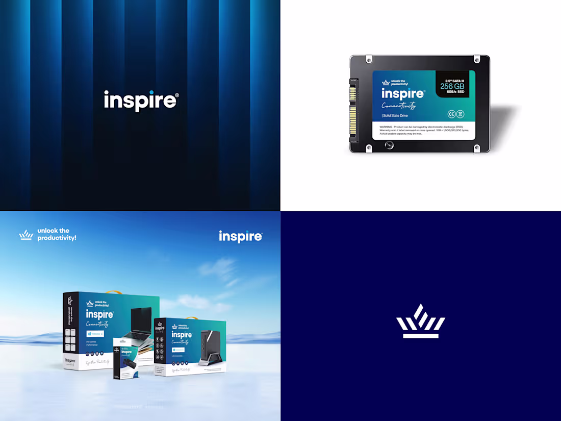
Inspire - Tech Brand Identity & Product Packaging
Brand identity designed for Inspire, a tech accessories brand offering laptops, SSDs, RAM, CPUs, and related products.
The project included:
- Logo design
- Crown brand icon
- Product packaging system
- SSD, RAM, and CPU product branding
The visual identity focuses on a clean, modern tech aesthetic built for strong product presence and consistent branding across devices and packaging.
Open to brand identity and packaging design work - feel free to connect or DM.
For branding projects & inquiries
📩 ahemad.design@gmail.com
(mailto:ahemad.design@gmail.com)📞 +91 73831 25219
Ahemad Designs
Brand Identity Designer | Tech & Product Branding | India
2
5
89
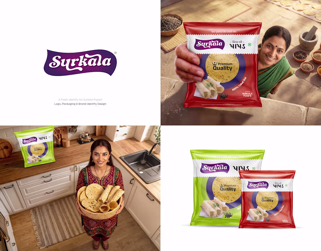
Surkala Papad - Brand Identity & Packaging Design
Surkala Papad had a strong product and trusted taste, but the brand lacked a shelf-ready identity.
This project rebuilt the brand through:
- Logo design
- Packaging design
- Brand identity
The new design keeps the traditional feel while improving shelf visibility and brand recall.
Open to brand identity and packaging design work - feel free to connect or DM.
For branding projects & inquiries:
📩 ahemad.design@gmail.com
(mailto:ahemad.design@gmail.com)📞 +91 73831 25219
Ahemad Designs
Brand Identity Designer | Food & FMCG Branding | India
1
40
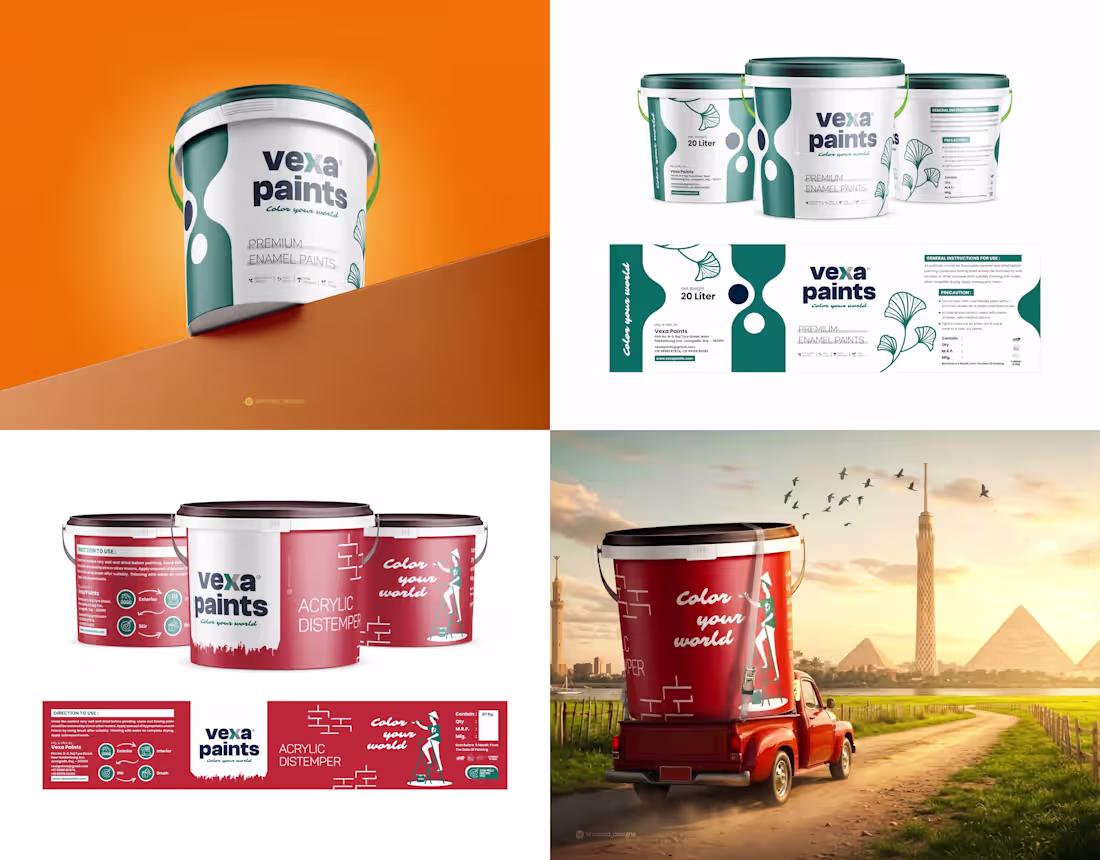
Vexa Paints – Industrial Paint Packaging Identity
There's a reason this packaging design captures attention so quickly.
For Vexa Paints, the goal was to create packaging that feels strong, modern, and clearly visible in a competitive hardware and construction market.
Color played a strategic role in the system.
The deep red variant communicates energy and bold shelf presence, while the navy palette reinforces a premium and reliable tone.
To show the brand in a real-world context, I created a mockup inspired by an Egyptian landscape.
If you are a founder building a brand — let's connect.
Ahemad Designs
Brand Identity Designer | Packaging Design | India
2
63
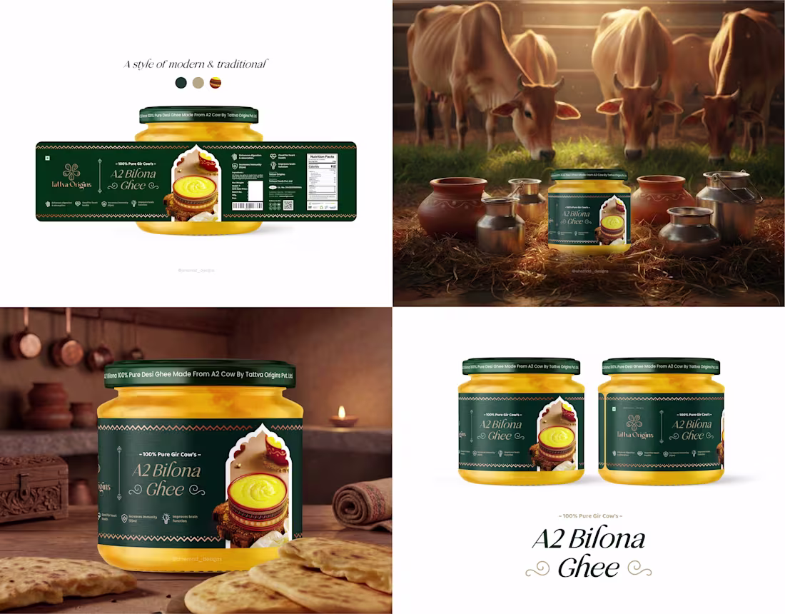
Premium Ghee Packaging Design | FMCG Branding
For Tattva Origins A2 Bilona Ghee, the goal was to create a pack that feels authentic while still standing strong on a modern retail shelf.
Deep green and gold tones establish a rich, high-quality feel, while traditional motifs and arch-inspired framing connect the design to the cultural roots of Bilona ghee.
A packaging system designed to communicate purity, tradition, and trust at first glance.
Currently available for brand identity and packaging design projects.
Ahemad Designs
Brand Identity Designer | FMCG Packaging | India
1
59
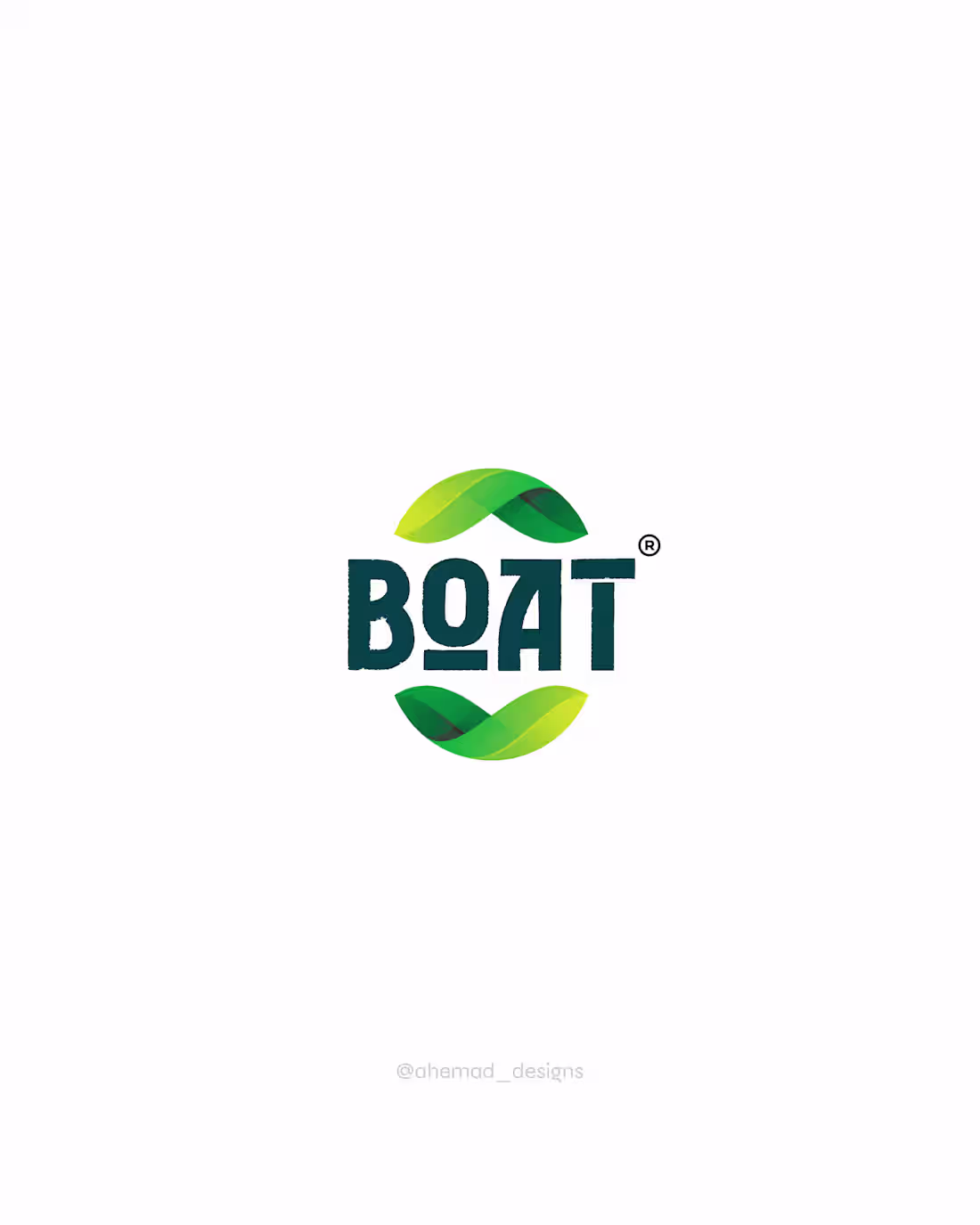
BOAT – Aloe Vera Brand Identity & Packaging Design
A logo should reflect the nature of the product.
For BOAT Aloe Vera Juice, the identity was designed to feel organic, fresh, and natural.
The flowing leaf elements symbolize growth and purity, while the letter “O” subtly forms an organic leaf shape.
Designed to work seamlessly across packaging, branding, and product presentation.
Open to new branding projects - feel free to connect or DM.
Ahemad Designs
Brand Identity Designer | Health & Wellness Brand | India
2
71
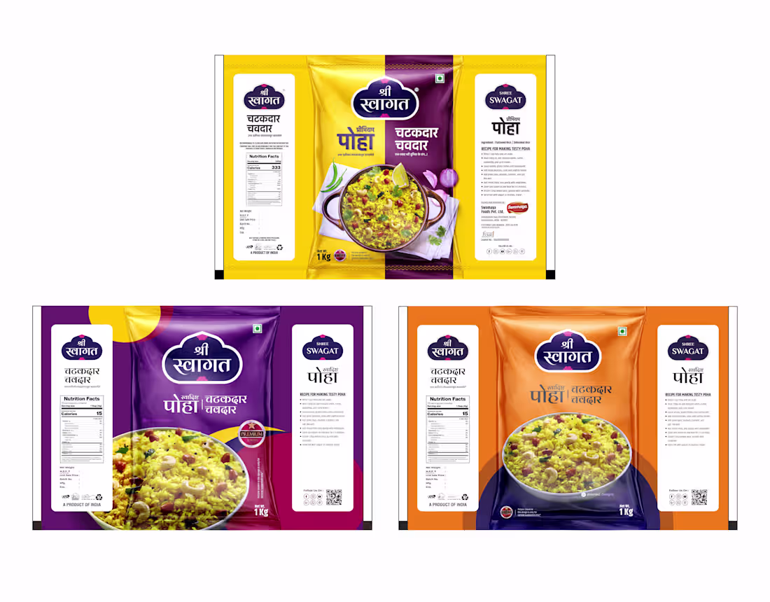
Shree Swagat – Poha Packaging Design System
Purple, Orange, or Yellow - which pack would you notice first on a crowded shelf?
This packaging concept for Shree Swagat Poha explores how color can drive shelf visibility while still respecting the traditional identity of an Indian breakfast staple.
Each variant plays a strategic role:
Yellow - energetic and instantly recognizable
Purple - modern with a premium shelf presence
Orange - warm, appetizing, and food-forward
The goal was simple: create a packaging system that attracts attention and remains scalable across product variants.
Looking to build a premium packaging identity for your brand? Let’s connect.
Ahemad Designs
Packaging Designer | Food & FMCG Packaging Design | India
2
65
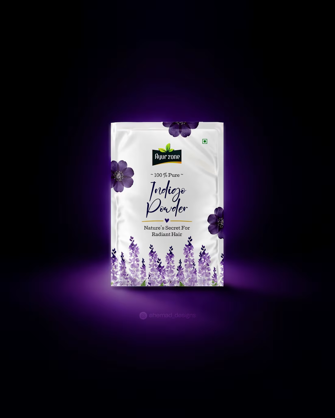
Henna Green or Indigo Purple - which one commands attention first?
For Ayur Zone, I reimagined herbal hair care with a modern, high-end visual direction. Clean white packaging, bold botanical illustrations, and strong color-led variants create instant shelf differentiation.
Each SKU is designed to feel fresh, premium, and confidently natural - without relying on outdated “herbal” clichés.
A packaging system built for visibility, clarity, and brand recall.
Open to beauty, wellness, and FMCG branding collaborations.
1
64
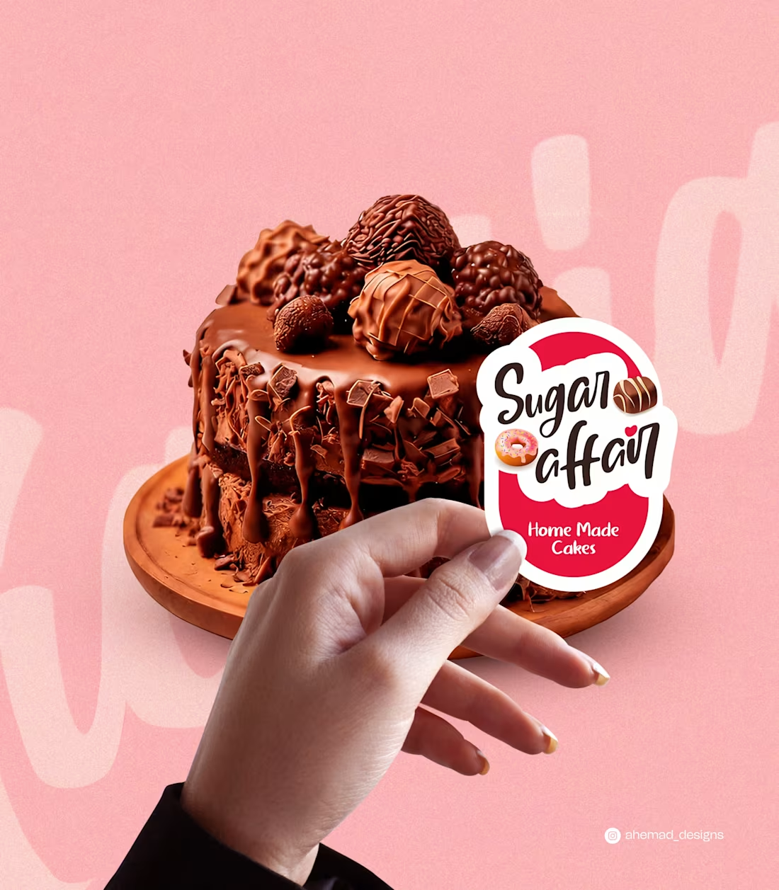
Sugar Affair – Cake Brand Sticker System
A cohesive sticker system designed to turn homemade cakes into a memorable brand presence.
Playful mascot, sweet iconography, and bold friendly typography create instant recall across packaging and orders. Small-format assets, built to scale brand recognition consistently.
Ideal for home-baked brands that need a distinctive, repeatable visual identity across every touchpoint.
22
9
169
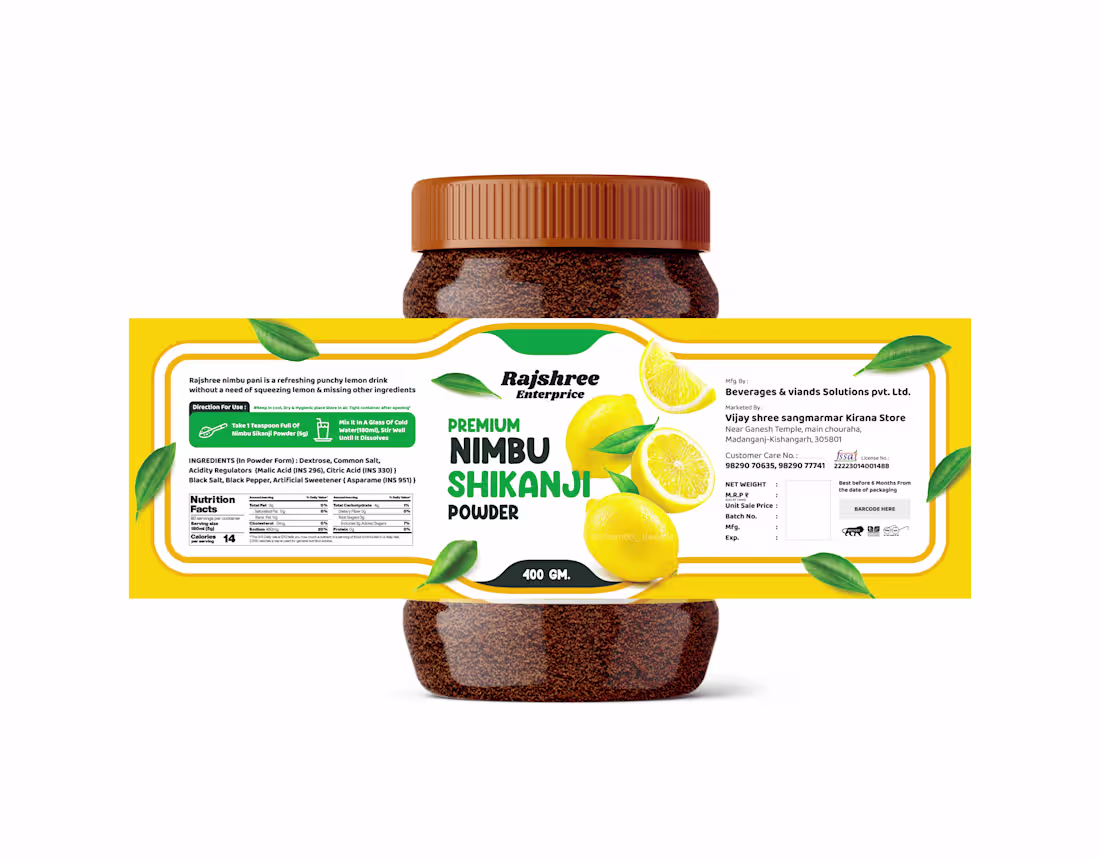
Rajshree Nimbu Shikanji – Premium FMCG Packaging Design
When life gives lemons, the packaging should sell the freshness first.
This Nimbu Shikanji powder label for Rajshree is designed to feel instantly refreshing and shelf-ready.
Bright citrus visuals, clean typography, and a bold FMCG layout work together to signal taste, quality, and energy before the jar is even opened.
Built for strong retail visibility and quick consumer recognition in a crowded beverage aisle.
Project Year – Jan 2024
Open to packaging and FMCG branding collaborations.
2
77
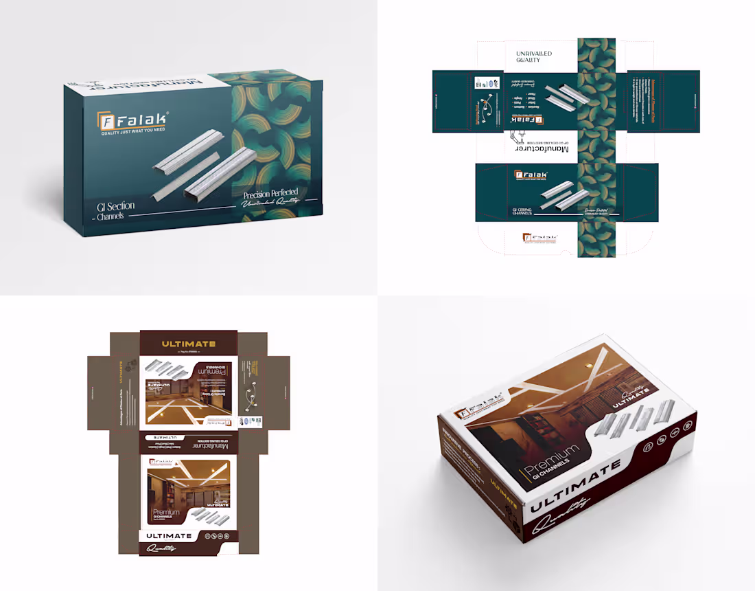
Box design for Falak, a Surat-based GI ceiling channel manufacturer.
The requirement was a product box that aligns with their existing logo and industrial brand language. Designed, printed, and delivered 8000 boxes,
ensuring accurate production and smooth execution for real warehouse and dealer-level distribution.
Project Year - Dec. 2023
DM for production-ready box design.
For Business branding & design inquiries:
📩 ahemad.design@gmail.com
(mailto:ahemad.design@gmail.com)📞 +91 73831 25219
Ahemad Designs
Packaging & Box Design Expert | Industrial Brands | India
1
74
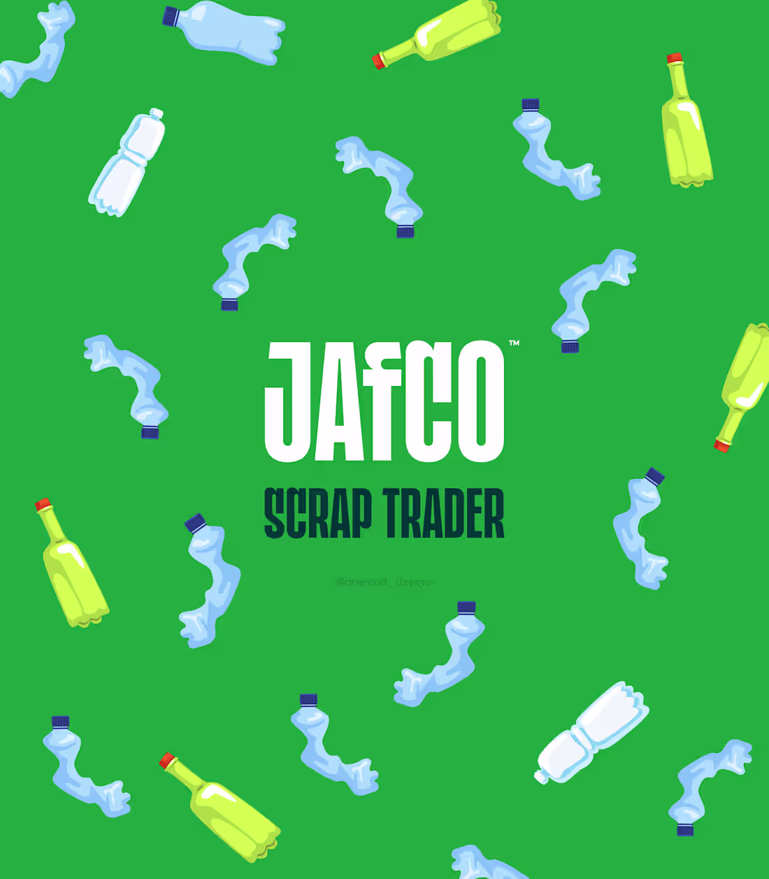
A bold identity designed for a plastic recycling business, using eco-friendly colors and bottle elements to reflect recycling and care for the environment.
DM to turn your business into a recognizable brand
For business branding projects:
📩 ahemad.design@gmail.com
(mailto:ahemad.design@gmail.com)📞 +91 73831 25219
Ahemad Designs
Brand Identity Designer | Recycling & Industrial Branding | India
1
66
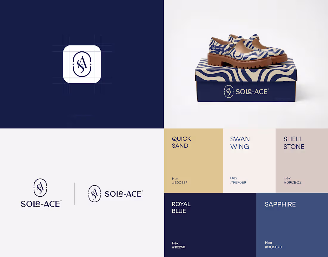
This is what founders usually mean when they say “make it premium.”
The identity is built around a refined SA monogram inside an oval seal, creating a timeless badge for shoes, boxes, and labels.
Subtle star accents hint at craftsmanship without overpowering the mark.
Royal blue establishes trust and durability.
Warm sand tones introduce elegance suited for modern footwear.
A focused badge system designed to scale across packaging and product touchpoints.
Open to collaborating with footwear and fashion brands looking for a premium, lasting identity.
Ahemad Designs
Brand Identity Designer | Footwear & Fashion Branding | India
8
6
114
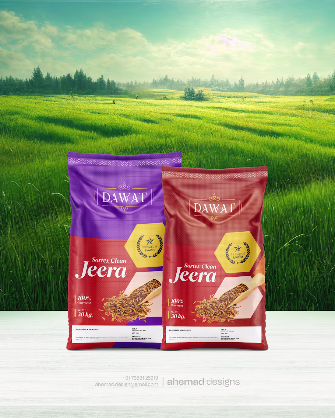
Dawat Jeera Rice – FMCG Packaging Design
Visibility is the first battle on a retail shelf.
This Jeera rice packaging for Dawat is designed to signal premium quality instantly.
Bold colours create strong shelf impact, while clear typography and hierarchy keep the product easy to notice and trust.
Designed for real retail conditions where attention decides the sale.
Building an FMCG brand and want stronger shelf presence?
Happy to connect and discuss.
2
5
132
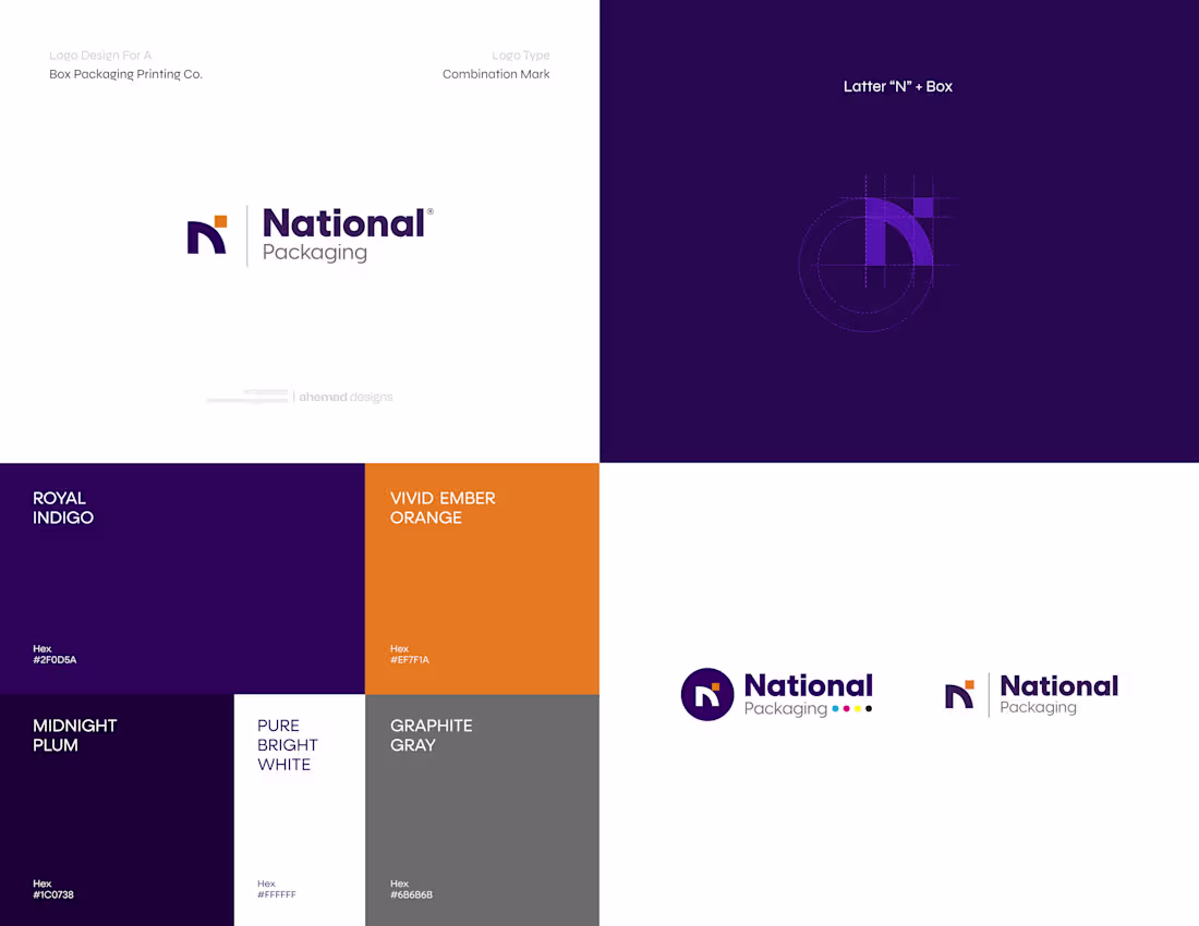
National Packaging – Industrial Packaging Brand Identity
It took real-world branding work to learn this.
National Packaging needed a logo that performs in actual packaging and industrial environments — not just on screens.
The concept stays direct:
• The letter N from National
• A box structure rooted in packaging
Colors are chosen for authority, visibility, and clean print output.
Built as a combination mark, designed to hold up across boxes, machinery, signage, and day-to-day operations.
Brand identity works best when it’s designed for where it will actually live.
If you’re building a packaging or industrial brand,
happy to connect.
4
5
122
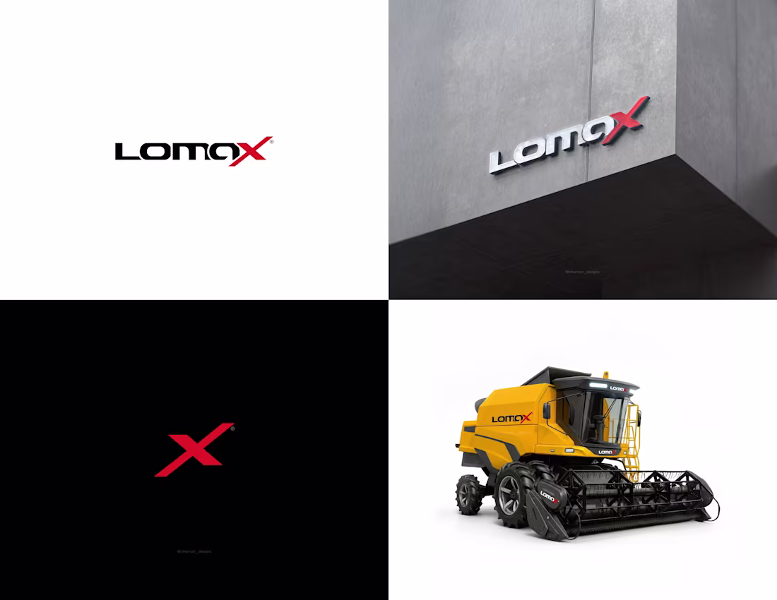
LomaX – Industrial Equipment Brand Identity
Design decisions should answer business questions.
LomaX is a hydraulic components manufacturer, so the identity had to feel as reliable and precise as the systems powering heavy construction equipment.
The solution focused on function first.
A strong wordmark built for industrial environments.
A sharp X symbol representing precision and the crossing of hydraulic lines.
This is industrial branding done with engineering standards in mind.
If you’re building an industrial or equipment brand,
happy to connect and discuss.
Ahemad Designs Brand Identity Designer | Industrial and Equipment Brands | India
4
5
107
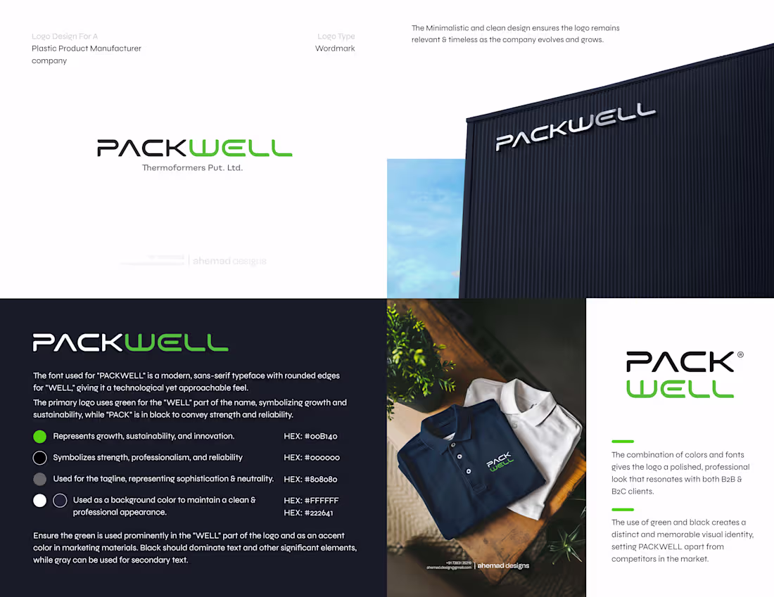
PACKWELL – Industrial & Manufacturing Brand Identity
This is why clear design works best for businesses.
PACKWELL was built with one mindset: clarity over cleverness.
A clean wordmark, precise spacing, and typography designed to stay consistent across every industrial and B2B touchpoint.
Green signals growth and forward movement.
Black adds strength, control, and reliability.
A focused identity designed to perform - on factory signage, packaging, uniforms, and digital platforms.
If you’re building a manufacturing or industrial brand,
let’s connect and build it right.
Ahemad Designs
Brand Identity & Logo Designer | Industrial & Manufacturing Brands | India
2
2
93
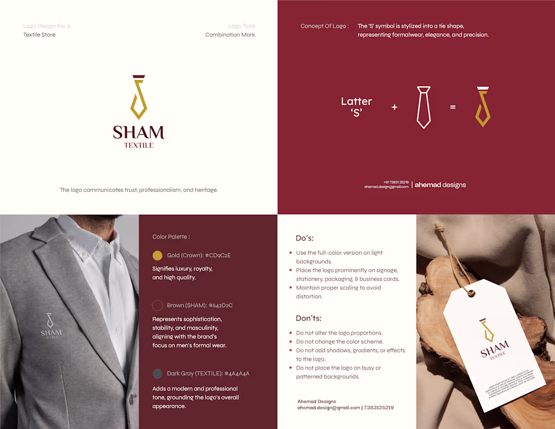
Sham Textile – Fashion & Textile Brand Identity
Experience teaches you where logos actually work.
The first direction explored royalty through a crown, but it was rejected.
This approach was developed next and approved at first glance.
For Sham Textile, the approved direction came from the culture of men’s formalwear, not decoration.
The symbol blends the letter “S” with a tie-inspired form, instantly referencing tailoring, precision, and elegance.
Gold brings a sense of heritage and premium craft.
Deep brown adds maturity and timeless appeal.
This is how textile branding works when decisions are made with experience.
If you’re planning a logo or brand identity for fashion or apparel,
feel free to connect — happy to discuss.
Ahemad Designs
Brand Identity & Logo Designer | Textile, Apparel & Fashion Brands | India
2
77
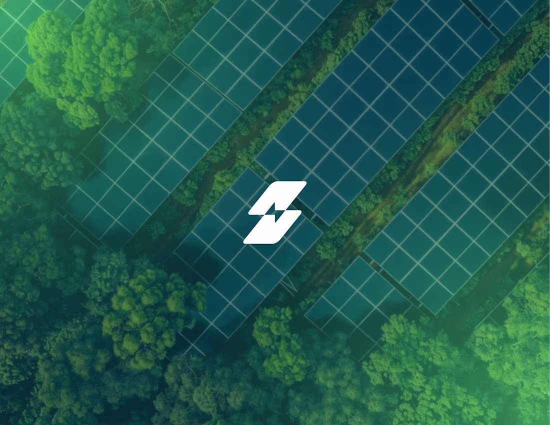
UCB Solar – Renewable Energy Brand Identity
The logo was built by simplifying the idea to its core:
solar panels + electricity.
The angled forms come directly from the structure of real solar panels — flat, aligned, and efficient by design.
Green communicates clean energy, while the deeper tone adds trust and reliability.
When these elements come together, the mark clearly represents conversion:
sunlight → power → impact.
A practical, logic-led identity designed to perform across digital platforms, signage, and infrastructure touchpoints.
Built for a growing renewable energy brand that values function as much as form.
Ahemad Designs
Brand Identity & Logo Designer | Solar, Energy & Infrastructure Brands | India
3
80
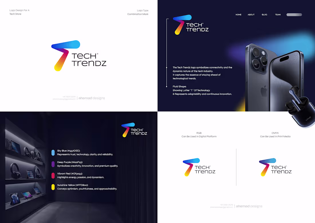
Tech Trendz – Tech Store Brand Identity
Smart founders design their brand with the next phase in mind.
Tech Trendz was created for a modern tech store operating where innovation, trust, and movement meet.
The idea was clear from the start — the logo should evolve as technology evolves.
The symbol is built directly from the brand name, using a fluid “T” designed to feel adaptable, dynamic, and always in motion.
This approach keeps the identity flexible across products, platforms, and future tech upgrades, while staying clear and recognisable at every scale.
A future-ready brand identity built to grow with the business.
For strategic branding and logo design projects:📩 ahemad.design@gmail.com
(mailto:ahemad.design@gmail.com)📞 +91 73831 25219
—
Ahemad Designs
Brand Identity Designer | Tech, Startup & Business Branding | India
1
80
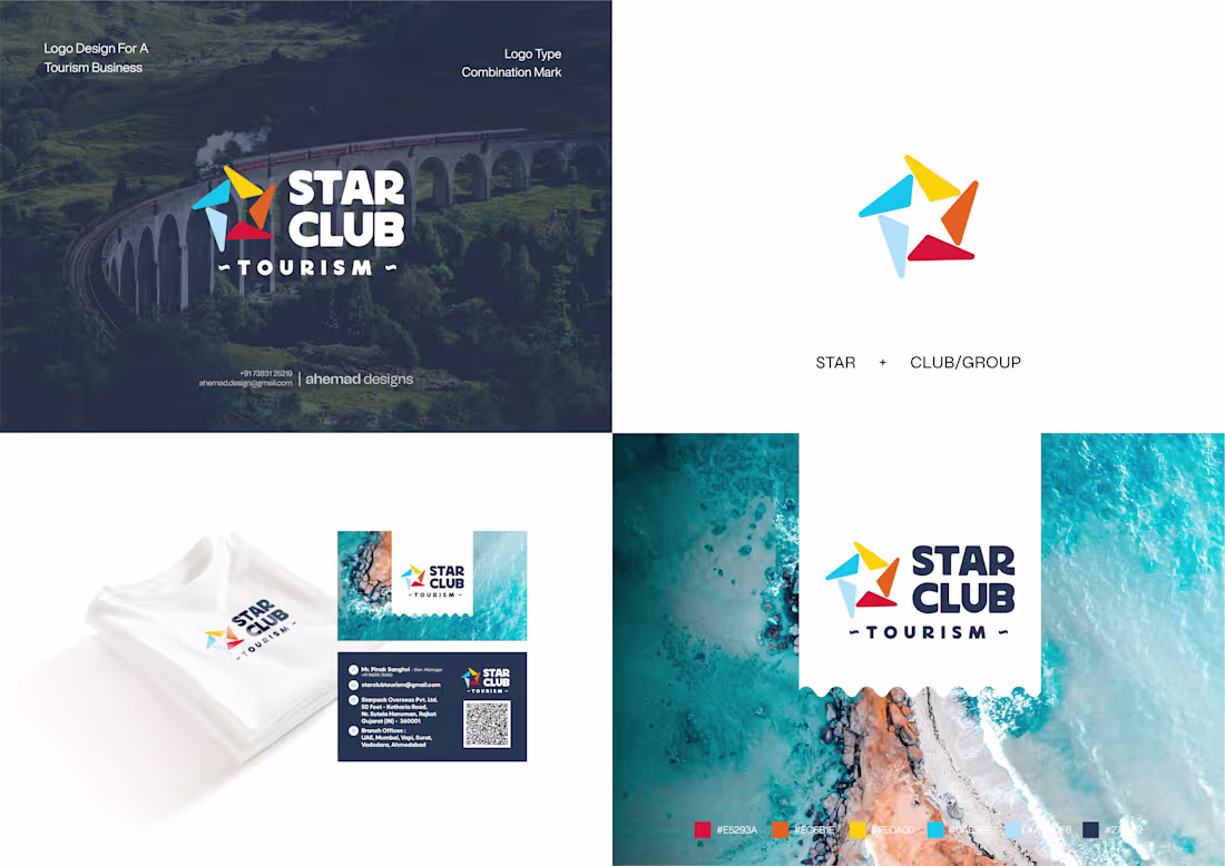
Star Club Tourism – Visual Identity for Tourism Brand
Built for five founders. Designed as one brand.
Star Club Tourism is shaped by five brothers —
five perspectives, five roles, one shared vision.
That idea drives the logo.
The star is formed using five distinct segments, coming together as a single mark.
Each part stays visible, while the whole feels unified — just like the business behind it.
An open structure keeps the identity modern and flexible.
The subtle rotation adds movement, hinting at travel, motion, and growth.
This is strategic logo design —
where brand identity supports a tourism business across digital and physical touchpoints.
Exactly the level of clarity and thinking growing travel brands need today.
If this approach resonates, feel free to connect or drop a DM.
2
77
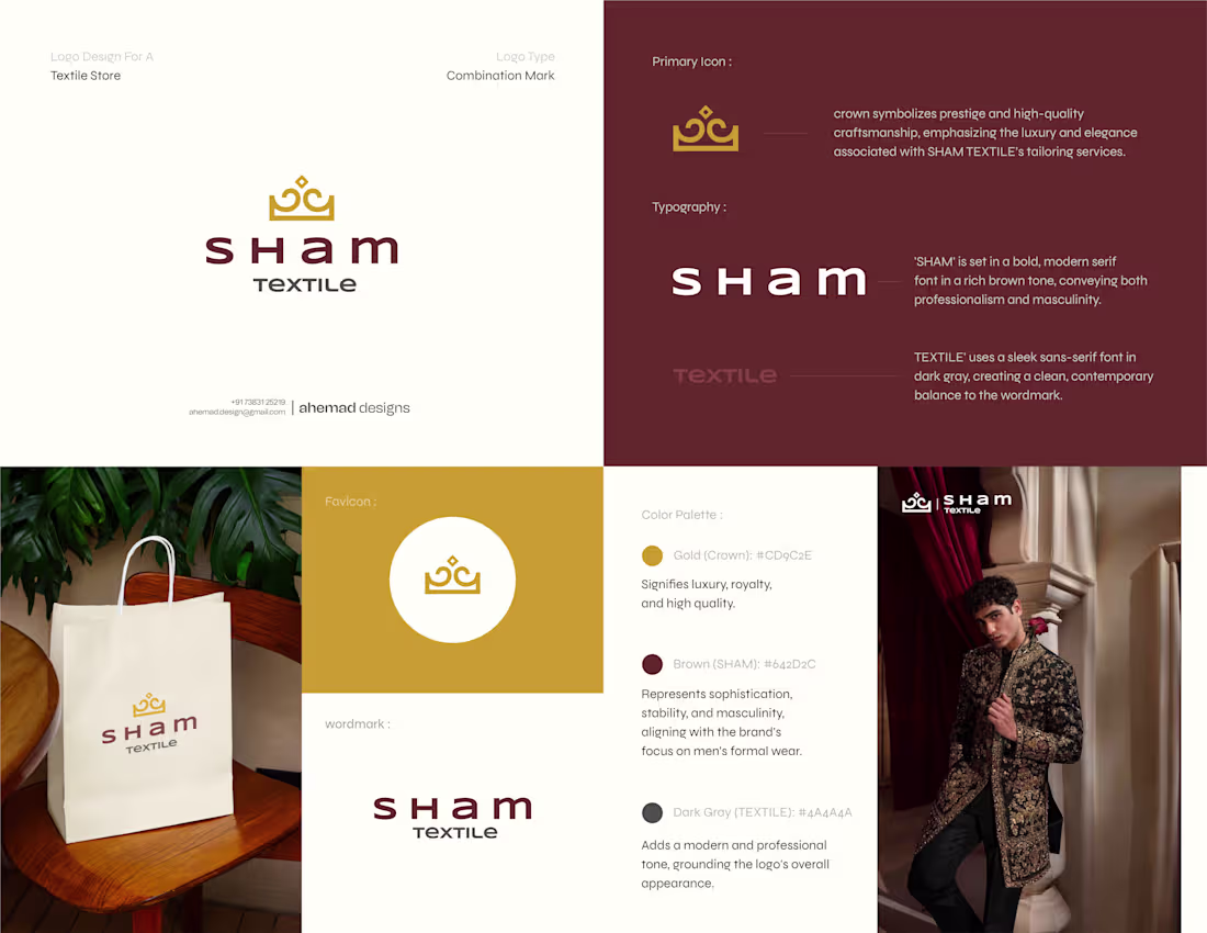
Experience is what makes textile branding work.
This identity for SHAM TEXTILE was built with a clear focus on authority, legacy, and premium appeal.
The crown represents craftsmanship and heritage.
Gold brings a sense of luxury.
Deep brown adds strength and a masculine tone suited for menswear branding.
The typography is clean and controlled — refined, confident, and timeless.
Designed to work seamlessly across storefronts, packaging, and brand assets, this identity is built for recognition and long-term scale.
A strong foundation for modern textile branding - created with intent.
If you’re building a textile or fashion brand with a long-term vision,
let’s shape it right.
-
Ahemad Designs
Brand Identity Designer | Fashion & Industrial Branding | India
1
79
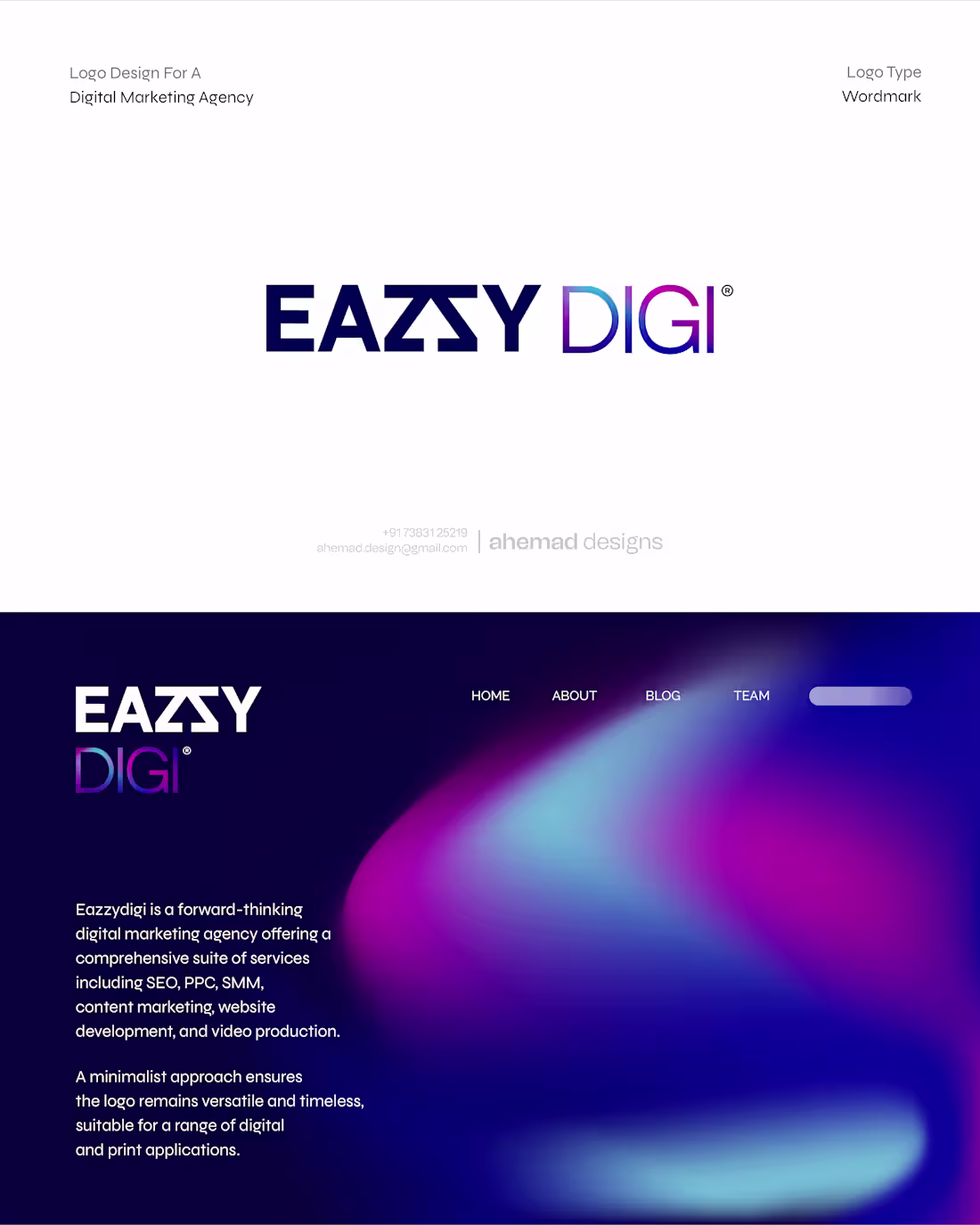
EAZZY DIGI – Brand Identity for Digital Marketing Agency
This wordmark was designed for digital brands that move with clear intent.
The arrow integrated into the typography signals direction, growth, and action.
Inspired by the cursor, it connects directly to what digital marketing is really about — making decisions that drive results.
Minimal, scalable, and consistent —
the logo performs smoothly across websites, ads, dashboards, and pitch decks without losing clarity.
Built to look sharp.
Built to move forward.
—
Ahemad Designs
Brand Identity Designer | Branding for Digital & Industrial Businesses | India
2
2
91
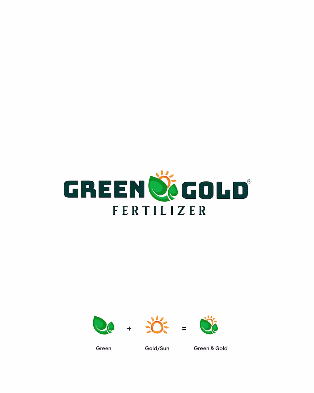
Green & Gold Fertilizer Logo Design | Agricultural Brand Identity
Experience and real-world work have taught me this.
For Green & Gold Fertilizer, the identity was built around one clear idea:
🌱 Green for life, soil health, and sustainability
☀️ Gold for sunlight, yield, and long-term value
Together, the logo communicates purpose at first glance — essential in fertilizer branding.
A leaf-led icon for agriculture.
A sun element for nourishment and productivity.
A clean wordmark built for packaging, signage, and digital use.
Simple. Relevant. Trust-led.
If you’re a founder shaping a long-term agri brand,
comment “AGRI” to explore working together.
1
78
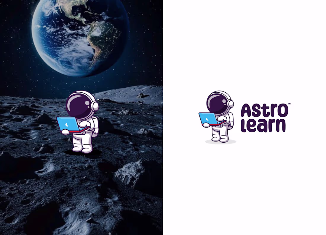
Without any explanation, what does this logo tell you?
AstroLearn was designed for the age where curiosity runs high and learning should feel exciting, not heavy.
It’s a kids EdTech platform for coding, maths, science, and digital skills — so the identity couldn’t feel like a tuition class or a corporate LMS.
It had to feel like an invitation.
Fun for kids. Reassuring for parents.
The astronaut reflects curiosity and exploration, naturally aligned with the name and purpose.
Soft, rounded forms keep the logo friendly, while a clear structure builds trust.
This is product-led brand identity design, built around how users should feel first.
comment “LEARN”, If this approach resonates you.
Ahemad Designs
Brand Identity Designer | EdTech • Startups Branding | India
1
78
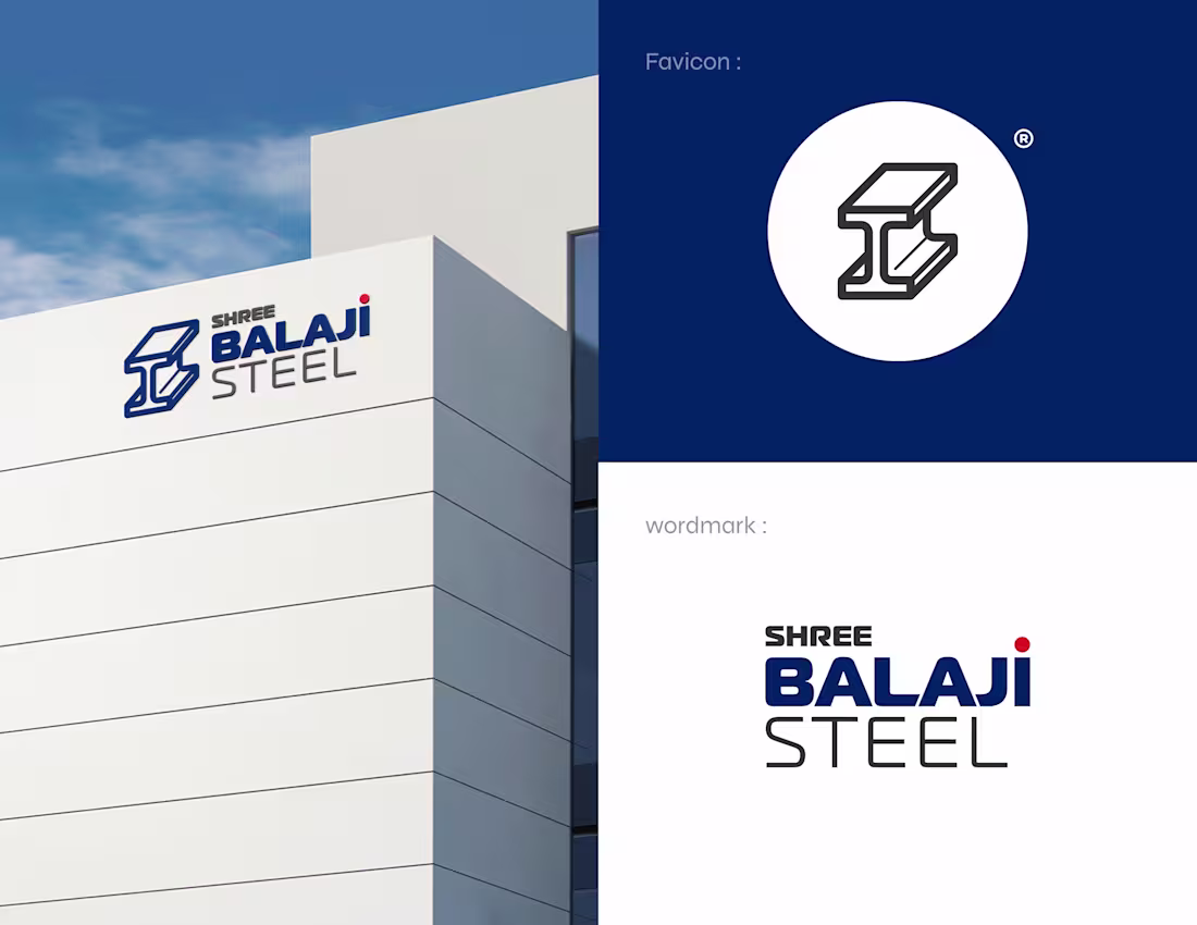
Shree Balaji Steel – Industrial Brand Identity
This steel brand made the right decision early — it built strength into its design.
For Shree Balaji Steel, the identity had one clear job:
communicate trust instantly, even before a conversation begins.
The design started from the foundation of the business itself.
A bold MS beam icon that directly reflects the core product.
Structured, industrial geometry that feels precise and purposeful.
A wordmark that looks stable, grounded, and built to last — just like steel should.
The result is a combination mark designed to perform everywhere:
factory signage, digital platforms, and a favicon that stays clear even at small sizes.
This is branding that works on the ground, not just on screens.
—
Ahemad Designs
Brand Identity Designer | Industrial & Manufacturing Branding | India
1
82
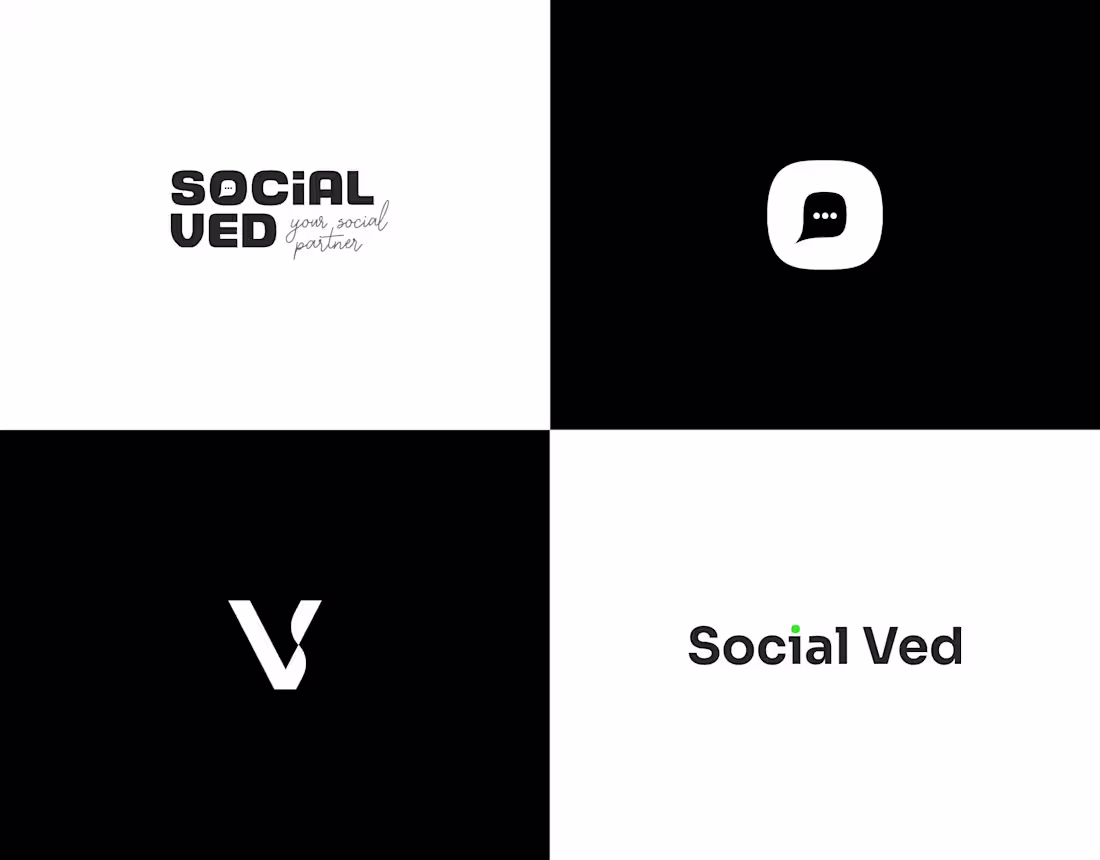
Social Ved – Social Media Brand Identity
Before touching any software, I sketched this identity to understand the idea behind the brand.
Because strong logos come from clear thinking, not shortcuts.
Social Ved is a social media agency focused on digital marketing and graphic design, so the symbol needed to communicate connection, clarity, and confidence at first glance.
I started with a chat box — a universal sign of communication and engagement. The core of every social media platform.
From there, the form naturally evolved into the letter “V”, taken directly from Ved.
From sketch to structure.
From idea to identity.
A clean, flexible logo designed for social media, digital platforms, and scalable brand systems.
If you want branding that defines the idea before the visuals,
comment “START” and let’s build it right.
1
74
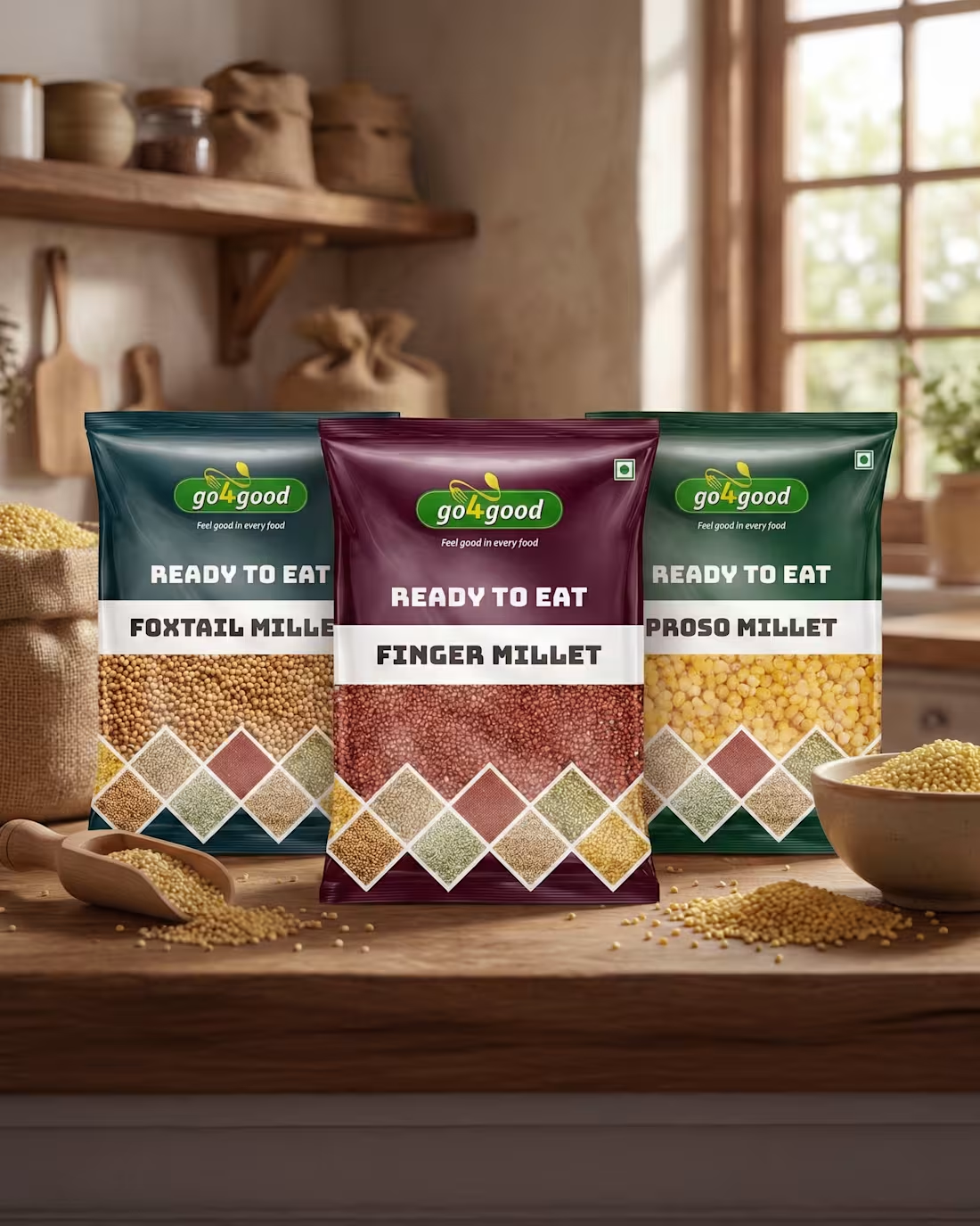
Go4Good – Premium Packaging for Modern Millets
This is how real premium food brands are built.
By making healthy food look exciting.
This packaging design for Go4Good Millets was created to elevate everyday nutrition.
Clean. Confident. Shelf-ready.
Each variant gets its own bold colour,
so Foxtail, Finger, and Proso millets stand out with personality.
The clear window builds instant trust,
showing the real grains inside.
Honest food. Honest design.
Geometric patterns add structure and meaning,
symbolising balance and nourishment.
And the Ready-to-Eat range?
Perfect for today’s fast lifestyle.
Smart eating, made simple.
Good packaging doesn’t just protect food.
It makes people choose it.
Comment “BRAND” and let’s connect.
—
Ahemad Designs
Packaging Designer | Brand Identity | India
2
76
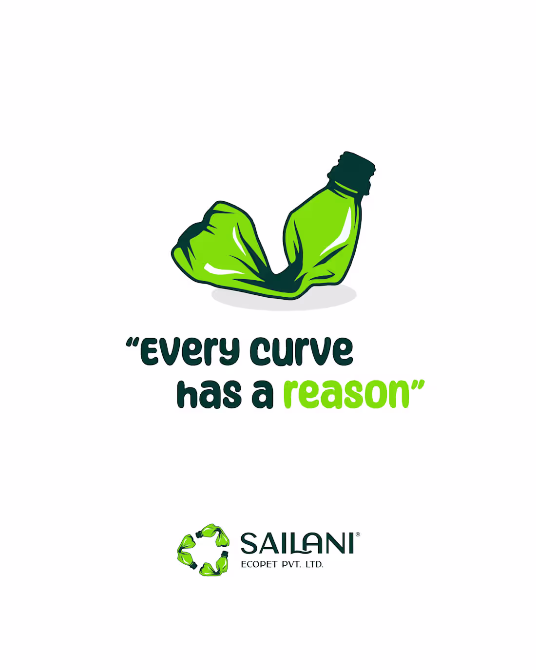
SAILANI ECOPET – Sustainable Brand Identity
If people have to ask what your brand does… your branding already lost.
That’s exactly what shaped this identity for SAILANI ECOPET PVT. LTD.
Instead of designing another “eco” logo,
I used the real hero — waste itself.
Crushed plastic bottles turned into a recycling loop.
Because waste doesn’t disappear. It transforms.
Every bend tells a story.
That’s why — “Every curve has a reason.”
Green isn’t decoration.
It signals sustainability instantly.
Haan bhai, nature wala kaam hai. 🌱
Simple. Clear. Purpose-driven.
Just like the brand.
If your brand stands for something bigger,
it deserves a design that shows it.
Comment “CLARITY” and let’s make it visible.
1
75
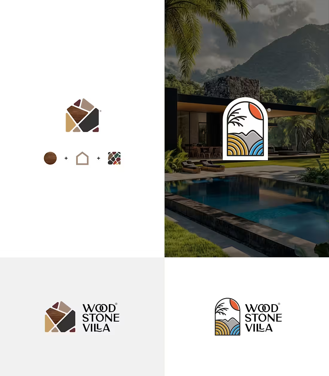
If this were your villa, which identity would you choose?
Option 1: Rooted in materials
Option 2: Inspired by nature
For Wood Stone Villa in Sasan Gir, I designed two logo directions:
1. Roots Edition
Wood. Stone. Earthy tones.
Built to reflect the villa’s real materials.
2. Nature Edition
Sunrise. Hills. Silence.
A logo that feels like a window into the stay.
One shows where it’s built from.
The other shows why people will come.
That’s branding doing the selling — quietly.
Because great hospitality branding
is about emotion, not decoration.
Your space deserves more than a logo.
It deserves a story.
Comment “ROOTS” to build a strong brand foundation.
— Ahemad Designs
Brand Identity Designer | Hospitality Branding | India
1
78
Dhanush Play & Learn — Brand Identity for a Toy Manufacturing Company
This is how smart founders turn stories into strategy.
Meet Dhanush – Play & Learn.
A toy brand inspired by a father’s love for his child.
This logo wasn’t designed to look corporate.
It was designed to feel personal.
The symbol is a playful brain — shaped for little minds, reflecting curiosity, movement, and joy.
Colours: Red for energy | Yellow for curiosity | Blue for calm thinking
Soft curves, bright tones, friendly type —
everything shaped for kids, not boardrooms.
Because great children’s brands don’t sell toys.
They build confidence.
If you’re a founder with a story, let’s turn it into a brand strategy.
Comment “TOY” to start the conversation.
2
74
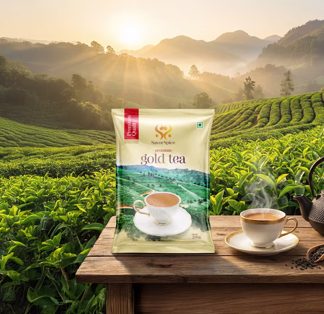
SavorSpice — Premium Tea Packaging Design
The difference between selling tea and building a brand.
Selling tea is about price.
Building a brand is about feeling.
That’s what shaped this SavorSpice packaging.
Because in India, chai isn’t a drink.
It’s routine. Comfort. Therapy.
So I didn’t design a packet.
I designed a moment —
that first quiet sip on a misty morning.
Green for estate freshness.
Gold for premium calm.
The cup on the pack?
Five minutes of peace. No notifications.
This isn’t packaging.
It’s personality.
Selling tea is easy.
Building a brand takes intention.
Ready to build a brand, not just sell a product?
Comment “TEA” ☕
1
72
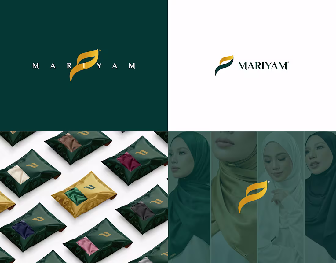
Mariyam — Premium Hijab Brand Identity & Logo Design
If you want a premium brand, read here.
For Mariyam, I didn’t chase trends. I designed how luxury should feel.
Scarves sit close to the skin and frame the face, so every curve had to feel soft, calm, and intentional.
The logo is built from the Arabic “م” — chosen for meaning, not decoration.
I shaped it like fabric in motion: no sharp edges, only flow. Elegant, controlled, and timeless.
Deep green represents trust and depth. Gold adds quiet luxury — not loud shine.
Before finalising, I tested the identity everywhere: packaging, fabric labels, brand covers, and social creatives.
The design never steals attention. It supports the product.
That’s real premium branding — restraint, purpose, and longevity.
Comment “PREMIUM” to build yours.
1
77
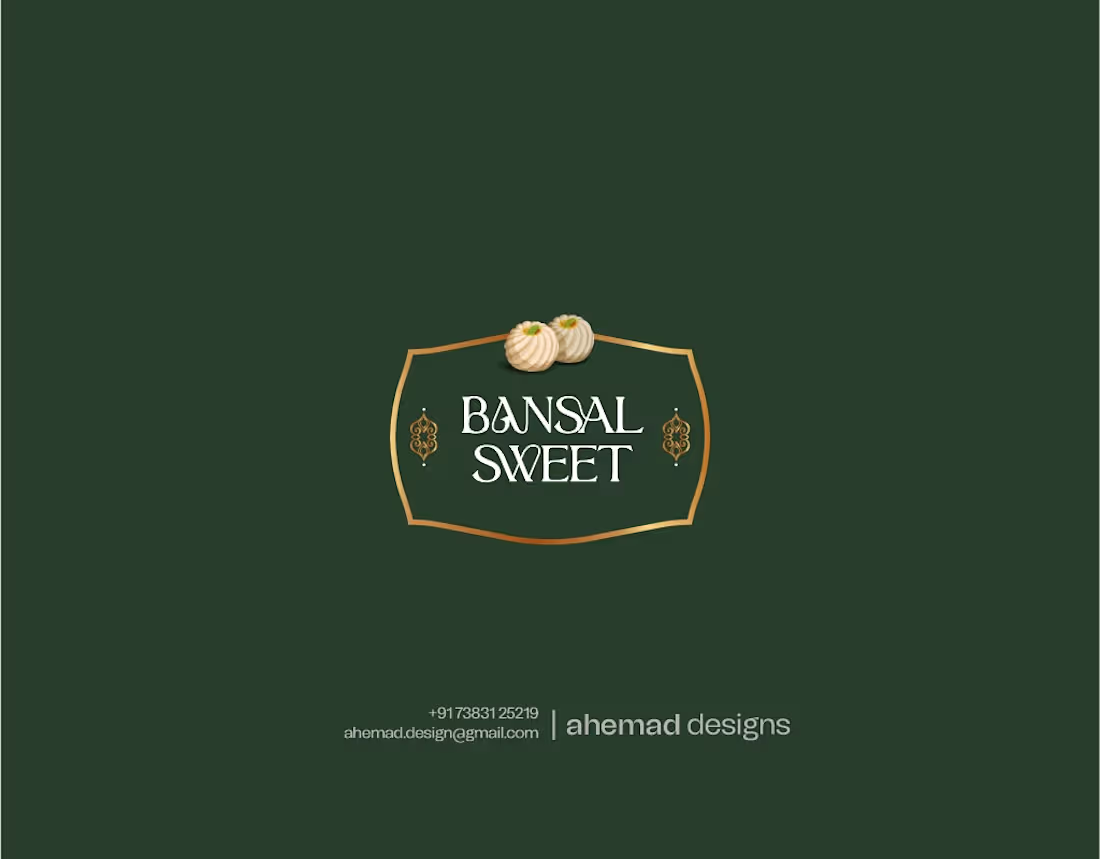
Bansal Sweet — Premium Indian Sweets Branding
Some brands don’t need louder branding.
They need branding that carries legacy.
Bansal Sweet was already trusted across Punjab — part of festivals, family moments, and everyday indulgence. The business was strong, but the identity hadn’t evolved with that trust.
The old logo wasn’t wrong.
It just didn’t reflect the emotion behind it.
This wasn’t about visibility.
It was about character.
So I redesigned with restraint — asking: How should it feel before the first bite?
Warmth. Tradition. Pride.
Inspired by classic Indian sweet shop signage, the badge-style mark feels familiar and dependable. Green and gold signal freshness and trust.
It doesn’t shout.
It holds its ground.
Like a legacy brand should.
If your brand deserves an identity that matches its reputation, let’s build it right.
1
84
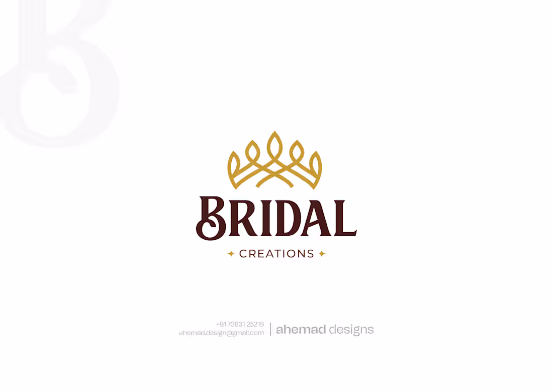
Bridal Creations – Luxury Wedding Brand Logo Design
Bridal branding isn’t about trends.
It’s about trust, dignity, and emotion.
For Bridal Creations, I designed a logo that feels graceful and composed — the way a bride is meant to feel on her wedding day. The crown-inspired symbol is a quiet metaphor for honour and importance, not a literal ornament. Its form draws from jewellery patterns seen in Indian weddings, creating familiarity without excess.
Warm gold reflects celebration and value, while deep brown adds stability and trust. The typography stays classic and balanced, so the brand feels established.
This identity doesn’t shout for attention.
It earns it — across storefronts, catalogues, packaging, and digital.
That’s the difference between decoration and branding.
Looking to elevate your bridal brand? DM me.
1
85
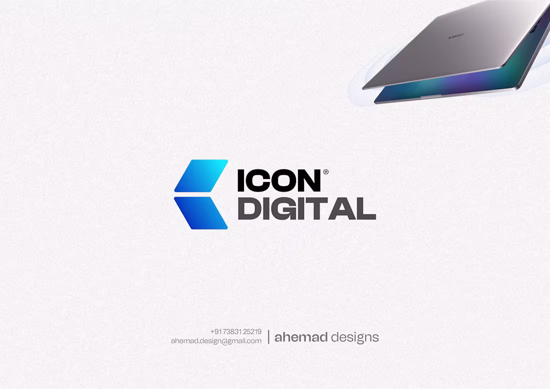
ICON DIGITAL | A laptop brand that needed to explain itself without words.
That was the real challenge behind ICON DIGITAL — a B2C laptop brand in a fast, price-sensitive market.
The earlier identity felt generic.
People saw the name but couldn’t instantly tell what it sold.
And in tech retail, even seconds of confusion cost trust.
So I designed the logo to work like a silent salesman.
The icon draws from the laptop form — clean, geometric, modern.
It doesn’t explain. It signals.
The blue gradient reflects trust and quality — values that matter to Indian laptop buyers.
Typography stays clear and bold, holding strength from shop boards to screens.
This identity puts customers first, not creative validation.
If your brand needs clarity that converts, let’s build it right.
1
77
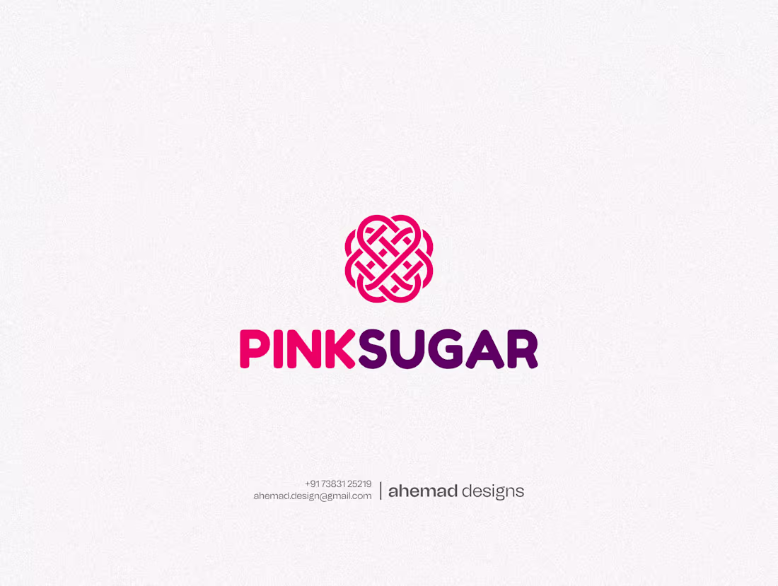
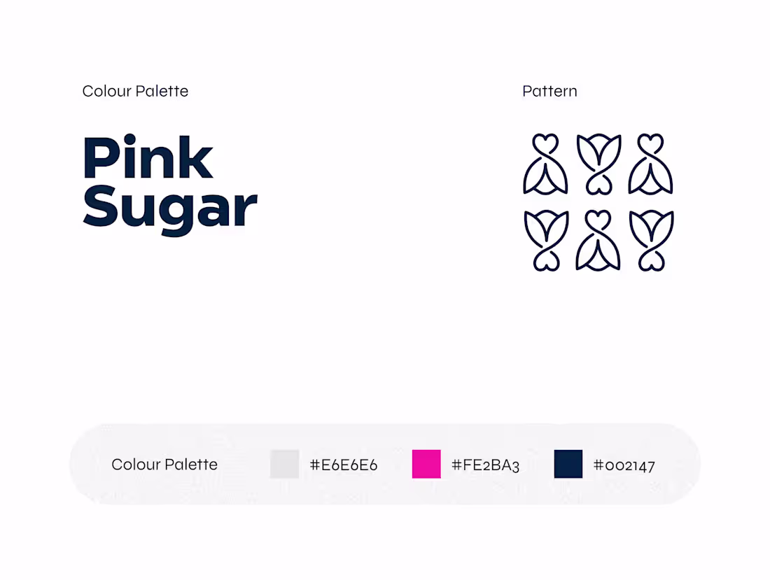
Pink Sugar Visual Identity | Elegant Fashion Branding
A brand identity that flows like fabric.
Pink Sugar is a women’s clothing brand from Ahmedabad built on contrast —
soft yet strong, playful yet powerful.
The logo was designed to feel wearable.
Fluid lines for movement.
Bold pink for warmth and modern femininity.
Clean typography to keep it confident and contemporary.
From clothing tags to brand touchpoints,
the identity stays clear, elegant, and consistent.
Because fashion branding shouldn’t feel forced.
It should feel natural — like the clothes themselves.
If your brand needs identity with feeling, let’s build it thoughtfully.
1
88
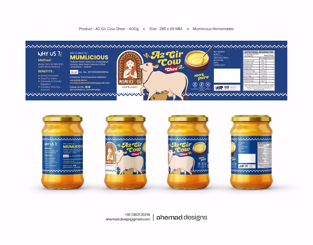
Mumlicious — A2 Gir Cow Ghee Packaging Design
Months after Mumlicious moved from steel dabbas to store shelves, they called again — this time for their A2 Gir Cow Ghee packaging.
Because in an Indian kitchen, ghee isn’t just food.
It’s the aroma that says aaj kuch special bana hai.
It’s comfort, memory, tradition.
So the design had to feel shuddh, desi, honest.
Slow-churned.
Tradition-led.
No factory vibes.
A calm Gir cow illustration anchors the label.
Brown reflects mitti and gaushala floors.
Blue balances warmth with trust.
This wasn’t a redesign.
It was a continuation of a story.
Which one feels right for this brand?
If you’re looking for branding that feels human, let’s connect.
2
84
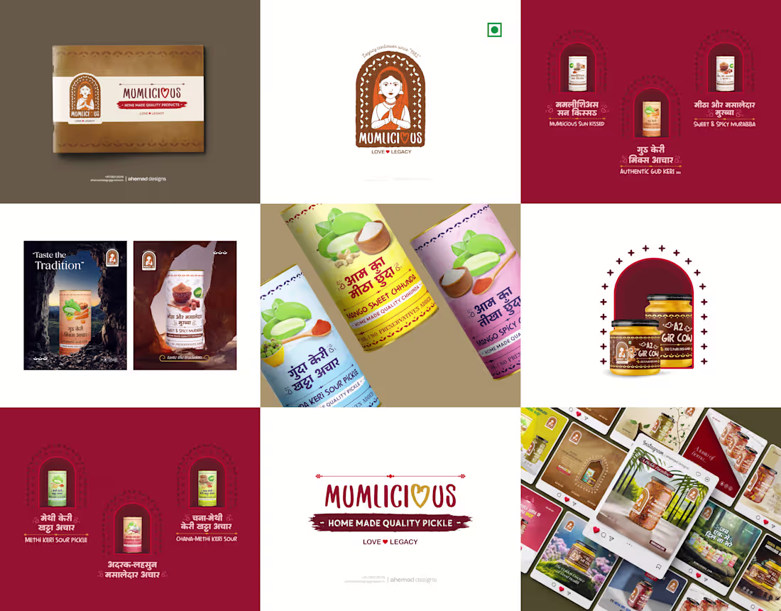
Mumlicious — From Home Kitchen to Brand Identity
Before it became a brand, it was a steel dabba travelling from Junagadh to different homes — carrying Leeriaben’s homemade pickles.
So when I did the complete branding — logo, packaging, and visuals — I followed maa ke haath ka swaad, not trends.
Nothing factory-made.
Nothing flashy.
Just honest, homemade design.
Because Mumlicious doesn’t sell pickles.
It sells memories.
Comment “DM” if you’re building a homegrown brand.
1
83
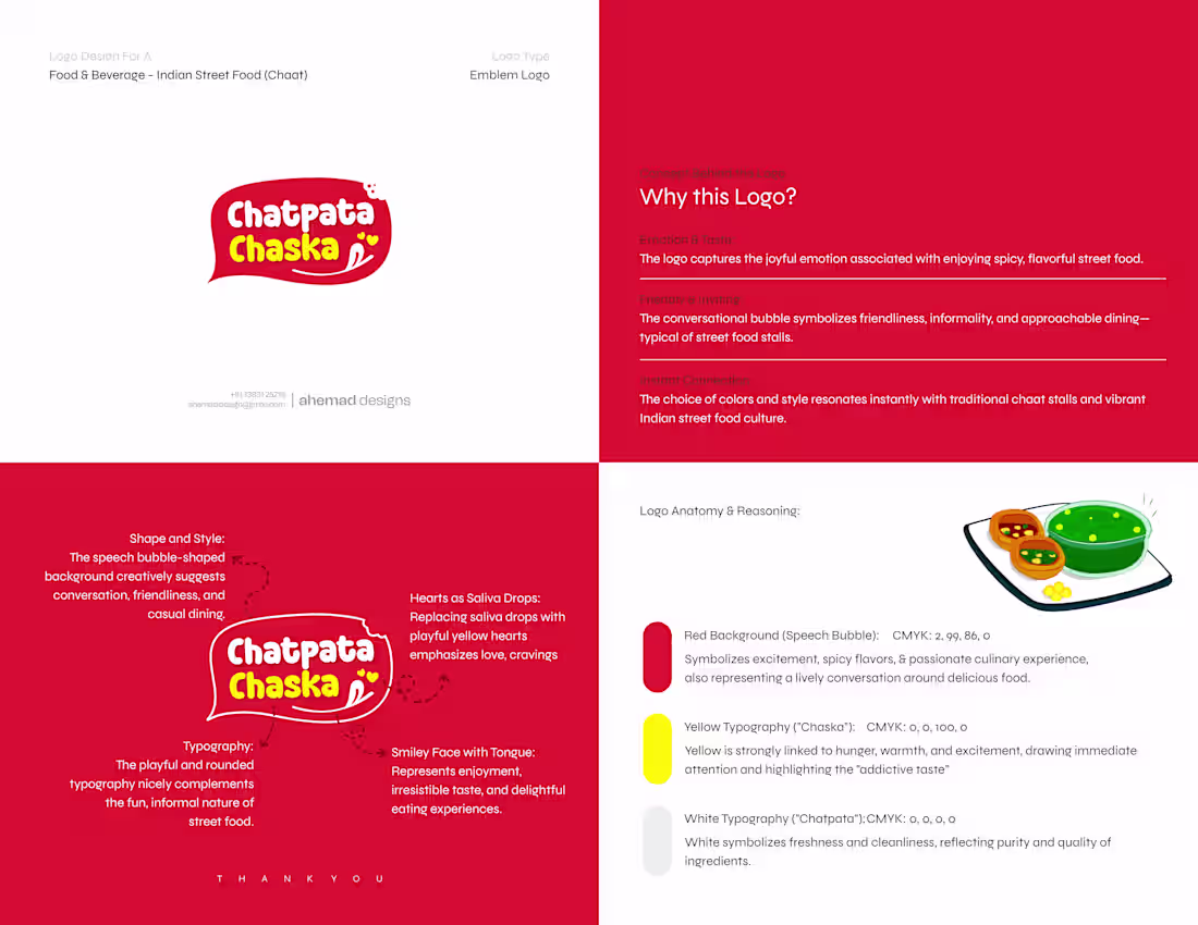
Chatpata Chaska — A Logo That Talks Like Chaat Tastes
Chaat is never quiet.
So this logo didn’t try to be.
Designed to feel like Indian street food itself — loud in flavour, friendly in tone, and instantly familiar.
The speech bubble reflects conversation.
The red brings heat.
The yellow triggers hunger.
Nothing here is decorative.
Every element exists to create craving at first glance.
Good food branding doesn’t explain.
It connects.
1
97
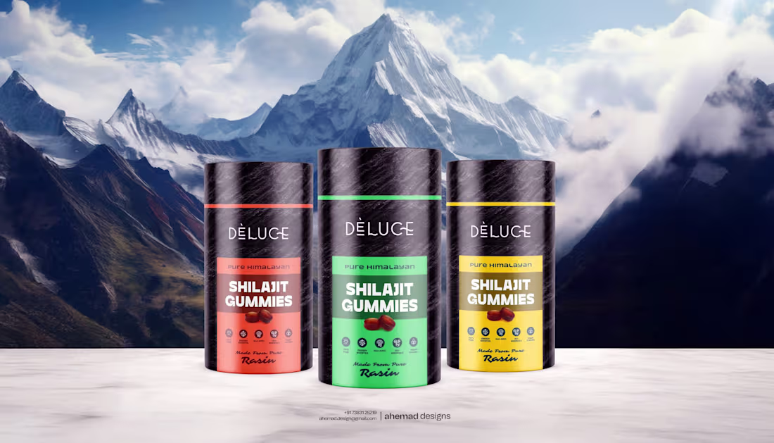
Good design starts with knowing what to leave out.
Shilajit is already powerful, so this identity didn’t need noise.
I designed DÈLUCE to stay calm where others shout.
Black stays quiet. Typography stays clear.
The marble texture hints at origin, not decoration.
The colour bands act as signals — one glance, one decision.
Nothing here tries to impress.
It simply knows what it is.
That’s how premium brands earn trust — by saying less, with confidence.
2
91
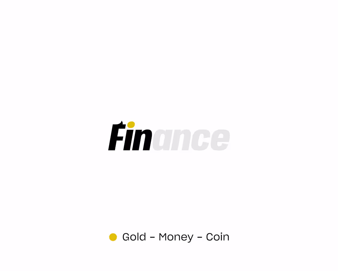
Fin Shark Identity Design | Built for Money, Momentum & Trust
This isn’t a logo added to finance.
Finance shaped the logo.
Fin Shark was designed as a clear, confident identity for a growing financial brand.
The thinking started with form, not decoration.
The F draws from a shark’s fin — controlled movement, not aggression.
The S carries a soft dollar logic — value embedded, not advertised.
The gold dot isn’t an accent. It’s a quiet cue for money, outcome, and focus.
The palette stays disciplined: black and white for authority, gold only where it adds meaning.
This logo doesn’t rely on symbols people have to decode.
It reads fast, feels steady, and holds its ground across screens.
That’s the kind of identity finance brands grow into —
clear today, confident tomorrow.
3
101
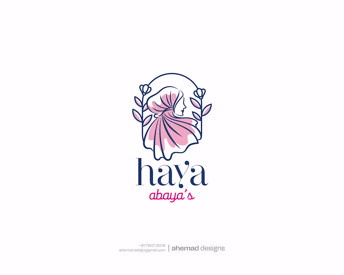
Haya Abaya — An Intentional Logo for Modern Modest Fashion
A logo should do more than look elegant.
It should feel considered.
Haya Abaya was built as a refined identity for a modest fashion brand where grace, culture, and restraint matter. The challenge wasn’t adding detail — it was knowing what to leave out.
The mark is designed to feel feminine without fragility, premium without noise, and cultural without looking dated. A soft silhouette paired with botanical elements creates a balance of modesty, growth, and timeless calm.
Every decision was deliberate:
Clean line work for longevity.
Quiet colours for warmth and elegance.
This logo doesn’t chase attention.
It earns recognition.
When an identity feels right, the brand feels established — even before the first interaction.
That’s the kind of clarity I build into every logo.
1
88
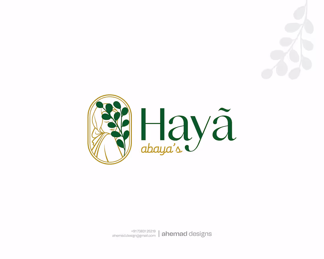
Quietly Luxurious Logo Design for a Modest Fashion Brand
A logo should feel considered, not decorative.
Haya Abaya was designed for a brand that values grace, culture, and quiet confidence. The goal wasn’t to impress loudly, but to communicate balance—feminine without fragility, premium without excess, and cultural without feeling dated.
The mark combines a soft silhouette with botanical elements to symbolise modesty, growth, and timeless elegance. Clean lines, calm colours, and a flexible structure ensure the identity works across digital, print, and physical touchpoints without losing clarity.
This logo doesn’t chase attention.
It earns presence.
That’s how I approach identity design—building marks that last, adapt, and make a brand feel established before a word is
2
82
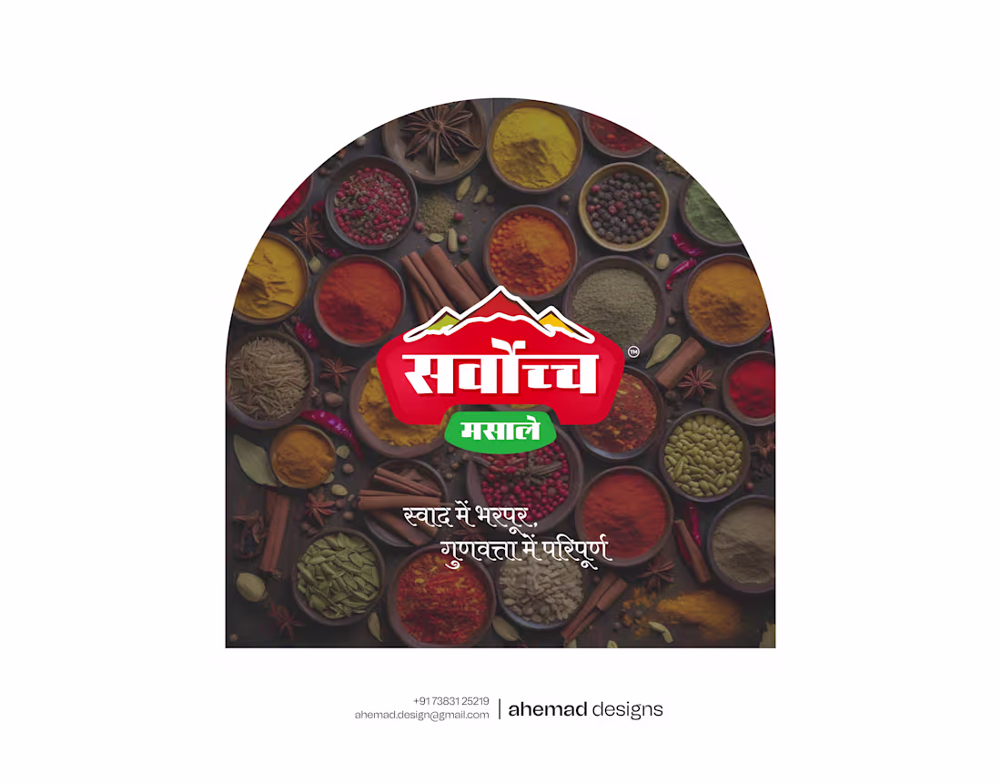
A Scalable Brand System for a Growing Spice Range
Good design isn’t a single layout.
It’s a system that stays strong as the brand grows.
This spice brand had quality products, but the identity wasn’t consistent. Every new pack felt like a fresh start instead of part of one recognisable brand.
I focused on building one clear design system —
shared structure, disciplined hierarchy, and a logo that actually leads. Different products, colours, and formats, but one visual language throughout.
The result is packaging that feels organised, confident, and easy to recall — whether it’s one product or the full range on shelf.
This is how design supports growth.
By staying structured, not decorative.
If your brand is expanding and consistency is starting to slip, that’s a design problem worth fixing.
1
83
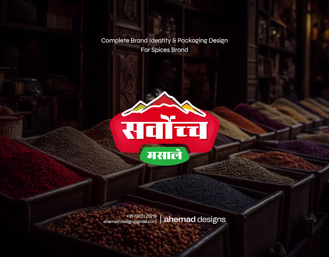
Complete Brand Identity & Packaging System for Indian Spices
This brand didn’t need better products.
It needed better clarity.
The range was growing, but the identity wasn’t holding it together. Each pack worked on its own, yet nothing built recall as a system.
I treated this as a brand problem, not decoration. One clear logo. One visual language. Strong hierarchy. Packaging that reads fast, stays familiar, and scales across the shelf.
The result is a unified identity that feels confident, recognisable, and ready to grow.
Good design doesn’t just look good.
It makes a brand easier to choose—and harder to forget.
3
116
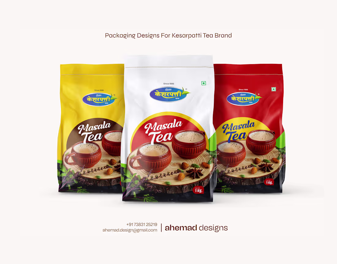
Tea Packaging Design for Regional Brand Expansion
The product was already trusted.
The taste was familiar.
But the packaging was holding the brand back.
This project wasn’t about making the pack louder. It was about helping a regional tea brand feel confident beyond its home market. I focused on clarity, hierarchy, and balance—so new customers instantly understand where the brand stands.
The result is packaging that keeps its local warmth while feeling ready for wider shelves. Familiar, readable, and easy to choose—no matter the city.
Good packaging doesn’t chase attention.
It supports growth without losing identity.
1
86
Premium Products Deserve Premium Presence
If your product is strong, your social media should show it.
In this project, the fragrance quality was already there. Pricing was right. Effort was real.
What was missing was visual weight.
On social media, people don’t experience the product first.
They experience how it looks.
I redesigned these posts to pause the scroll—clean hierarchy, calm colours, and balanced composition that quietly communicate quality. No loud offers. No clutter. Just clarity and confidence.
Because good social media design doesn’t push products.
It builds trust before the first click.
2
4
104
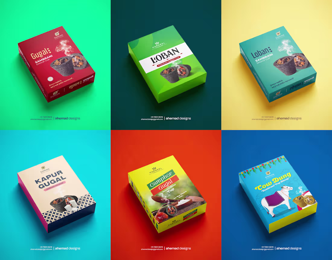
Clarity-Led Packaging for a Modern Incense Brand
Design doesn’t fail because it looks bad.
It fails when it confuses.
This project focused on removing visual noise and restoring order. I simplified the hierarchy—Brand → Product → Experience—so the pack guides the eye instead of fighting for attention.
Clean spacing, disciplined typography, and restrained colours help the product feel calm, clear, and trustworthy at first glance.
Every element has a role. Nothing competes. Nothing shouts.
Because when packaging is understood quickly, it’s chosen confidently—on shelves, online, and in real use.
2
86
Incense Packaging Design | Packaging That Works Beyond the Screen
Good design isn’t tested on screens.
It’s tested in print, packaging, and daily use.
This project began where most designs fail—when mockups turn into reality. Details fade, contrast weakens, and structure breaks. That’s where brands quietly lose trust.
I designed this system with real conditions in mind: shop lighting, small sizes, physical materials, and repeat printing. Spacing, hierarchy, and contrast were kept disciplined so the design stays clear and confident everywhere it appears.
No trends. No shortcuts.
Just design that holds up when it matters.
1
80
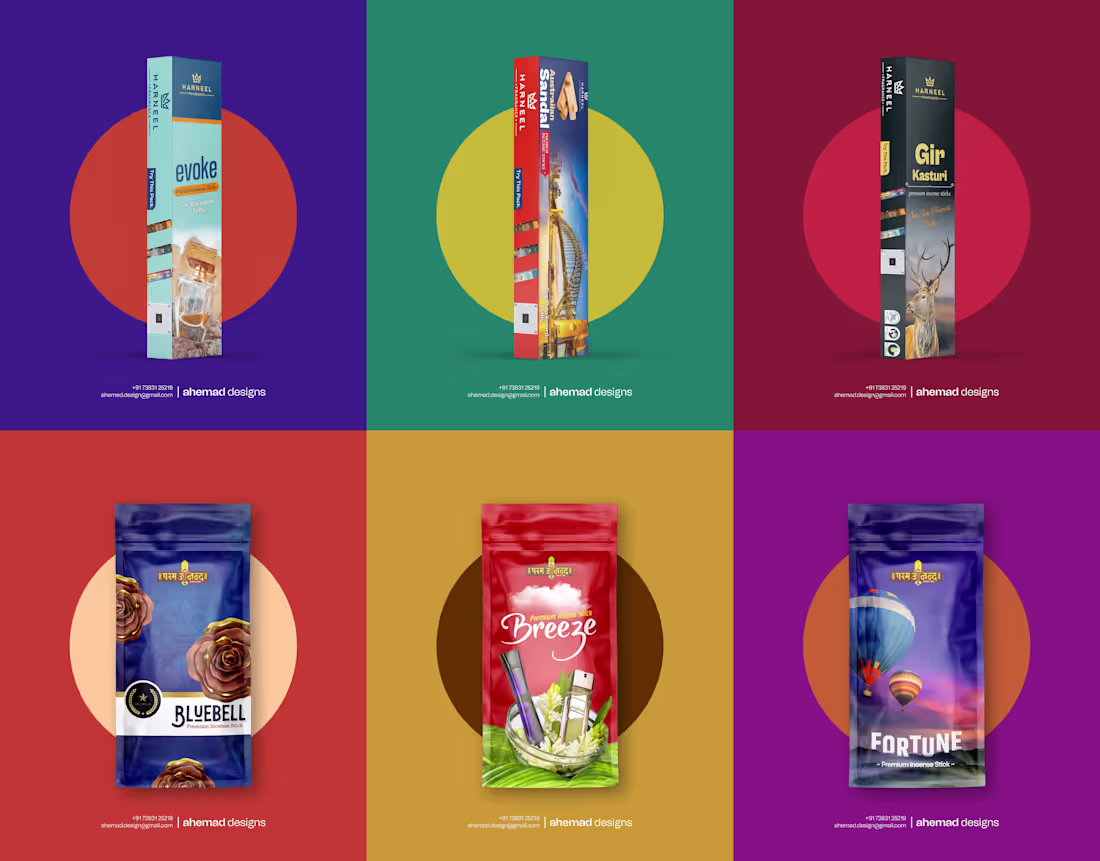
Simran Perfumes — Scalable Premium Packaging Identity
Good brands don’t need frequent redesigns.
They need one design that can grow with them.
When Simran Perfumes reached out, the product quality was already strong — rich, refined fragrances for a premium audience. The challenge wasn’t the incense, but the visual identity. The earlier packaging felt dated and unable to reflect the confidence of the brand or support long-term growth.
I approached this as a foundation, not a cosmetic update. The focus was clarity, longevity, and quiet confidence. Clean structure, disciplined layouts, and refined typography help the brand feel premium at first glance and consistent across all variants.
This design doesn’t chase attention.
It earns trust — and stays relevant as the brand grows.
2
93
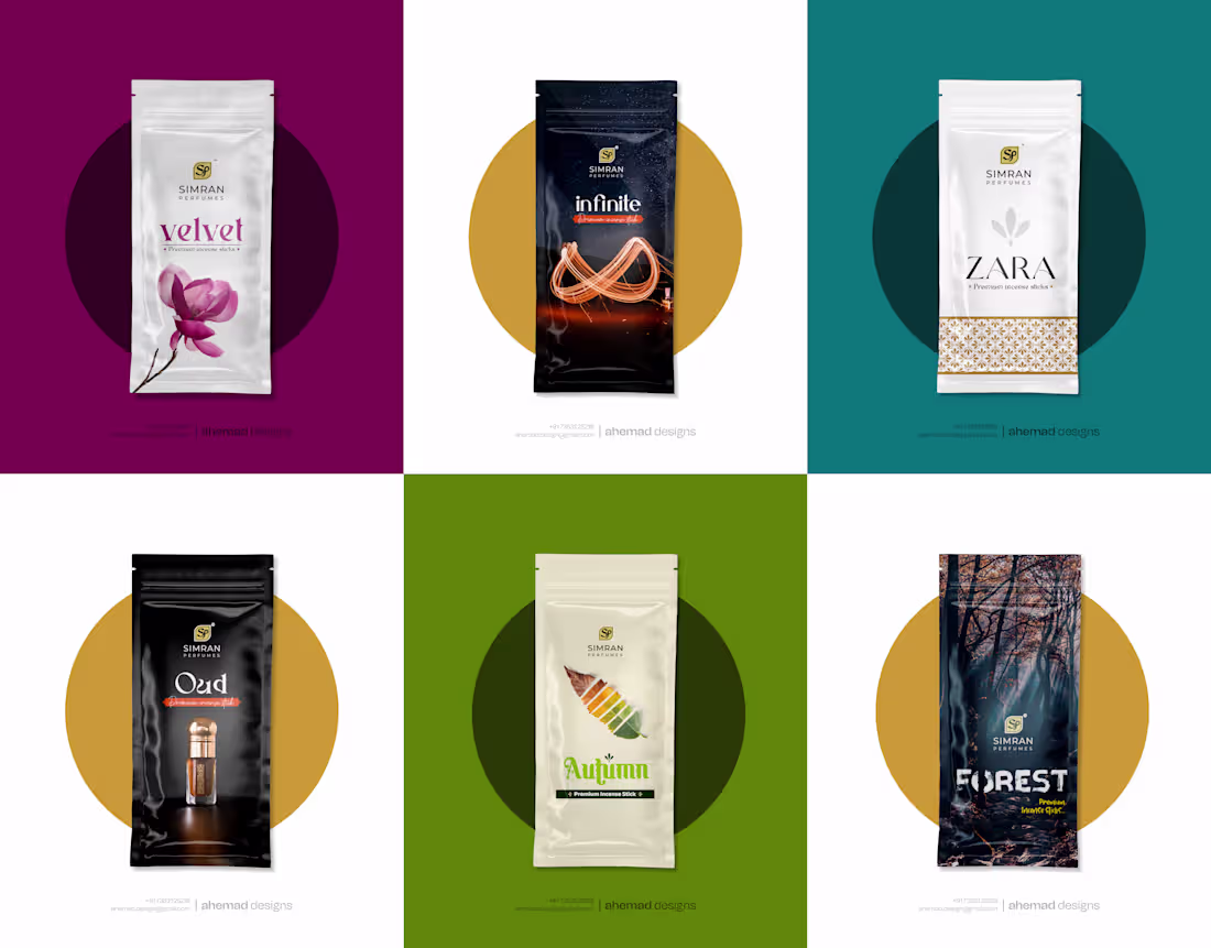
Good design doesn’t chase attention.
It earns it quietly.
This incense packaging project began with one clear thought: in a crowded market, quality products shouldn’t look replaceable. The fragrances were already rich and thoughtful, meant for people who care about what they bring into their homes and prayer spaces. But the earlier visual language didn’t reflect that care.
The challenge wasn’t decoration.
It was clarity and presence.
I approached the design with restraint — a clean, premium structure that feels calm at first glance. Controlled colours and refined typography communicate quality without shouting. Each variant carries its own mood while staying part of one disciplined brand system.
The result is packaging that feels confident, composed, and worth choosing even before the fragrance is experienced.
2
1
88
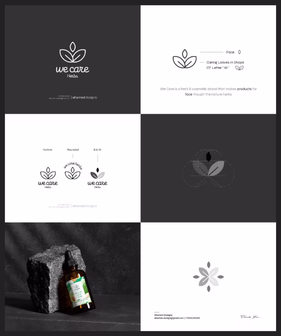
We Care Herbs — Meaning-Driven Logo Design for a Herbal Skincare Brand
Some brands look good at first glance—until you realise the visuals say nothing.
That was the challenge with We Care Herbs.
The products were honest and herbal, but the logo didn’t explain why the brand exists. It had presence, not meaning.
I treated this as a clarity problem, not a styling exercise. The symbol is built from intention: leaves forming the letter “W” to express care, growth, and nature in a natural way. Soft curves reflect skin-focused products, while balance and symmetry create trust.
Nothing here is decorative.
Nothing is rushed.
The final mark works in colour, black and white, and at small sizes. Most importantly, it communicates before a single word is read.
That’s the difference between a logo that looks good
and one that feels right.
2
1
117
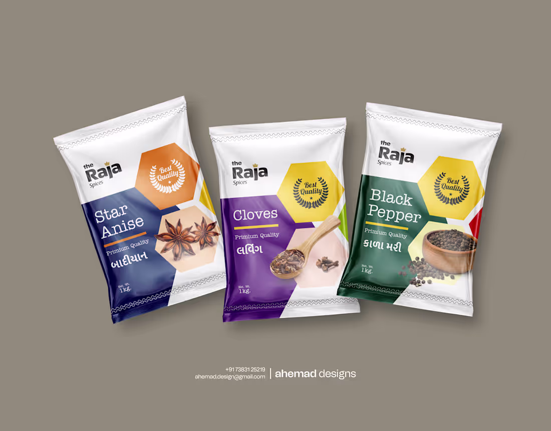
Raja Spices — Scalable Logo & Packaging System
When I worked on Raja Spices, I didn’t design a single pack. I designed a system — because today it’s black pepper and cloves, and tomorrow it could be many more.
Each product needed its own identity without breaking the brand. So I fixed the structure first — layout, grid, and hierarchy — before introducing colours. This ensures every new spice feels fresh, yet instantly recognisable.
Each variant has its own colour language, while the core system stays disciplined. Hexagon elements act as anchors, keeping the design balanced and repeatable. Typography remains bold and readable from warehouse stacks to kitchen shelves.
Nothing here is accidental.
This is packaging built to grow — without redesigning everything again.
Good design doesn’t just look good today
It stays useful tomorrow
2
1
108
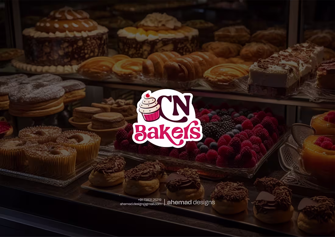
Designing a brand that earns cravings, not just attention.
When a bakery becomes part of everyday life — morning buns, evening treats, celebration cakes — it doesn’t need noise. It needs warmth and trust at first glance.
That’s what shaped the CN Bakers identity.
The cupcake mark stands for consistency and freshness. Rounded forms and friendly type keep the brand honest and familiar. Bold reds bring appetite, softer tones add balance — everything working toward one feeling: “I’ll come back here.”
Good branding isn’t about trends.
It’s about being remembered.
CN Bakers didn’t need a makeover.
It needed an identity that already feels like home.
2
3
167
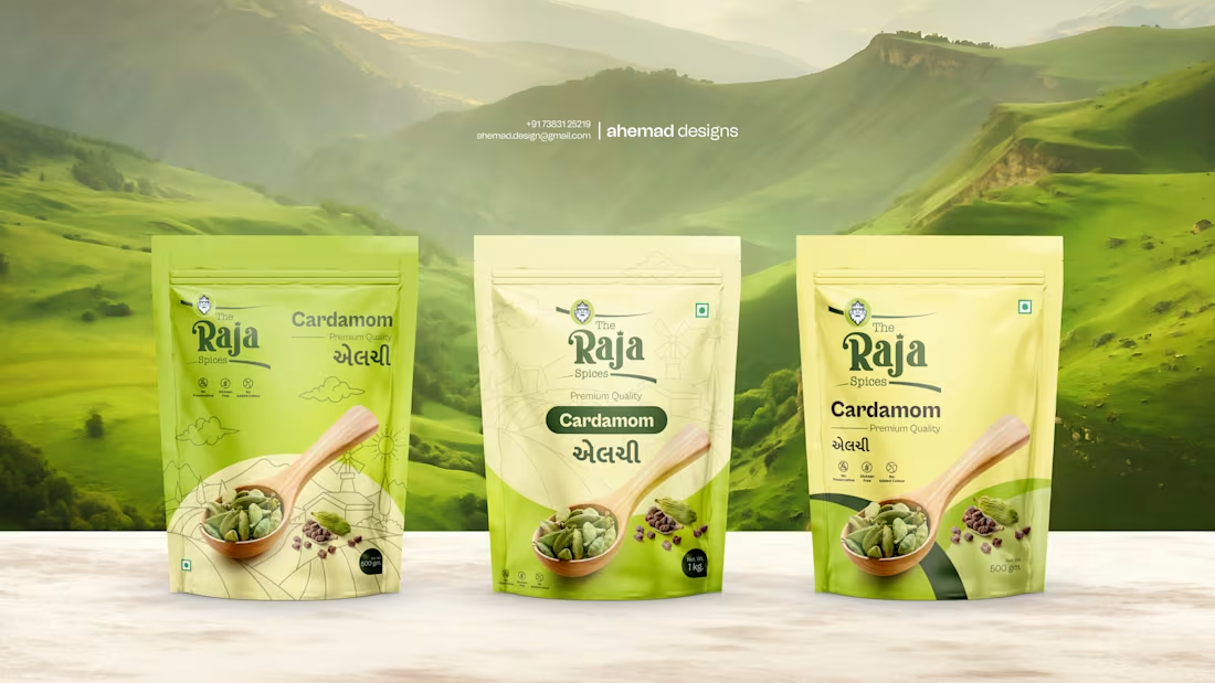
RAJA Spices — Packaging Design for Premium Elaichi
In Indian kitchens, elaichi isn’t just a spice — it’s a feeling.
You smell it before you see it, and trust it before you taste it.
That insight shaped the branding and packaging for RAJA Spices.
This brand serves bulk buyers who value purity, freshness, and honesty over flashy design. So instead of trying to impress, I focused on respecting the product.
The logo is clean, confident, and grounded — because premium elaichi doesn’t need decoration. It needs clarity.
The packaging follows the same thought. Natural greens, open space, and calm visuals inspired by where cardamom grows, not where it’s sold. The spoon and pods quietly communicate quality and trust.
No drama.
No forced luxury.
Just packaging that feels fresh at first glance — the way good elaichi feels in hot chai.
3
3
162
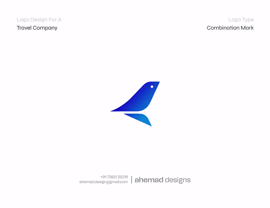
Jet Journey – Dubai Premium Travel Brand Identity
1
3
🚀 NEXA — A Future-Ready Tech Identity
Built with bold precision, geometric intelligence and a digital-first mindset.
Approved on the first presentation with zero revisions — a proud designer moment!
🎯 Design Goals • Futuristic brand voice • Strong modular angles • Sharp yet minimal movement
💡 Visual Strategy • Heuvel Grotesk for clean readability • Grid harmony for scalable usage • Seamless adaptability on devices
👇 Quick question: Which slide communicates “premium tech” the most for you?
1️⃣ Gradient Hero 2️⃣ Minimal Monogram Display 3️⃣ Construction Grid 4️⃣ Smartwatch Application
hashtag#brandidentity hashtag#graphicdesign hashtag#logodesign hashtag#branding hashtag#minimalism hashtag#visualidentity hashtag#techbranding hashtag#branddesigner
2
11
181
Introducing Pink Sugar — a women’s clothing brand born in Ahmedabad, created to celebrate confidence wrapped in softness.
The founders envisioned a brand that feels playful yet powerful, feminine yet fearless.
Our goal? To design a logo that visually embodies the modern woman — gentle in style, bold in spirit.
Designed by: Ahemad Designs
📍 Junagadh, Gujarat
📞 +91 73831 25219 | ✉️ ahemad.design@gmail.com
(mailto:ahemad.design@gmail.com)💬 I’d love to hear your thoughts — what do you see first: the heart of love or the flow of fashion?
1
185
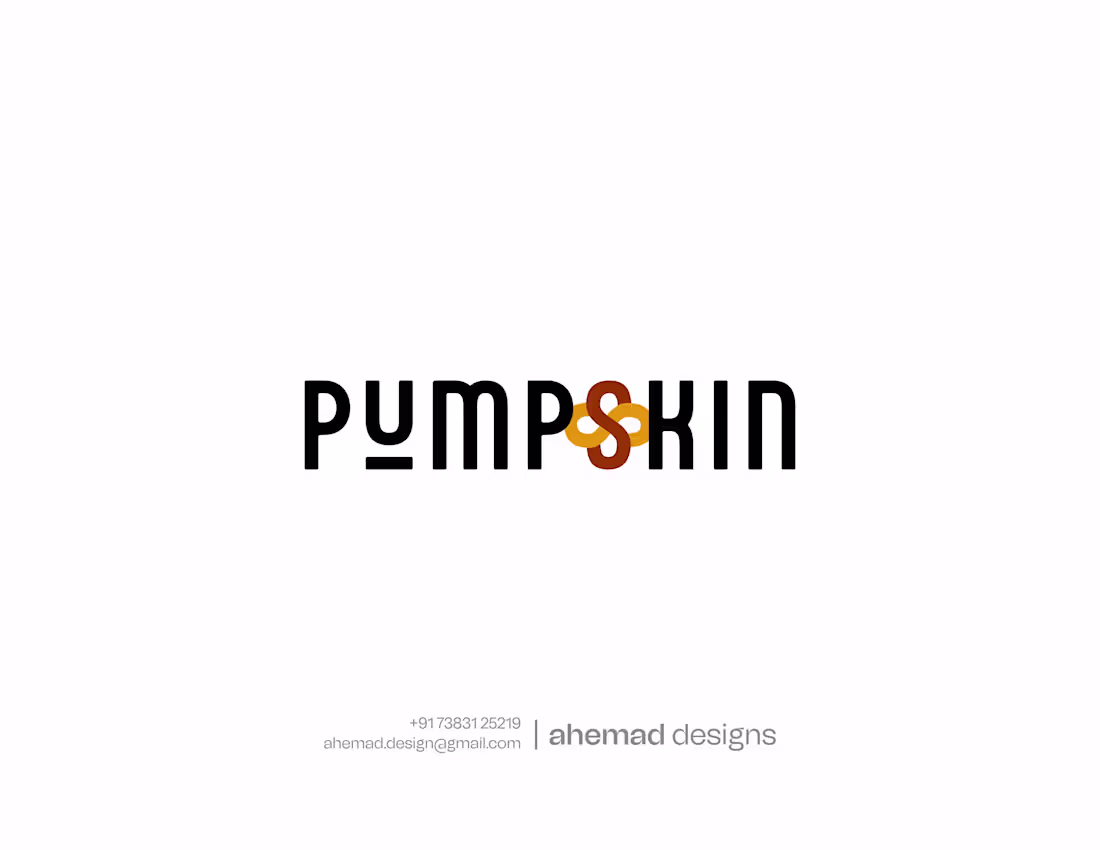
a unisex cosmetic brand redefining what beauty means.
It’s not about gender, it’s about confidence, care, and self-expression.
The name blends “Pump” (energy) and “Skin” (care) — reflecting a perfect balance between power and nourishment.
In the logo, the letter S blooms into a flower, symbolizing radiance, renewal, and natural confidence.
Every curve of the design represents how skincare connects the inner and outer self.
From the clean typeface to the warm orange-brown palette, the visual language speaks of purity, inclusivity, and timeless elegance.
This design isn’t just a logo — it’s a story of how confidence blossoms when we embrace our natural self.
📩 Reach out: ahemad.design@gmail.com
(mailto:ahemad.design@gmail.com) 📞 +91 73831 25219::
1
144
Does your brand identity speak before you do?
"In today’s digital-first world, your logo isn’t just design—it’s the face of your brand, the proof of your credibility, and the voice that connects you with your audience.”
1
123
Black Panther Logo Design
1
0