The network for creativity
Join 1.25M professional creatives like you
Connect with clients, get discovered, and run your business 100% commission-free
Creatives on Contra have earned over $150M and we are just getting started
Back to feedPost
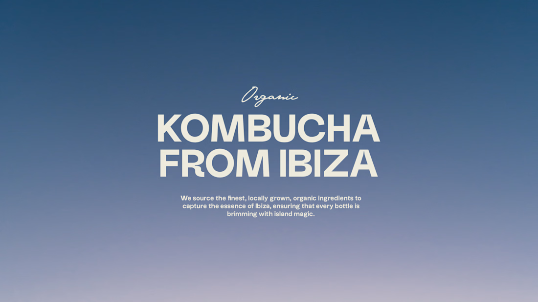
How do you rebrand in a market where everyone says the same thing? 🧠
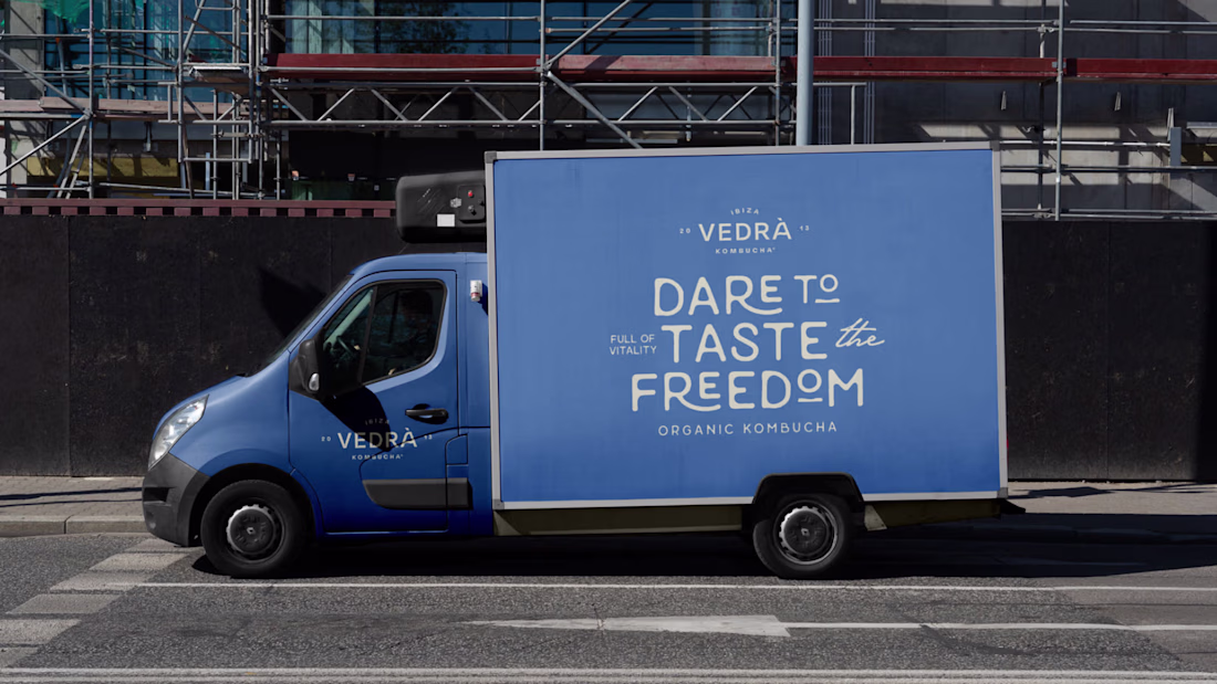
This Ibiza kombucha brand wanted to move beyond functional messaging. Inspired by Es Vedrà, the iconic island near Ibiza known for its magnetic energy, we created a brand identity that reflects the natural effervescence and vibrant spirit of kombucha. 🧚
3 key design decisions:
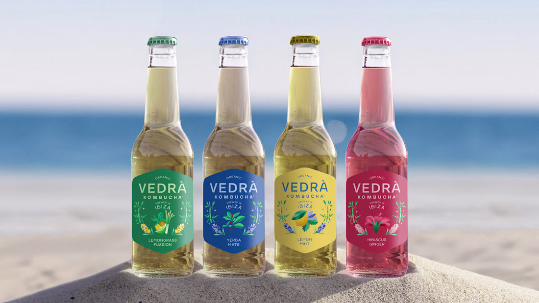
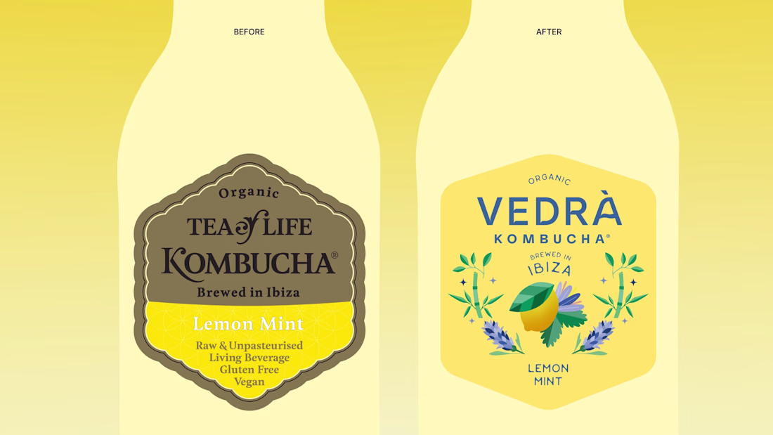
1. Label shape: Keeping a diamond-like label similar to the previous packaging to maintain a visual link with past.
2. Color system: Maintaining flavor color differentiation so returning customers can still easily recognize their favorite one.
3. Ingredient illustrations: A shared base of botanical elements across all bottles, with the center of the illustration highlighting the main flavor of each variant.
Would you have kept more from the original brand, or started fresh?
Makes me want to hit the beach 😍
Let's goooooo 🏖️
I love your choice of colour and mockups... Nice work
thank you!!
amazing work
thanks!
Very professional and creative work.
Thank you!
The way you honored the original label shape while elevating everything else is chef's kiss. That Vedrà color palette is stunning!
Thanks! The shape was very distinctive, so it felt like the right thing to highlight.
This is very unique, professional and clean
thanks!
Looks amazing! Such a smart rebrand!
Thank you! 🙌
Stylish!
thanks!
this is so beautiful!
thank you! 😍
This is really cool
thanks!
Looks good
Thanks Gregory!
nice
🫶
well done
thanks!
This is beautiful 🔥
thank you! 🙌
Attractive @Chantal Jemmott
thanks!
good
thank you!
This is awesome! Thanks for making it so clear and easy to understand! 😊
Thank you!
🤌
This look beautiful! You did a wonderful job
Thank you so much!
This is really strong. The shift away from functional messaging into emotional positioning makes a huge difference here.
We’ve been seeing the same thing when building comparison and affiliate-style brands. The ones that win don’t just list features, they create a feeling and a clear identity.
Thank you! I totally agree, once you move into emotional positioning, everything becomes much more distinctive and memorable.
@Chantal Jemmott I would have studied the conversion and success of the original brand and then decide how much of the original would I want to preserve in the rebranding design. And the second important consideration would have been to solve the pain points or challenge the brand is facing...
Completely agree! By understanding what was working and where the brand was constrained, it became clear we needed to move beyond functional messaging.
Love this rebrand! It gives it more of a lifestyle feeling. I love how this also feels like a great non-alcoholic choice for a beach day.
The network for creativity
Join 1.25M professional creatives like you
Connect with clients, get discovered, and run your business 100% commission-free
Creatives on Contra have earned over $150M and we are just getting started
Related posts
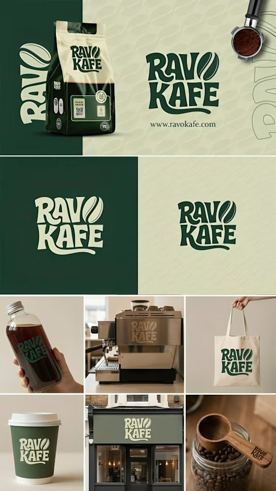
I designed this brand identity for Ravo Kafe using Figma, focusing on creating a warm, modern, and recognizable coffee brand.
The concept combines earthy green tones with soft beige to reflect a natural, premium, and calming coffee experience. The logo is bold and slightly organic, giving it a handcrafted feel while remaining clean and versatile across different applications.
I developed a cohesive visual system including packaging, takeaway cups, tote bags, storefront signage, and social-ready assets to ensure consistency across all brand touchpoints. The design is built to be scalable and easily adaptable for both physical and digital use.
The goal was to create a brand that feels inviting, memorable, and visually strong in a competitive coffee market.
wow looks cool
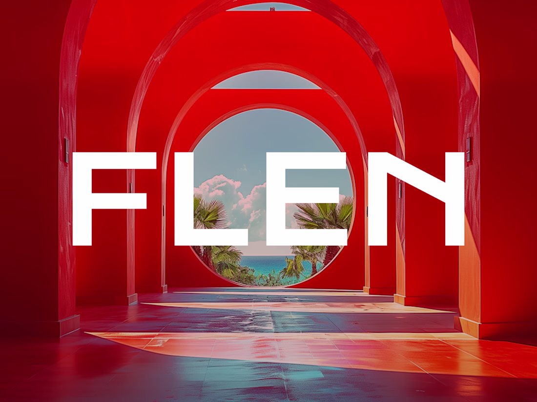
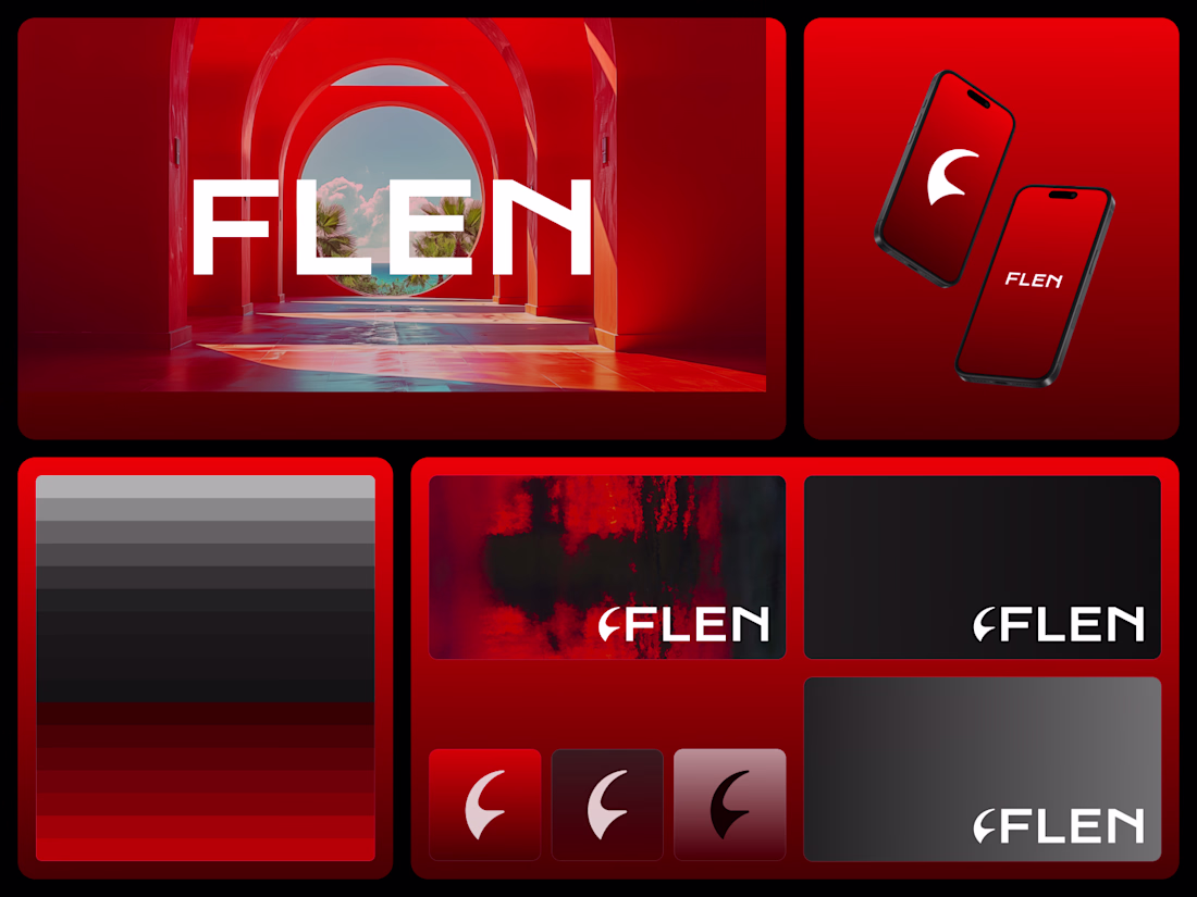
Flen A brand identity crafted for a running app. Bold, fast, and built to move. Available for new projects. Book me via my services.
Amazing! It feels very modern and intentional.
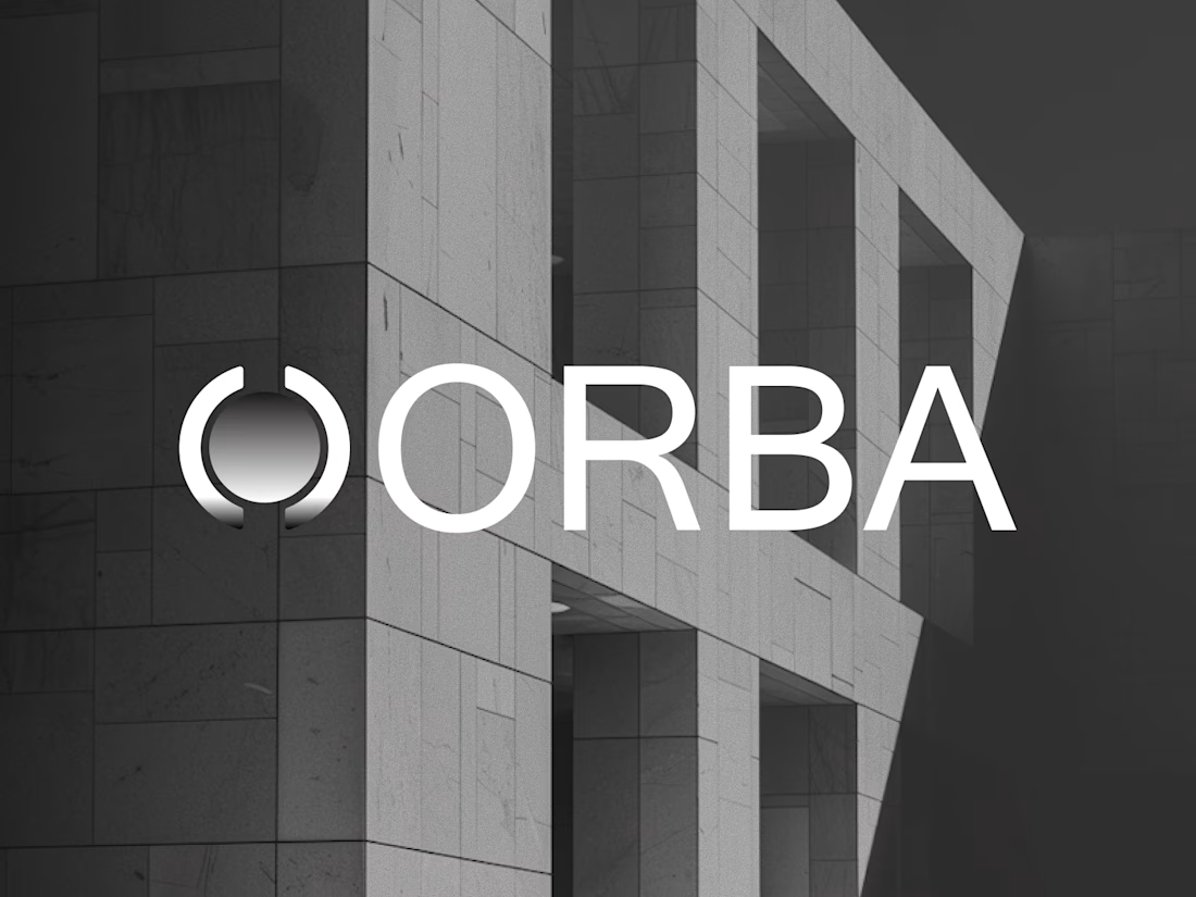
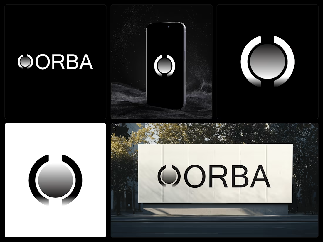
Orba A brand identity crafted for a cloud storage brand. Clean, global, and built for scale. Available for new projects. Book me via my services.
This is seriously impressive work. The attention to detail and level of execution stand out immediately. You’ve set a high standard here, well done.
Trending
Runway
AI video generation is exploding. What are you dreaming up in Runway?
Contra University
Learn from expert creatives how to earn more using next-gen AI tools.
creativeaiflow
Creative AI workflows are evolving. What tools do you use, and what are their strengths and weaknesses?
portfolioreview
The best portfolios tell a story, not just show a grid. Share yours for feedback.
freelancerlife
Freelancer life is wins, pivots, and everything in between. What’s yours right now?