The network for creativity
Join 1.25M professional creatives like you
Connect with clients, get discovered, and run your business 100% commission-free
Creatives on Contra have earned over $150M and we are just getting started
Back to feedPost
Taste Test

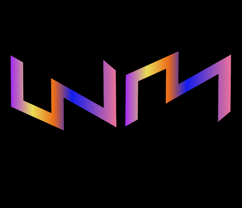
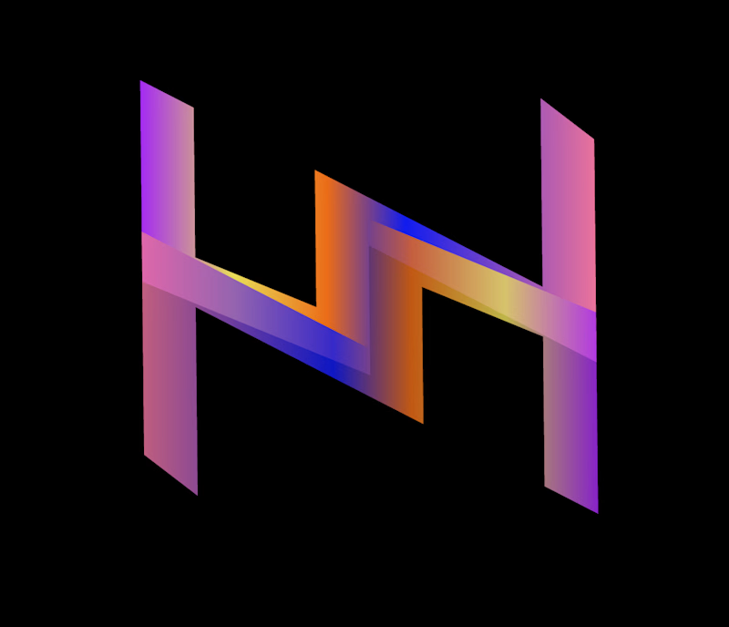
A masterclass in visual perception and negative space. This design plays with perspective to create a magical illusion: depending on how you look at it, the monogram seamlessly transforms and reveals both W and M in a single, unified geometric flow.
Built with sharp isometric angles, vibrant neon-to-sunset gradients, and a striking dark-mode contrast, this logo isn't just a brand mark—it's an interactive visual experience.
The Magic Factor: A single continuous form that tells two stories, symbolising versatility, interconnectedness, and modern innovation
0 voted
1%
0 voted
1%
0 votes
Closed
The network for creativity
Join 1.25M professional creatives like you
Connect with clients, get discovered, and run your business 100% commission-free
Creatives on Contra have earned over $150M and we are just getting started



Related posts


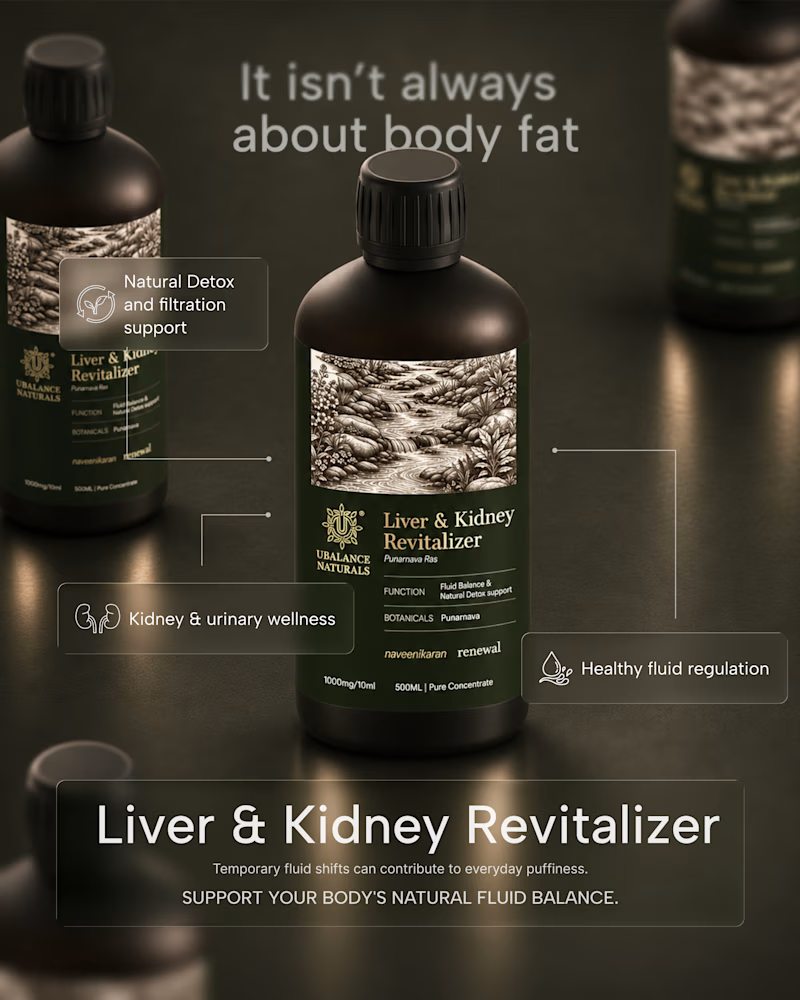
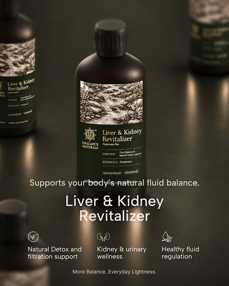
A quick exploration of two different directions for a wellness product ad.
One focuses on the product, while the other brings more attention to the product information.
These are early explorations, just to get a feel for the brand and its visual direction.
I’d love to hear your honest thoughts. Which direction feels more effective, and what would you improve?
1 voted
50%
1 voted
50%
2 votes
Closed

Honest take: the information-first direction wins for me. "It isn't always about body fat" is a proper hook — it speaks to the actual worry behind the product, so it stops the scroll. The product-first shot is gorgeous, but it reads more like a product page image than an ad. One...

How do you make a construction brand feel consistent from a business card to a building site?
Brixon’s identity brings angular lettering, an assembled geometric symbol, and a lime, black, and white palette together.
I carried those elements into stationery, brand guidelines, team identification, social graphics, and site signage, then brought the system into motion with Adobe After Effects.
The connecting decision: keep the geometry and layout structure consistent while the logo details, messages, and application previews change within the animated panels.
My contribution covered brand design, graphic design, and motion design.
What draws your attention first: the wordmark, the lime palette, or the rotating symbol?
See the full Brixon case study. If you’re shaping a construction or development brand, I’m available for brand identity and motion projects.

Incomparable work!


ESE GIN — Between the Dunes | Visual Identity & Packaging
ESE GIN draws its curves from the dunes. The signature S catches the light in sculpted olive glass and leaves its imprint in wax.


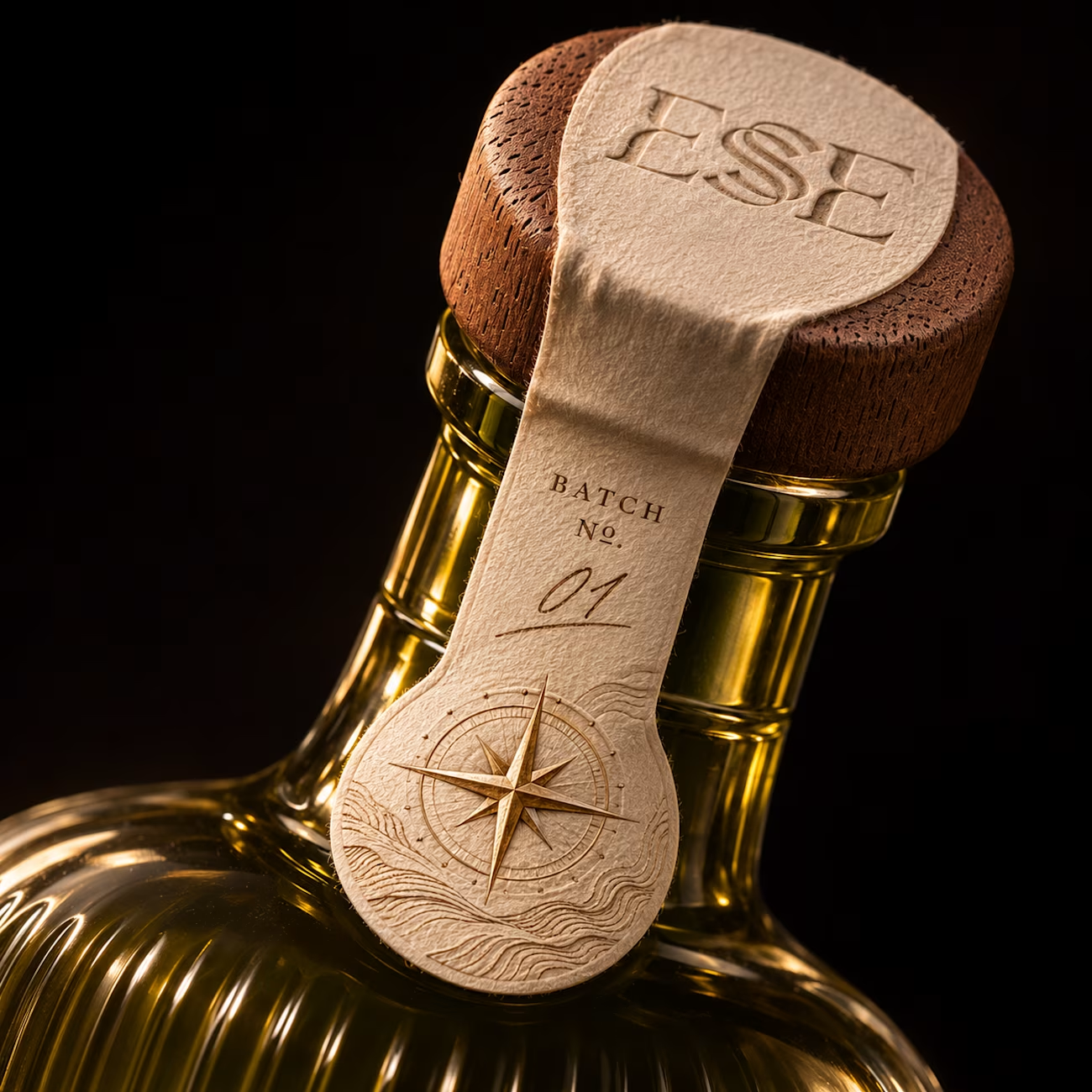
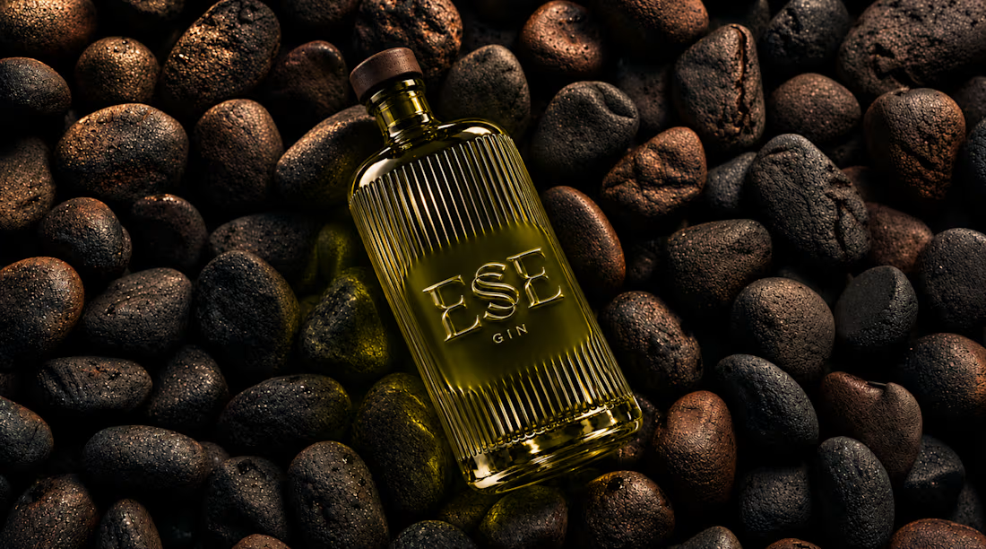
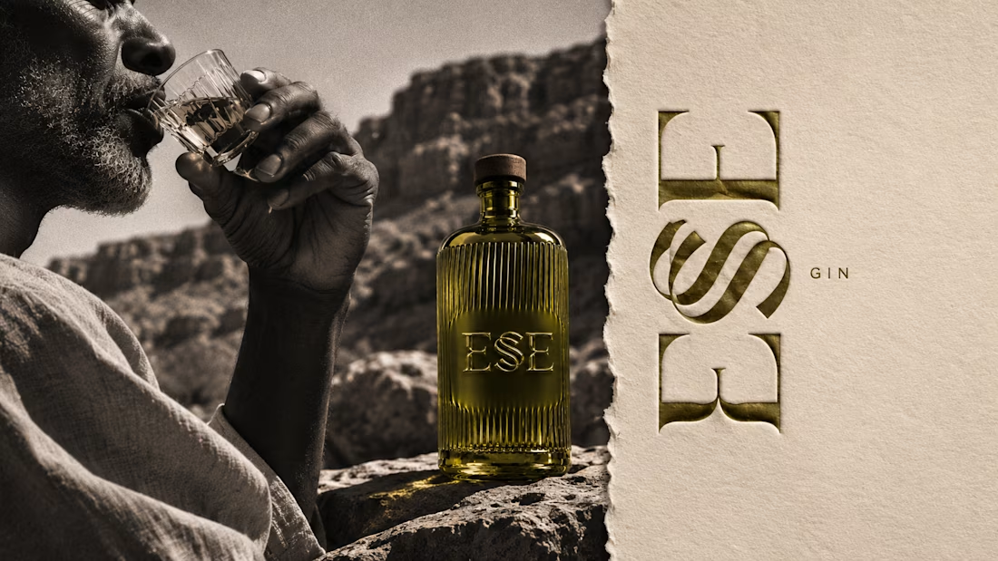
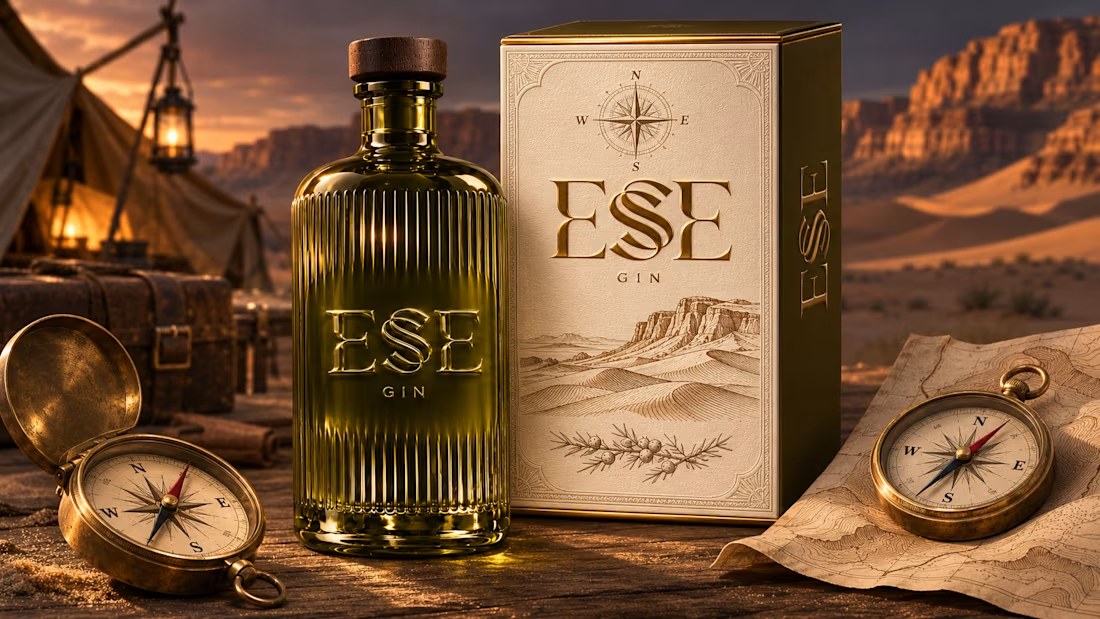
This is gorgeous, Maya — the sculpted olive glass with that S catching the light is such a clever way to carry the dunes into the bottle itself. And the wax seal imprint is a beautiful finishing touch, it gives the whole thing a crafted, almost apothecary feel. Really cohesive...