The network for creativity
Join 1.25M professional creatives like you
Connect with clients, get discovered, and run your business 100% commission-free
Creatives on Contra have earned over $150M and we are just getting started
Back to feedPost
How do you turn a sense into a symbol?
Sensorium is a luxury wellness brand from Dubai built around the connection between the senses, the body and emotional wellbeing.
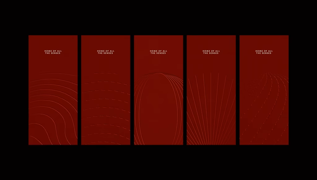
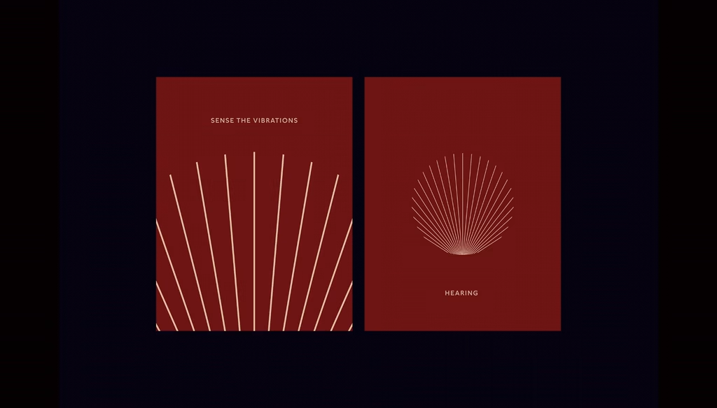
For this project, I created a visual language around the five senses, with a unique symbol for each one. Each symbol is built within the same circular structure, giving the elements shared proportions and a cohesive relationship, while keeping enough movement to work across different scales, textures and applications.
How important is visual cohesion to you when building or evaluating a brand system, and how do you approach it?

Good line work!

Thank you!

This is a beautiful way to turn an abstract sense into a system—the shared geometry makes the five symbols feel related without flattening their individual character. The balance between repetition and movement should give the identity a lot of range across touchpoints.
Thank you! That's the beauty of this kind of work, a challenge like representing the senses in a simple but intentional way is exactly the kind of exercise that pushes you creatively. Simple on the surface, a lot of thought underneath.

Good Work!
Thanks!

The shared circular structure is a smart system move. Keeping the proportions consistent across five different symbols means the whole set holds together even at a glance. That deep red is really fitting for a wellness brand that leans into ritual.
Thank you! Consistency across formats and sizes was non-negotiable here. Without it, each application would feel like a different brand, no clear recognition, no system.

Visual cohesion matters a lot to me too, a system falls apart fast if each piece feels like it was designed in isolation. Building all five marks on that same circular base was a smart constraint, which sense ended up being the hardest to translate into a symbol?
Exactly, in any brand element you have to consider the big picture. The hardest one for me was smell. When I think of a scent I think of that mist rising in the air, which is why the final mark has that sense of movement, it's the only one that isn't solid in color, it fluctuates.

The shared circular structure is doing the heavy lifting here, it's what lets five different symbols read as one system instead of five icons that just happen to share a project. For me cohesion usually comes down to a few repeated moves, consistent stroke weight, one recurring...
100% agree. Stroke weight and proportion were decisive for me too. And the circular structure wasn't really a separate decision, it came directly from the brand symbol and the world behind the strategy.

Nice balance

I looove your design style Chantal, genuinely!! You really do create awesome functional systems.
I really appreciate this Reda, comments like this keep me going. I value your support so much, let me know if there's ever anything I can help with 🙏🏽

Cohesion is the whole game for me. A system holds when a few moves repeat, one stroke weight, one construction grid, one set of proportions, so any new asset drops in without a redraw. Anchoring all five senses to a shared circular base is exactly that kind of constraint, and it...
Nothing better than a system that can grow without losing itself. 🙌

I test cohesion by taking things away: strip the colour, scale it to 16px, and if it still reads as one family then the structure was carrying it rather than the styling. The harder half of a five-senses set is usually smell and taste — sight and hearing arrive with ready-made...
Love that approach. The hardest one was smell, the final mark is inspired by a scent mist rising in the air, which is why it's the only one with movement. It doesn't close, it fluctuates.

Stunning work. How do the fine lines hold up at smaller screen sizes?
Thank you so much! As you can see in the image, the elements are applied quite large in context. If they ever need to work at smaller screen sizes the stroke and proportions are adjustable but these icons are just one part of the system. There are other brand elements strong enough to carry the identity on their own.


same circle structure for all five, smart

cohesion is basically everything for me, its what makes a brand feel like one voice instead of a bunch of nice pieces. locking every symbol into the same circular grid is such a smart move. and that oxblood palette feels so premium

Building all five inside the same circular structure is what makes it a system — cohesion comes from a shared constraint you can hand to someone else, not from the marks resembling each other.
Yeah and that's where a system really earns its place. Not just in what exists now but in what can come next without breaking anything.

Turning "sense" into symbol is one of the hardest briefs to nail — and this set does it without falling into the usual sensory-brand clichés. The linework feels calm and deliberate, and the deep red on black gives it real weight. Excellent system.

Impressive work
The network for creativity
Join 1.25M professional creatives like you
Connect with clients, get discovered, and run your business 100% commission-free
Creatives on Contra have earned over $150M and we are just getting started

Challenges
View all


Related posts

Outstanding 😊


“Or similar” leaves a lot to the imagination.
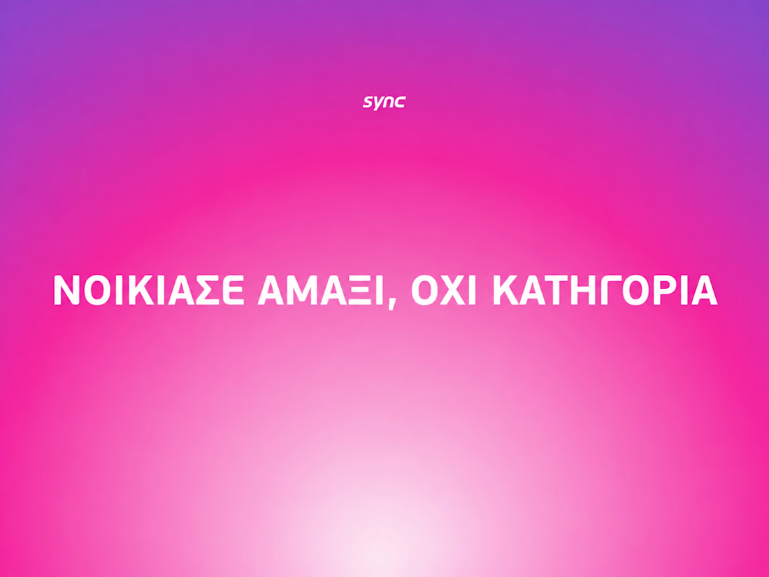
A few billboard designs I made for Sync as part of the rebrand. The campaign centres on a simple promise: the car you see is the car you drive.
I kept that message big and direct, with the cars up close and enough pink to make you look twice.

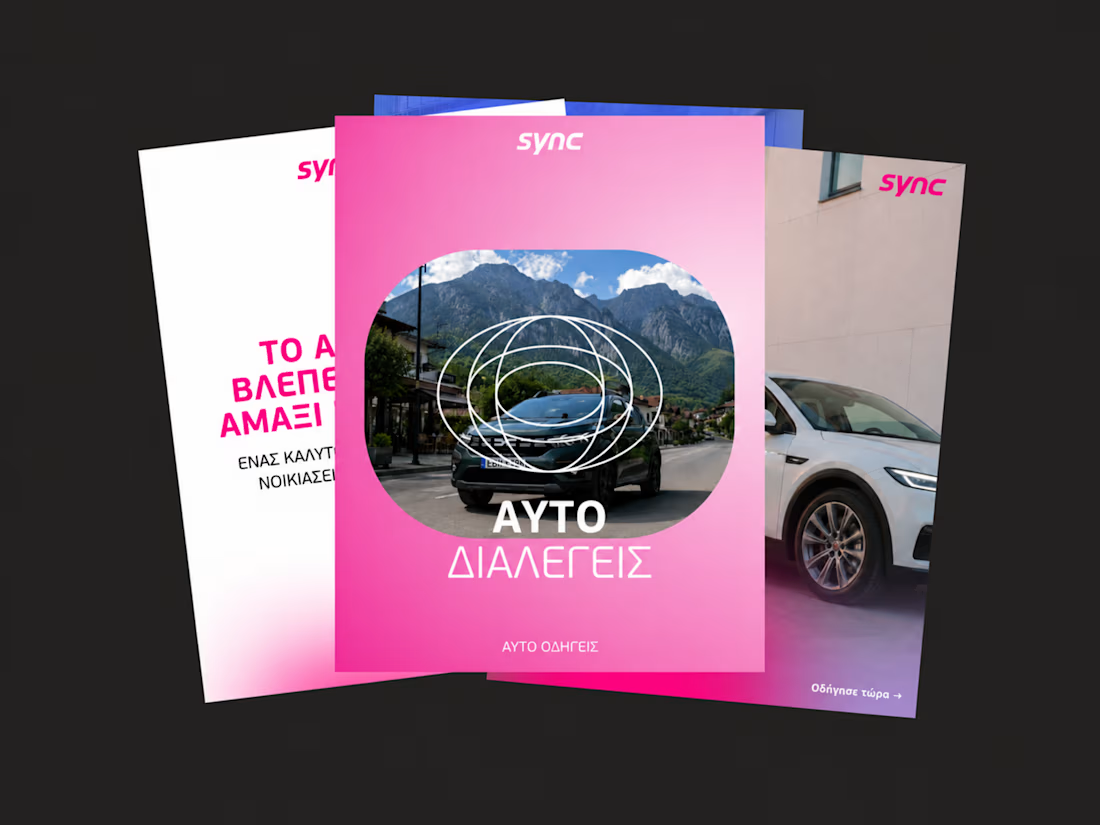
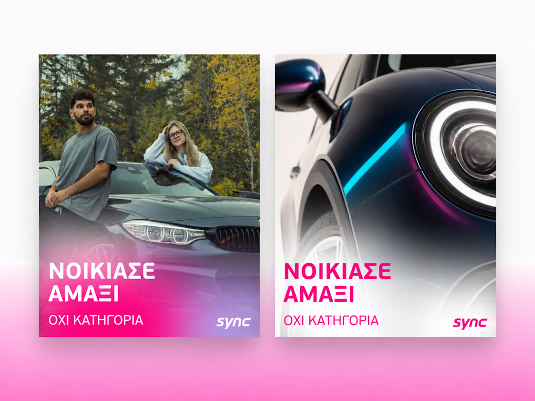
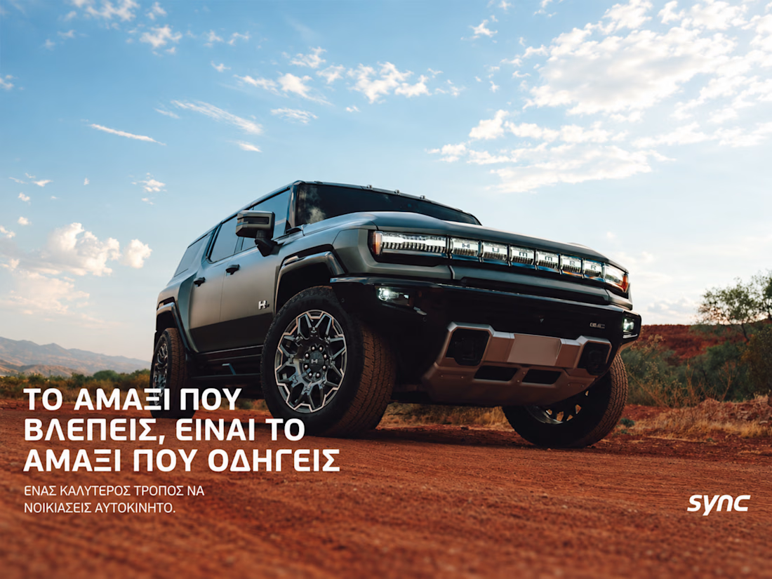
The way the oversized promise carries through the pink palette is really effective—the close-up crops make the car feel immediate without losing the campaign idea.


wow the UI is insane and the presentation is mindblowing