The network for creativity
Join 1.25M professional creatives like you
Connect with clients, get discovered, and run your business 100% commission-free
Creatives on Contra have earned over $150M and we are just getting started
Back to feedPost
Taste Test

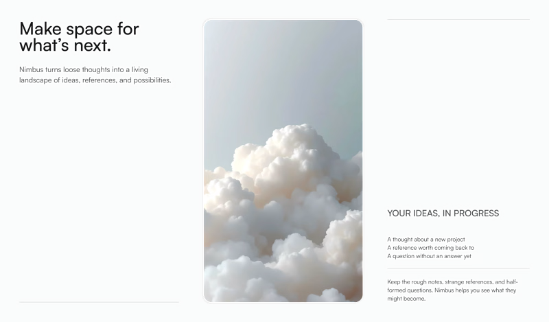
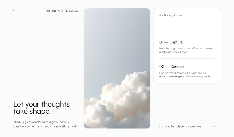
Exploring two ways to frame the same section for Nimbus — a creative workspace for collecting scattered thoughts, references, and unfinished ideas.
Which one would you choose for this section: Title Top Left or Title Bottom Left?
37 voted
45%
46 voted
55%
83 votes
Closed

I like the cards one more. But totally depends on the rest of the website

I believe title top is better since it has the main message so the time users will take to understand what this website all about is none but I love the description part of the second one which means title in top and description of the second one in the bottom is the best one in my personal opinion

Title bottom with card is more structured and well organized.

Top title looks nice 👍


title bottom + card for me

I like Title Top


Title bottom + card🔥

Title top one stand out more

Title bottom plus card looks a lot better

Mind blowing work

Seems like you uploaded transparent background images, so I can only appreciate the small thumbnails. I would combine the two. Heading should be at the top, and the white card is a nice structural accent.


Outstanding work !

TItle Top

I prefer the card one. The composition feels more refined.

I think having the title at the top is easier to read. The diagonal layout creates a clear visual hierarchy, guiding the eye naturally from top to bottom. Nice work!

Great comparison! I'd go with "Title Bottom" too — it feels more natural to read, the eye flows from the visual straight into the message. "Title Top" feels a bit more conventional/safe in comparison. Nice exploration! 🙌


Title Bottom card looks very eye-catching and easy to digest.
The network for creativity
Join 1.25M professional creatives like you
Connect with clients, get discovered, and run your business 100% commission-free
Creatives on Contra have earned over $150M and we are just getting started








Related posts


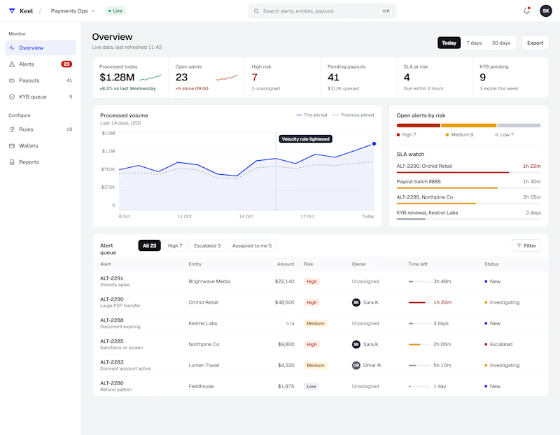
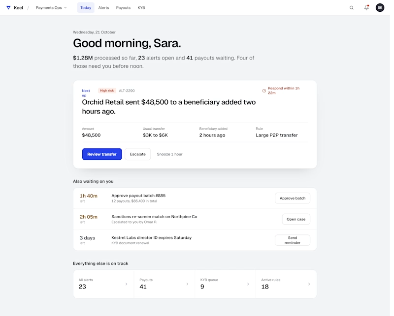
Same data, two layouts. Comment A or B
2 voted
50%
2 voted
50%
4 votes
Closed

Both are fantastic. Rather than choosing have you though to offer them as toggles "focus first" to clear urgent tasks and "all in one" to track overall progress.


What do you guys think? Which one do you think would be the best option? Honestly, my personal favorite is the first one, but I’d love to hear your thoughts and opinions too! Let me know which one you like the most.
2 voted
29%
5 voted
71%

7 votes
Closed

Ye le Jani tere wali post ke liye — Umer ki post pe comment karne ke liye:
I’d go with the first one too! The realistic photo on green background feels more trustworthy and professional for Contra, especially for client work. The illustrated one is cool and stylized but the...

Two 10-second vertical spots for Zest, a wake-up pill brand.
The idea was simple: show the energy inside the capsule. The first spot is the product reveal. The pouch rises on a glowing platform, the capsule lights up, a burst of energy races down a neon tunnel, and it lands on the hero shot with the pouch, capsule and jar. The second spot stays close on the capsule as it splits into a cloud of red and gold beads, then pulls back together, charged with blue energy.
Look and feel: a dark, cool-blue setting with Zest’s orange so the product stands out. Clean, premium and built for Reels, TikTok and Shorts.
4 voted
100%
0 voted
0%
4 votes
Closed

Option 1 Hits better to me 🔥🔥