The network for creativity
Join 1.25M professional creatives like you
Connect with clients, get discovered, and run your business 100% commission-free
Creatives on Contra have earned over $150M and we are just getting started
Back to feedPost
Taste Test
What do you guys think? Which one do you think would be the best option? Honestly, my personal favorite is the first one, but I’d love to hear your thoughts and opinions too! Let me know which one you like the most.
2 voted
29%

5 voted
71%

7 votes
Closed

I'll back you on Option 1. The illustrated look has more personality than the photo crop, and it will read better at avatar size too. What are you using these for, a profile or something client facing?


Appreciated your words man, BTW This is for my personal freelance Career 😁

Option 2 looks professional🔥🔥
Thanks Moamen Appreciated

Option 2 for me. The photo feels more personal and trustworthy for client work.


option 1, the illustrated one. more memorable at small size
Yess. I also live the first one because it's look so cool
The network for creativity
Join 1.25M professional creatives like you
Connect with clients, get discovered, and run your business 100% commission-free
Creatives on Contra have earned over $150M and we are just getting started



Related posts

Choose your product hero shot
2 voted
29%
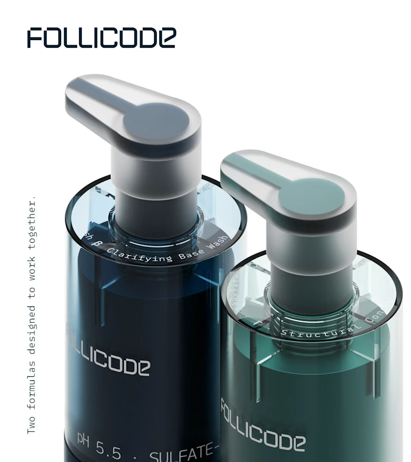
5 voted
71%
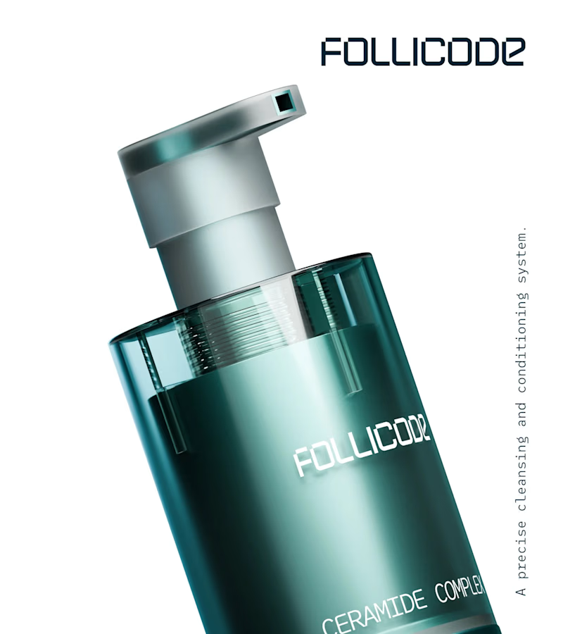
7 votes
Closed

Option 2 for me. The single bottle has room to breathe and the FOLLICODE branding reads instantly — it feels like a proper hero. Option 1 is nice for showing the system, but the two bottles compete with each other and the label gets a bit lost in the dark. I'd run Option 2 as...

Which Infographic is More Visually Appealing and attractive?
1 voted
100%
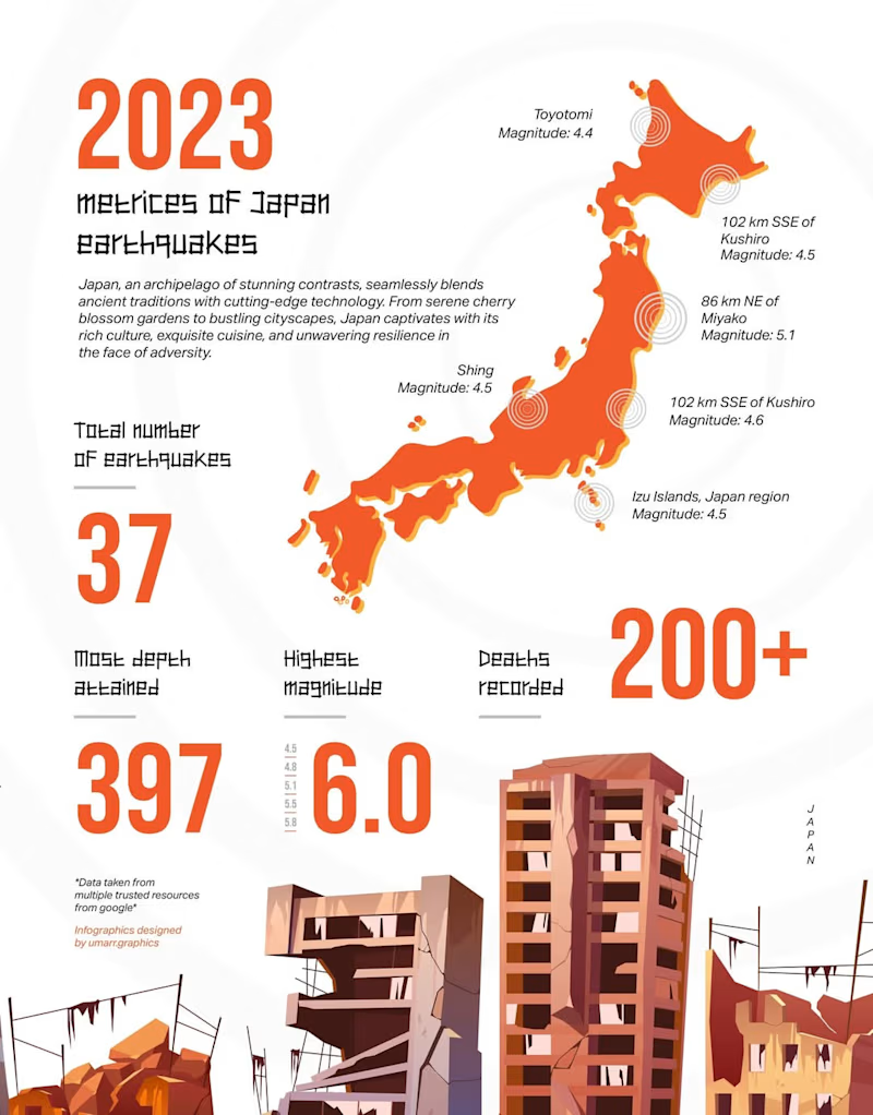
0 voted
0%
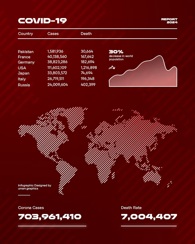
1 vote
Closed

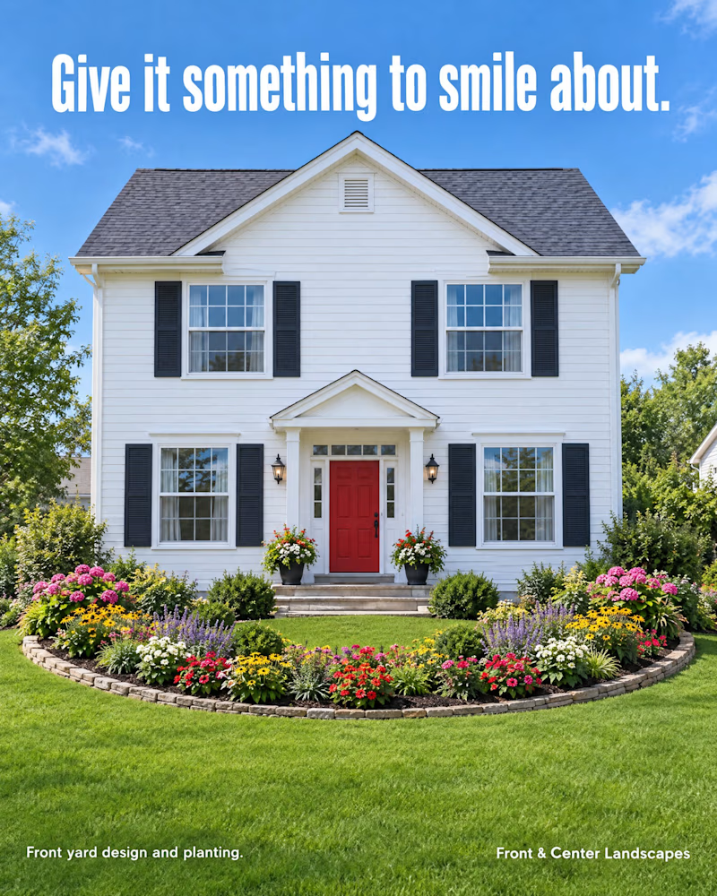
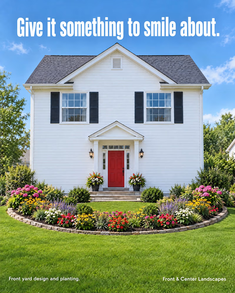
Which house is smiling at you?
Same house. Same flower-bed smile.
One change between A and B.
Vote, then tell me what you spotted.
I'll share which one I picked, and why, when the vote closes.
PS: This is a concept for a made-up landscaping brand, not a client project.
0 voted
1%
0 voted
1%
0 votes
Closed