The network for creativity
Join 1.25M professional creatives like you
Connect with clients, get discovered, and run your business 100% commission-free
Creatives on Contra have earned over $150M and we are just getting started
Back to feedPost
Taste Test

Which hero layout works better for a modern healthcare website — A or B? 👇
I’m exploring two landing page directions for a healthcare website focused on trust, clarity, and patient conversion.
Option A: Clean and minimal with a strong central call-to-action.
Option B: A more informative layout with a patient trust card, credibility indicators, and social proof integrated into the hero section.
My goal was to create a healthcare experience that feels professional, compassionate, and easy to navigate, while helping users quickly take action.
Designed in Figma with a focus on visual hierarchy, accessibility, and conversion-focused UX.
If you were choosing a direction for a healthcare brand, which one would you pick — A or B?


3 voted
75%
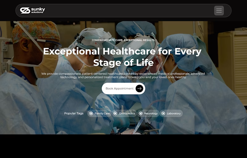
1 voted
25%
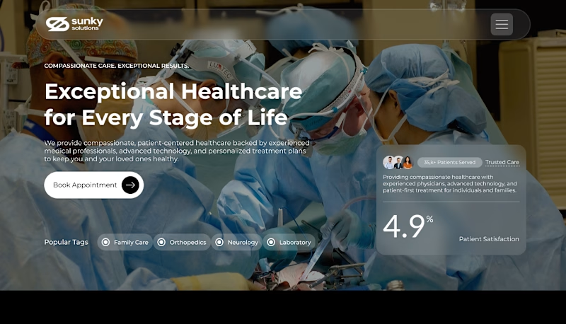
4 votes
Closed


Clean one


Option B. The trust card gives patients a faster reason to believe the page, but I'd keep one clear booking action so the extra proof doesn't slow them down.
The network for creativity
Join 1.25M professional creatives like you
Connect with clients, get discovered, and run your business 100% commission-free
Creatives on Contra have earned over $150M and we are just getting started
Trending

Claude
Claude has entered the design space. How are you using it?

Contra University
Learn from expert creatives how to earn more using next-gen AI tools.
Brand Design
The best brand designers are on Contra. Scroll to see what's trending in brand design. What are you building?
creativeaiflow
Creative AI workflows are evolving. What tools do you use, and what are their strengths and weaknesses?
freelancerlife
Freelancer life is wins, pivots, and everything in between. What’s yours right now?



Related posts

I’m exploring two homepage hero directions for a Lumena Health concept and testing which one feels stronger for a preventive healthcare brand.
Both directions focus on the same core message: healthcare built around prevention, not reaction.
Direction 1 feels more warm, human, and consultation-focused.
The large lifestyle image creates a clear patient/provider moment right away, which helps the experience feel personal and trustworthy.
Direction 2 feels more premium, editorial, and brand-driven.
The dark green background, centered headline, and image collage make the page feel more elevated and visually distinctive.
Direction 1: personal, warm, trust-focused
Direction 2: premium, editorial, brand-forward
Which direction feels stronger for a preventive healthcare website?
25 voted
40%
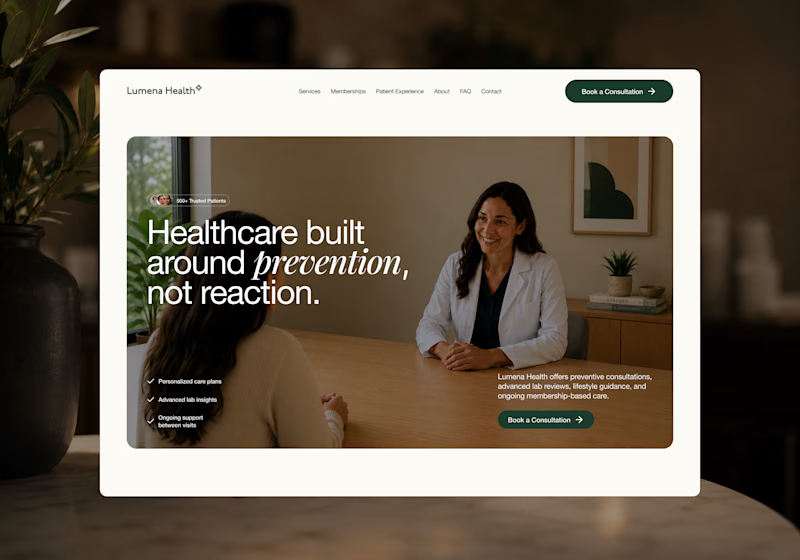
37 voted
60%
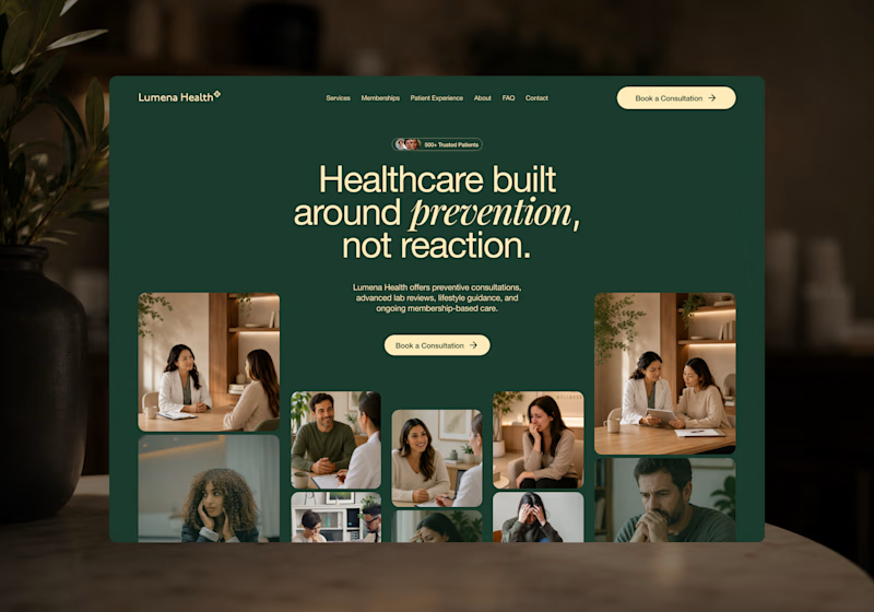
62 votes
Closed

Direction 1's consultation-focused warmth feels like it'll convert better for anxious first-time patients, but Direction 2's premium editorial feel might build more trust with referral sources. Did you already have a lean going in, or are you genuinely torn?

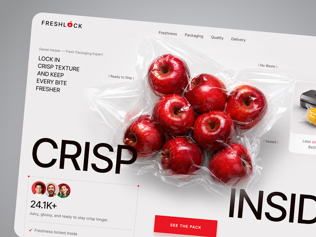
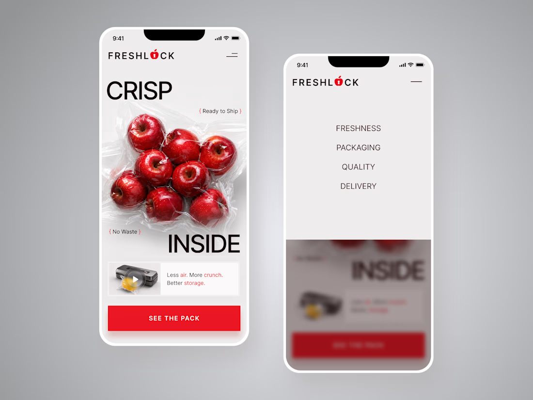
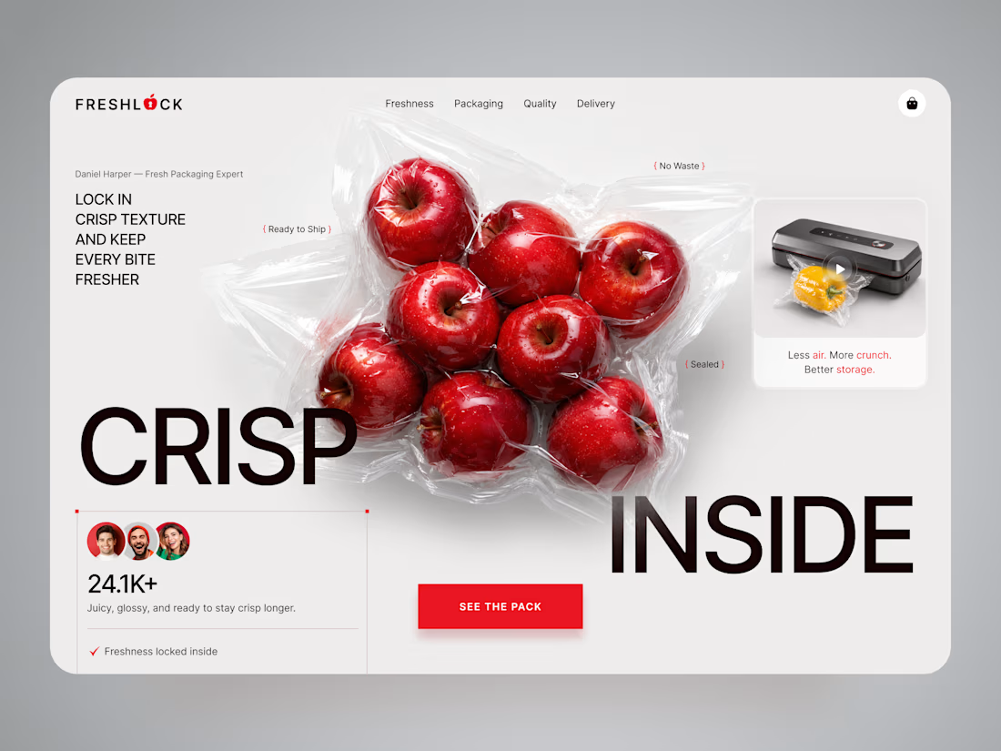
FreshLock — Food Packaging Landing Page Design 🍎📦
FreshLock is a modern landing page concept created for a food packaging brand focused on preserving freshness, reducing waste, and presenting innovative packaging solutions through a clean digital experience.
The goal was to communicate product benefits instantly while making the website feel fresh, premium, and trustworthy. The visual direction combines bold typography, minimal layouts, realistic product imagery, and vibrant red accents to create a strong first impression while keeping the focus on the product.
Special attention was given to:
• a product-first hero section that immediately highlights freshness and packaging quality;
• clean visual hierarchy that makes key messages easy to scan;
• responsive desktop and mobile layouts optimized for every device 📱;
• trust-building elements showcasing product quality, freshness, and customer confidence;
• bold CTAs that encourage users to explore the product and learn more;
• a minimal interface that lets the packaging and product visuals become the center of attention;
• a scalable landing page design suitable for future product launches and marketing campaigns.
The result is a modern, conversion-focused landing page that helps communicate product value, strengthens brand credibility, and creates an engaging experience from the very first screen ✨
Looking to create a modern landing page for your food, packaging, FMCG, or consumer product brand? Let's build something fresh together 🚀



🔥 🔥 🔥

Most LinkedIn templates are just a pile of designs. I'm building a system.
A library of pre-designed LinkedIn posts you can easily customise to match your own brand.
One Figma file:
✓ 48 post templates
✓ 7 types of carousels
✓ 12 landscape posts
✓ profile banners
✓ 50 written hooks
✓ step-by-step setup and a help page
Type your name once, set your colors and fonts: every post updates.
I'm planning to finish the digital product this week.
For companies, I'll also offer a fully custom version: I rebuild the entire system in your own branding, including ready-to-use posts in your tone of voice and hooks for your niche.
Is this something you'd actually use?

Yes, honestly, the type-your-name-once-and-every-post-updates part is the sell for me, that's usually where these template packs fall apart. My guess is the custom version ends up being where the real money is, not the self serve file. Does that track with what you're seeing so far?