The network for creativity
Join 1.25M professional creatives like you
Connect with clients, get discovered, and run your business 100% commission-free
Creatives on Contra have earned over $150M and we are just getting started
Back to feedPost
Taste Test

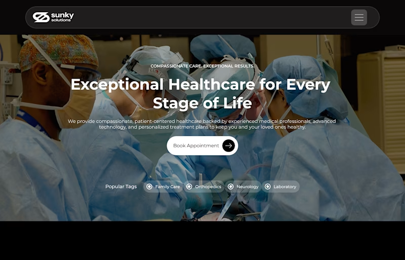
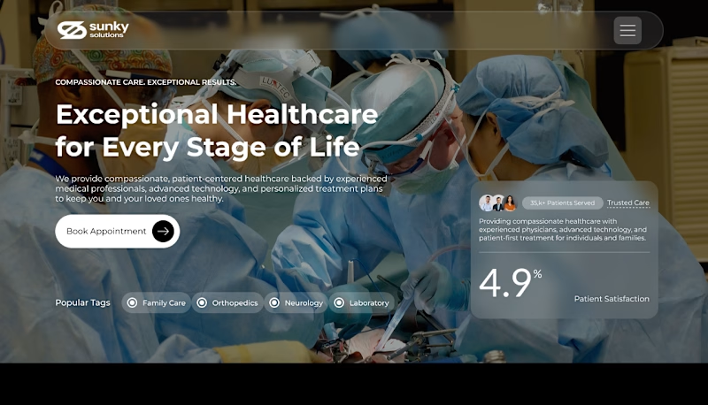
Which hero layout works better for a modern healthcare website — A or B? 👇
I’m exploring two landing page directions for a healthcare website focused on trust, clarity, and patient conversion.
Option A: Clean and minimal with a strong central call-to-action.
Option B: A more informative layout with a patient trust card, credibility indicators, and social proof integrated into the hero section.
My goal was to create a healthcare experience that feels professional, compassionate, and easy to navigate, while helping users quickly take action.
Designed in Figma with a focus on visual hierarchy, accessibility, and conversion-focused UX.
If you were choosing a direction for a healthcare brand, which one would you pick — A or B?


3 votes
Ends in 20h

Option B. The trust card gives patients a faster reason to believe the page, but I'd keep one clear booking action so the extra proof doesn't slow them down.

The network for creativity
Join 1.25M professional creatives like you
Connect with clients, get discovered, and run your business 100% commission-free
Creatives on Contra have earned over $150M and we are just getting started



Trending

Claude
Claude has entered the design space. How are you using it?

Contra University
Learn from expert creatives how to earn more using next-gen AI tools.
Brand Design
The best brand designers are on Contra. Scroll to see what's trending in brand design. What are you building?
creativeaiflow
Creative AI workflows are evolving. What tools do you use, and what are their strengths and weaknesses?
freelancerlife
Freelancer life is wins, pivots, and everything in between. What’s yours right now?
Related posts


The “mobile-first” approach is no longer an option.
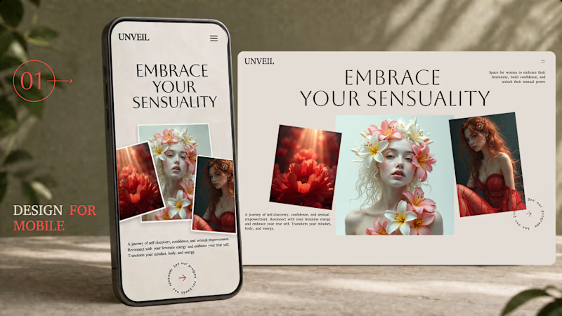
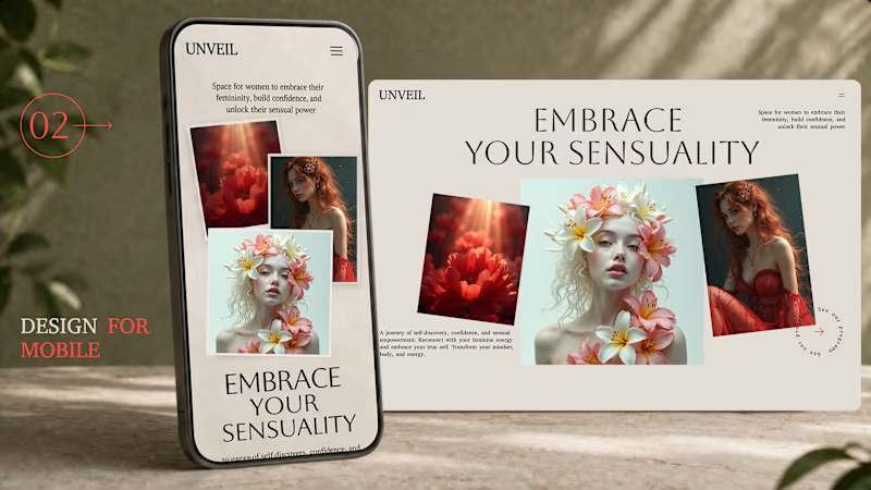
A beautiful design for desktop computers does not automatically guarantee an excellent mobile experience. Good responsive design isn’t just about resizing elements to fit the screen; it’s about ensuring they function effectively.
In this comparison, both versions are based on an identical desktop layout. The only difference lies in how the content is adapted for smaller screens.
In one version, everything is simply scaled down.
In the other, the hierarchy, spacing, and composition have been reimagined to meet the needs of mobile users.
Now it’s your turn. 👇
Which mobile version would you choose – 01 or 02? Tell us why in the comments.

56 voted
52%
52 voted
48%
108 votes
Closed

1 🙌

🚀 Design Challenge — Which Concept Wins? 👀
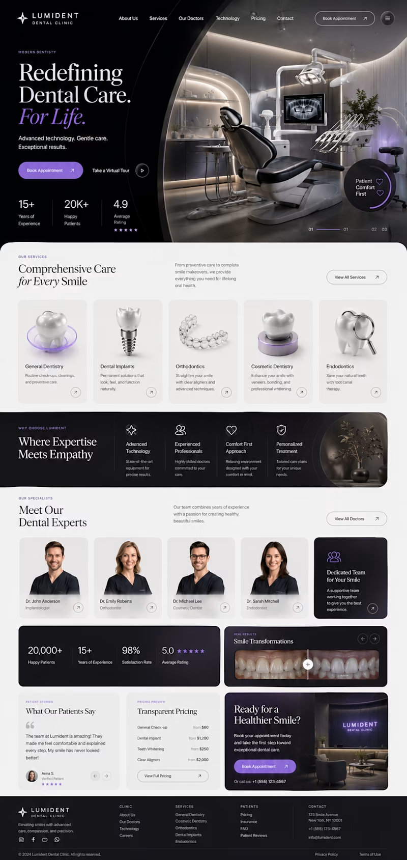
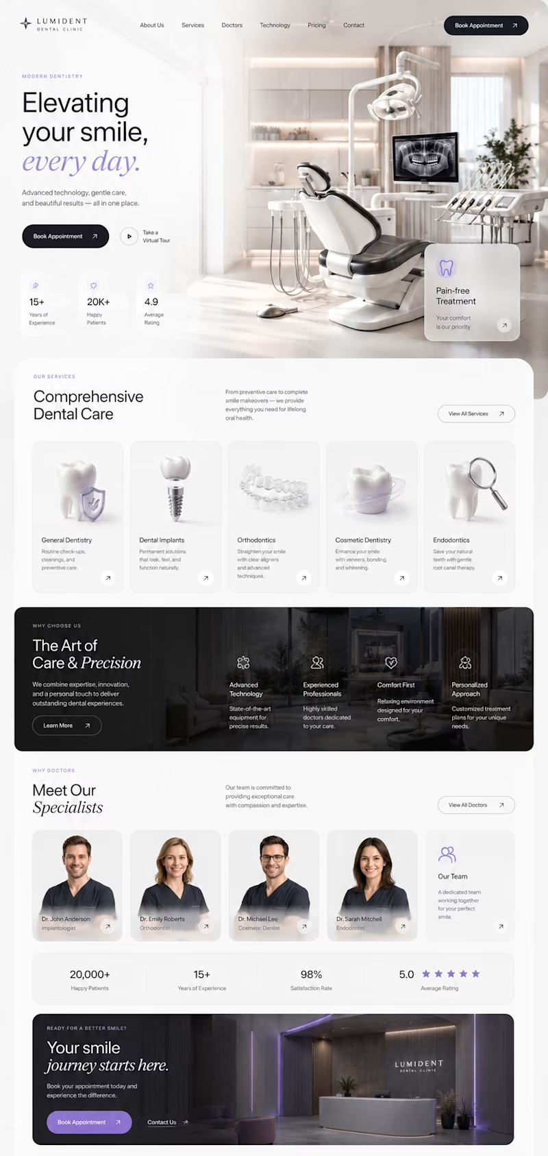
I've been exploring two different directions for a premium dental clinic website, both designed from scratch with a focus on modern UI, clean UX, and strong visual storytelling.
🦷 Concept A
✨ Bold editorial layout
✨ Minimal luxury aesthetic
✨ Large typography
✨ Premium 3D visuals
✨ High contrast & cinematic feel
VS.
🦷 Concept B
🌿 Bright and elegant
✨ Spacious composition
✨ Softer premium look
✨ Modern cards & subtle glass effects
✨ Clean, approachable experience
Both concepts are aimed at creating trust while feeling distinctive—not like another generic medical website.
👇 Which one would you choose and why?
A or B?
Your feedback will help shape the final direction. 💜

4 voted
27%
11 voted
73%
15 votes
Closed

Concept A's dark cinematic mode feels premium but might read as a little intimidating for a dental site, patients usually want reassurance over drama. Was this tested with actual patient personas or is it more of a portfolio exploration?

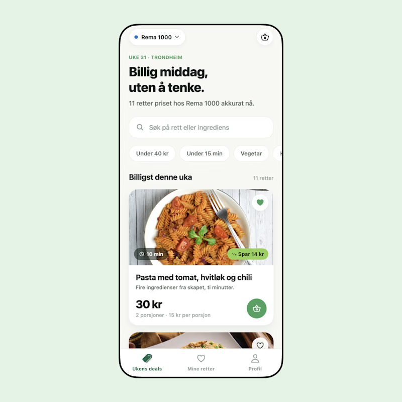
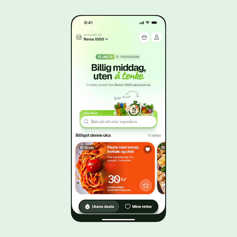
Which one do you guys think would work as a real-world app with daily use?
7 voted
21%
27 voted
79%
34 votes
Closed

The redesign looks cool and modern. But for daily use the dark cards feel a bit heavy making them lighter would give you the best of both worlds. Did you test how easy it is to read on the go?