
Ilia Ignatiev
Premium Tilda Developer | High-converting websites for start
New to Contra
Ilia is building their profile!
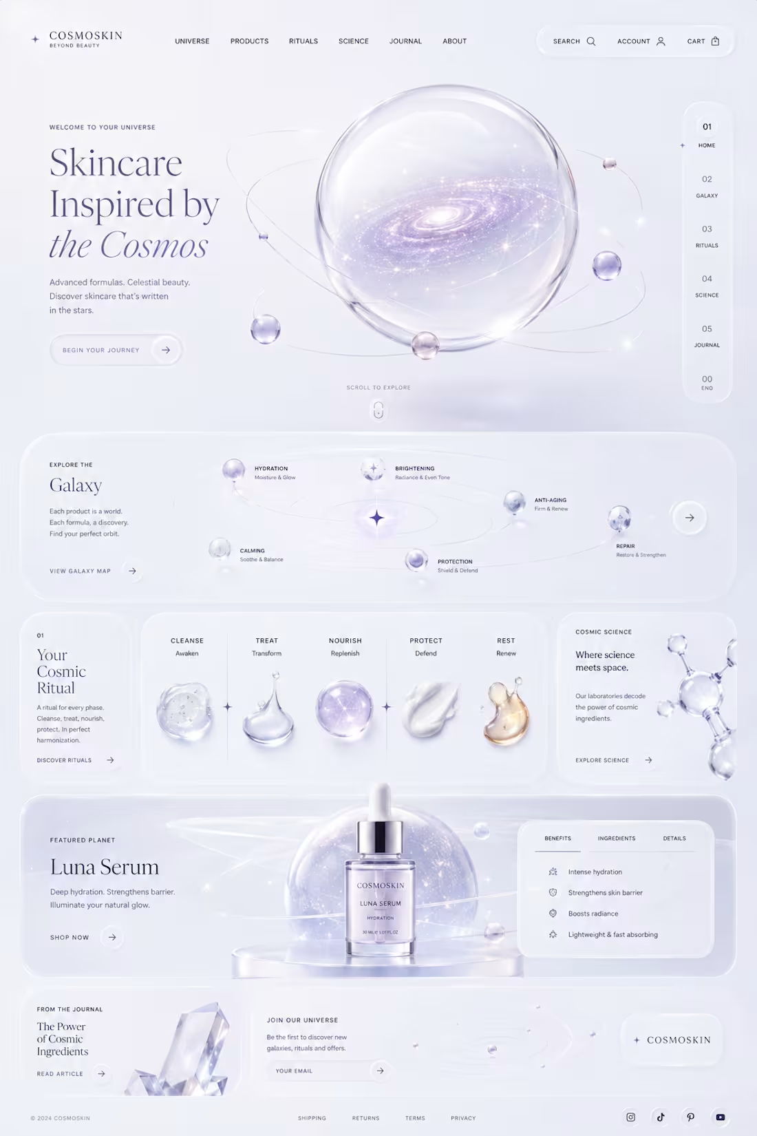
✨ COSMOSKIN — Where Skincare Meets the Universe 🌌
Every great product deserves an unforgettable experience. So I reimagined a skincare brand as an entire universe — where every serum is a planet, every ingredient is a constellation, and every skincare ritual becomes a journey through the cosmos. 💫
Instead of creating another ordinary landing page, I focused on storytelling, emotion, and interaction. Clean luxury aesthetics, liquid glass effects, soft gradients, premium typography, and a futuristic user experience come together to create a brand that feels truly unforgettable. 🤍
🚀 Project Highlights:
• Space-inspired luxury skincare concept
• Minimalist UI with liquid glass aesthetics
• Interactive galaxy-inspired navigation
• Product ecosystem designed as planets & constellations
• Premium art direction & modern visual language
• Designed to stand out on Awwwards & Behance
Looking for a unique website that people will actually remember? Let's build something extraordinary together. ✨
#WebDesign #UIDesign #UXDesign #Figma #CreativeDesign #LuxuryBrand #Skincare #CosmicDesign #Glassmorphism #LandingPage #Awwwards #Behance #Contra #Portfolio
4
42
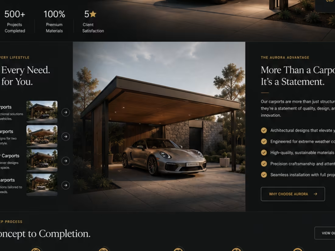
🚧 Design Concept Comparison
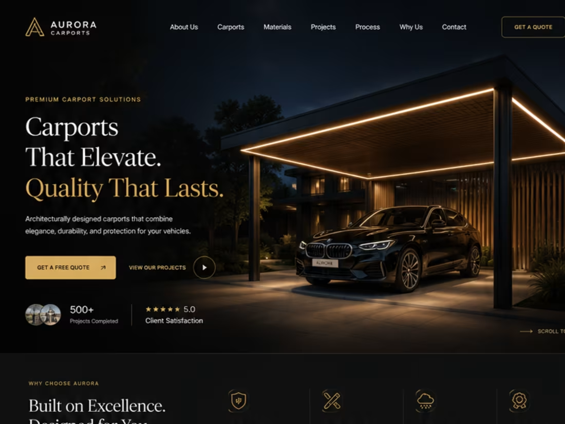
I created two homepage concepts for a premium carport construction company. Both target the same audience but use different design strategies.
🅰️ Concept A
• Bold, modern design
• Large immersive hero
• Product-first approach
• Premium craftsmanship
• Strong visual impact
🅱️ Concept B
• Structured and informative
• Customer-focused flow
• Trust and process first
• Completed projects
• Clean premium aesthetic
Both achieve the same goal in different ways.
👇 Which would you choose?
🅰️ Concept A
🅱️ Concept B
Share your choice and why in the comments. Your feedback is appreciated! 🚀
1
5
241
🚧 Design Concept Comparison
I created two homepage concepts for a premium carport construction company. Both target the same audience but use different design strategies.
🅰️ Concept A
• Bold, modern design
• Large immersive hero
• Product-first approach
• Premium craftsmanship
• Strong visual impact
🅱️ Concept B
• Structured and informative
• Customer-focused flow
• Trust and process first
• Completed projects
• Clean premium aesthetic
Both achieve the same goal in different ways.
👇 Which would you choose?
🅰️ Concept A
🅱️ Concept B
Share your choice and why in the comments. Your feedback is appreciated! 🚀
1
5
241
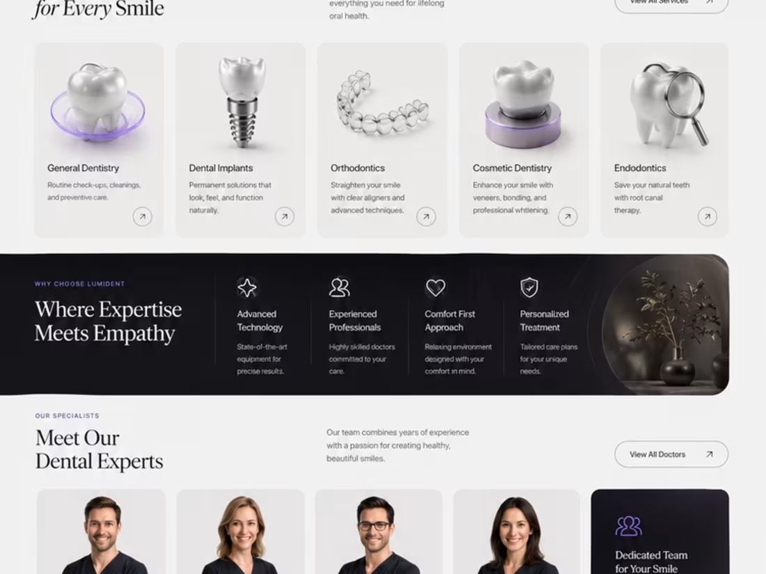
🚀 Design Challenge — Which Concept Wins? 👀
I've been exploring two different directions for a premium dental clinic website, both designed from scratch with a focus on modern UI, clean UX, and strong visual storytelling.
🦷 Concept A
✨ Bold editorial layout
✨ Minimal luxury aesthetic
✨ Large typography
✨ Premium 3D visuals
✨ High contrast & cinematic feel
VS.
🦷 Concept B
🌿 Bright and elegant
✨ Spacious composition
✨ Softer premium look
✨ Modern cards & subtle glass effects
✨ Clean, approachable experience
Both concepts are aimed at creating trust while feeling distinctive—not like another generic medical website.
👇 Which one would you choose and why?
A or B?
Your feedback will help shape the final direction. 💜
7
14
394