The network for creativity
Join 1.25M professional creatives like you
Connect with clients, get discovered, and run your business 100% commission-free
Creatives on Contra have earned over $150M and we are just getting started
Back to feedPost
📊 AI-Powered Sales Dashboard | Project Completed
I’ve successfully completed this AI-assisted Sales Data Visualization project, transforming raw sales data into a clear, decision-ready dashboard.
✅ What this dashboard delivers:
Business-focused KPIs (Sales, Profit, Quantity, Discount)
Segment, Region, State & Category-wise performance analysis
Clean, modern, client-friendly visual layout
Easy insights for fast business decisions
🧠 My Role & Skills:
Data cleaning & structuring
KPI identification & analysis
AI-assisted data visualization
Dashboard design & data storytelling
📌 This project is fully completed and ready for real-world business use.
I don’t just visualize data — I turn data into business decisions.


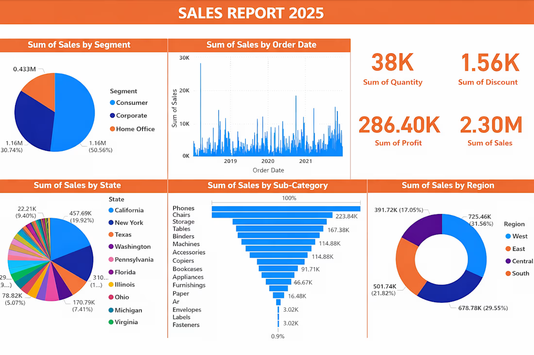

This is exactly how sales dashboards should be built—decision first, visuals second. Clear KPIs, strong segmentation, and a client-friendly layout make this genuinely usable, not just impressive.
What stands out most is the focus on actionability: turning raw sales data into...

Thank you so much—really appreciate the thoughtful feedback. The goal was exactly that: designing with decisions in mind, not just visuals. Glad it resonated.
Glad to hear that. Designing with decisions in mind always shows in the final outcome. Wishing you many more projects where clarity drives impact—keep going.
Thank you so much

Really solid dashboard work — I like how you focused on decision-ready KPIs instead of just visuals. The segmentation and regional breakdown make it very practical for real business use. Great example of data storytelling done right.
Thank you very much for the kind feedback. The goal was to keep the dashboard decision-focused and business-ready, so I’m glad the KPI structure and segmentation came across clearly.
The network for creativity
Join 1.25M professional creatives like you
Connect with clients, get discovered, and run your business 100% commission-free
Creatives on Contra have earned over $150M and we are just getting started

Challenges
View all


Related posts


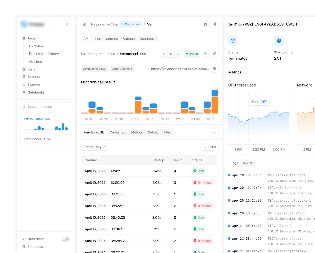
ultra-complex analytics dashboard

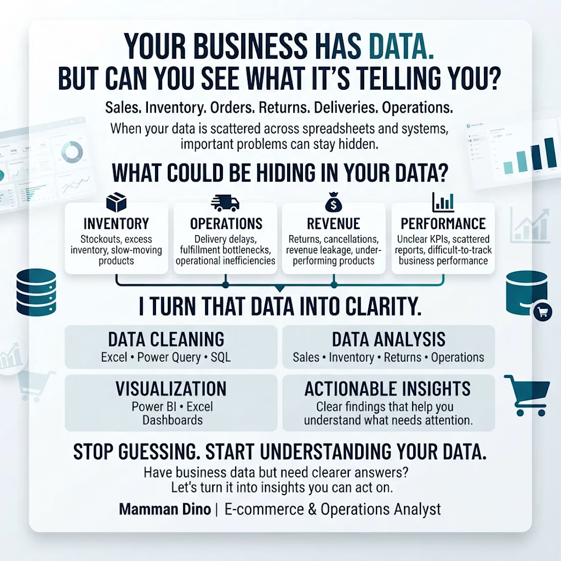
Your business is generating data every day.
But can you quickly answer:
📦 Which products are at risk of stockouts?
🚚 Where are delivery and fulfillment problems happening?
💰 Which products or processes are affecting revenue?
📊 Which numbers actually need your attention?
That’s where I come in.
I help e-commerce and operations businesses clean, analyze, and visualize their data using Excel, Power Query, SQL, and Power BI.
The goal isn't just another dashboard.
It’s clearer answers, better visibility, and insights you can act on.
If your business has data but you're struggling to turn it into decisions, let's talk.
#Ecommerce #Operations #DataAnalytics #PowerBI #SQL #Excel #BusinessIntelligence

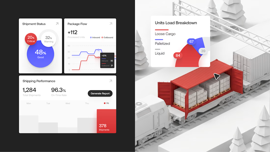
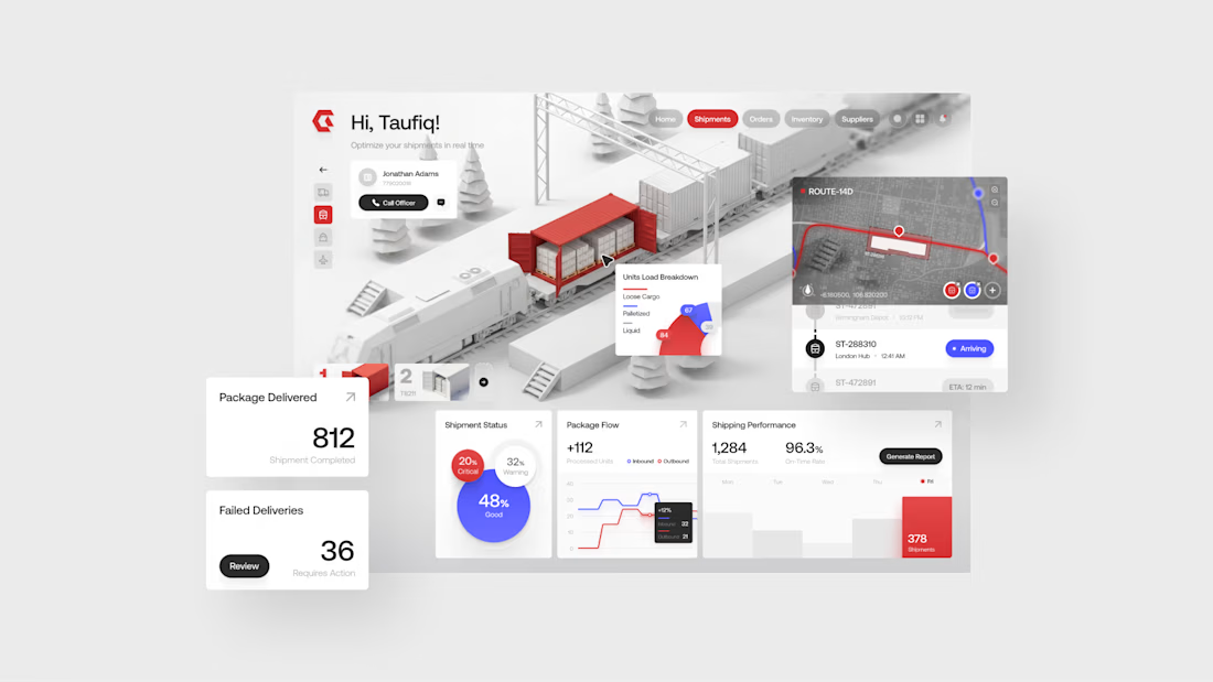
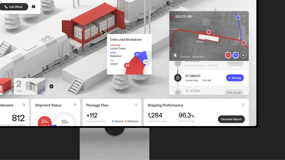
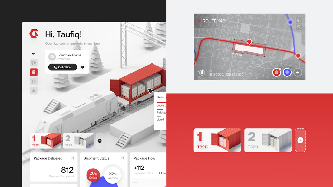
Gaze — Logistics & Supply Chain Dashboard
A clean dashboard for tracking shipments and operations, with bold red accents and structured data for a clearer workflow.
Want to create something like this?
Let's Talk!