The network for creativity
Join 1.25M professional creatives like you
Connect with clients, get discovered, and run your business 100% commission-free
Creatives on Contra have earned over $150M and we are just getting started
Back to feedPost

Built email automations, audience segmentation, and conversion workflows that increased engagement, retention, and revenue.


The network for creativity
Join 1.25M professional creatives like you
Connect with clients, get discovered, and run your business 100% commission-free
Creatives on Contra have earned over $150M and we are just getting started



Related posts

Ovéa — care with character.
One skincare identity across bottles, jars and tubes. I designed the wordmark, pink-and-cobalt packaging system, campaign applications and digital mockups, then brought the collection into motion.
A consistent visual language, with room for each product to feel individual.
View the full case study. Building a skincare brand? Let’s talk about your identity and packaging.

Love the colour direction and the visual language. Everything feels so well thought out. The overall look is beautiful.

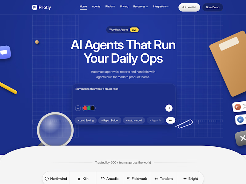
Testing two color directions for Pilotly, an AI agent platform for product teams.
Which direction would you pick for an AI automation product?


3 voted
100%
0 voted
0%
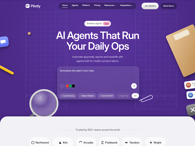
3 votes
Closed

I'd pick Violet Desk. Blue is what every SaaS uses, violet stands out and still says AI, and the orange sticky notes pop more against it. Does the hero chip row under the headline work on mobile?

The era of custom brand systems is here.
I’ve been building systems that make it easy to tweak, adapt, and evolve brand assets without starting from scratch every time.
Here’s a little preview of one I’m working on 👀