The network for creativity
Join 1.25M professional creatives like you
Connect with clients, get discovered, and run your business 100% commission-free
Creatives on Contra have earned over $150M and we are just getting started
Back to feedPost
I've designed this Charli XCX poster trilogy. A visual experiment exploring raw halftones, high-contrast pop colors, and expressive typography built around iconic lyrics of her latest album.

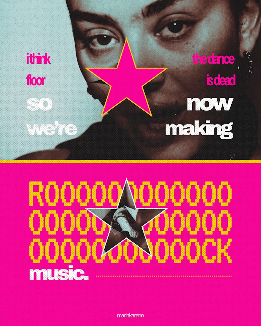
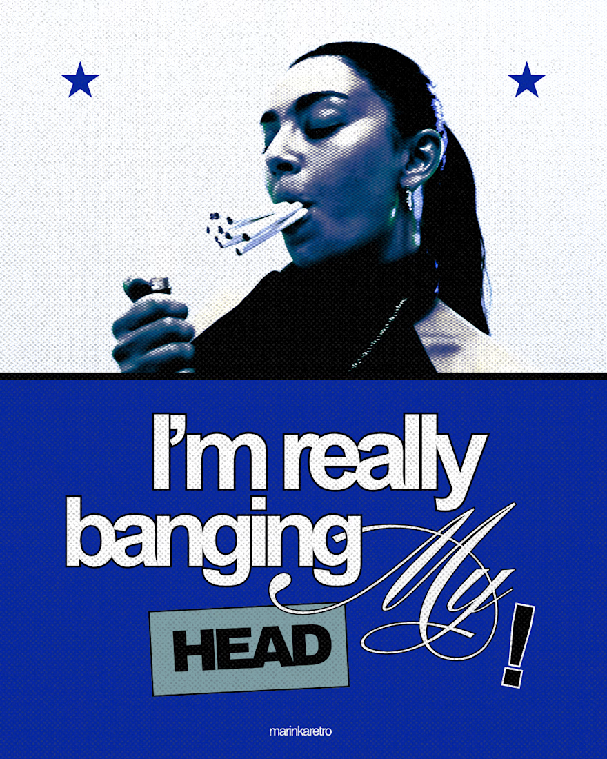
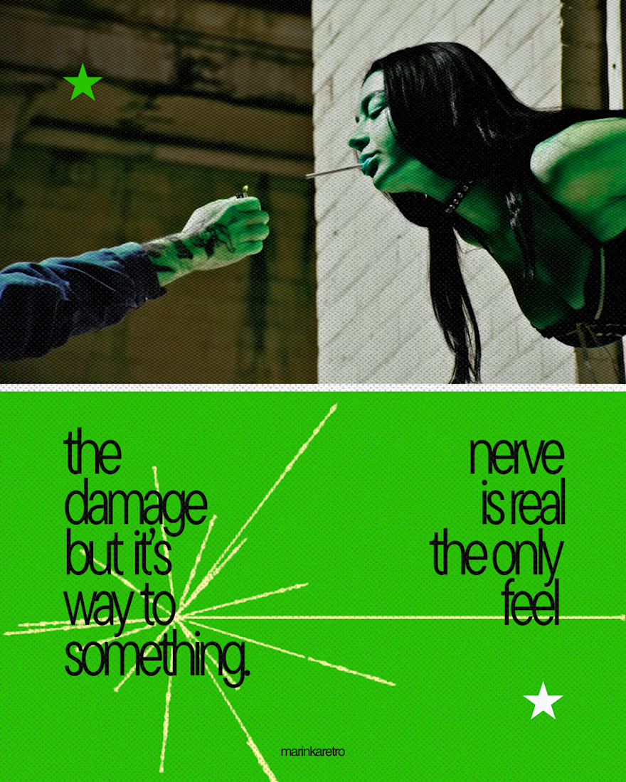

The stretched ROOOCK panel is the one where the type actually performs the lyric rather than quoting it, which is the hardest trick in lyric posters. Was Charli's own brutalist-pop art direction something you worked inside, or deliberately pushed against?

Thank you! I love that you noticed the type treatment on "ROOOOCK" making the typography actively embody the lyric/sound instead of just quoting it was definitely the most fun (and challenging) part of that layout.
As for Charli's brutalist-pop direction, I aimed to work...
The network for creativity
Join 1.25M professional creatives like you
Connect with clients, get discovered, and run your business 100% commission-free
Creatives on Contra have earned over $150M and we are just getting started







Related posts


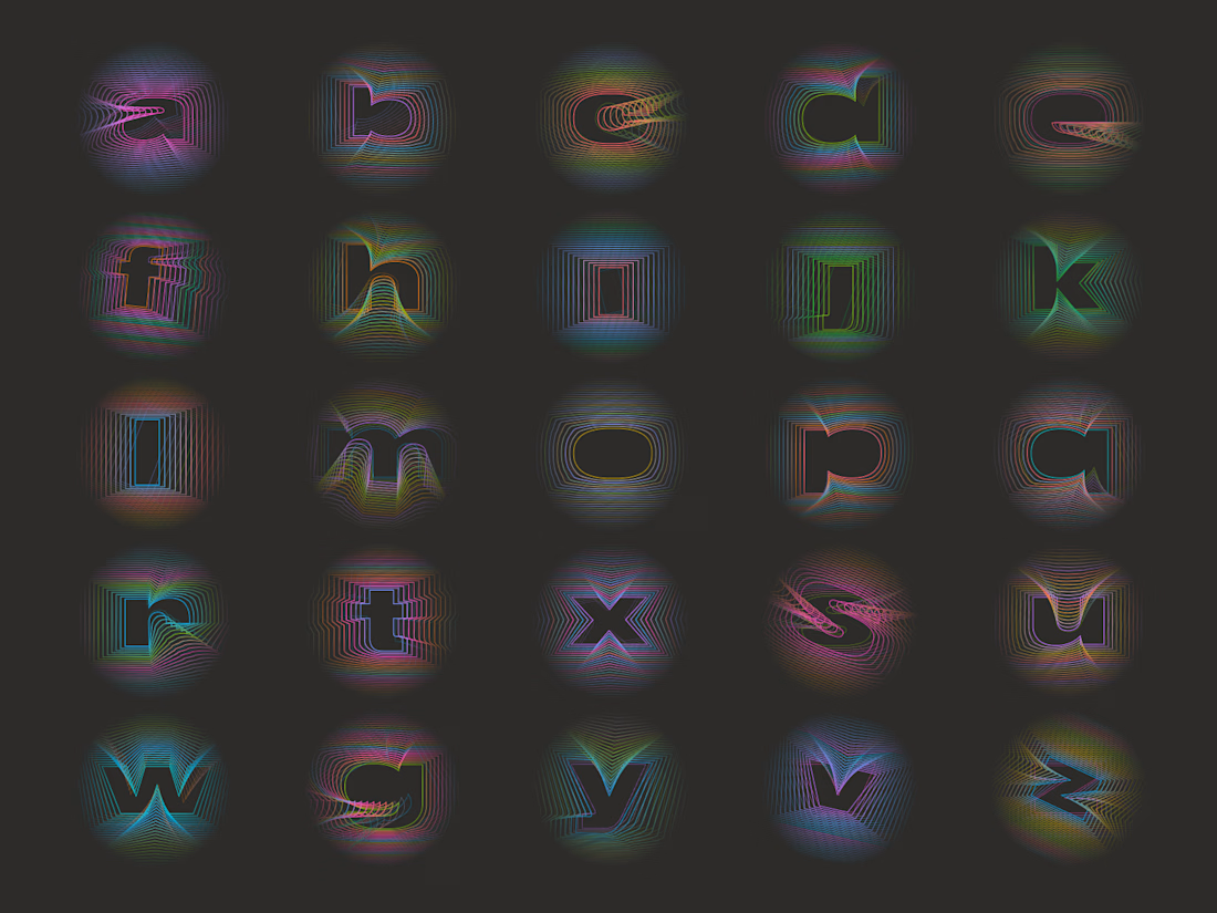
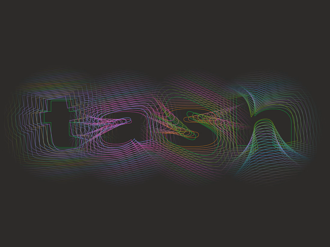


This is such a clever way to turn familiar client feedback into a visual language. The concept and typography make the message really memorable. 👏


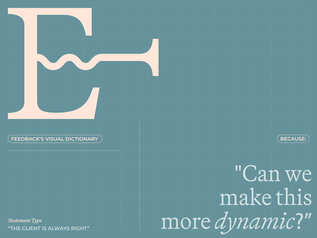
Are clients always right? 😀
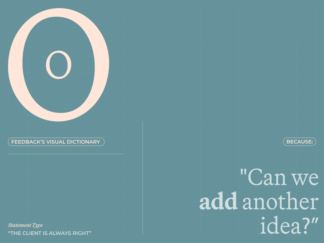
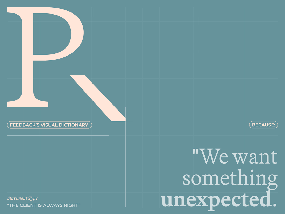
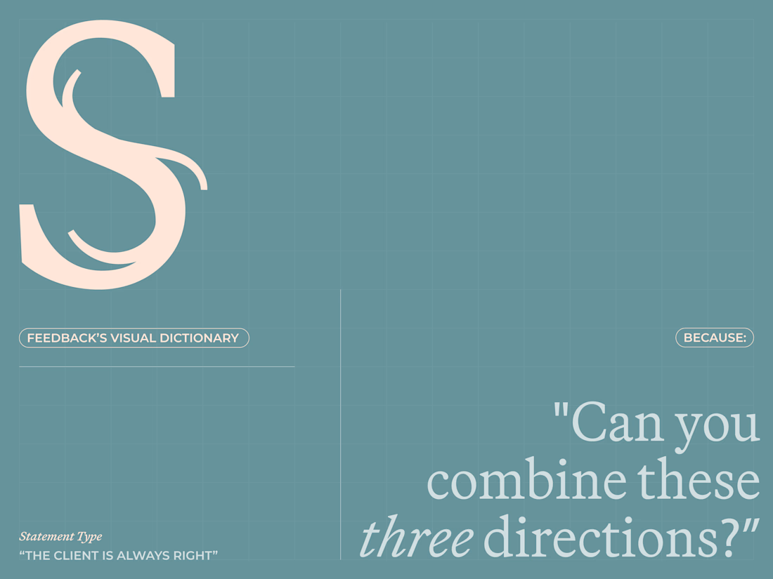
I created a lettering system where every letterform represents one of the things designers routinely hear from clients.
The typeface becomes a visual dictionary of bad creative feedback, that proves the statement wrong.
Give me your worst client...

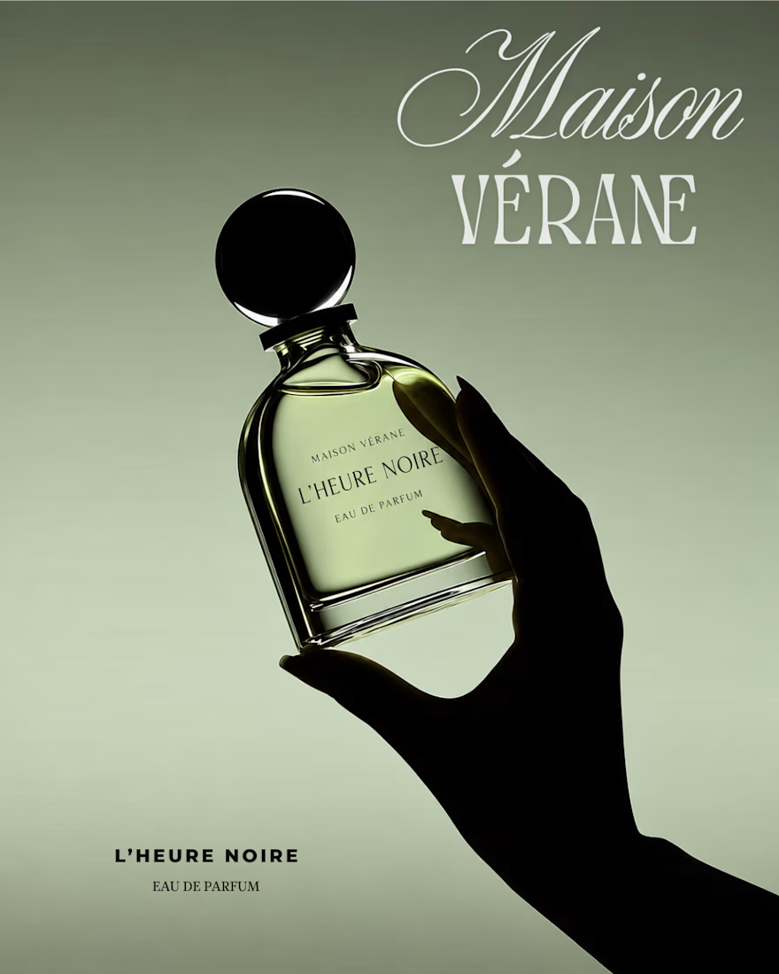
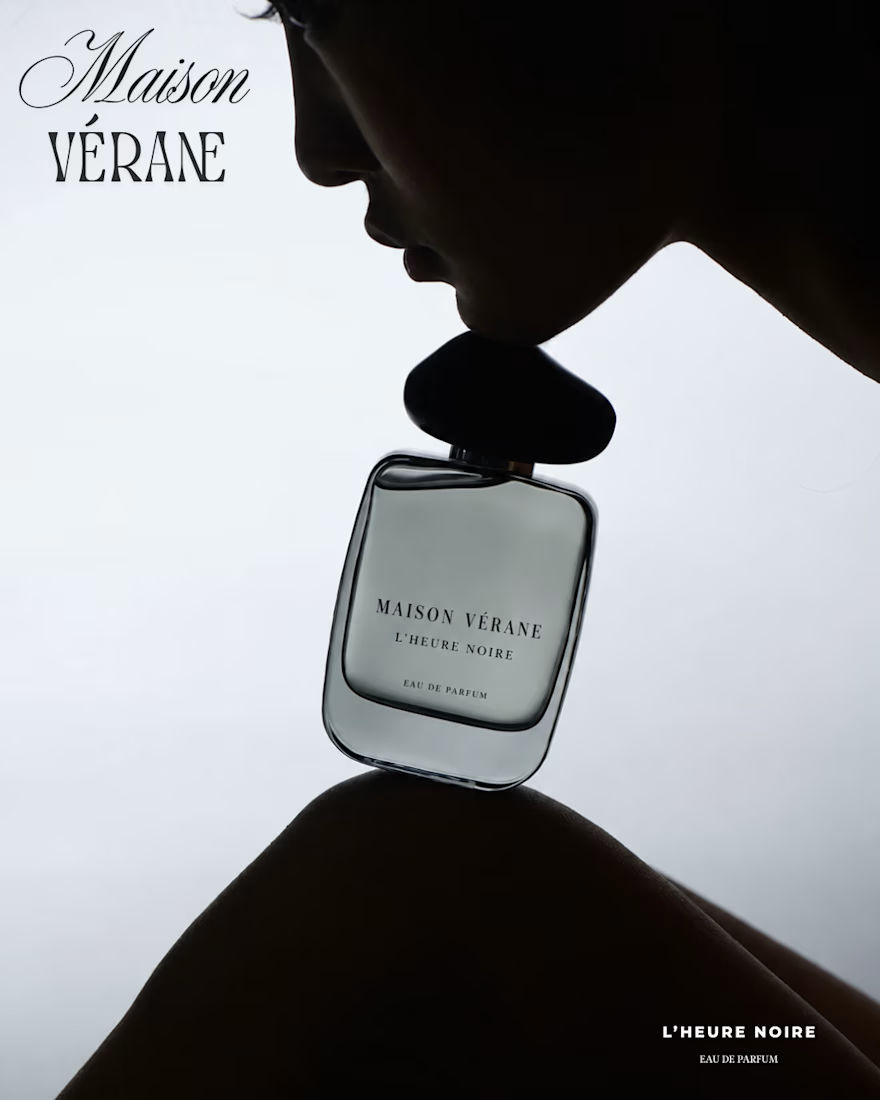
My latest perfume poster series for Maison Vérane. Muted olive tones, cool monochromes, and dramatic silhouettes bring out the mysterious mood of L’Heure Noire. Designed in Canva with elegant typography and minimal layouts that keep the fragrance in focus.
Looking for visuals that reflect your brand’s personality? Let’s connect.