The network for creativity
Join 1.25M professional creatives like you
Connect with clients, get discovered, and run your business 100% commission-free
Creatives on Contra have earned over $150M and we are just getting started
Back to feedPost
Taste Test

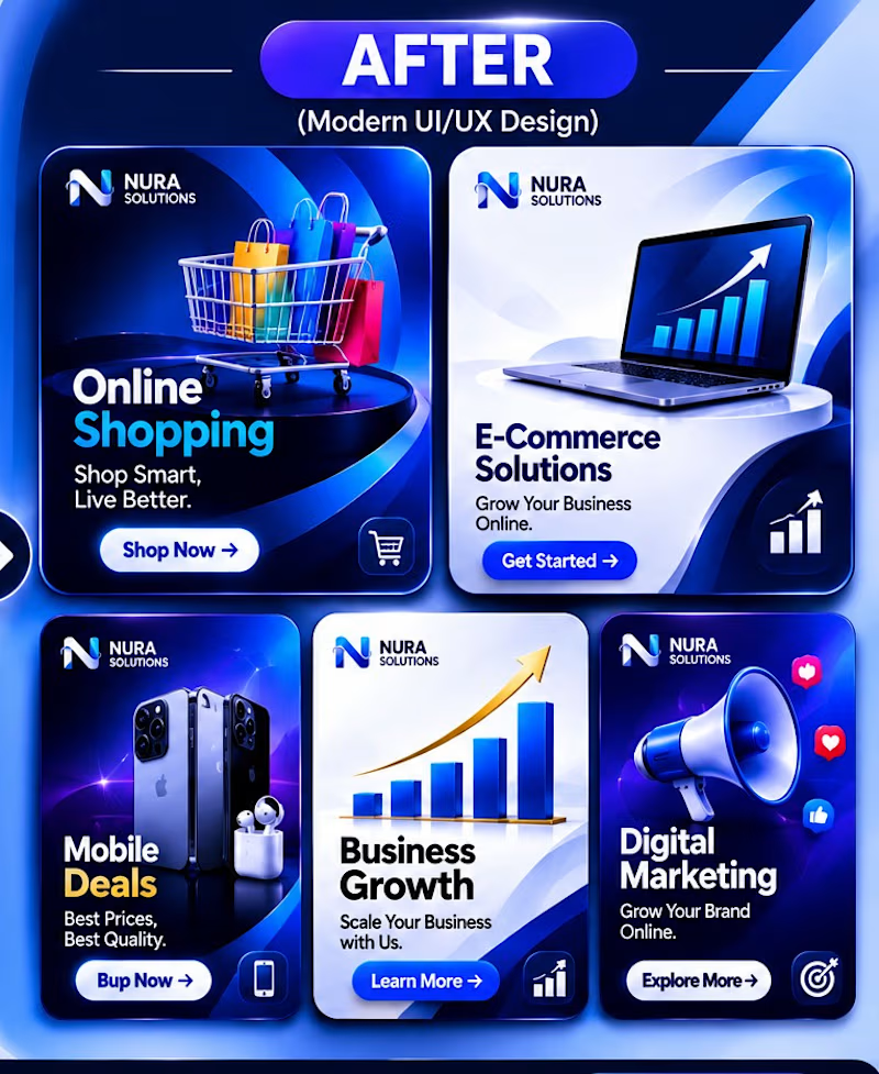
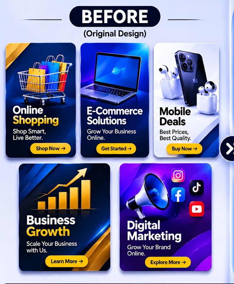
✨ FROM BASIC TO PREMIUM — A Creative Design Transformation.
Great design is more than just visuals; it's about creating clarity, impact, and a memorable experience.
This project showcases the transformation of five business-focused social media graphics into modern, premium designs using professional visual hierarchy, refined typography, balanced colors, and modern UI/UX principles.
My goal was to turn ordinary promotional graphics into visually engaging designs that communicate value and capture attention.
Design is not just what you see. It's how effectively it communicates.
BEFORE → AFTER
What's your favorite transformation?
#GraphicDesign #SocialMediaDesign #UIUXDesign #VisualDesign #BrandDesign #CreativeDesign
1 vote
Ends in 1d
The network for creativity
Join 1.25M professional creatives like you
Connect with clients, get discovered, and run your business 100% commission-free
Creatives on Contra have earned over $150M and we are just getting started
Related posts


Would you send an AI icon set straight to a client? 👀
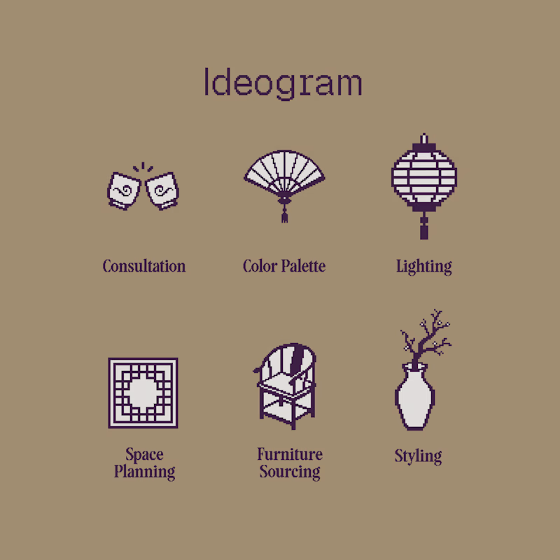
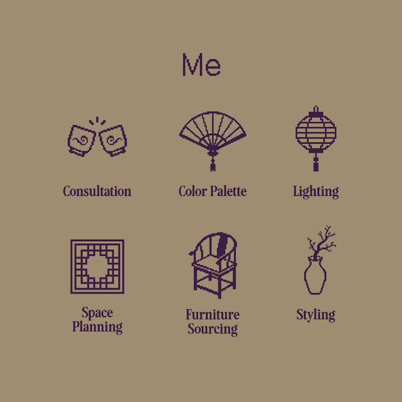
I tested Ideogram Vector on a pixel icon set for Yue Fang, an interior decorator with Chinese inspirations. The icon set was for her services.
After a few tries & prompt refining, Ideogram nailed the vibe!
BUT, some things needed to be reworked:
➡️ the white parts were shapes stacked on top of a solid black shape, not real cutouts (surprise when you open the SVG 💀)
➡️ some pixels weren’t actually square
➡️ some pixels were bigger than others
➡️ icon sizes were all different
Pixel art is supposed to be the ONE style where everything sits on a grid lol
So, which set would you hand to the client?
11 voted
34%
21 voted
66%
32 votes
Closed

Stacked shapes instead of real cutouts is exactly the kind of flaw that only shows up when you open the file. AI gets the vibe fast, but the file-level check before handoff is still on us.


Same course. Same content.
But two completely different feelings ✨
Which version would you choose?

18 voted
31%
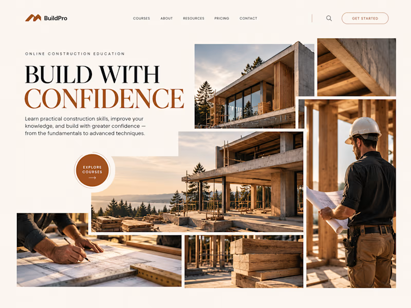
40 voted
69%
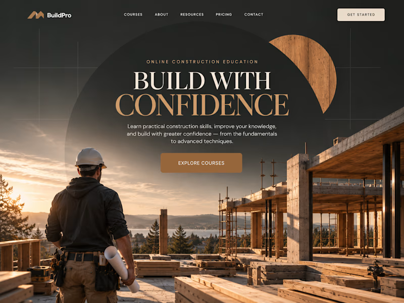
58 votes
Closed

option 2 feels a bit more cinematic, the confident feeling is embedded into the layout!

Which option works better? 👀
Option 1: the full lineup with the mesh bag
Option 2: the picnic setup
7 voted
20%
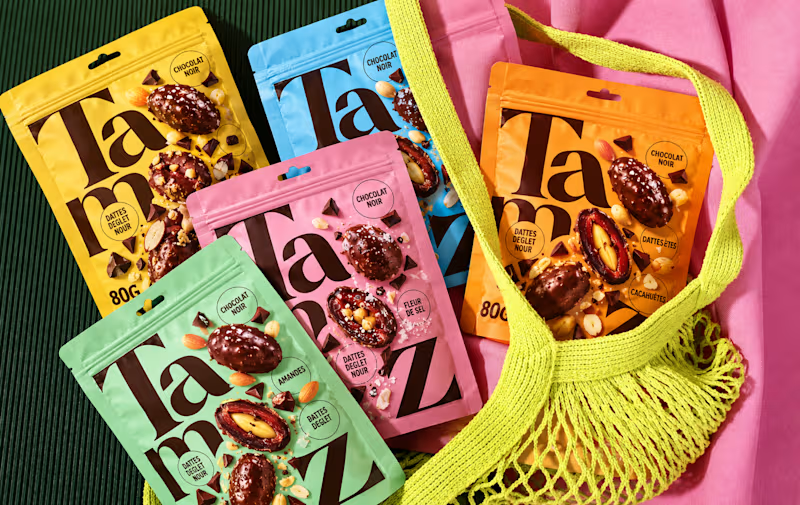
28 voted
80%
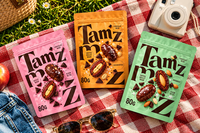
35 votes
Closed


option 2 for me, the picnic setup feels like something you would actually want to buy