The network for creativity
Join 1.25M professional creatives like you
Connect with clients, get discovered, and run your business 100% commission-free
Creatives on Contra have earned over $150M and we are just getting started
Back to feedPost
Taste Test

Taste test 🔴🔵
Exploring two directions for the same scene.
Everything is identical - except the feeling.
Red pushes it into something more aggressive and tense.
Blue feels calmer, more controlled, almost distant.
Interesting how just color + motion can completely shift perception.
Curious what works better for you.
65 votes
Ends in 1d

i think blue fit it the most


Agreed with you!

::🙂↔️ hmmmm

Both look great, though I’m biased toward the blue. I can definitely feel the aggression in the red, but the blue feels much more controlled.

Depends what do you wanna present in the scene and if brand's primary palette is considered while creating.

Wow,I love your creativity

blue feels calm for real

Red feels like an error state, whereas blue is more professional and calmer.

Great idea

The red definitely feels more urgent!

Blue works better for me

Red one gets my brain to Danger mode, like something bad is happening

blue
The network for creativity
Join 1.25M professional creatives like you
Connect with clients, get discovered, and run your business 100% commission-free
Creatives on Contra have earned over $150M and we are just getting started
Related posts

Success State Animation 💫
Minimal. Smooth. Responsive.
Crafted in Rive to enhance user feedback with subtle motion.


This is incredible 👏 👏 👏 👏 👏
Motion-Driven Visual Experience 🎯
I design and animate UI elements that go beyond static screens.
This “Glimmer Plant” is a small exploration of how motion + lighting can elevate digital products.
Tools: Figma + Rive
Open to collaborations & creative projects.
Figma file & Animation file will be Available
Rive file -https://rive.app/@Sandyuiuxstudio/
Figma- https://www.figma.com/community/file/1249714612467715682


looks stunning, great job 👌

Working on a new project
Brand identity design for Sheild Brand.
It's a fashion brand and we are finding it difficult to decide which color would work better for the brand personality.

3 voted
43%
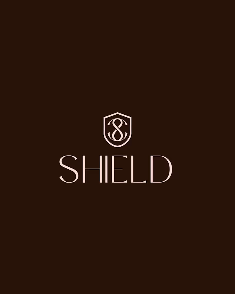
4 voted
57%
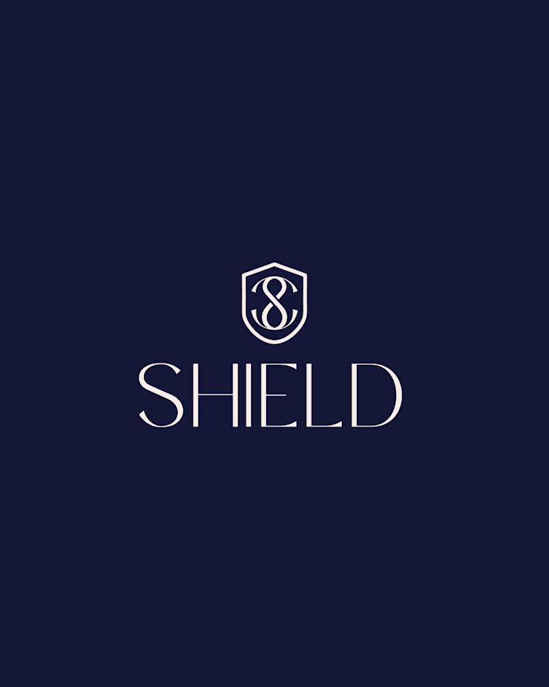
7 votes
Closed


Trending


FLORA
Reusable workflows are replacing one-off prompts in creative AI. Share what you're building in FLORA.
Contra University
Learn from expert creatives how to earn more using next-gen AI tools.
creativeaiflow
Creative AI workflows are evolving. What tools do you use, and what are their strengths and weaknesses?
portfolioreview
The best portfolios tell a story, not just show a grid. Share yours for feedback.
freelancerlife
Freelancer life is wins, pivots, and everything in between. What’s yours right now?