The network for creativity
Join 1.25M professional creatives like you
Connect with clients, get discovered, and run your business 100% commission-free
Creatives on Contra have earned over $150M and we are just getting started
Back to feedPost

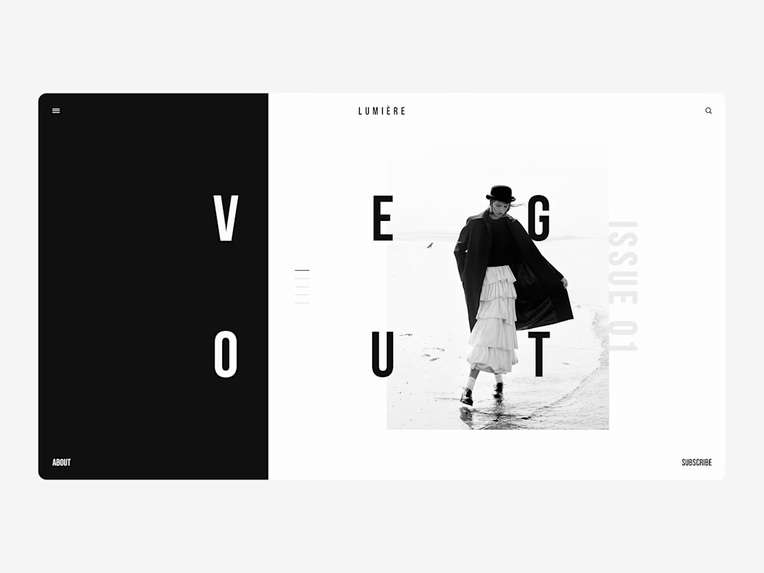
Saint Laurent — Fashion E-commerce Exploration.
A little more from this one. This time, a closer look at the product experience and how the editorial direction carries into shopping. Full version coming next.
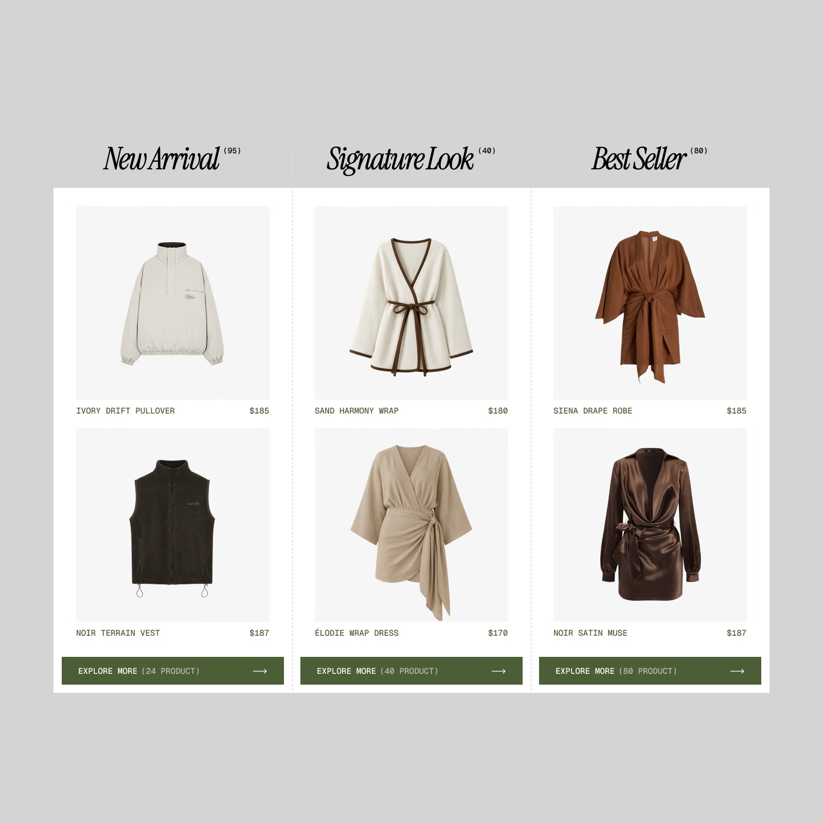

This is attention seeker, like the cleanliness and olive accent grabbing all the attention. wonderful work


I need the black armless 😂 nice work bro
The network for creativity
Join 1.25M professional creatives like you
Connect with clients, get discovered, and run your business 100% commission-free
Creatives on Contra have earned over $150M and we are just getting started





Related posts

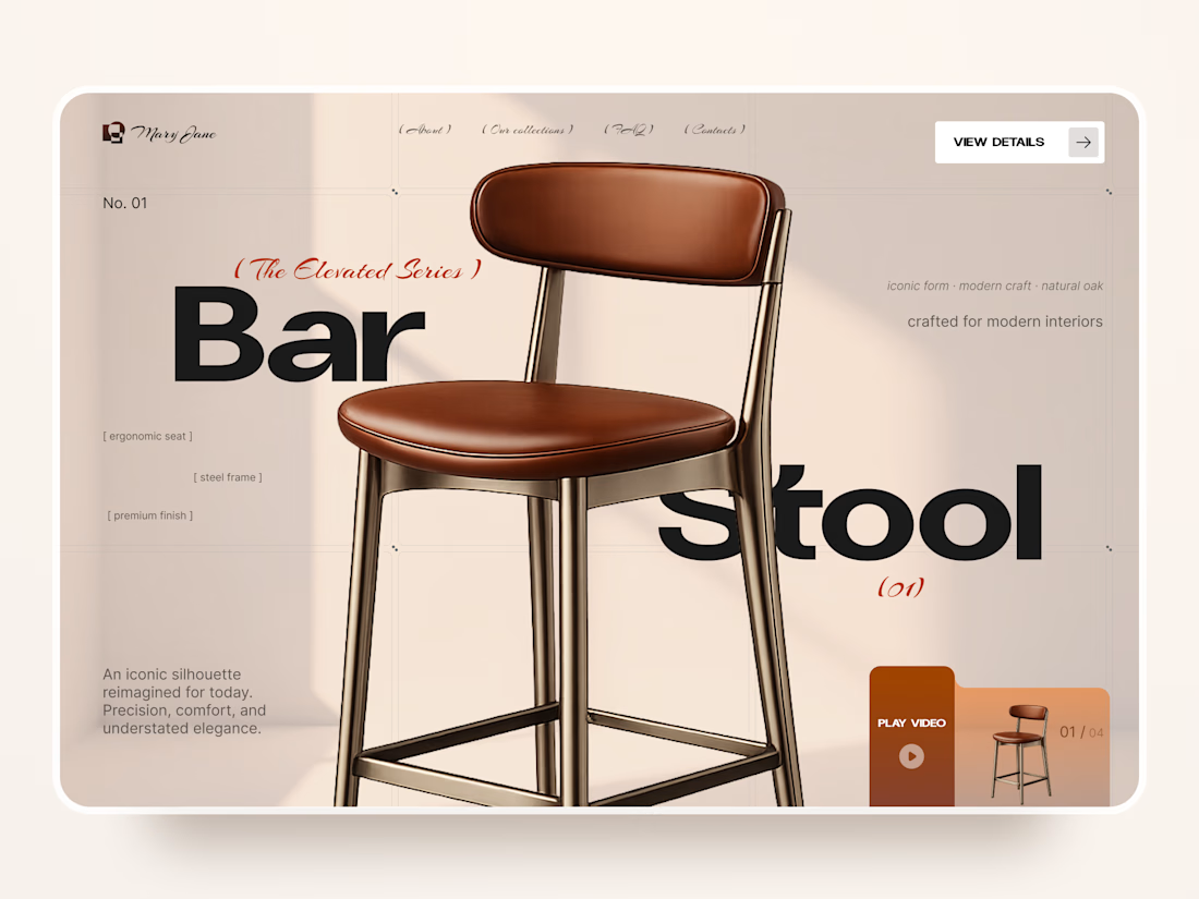
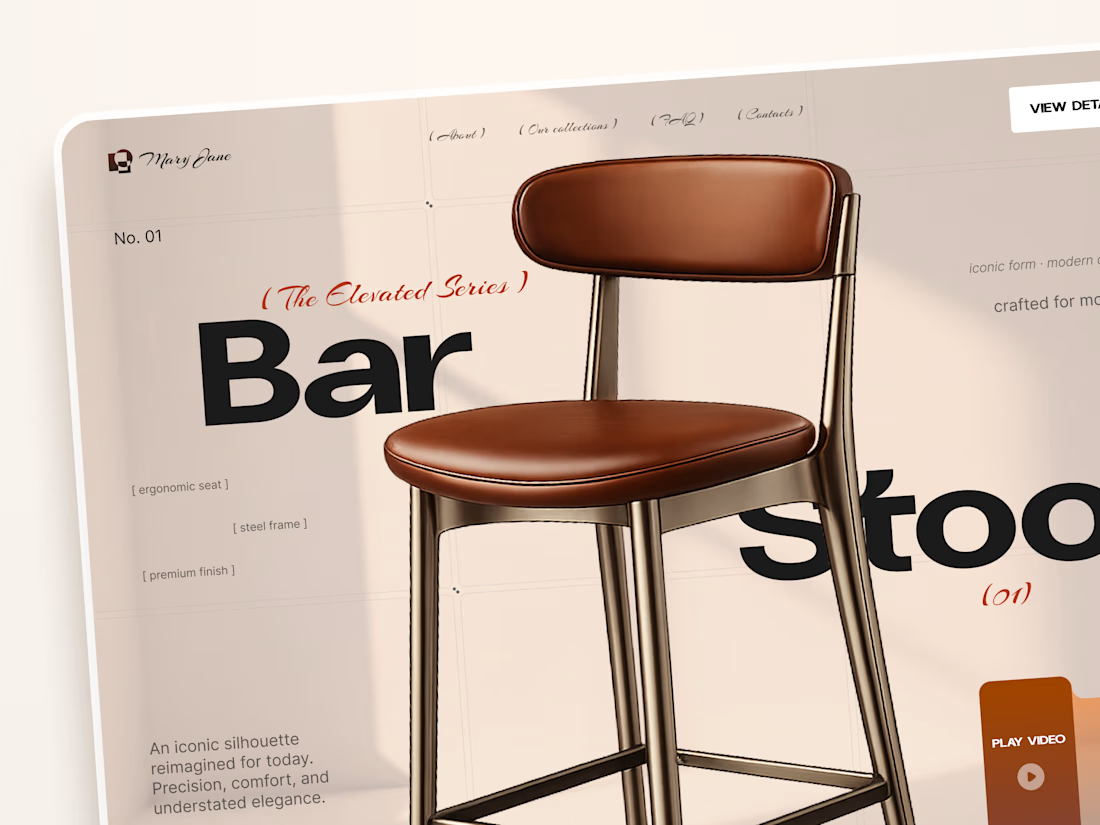
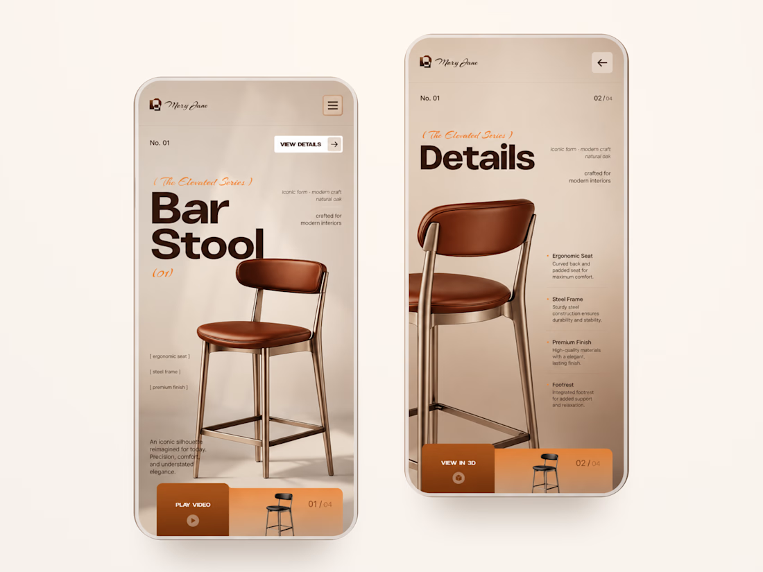
Mary Jane — Bar Stool Product Landing Page 🪑✨
A refined product landing page concept for a modern furniture brand, built around one statement piece
The design combines warm neutral tones, oversized typography, and editorial layouts to give the bar stool a premium, design-focused feel
Special attention was given to:
• Product-first composition
• Clean editorial typography
• Warm premium aesthetic
• Product details and features
• Video and 3D presentation
• Responsive mobile layout
The result is a simple, elegant experience that keeps the product at the center while giving the brand a distinctive visual character 🤎



Nice work

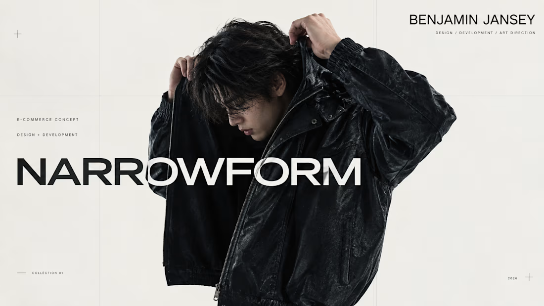
I wanted to create something that felt like a real fashion brand had already existed for years.
Not just a homepage. Not a collection of pretty screens. An actual store, with its own identity, imagery, products, interactions and all the small details that make a website feel complete.
That idea became NARROWFORM.
I created the brand and name, developed the art direction, produced the fashion and product imagery, designed the entire interface and shopping experience, and built the website myself.
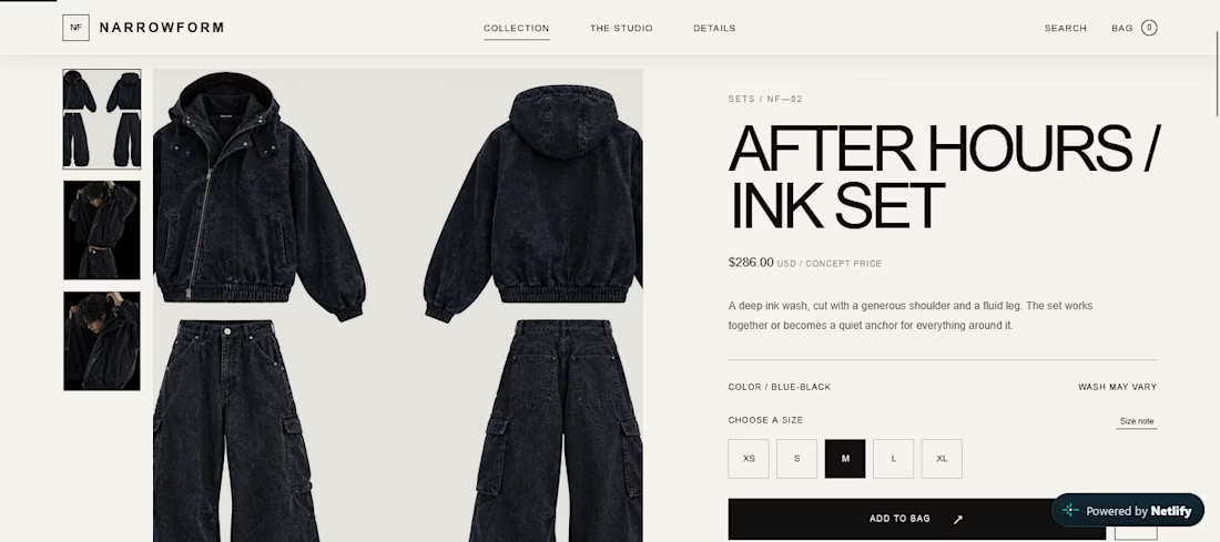
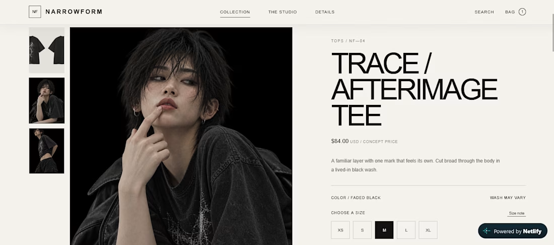
I wanted the concept to hold up beyond the first impression, so I built the experience all the way through:
Product discovery
Product pages
Cart interactions
Checkout
Simulated payment
Cookie consent
Responsive layouts
Mobile interactions
And the smaller interface states throughout the experience
The imagery was created specifically for NARROWFORM using generative tools, then refined and directed to fit the same visual language as the website.
The result is a complete fashion e-commerce concept that you can actually explore.
This is probably the most involved project I've made so far, because I wasn't trying to design a website around an existing brand.
I wanted to create the brand, then build the website that belonged to it.



Creative work

Incredible work