The network for creativity
Join 1.25M professional creatives like you
Connect with clients, get discovered, and run your business 100% commission-free
Creatives on Contra have earned over $150M and we are just getting started
Back to feedPost
Taste Test
SaaS Workflow Section for desktop, explored both light and dark modes.
Which one would you choose for a modern startup SaaS?
☀️ Light Mode
🌙 Dark Mode

3 voted
17%
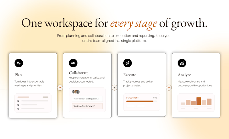
15 voted
83%
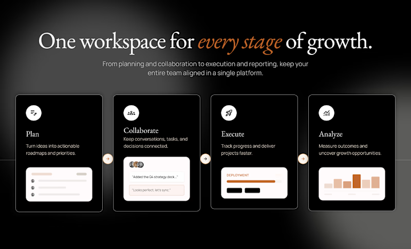
18 votes
Closed

For a workflow tool people keep open all day, dark mode usually wins on eye comfort, so the 83% tracks. The detail I'd test before committing: dark mode tends to hide weak hierarchy, and the card shadows here are doing a lot of the spacing work. Does the light version still hold...

Great point. The poll definitely favored dark mode, but I agree that hierarchy should hold up regardless of theme. The shadows were intentionally subtle, though testing a flatter version of the light mode would be a good way to validate whether the structure stands on its own. Thanks for the insight!

Dark Mode Always
Thank you

my take for the light mode is try and reduce the shadow on the cards
nice work btw
Thanks, Emmanuel

I prefer the dark mode
Love your choice
My choice are always right 😂
Thanks Boluwatife

Dark mode for me. The contrast makes the workflow cards pop more and it feels right for a startup positioning around productivity. Light can read as 'legacy enterprise' in that category.
That's a great perspective. Thanks for the feedback!

Dark mode anyday
Thank you
You’re welcome ☺️


This dark mode really stands out. The effort and thought behind it are obvious, and it shows in the final result. Keep pushing like this, you're building something remarkable.
Appreciate this! It means a lot to me. Thanks

In this case, i like them both
Love this. Thanks Chidera
You are welcome


Glad, you like it

dark mode is stronger
Thanks

Dark mode
Thanks

The Dark Mode is perfect!
Glad

Thanks


Nice work! I prefer Dark Mode, but offering both would be ideal. Users love having the choice, and both directions have their own strengths.
Absolutely! Thanks
The network for creativity
Join 1.25M professional creatives like you
Connect with clients, get discovered, and run your business 100% commission-free
Creatives on Contra have earned over $150M and we are just getting started
Related posts



Never fail to surprise me 🥹

Hi everyone! 👋
This is my first post here, so I thought I'd share something I've been really excited to work on.
I recently designed the AI Project Setup experience for ThinkEasy from scratch. The goal was to make creating research projects feel simple and intuitive, while using AI to guide users instead of overwhelming them.
It was a fun challenge to figure out how to balance flexibility with clarity, and I'm really happy with how it came together.
I'd genuinely love to hear your thoughts or feedback!
#UXDesign #ProductDesign #AI #CaseStudy #UserExperience


This is nice 👍


We’ve just wrapped up another project! 🚀
It actually started with a different plan – the client wanted to build everything on Circle.
Before designing the website, we took time to map out the community structure and member journey. After reviewing the project goals, we realized Kajabi would be a much better fit.
Sometimes the most valuable part of a project isn't building the website – it's helping a client choose the right platform from the start.
The result? A fully integrated Kajabi website with products, community, and a seamless experience all in one place.


Impressive 👍




Trending

Claude
Claude has entered the design space. How are you using Claude Design?

Contra University
Learn from expert creatives how to earn more using next-gen AI tools.

MagicPath
The canvas is infinite, and exploration is becoming the workflow. How are you using MagicPath?
creativeaiflow
Creative AI workflows are evolving. What tools do you use, and what are their strengths and weaknesses?
freelancerlife
Freelancer life is wins, pivots, and everything in between. What’s yours right now?


