The network for creativity
Join 1.25M professional creatives like you
Connect with clients, get discovered, and run your business 100% commission-free
Creatives on Contra have earned over $150M and we are just getting started
Back to feedPost
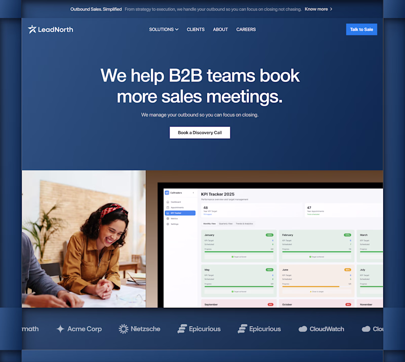
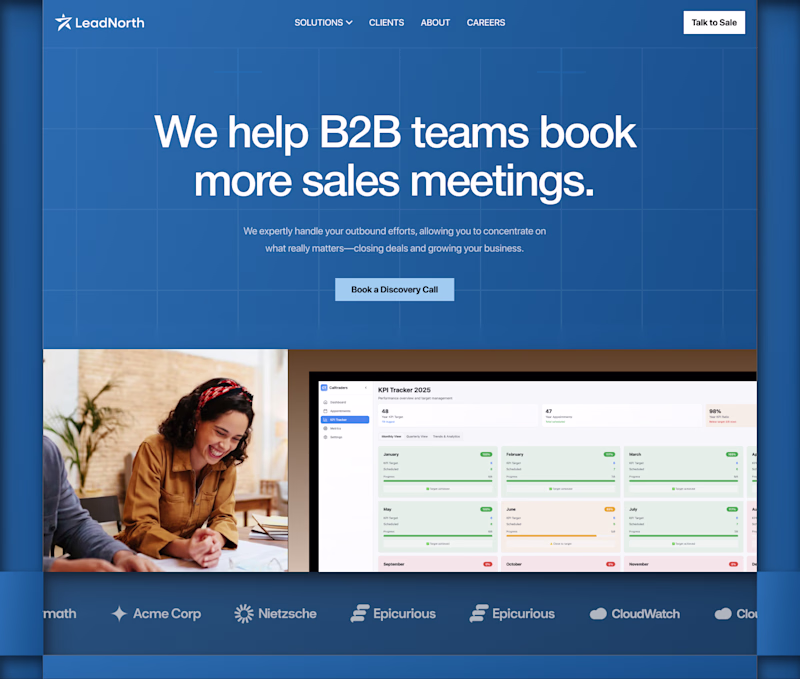
Taste Test
SaaS Workflow Section for desktop, explored both light and dark modes.
Which one would you choose for a modern startup SaaS?
☀️ Light Mode
🌙 Dark Mode
3 voted
17%
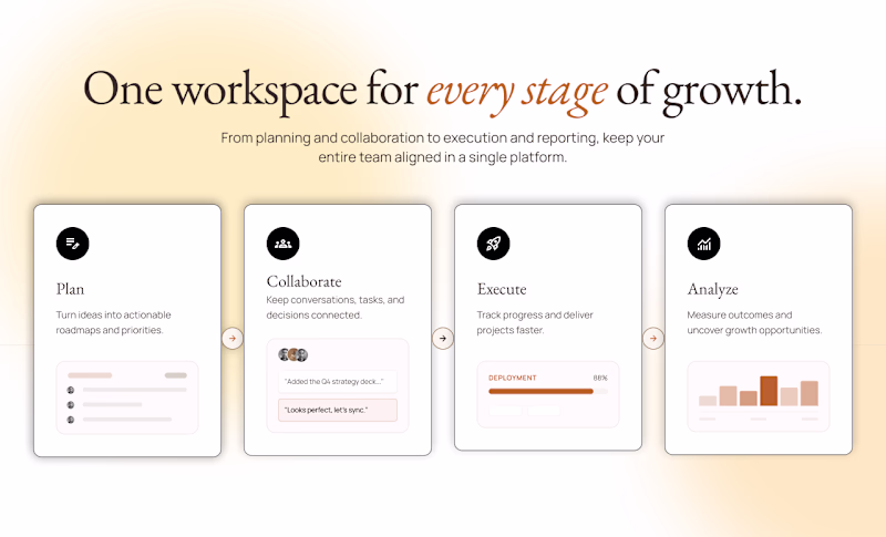
15 voted
83%
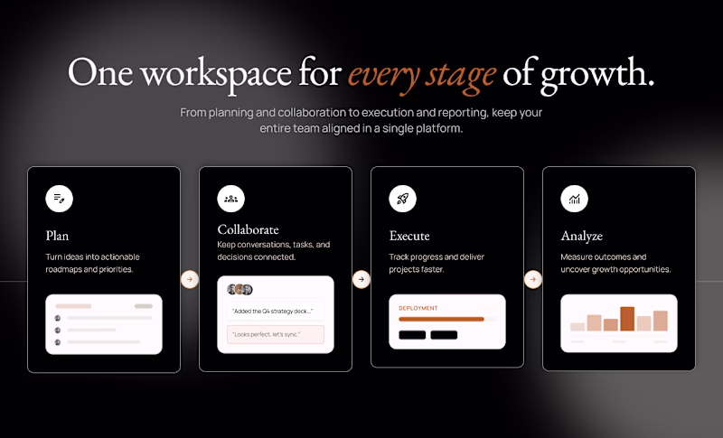
18 votes
Closed
Dark Mode Always
Thank you
my take for the light mode is try and reduce the shadow on the cards
nice work btw
Thanks, Emmanuel
I prefer the dark mode
Love your choice
My choice are always right 😂
Thanks Boluwatife
Dark mode for me. The contrast makes the workflow cards pop more and it feels right for a startup positioning around productivity. Light can read as 'legacy enterprise' in that category.
That's a great perspective. Thanks for the feedback!
Dark mode anyday
Thank you
You’re welcome ☺️
In this case, i like them both
Love this. Thanks Chidera
You are welcome
Glad, you like it
dark mode is stronger
Thanks
Dark mode
Thanks
The Dark Mode is perfect!
Glad
Thanks
For a workflow tool people keep open all day, dark mode usually wins on eye comfort, so the 83% tracks. The detail I'd test before committing: dark mode tends to hide weak hierarchy, and the card shadows here are doing a lot of the spacing work. Does the light version still hold...
Great point. The poll definitely favored dark mode, but I agree that hierarchy should hold up regardless of theme. The shadows were intentionally subtle, though testing a flatter version of the light mode would be a good way to validate whether the structure stands on its own. Thanks for the insight!
Nice work! I prefer Dark Mode, but offering both would be ideal. Users love having the choice, and both directions have their own strengths.
Absolutely! Thanks
The network for creativity
Join 1.25M professional creatives like you
Connect with clients, get discovered, and run your business 100% commission-free
Creatives on Contra have earned over $150M and we are just getting started
Trending
Claude
Claude has entered the design space. How are you using Claude Design?
Contra University
Learn from expert creatives how to earn more using next-gen AI tools.
creativeaiflow
Creative AI workflows are evolving. What tools do you use, and what are their strengths and weaknesses?
freelancerlife
Freelancer life is wins, pivots, and everything in between. What’s yours right now?
Related posts
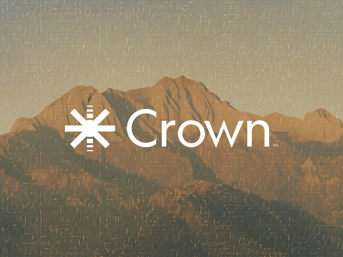
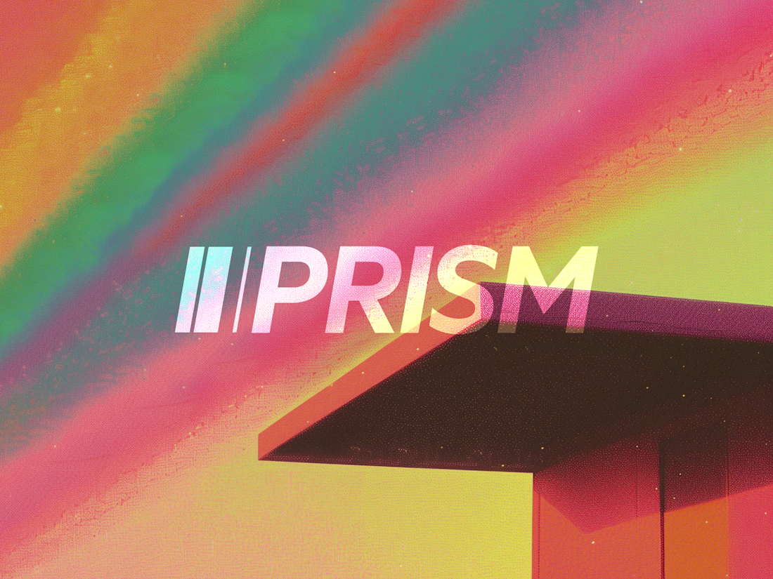
Crown pairs surprisingly well with that mountain texture, most crown marks lean literal but the asterisk treatment keeps it abstract. Prism's diagonal cut mark is doing the most work of the four for me.
Bit hard to choose which look more appealing? 🤔
24 voted
50%
24 voted
50%
48 votes
Closed
Hero 1 for me
Just wrapped Risen Strategic.
The site had to match that energy. Dark, cinematic, premium. A brand that feels like it belongs next to the big players even at launch stage.
Live site: https://www.risenstrategic.ai/
Upgoating this..... nice work man