The network for creativity
Join 1.25M professional creatives like you
Connect with clients, get discovered, and run your business 100% commission-free
Creatives on Contra have earned over $150M and we are just getting started
Back to feedPost

Tendral Health came to us with a platform that connects verified physicians with paid clinical surveys.
They needed a brand identity and product experience that made the offer feel credible from the first screen.
Physicians are busy, skeptical, and putting their professional expertise behind every response. If the product is vague about verification, time commitment, or payout, there is no reason for them to keep going.
So we designed the full experience around clarity:
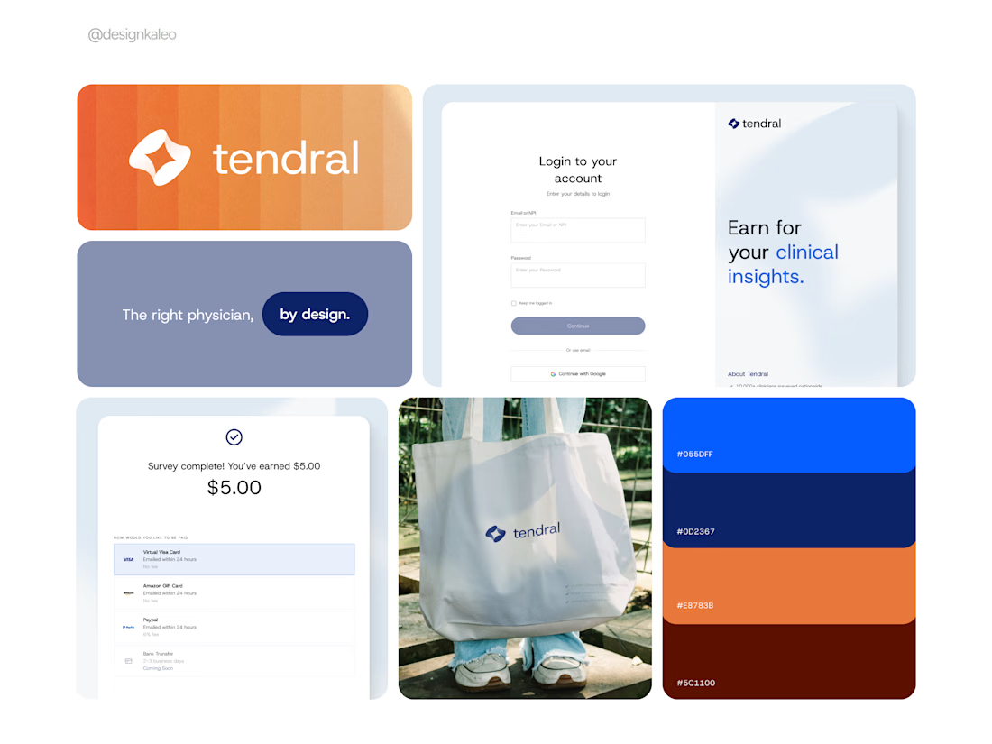
Sign-in recognizes users as clinicians, with verification and HIPAA messaging visible immediately.
Before a survey begins, physicians see the payout, time commitment, question count, and who’s signed in.
The completion screen puts the earned amount and payout options front and center.
The identity needed to do the same work. Navy and blue establish the clinical, professional feel this audience expects. Orange brings in the human part, the value of a physician’s time and insight.
The result is a brand and product experience that feel like one system, from the first impression through payment.
For Tendral’s users, trust is not something you earn halfway through the flow.
It has to be there before the first question loads.

Clean work!
Thank you!

awesome work


Smart to lead with verification and payout clarity. That builds trust fast for a skeptical audience.

Amazing work


makes sense, doctors won't click anything vague


Really like how the design is built around trust from the very first screen. The small details around payout and time make a lot of sense too.

everything is looks great


Good work🔥👏👏


Great work!

So nice. Love it

Incredible work—so smooth and clean!


Whenever a product is credible, users experience is maximum!
The network for creativity
Join 1.25M professional creatives like you
Connect with clients, get discovered, and run your business 100% commission-free
Creatives on Contra have earned over $150M and we are just getting started











Related posts

HuroPay Branding for Fintech
We built its identity to feel the same way: fast, clear and human.
Need a branding? DM Now...
#branding #brandidentity #logo


sentences
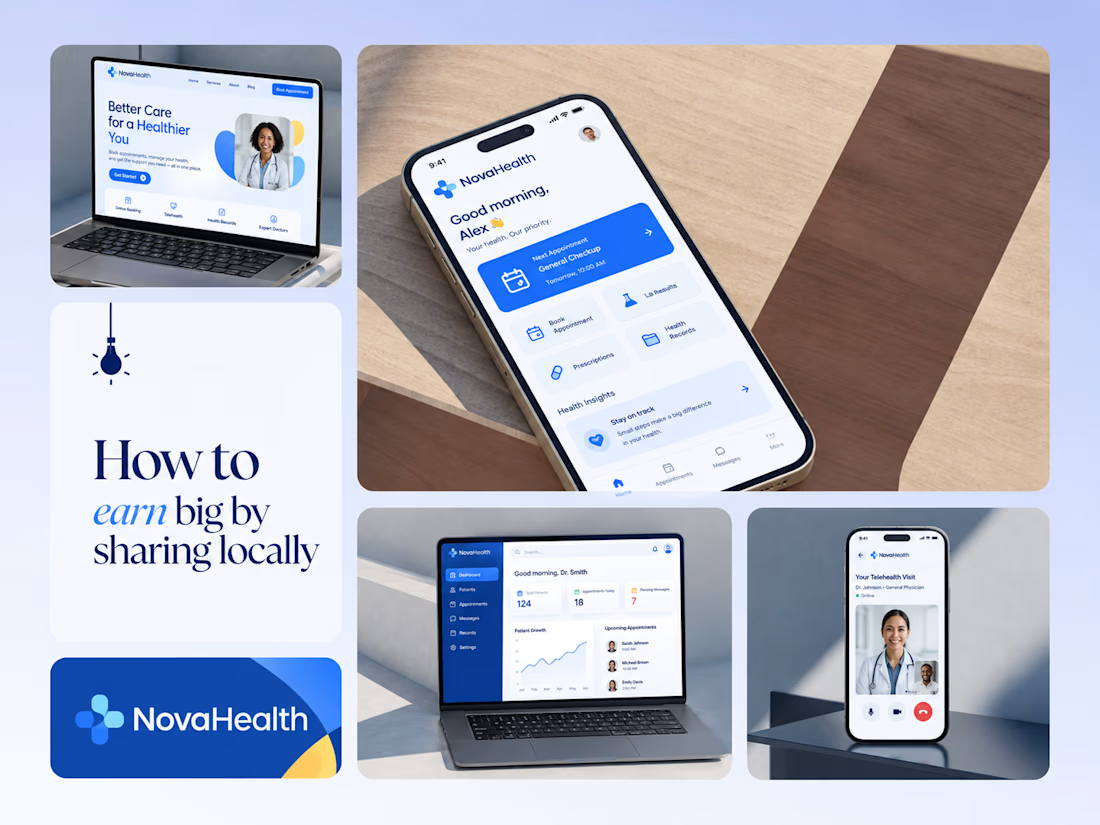
One brand, three screens: patient, doctor, and the video call between them.
NovaHealth is a healthcare brand and product system I designed from logo to apps. Healthcare software tends to feel either cold and clinical or too cluttered to open. I wanted something calm for a worried patient and quick for a doctor between appointments.
The logo breaks the classic medical cross into soft, rounded blocks in two blues, so it reads as “health” without feeling sterile.
The patient app opens with one thing: a solid blue card showing your next appointment. It’s the only fully saturated block on the screen, so nothing competes with it.
The doctor dashboard is built for a glance. Total patients, today’s appointments, and pending messages come first, in the same blue and rounded style as the patient app.
The telehealth screen has almost no UI. The doctor’s face fills the screen, with just three controls: mic, camera, and a red end-call button, the only red in the whole system.
One rule ties it together: blue means action, white space means calm, and yellow is a small spark of warmth.
Which screen should I break down next? 👇



Great medical brand design specially the phone app UI and top left laptop dashboard 🔥🔥🔥
great job Joshua ❤️🎉
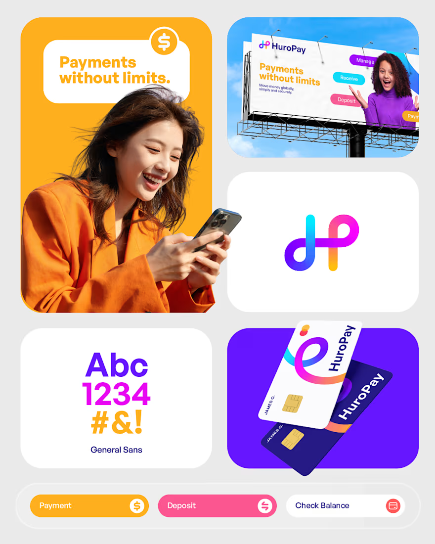
Meet HuroPay.
A digital payments platform making it simpler to move, receive and manage money. We built its identity to feel the same way: fast, clear and human.
Need a branding? DM Now...
#branding #brandidentity #logo


That's stunning Muhammad the logo and the business card is the best 🔥🔥🔥🔥