The network for creativity
Join 1.25M professional creatives like you
Connect with clients, get discovered, and run your business 100% commission-free
Creatives on Contra have earned over $150M and we are just getting started
Back to feedPost

If websites came with a care label, what would yours say? 🤔
I've been thinking about how micrographics, those small labels usually found on packaging or clothing tags, could translate to the web.
As web designers and developers, we know there is *so* much invisible thinking behind a site: structure, performance, accessibility, content systems… and we rarely see it. 👀
As builders, we think about these things constantly, but users rarely see them. Maybe there’s value in making the craft more legible.
What do you guys think? 💭


This is really cool, like a hang tag but for a design project 🔥
Thank you!


Love the use of micro interactions, they make websites so much more engaging!
Yes, it does make a difference
Great work, the micrographics you created are so good!

So creative, love this concept!
Thank you, Ellie!

This is INSANE!

This is such a fun concept. The care label idea makes all that invisible work visible in a really clever way. "Reduced motion safe" and "92 Lighthouse" on a tag would tell you so much about how thoughtfully a site was built. Would love to see this become a real thing designers actually share with clients.
Thank you, Stephanie! Exactly, there really is a craft to it 😊

Good luck

@Amanuel G. Love this idea. A web “care label” could surface invisible craftsmanship like accessibility, performance, and structure making digital quality as legible as material quality.
Appreciate that a lot, Asif 🙌

Wonderful
🙌 🙌 🙌


This is really interesting how we can take ideas from offline and translate them on to online concepts! 🚀
😍

This is such a cool take on a design! 😊
Thank you

I love the use of micrographics. it looks very cool!

Really cool, love the micro interaction
Thank you! 🙌

I see a lot of potential in this style
There’s serious potential here.
absolutely

isn’t there something like that at the bottom of a website?

Such a cool idea.
I love the metaphor. There’s so much invisible thinking behind a good site, and making that craft visible in a subtle way could be really powerful.

I super love this concept, the care label 😍

This very interesting, I'm not webflow or UI design expert, however, seeing it, Initially, I thought, "oh a postal", until I saw the interactions, really cool. Kind of reminiscent of some games I have played: hovering over selectables.

Totally! 'Legible craft' is crucial. My label: 'Hand-coded with 💖 & countless iterations.' So much hidden work! Love this idea. ✨


Interesting concept!
The network for creativity
Join 1.25M professional creatives like you
Connect with clients, get discovered, and run your business 100% commission-free
Creatives on Contra have earned over $150M and we are just getting started








Related posts



Beautyy


A few pieces of the website we recently created for Kodilion. Com check the complete website at https://kodilion.hr/


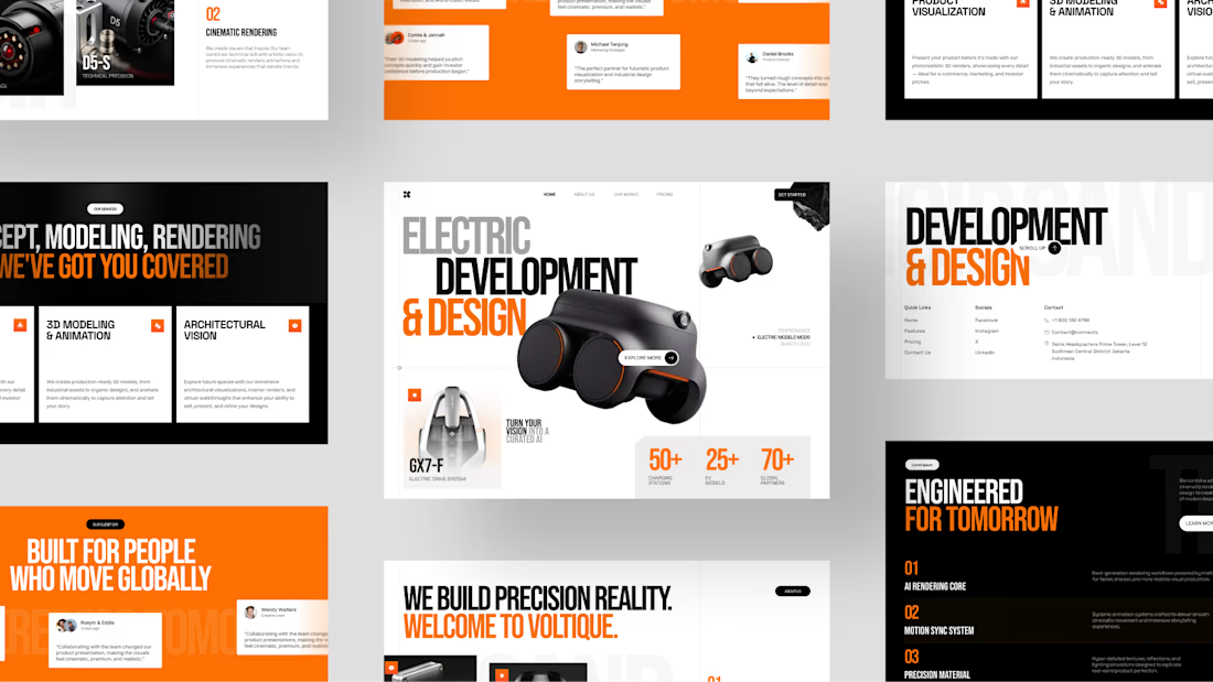
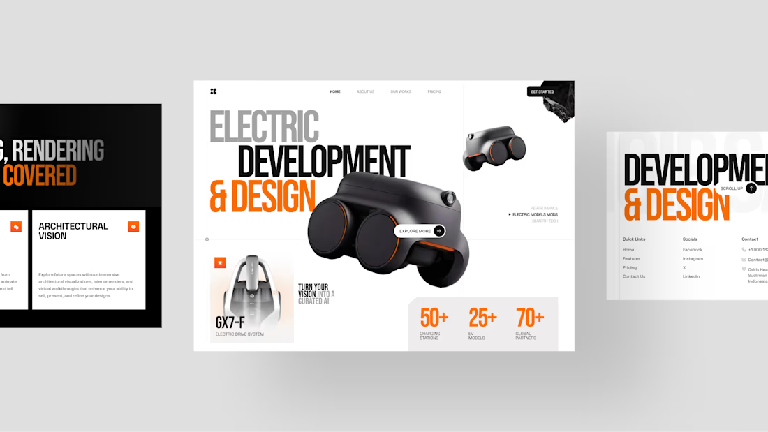
Voltique — Modeling Agency Website
A bold, futuristic website concept combining striking typography, immersive 3D visuals, and refined minimalism.
Want to create something like this?
Let's Talk!



Great design Hatypo that's stunning 🔥🔥🔥