The network for creativity
Join 1.25M professional creatives like you
Connect with clients, get discovered, and run your business 100% commission-free
Creatives on Contra have earned over $150M and we are just getting started
Back to feedPost

Incredibly sharp and visually stunning work.

Most real estate brands look like they were designed not to offend anyone. Arcova was designed to be impossible to ignore.
Electric lime. Forest green. A house mark that owns a building facade as confidently as it owns a tote bag. "Build where others only look." "What we build...


The network for creativity
Join 1.25M professional creatives like you
Connect with clients, get discovered, and run your business 100% commission-free
Creatives on Contra have earned over $150M and we are just getting started



Related posts

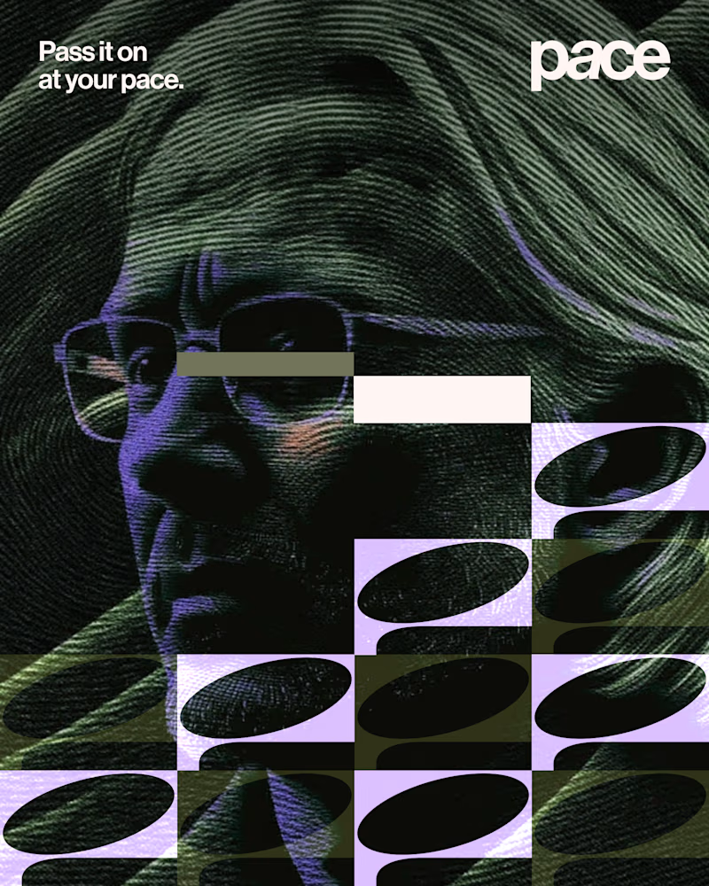
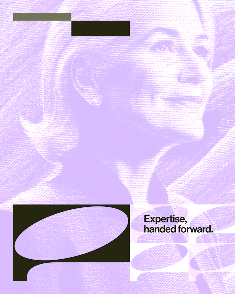
Experimental layouts for Pace. Which one do you like?
23 voted
52%
21 voted
48%
44 votes
Closed

Looks cool.

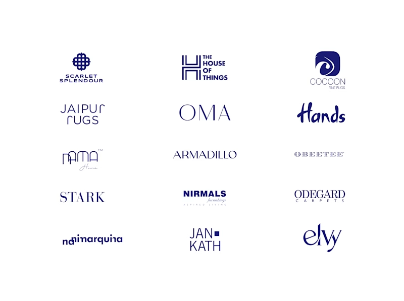
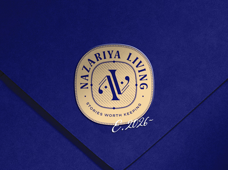
A little look at how Nazariya Living stands apart from its category.
On one side, familiar visual conventions. On the other, an identity with its own character, rooted in stories worth keeping.
We chose not to blend in. :)
Which side catches your eye?


3 voted
30%
7 voted
70%
10 votes
Closed

That side with all the competitor logos in one grid is the slide I'd steal for a client presentation. Nothing explains "why this direction" faster than showing the sea of sameness first. The navy seal wins easily after that.

AI can generate visuals. But can it create a feeling?
A little cinematic escape to Paris. 🇫🇷
From the lighting and atmosphere to the composition and storytelling, every frame was crafted to capture the feeling of a luxury campaign.
This is the kind of visual storytelling I love creating.
More than just generating. Directing, crafting and bringing a vision to life. 🎬


The pale blue suit against the blue hour Eiffel Tower and warm bokeh lights gives it a real luxury campaign feel. How many generations did the car shot take to stay consistent?