The network for creativity
Join 1.25M professional creatives like you
Connect with clients, get discovered, and run your business 100% commission-free
Creatives on Contra have earned over $150M and we are just getting started
Back to feedPost
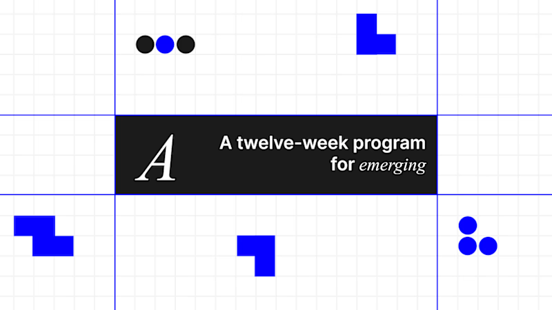
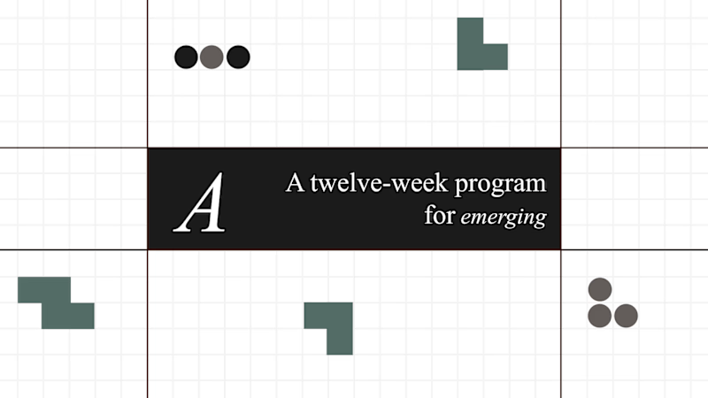
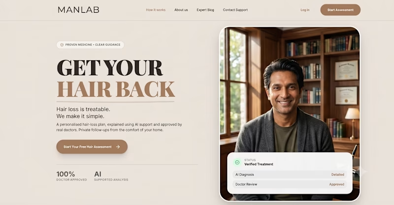
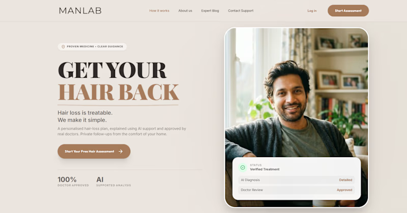
Taste Test

I changed just two things:
• Color palette
• Typography
Everything else stayed the same.
Which version would you choose?
44 voted
54%
37 voted
46%
81 votes
Closed

I prefer Version B it looks professional

Going with B. The green palette feels more considered, there's a restraint to it that makes the typography breathe better. Blue is safe but it flattens everything out at the same energy level.

Color brightness is definitely an added design brilliance.

Version B



Version B for me. The softer palette creates less visual competition, which makes the typography feel more prominent. It feels closer to how I'd approach an editorial or presentation layout where hierarchy matters more than attention-grabbing color.

Version A

Version B for me

I choose A

B is good

Will go for the B version

Version B

Version A is better

The A

version A looks best

Versão B

Would go for the first sincerely

version B
The network for creativity
Join 1.25M professional creatives like you
Connect with clients, get discovered, and run your business 100% commission-free
Creatives on Contra have earned over $150M and we are just getting started
Related posts

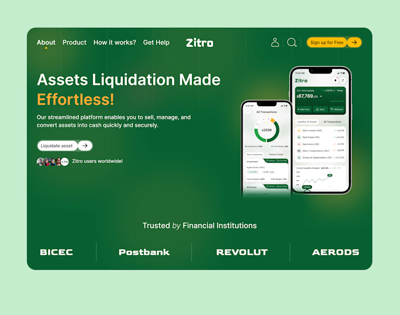
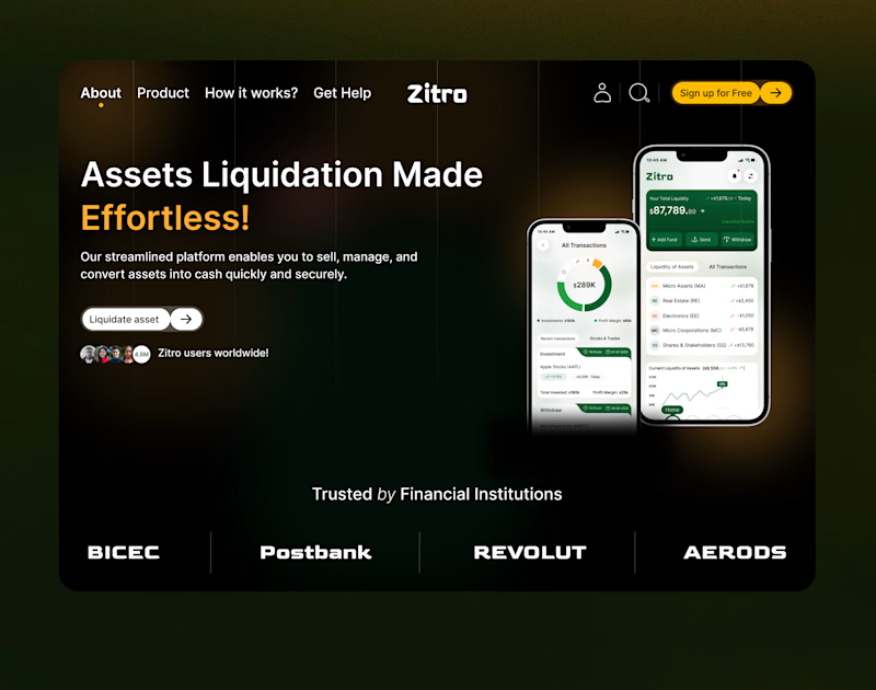
I recently designed a Landing Page for Zitro Digital Banking for the liquidation of Assets.
Which mode is better? White or Dark?
5 voted
33%
10 voted
67%
15 votes
Closed
Dark mood

Which image suits the aesthetics better? The first one makes the aesthetic seem darker while the second one makes it look lighter. Let me know your thoughts
2 voted
29%
5 voted
71%
7 votes
Closed

Amazing attention to every detail.

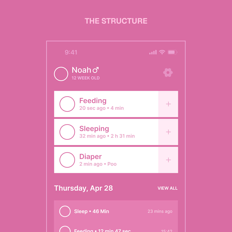
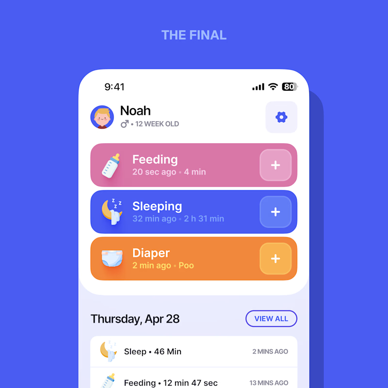
Every screen I design starts flat – structure first, style second.
When a designer shows a case, which do you actually want to see?
Same screen, two stages.

3 voted
21%
11 voted
79%
14 votes
Closed

Love it. The final






Trending

Claude
Claude has entered the design space. How are you using Claude Design?

Contra University
Learn from expert creatives how to earn more using next-gen AI tools.
fifaworldcup2026
The World Cup is here and the whole world's watching. How are you designing for the world stage?
creativeaiflow
Creative AI workflows are evolving. What tools do you use, and what are their strengths and weaknesses?
freelancerlife
Freelancer life is wins, pivots, and everything in between. What’s yours right now?