The network for creativity
Join 1.25M professional creatives like you
Connect with clients, get discovered, and run your business 100% commission-free
Creatives on Contra have earned over $150M and we are just getting started
Back to feedPost
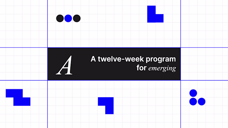
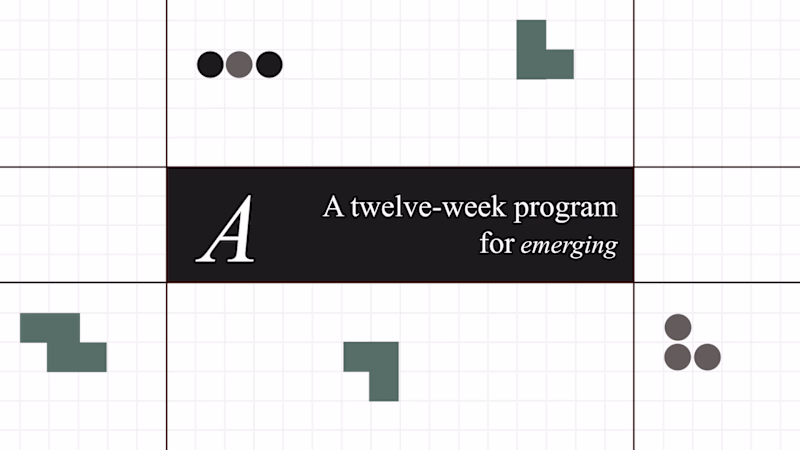
Taste Test
I changed just two things:
• Color palette
• Typography
Everything else stayed the same.
Which version would you choose?
20 votes
Ends in 1d
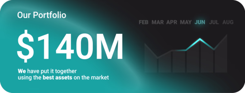
Going with B. The green palette feels more considered, there's a restraint to it that makes the typography breathe better. Blue is safe but it flattens everything out at the same energy level.
Color brightness is definitely an added design brilliance.
Version B
The network for creativity
Join 1.25M professional creatives like you
Connect with clients, get discovered, and run your business 100% commission-free
Creatives on Contra have earned over $150M and we are just getting started
Related posts
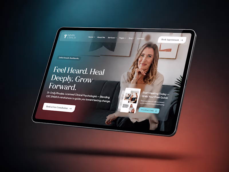
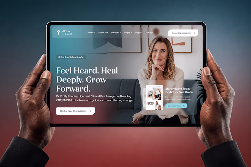
Which mockup feels more premium for coaches?
A or B 👇
Project loading…
7 voted
44%
9 voted
56%
16 votes
Closed
Going for the B because it looking more realistic
Round 2 👀
Which visual style is more appealing to you, and what emotions does each design evoke for you?
27 voted
50%
27 voted
50%
54 votes
Closed
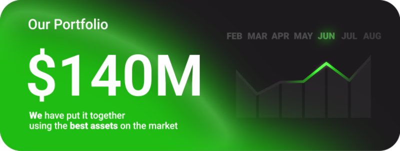
Left one for me. The green naturally reinforces the financial context, so the $140M immediately felt more connected to growth and value to me.
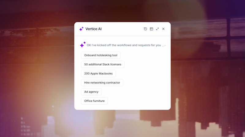
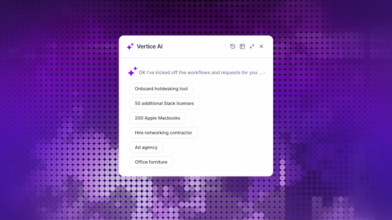
Same scene.
One with effects.
One without.
Crazy how 20% of visual polish can completely change how expensive a product feels.
Which one would you ship?
9 voted
19%
38 voted
81%
47 votes
Closed
Looks great, definitely FX on
Challenges
View allTrending
Claude
Claude has entered the design space. How are you using Claude Design?
Contra University
Learn from expert creatives how to earn more using next-gen AI tools.
MagicPath
The canvas is infinite, and exploration is becoming the workflow. How are you using MagicPath?
creativeaiflow
Creative AI workflows are evolving. What tools do you use, and what are their strengths and weaknesses?
freelancerlife
Freelancer life is wins, pivots, and everything in between. What’s yours right now?