The network for creativity
Join 1.25M professional creatives like you
Connect with clients, get discovered, and run your business 100% commission-free
Creatives on Contra have earned over $150M and we are just getting started
Back to feedPost
Taste Test


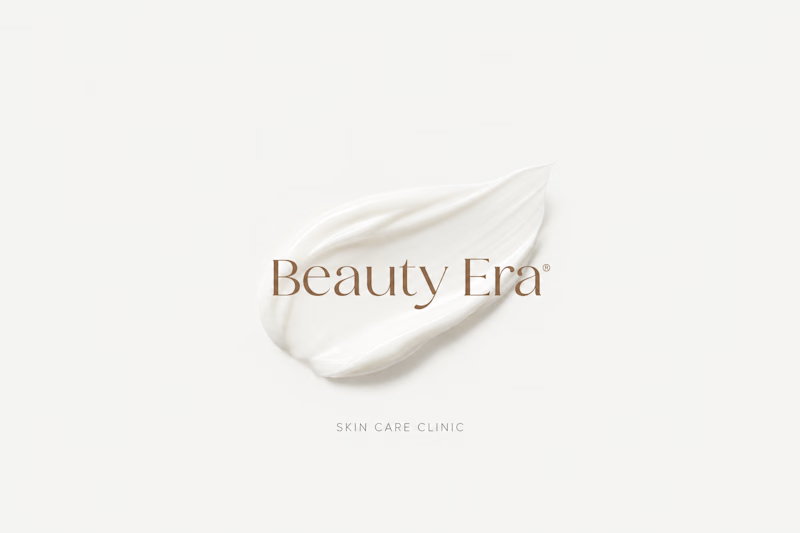
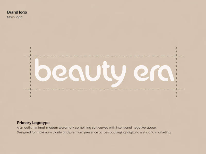
Which of the two logos is better?


8 voted
62%
5 voted
38%
13 votes
Closed

Voted Option 1. The serif version carries more weight for a skin care clinic. The lowercase construction grid on Option 2 is technically solid but it feels more like a fashion label than a treatment-focused brand.

Option 2

Option 1

Going with option 2

I go with option 1

I'd say it really depends on the brand's overall vibe. Option 1 is perfect for a high end luxury aesthetic, while option 2 works much better for a youthful, organic feel.
The network for creativity
Join 1.25M professional creatives like you
Connect with clients, get discovered, and run your business 100% commission-free
Creatives on Contra have earned over $150M and we are just getting started
Trending
retrofuturism
Share your favorite designs from the past exploring the distant future. Or your own take on the aesthetic 🚀
halftone
Dots. Texture. Grain. Let's see your designs using the halftone technique.

Midjourney
Creatives are showing off what they're making with Midjourney.
colorgrade
Video editors sound off: How do you enhance the mood of your video in color grading?


Related posts


Wooaah! Finally had the time to make a full case study of this project. I'm so super proud of everything we've built here! 😊✨
This project was super exciting. We had a very simple branding, connected to a complex product, ready to make the step to an enterprise market.
We layed out this concept against AutoRFP to show an enterprise approach. They loved it! ⚡️
Please support the case study by liking it, leaving a comment or just checking it out 👇


I this this is one of the best branding project i have seen today on contra.

This is a preview of one mark from my full collection. You can check out the complete Logofolio & Mascot Showcase on my Behance!
Thank you for watching!

simple but chic, love it


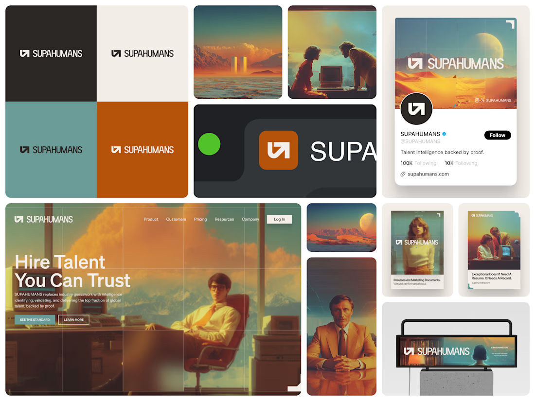

It's a privilege to follow your exponential growth. Such a rapid increase in authenticity and quality of your design work and projects. Incredible. Well done. 🤍


