The network for creativity
Join 1.25M professional creatives like you
Connect with clients, get discovered, and run your business 100% commission-free
Creatives on Contra have earned over $150M and we are just getting started
Back to feedPost


Wooaah! Finally had the time to make a full case study of this project. I'm so super proud of everything we've built here! 😊✨
This project was super exciting. We had a very simple branding, connected to a complex product, ready to make the step to an enterprise market.
We layed out this concept against AutoRFP to show an enterprise approach. They loved it! ⚡️
Please support the case study by liking it, leaving a comment or just checking it out 👇


The AutoRFP comparison is a smart move, seeing how the identity holds up next to a direct competitor is the real test. Was that always part of the plan, or did it come up once the branding was further along?


Looks really good man. You should be proud of this one!

I this this is one of the best branding project i have seen today on contra.
Thank you so much Mahmudul!
You are most welcome, how long did it take you to put together the full case study?

So inspirational!

This is amazing work! 🤍

Amazing work


Goated!
Thanks bro!

Nice work! 🔥

Amazing work!


simple brand + complex product is the hardest combo tbh

Job well-done, Chris

I think this is a project worth sharing here on Contra.
I’ve been looking for good case study inspiration, and this one gave me a much clearer idea of how I want to approach mine.

Amazing Work

Well done, Chris!

Looks great

The wordmark holding up against a full building sign is the real test for a "simple branding" claim, a lot of simple marks fall apart at that scale or lose their color. Kairos looks solid lit up at dusk in the shot you posted. Makes sense AutoRFP responded well to it, the stepped mark reads enterprise without going cold.

you nailed this project for real

Amazing and Goated!

What actually reads as "enterprise" here isn't the logo, it's the density and restraint in the UI itself — that's usually where simple branding either survives contact with a complex product or falls apart. Which part held up the most under pressure?

All 🔥

good job!


Spot on

One of tip tier project I've seen so far in this platform.
Impressive!
The network for creativity
Join 1.25M professional creatives like you
Connect with clients, get discovered, and run your business 100% commission-free
Creatives on Contra have earned over $150M and we are just getting started





Related posts

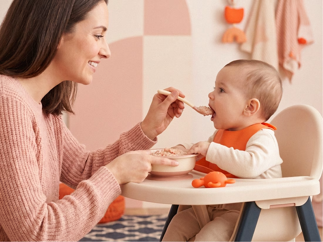
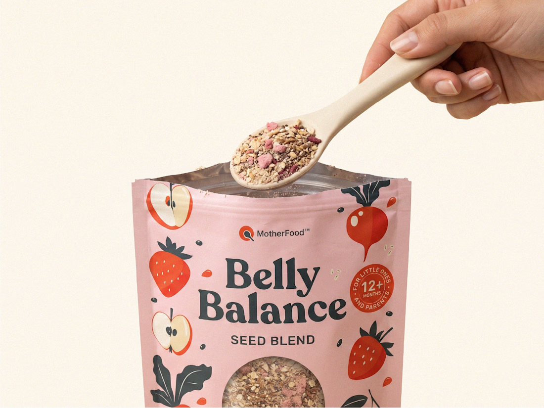
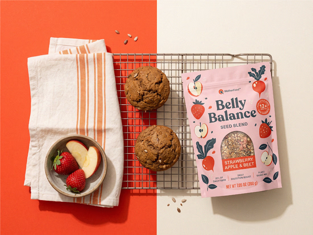
Digestive health for little ones doesn’t need to look clinical to feel credible.
For Belly Balance, I took the brand in a more joyful, approachable direction — using soft colors, playful illustrations, and a clean packaging system to make the product feel friendly without losing clarity.
The goal was simple: turn a functional product for babies and toddlers into something parents would feel good choosing every day.

premium work

$10K earned on Contra. 🎉💸
Grateful for every client who took a chance on me. This is just the beginning. More great products, more real partnerships, more milestones to hit. 🙌
Thank you to everyone who's been part of it. Onward. 🚀
#10k #contraearnings #Freelance #Webflow #Framer #Webdesign


Congratulations nice job 🎉🎉


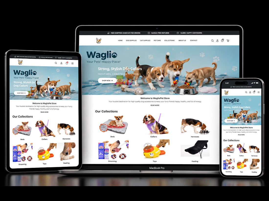
WaglioPet — Shopify Store Design & CRO
Designed and developed a conversion-focused Shopify store for WaglioPet, improving product discovery, merchandising, trust, mobile UX and the buying journey. Recent client-shared Shopify data showed $4,950.70 in daily sales, 121 orders and a 4.67% conversion rate.
Check it out