The network for creativity
Join 1.25M professional creatives like you
Connect with clients, get discovered, and run your business 100% commission-free
Creatives on Contra have earned over $150M and we are just getting started
Back to feedPost



Professional work bro
Thanks Rahman!

That's cool man it feels professional 🎉🎉🎉
Thanks!

Clean!

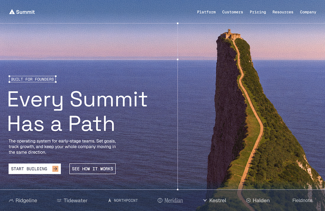
Love the concept here. The mountain path works so well with the “Every Summit Has a Path” message. 🔥
Some images make it easy; you simply have to reinforce the visual message that already exists.

Really nice composition. Love how the path in the image becomes part of the visual hierarchy. Great work!
Thanks, I’m glad you like it! Sometimes the message is already in the image, it just needs to be reinforced.

Top-notch design.
Thanks!


Lovely design !
Thanks!

Really clean layout and great imagery selection! Aesthetic vibes. 🔥
Thanks Saba, I’m glad you like it!

Nice design
Thanks!

Awesome 😎
Thanks!

Pro work. Congrats 🎉
Thanks Dan!

Really cool work🤩
Thanks mate!

The vertical guide through the sea stack is a clever ‘path’ metaphor without turning the hero into a UI demo. BUILT FOR FOUNDERS as an outlined pill stays quiet on that moody blue plate. Left-weighted type lets the rock stay the anchor—reads intentional, not default SaaS centering.

Nice design


such a great style! love it 🔥

I love this very much ❤️

The path running up the cliff ties into the headline really well. Did you generate the photo or shoot it?
Thank you very much, I’m glad you like it! I found the image in vertical format (credits to the rightful creator). It was generated with AI, and then I used AI again to create the horizontal option.
The network for creativity
Join 1.25M professional creatives like you
Connect with clients, get discovered, and run your business 100% commission-free
Creatives on Contra have earned over $150M and we are just getting started










Related posts


Gorgeous 😍


Your Hero Section Has One Job: Be Clear.
You don’t need huge headlines or long explanations. You need the right image + short headline + clear offer.
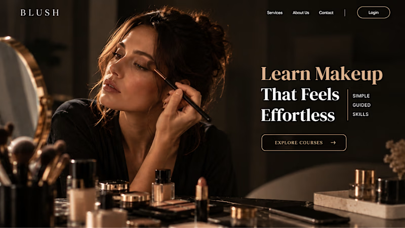
For the first version, we worked on the branding, the image and the copy together, so at first glance it’s clear: this is a makeup course, and here’s what you’ll get.
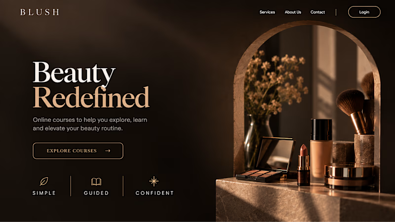
The second version is still beautiful and still feels like beauty. But what are you actually getting? A makeup course? Products? A store? That’s the problem with a Hero that looks good but isn’t thought through.
Your first screen doesn’t need to say everything. It just needs to say the right thing.

22 voted
61%
14 voted
39%
36 votes
Closed


AI can build the UI in minutes.
Bringing it up to a good standard, still needs a designer. Agree or disagree?
I see some of your work and honestly your work is really premium 🎉🎉
Great job Alex🎉🎉🔥🔥