The network for creativity
Join 1.25M professional creatives like you
Connect with clients, get discovered, and run your business 100% commission-free
Creatives on Contra have earned over $150M and we are just getting started
Back to feedPost
Taste Test
Working on the landing page for an AI translation startup .Which style do you think looks the best?
54 voted
37%
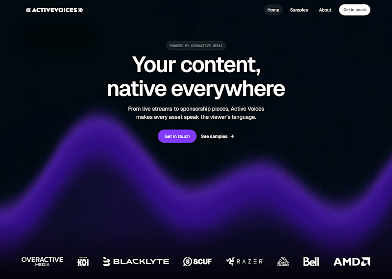
91 voted
63%
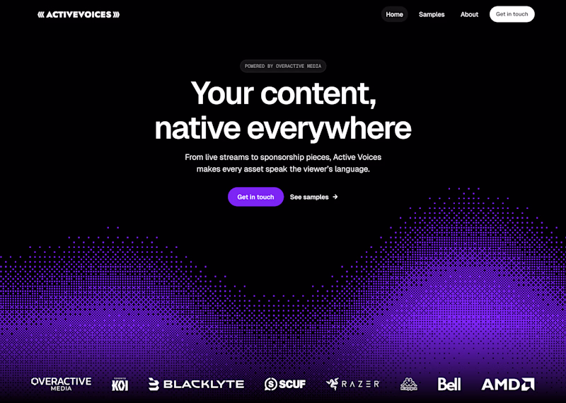
145 votes
Closed
both versions look clean! but i'm leaning towards the gradient one, it has that smooth sleek vibe that's perfect for an ai brand
Thanks Faith! I am kind of leaning towards gradient as well but a lot of people like the dithered as well
Thanks Amy! Interesting insight, will have to play around with the placement of the gradient element
Exactly. i voted for gradient but thought it could move down a bit. I think gradient is easier on the eyes.
Interesting! I've been seeing a lot of the same sentiment, I wonder if I moved the gradient down a bit it would change the voting
Dithered for me, it gives the illusion of talking to the AI tool
I love that thought, super interesting!
Thanks!
Dithered one looks awesome in my opinion.. Specially in AI space where softer gradients are overused!!
Very true haha it seems design has moved past gradients in favor of dithered effects
Gradient seems to be competing for attention with the hero text, Dithered for the win!!
Thanks!
I prefer the dithered one
Dithered works for me , love how clean hero section is !🙌
Thanks! Clarity and minimal is always the best option
Def Dithered
Gradient becomes kinda like old school.
Dithered is new in the market!
And people want to see something new to their 👀
True! It is definitely par for the trend right now
The first looks absolutely amazing, Reminds me of digital communications waveforms😊
Thank you! That's exactly the vibe I'm going for
Thank you, I really appreciate that!
By the way, I’m a full stack developer and I’d be happy to help turn this into a real working project if you’re interested — from backend to frontend and deployment.
Let me know, I’d love to collaborate.
Currently the project is in progress building with Webflow, but thank you! I'll keep it in mind for future projects
Team gradient here, both look awesome but gradient gives more professional vibes.
Interesting! I never thought of it quite like that
Dithered
Both are great, but dithered for me
Any extra thoughts on why? Or just how it looks?
My heart tells me🙌
Can't argue with that haha
Dithered looks awesome David 🙌
Thanks Pranav!
Gradient it is...
Such a hard choice lol. I started liking the gradient and no I don’t know anymore haha
Tough choice, but I'd go with Dithered. It feels more intentional and less like a standard SaaS template. Both layouts are super clean, though!
Thanks! I love that insight, seems like gradients are definitely played out and people are tired of them haha
I prefer the second screen better for its better simplicity.
Thanks Oluwaseun!
Would love to see the dithered version with some motion, either just autoplaying or perhaps based on cursor movement ✨
Both of these examples are actually animated, just wanted to see what the public thought about the static versions first haha
Will be working on that aspect next
Animating on cursor movement is an interesting idea I'll try that out!
This is cool
Thanks!
the gradient version feels right for this — smooth and modern, perfect for showing off translation tech
Thanks Stephanie! I agree
the Dithered one.
dithered really looks best for me
Loving the dithered look for sure!
Thanks Evan!
For a general AI tool, Gradient is safer. But if this were an AI Translator, I’d go for something even cleaner with more 'white space' and maybe some glassmorphism. A translator needs to feel fast and accurate, and too much grain (Dithered) can feel like 'noise' in the communication.
Interesting thought! Never considered that, while both are in a way similar, the details of them give off different feelings about the quality of the tool
i love the second version
For an AI translation startup, I’d say Gradient. I’ve found smoother visuals communicate accessibility better than textured ones
Interesting take! Thanks Razvan
The network for creativity
Join 1.25M professional creatives like you
Connect with clients, get discovered, and run your business 100% commission-free
Creatives on Contra have earned over $150M and we are just getting started
Related posts
recent static ad work for an AI-native B2B marketing automation platform
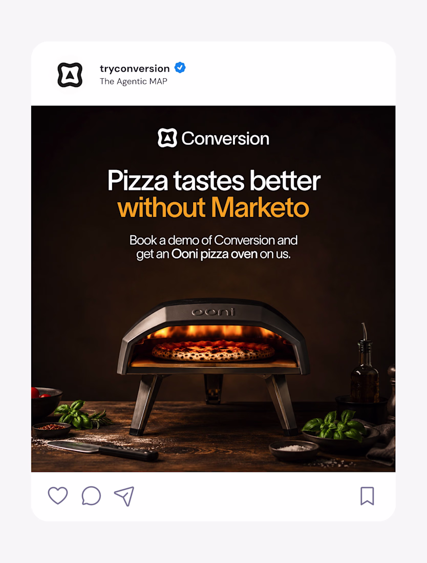
Nice work as usual! The layout balance here is exactly what makes high-converting landing page hero sections work.
New resource: Auria AI Rebuild Prompt ✦
I turned the complete Auria homepage into one detailed prompt for Codex and Claude Code.
Auria is a luminous Framer template created for modern service businesses, wellness brands, and productized offers.
Usually $19. Free for anyone who supports Auria on its Framer Marketplace page.
Get the prompt:
https://startfrom.co/templates/auria
Created with Framer, Midjourney, Claude Code, and Codex.
Rebuilding a whole landing page with just one prompt is such a cool experiment, Alex! Did Claude Code manage to handle the Framer-specific layout structure well on the first try?
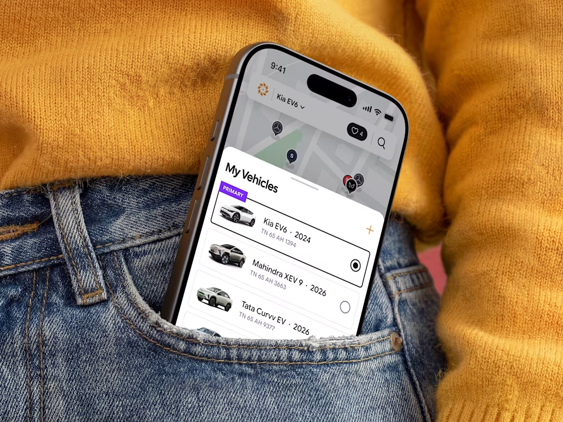
⚡ Just published my latest case study: ChargeIndia.
Branding and Mobile app for an EV charging platform focused on creating a seamless, scalable, and user-friendly charging experience.
Proudly made for the Indian market.
Amazing work!
Trending
Claude
Claude has entered the design space. How are you using Claude Design?
Contra University
Learn from expert creatives how to earn more using next-gen AI tools.
creativeaiflow
Creative AI workflows are evolving. What tools do you use, and what are their strengths and weaknesses?
freelancerlife
Freelancer life is wins, pivots, and everything in between. What’s yours right now?