The network for creativity
Join 1.25M professional creatives like you
Connect with clients, get discovered, and run your business 100% commission-free
Creatives on Contra have earned over $150M and we are just getting started
Back to feedPost
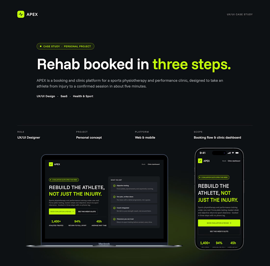
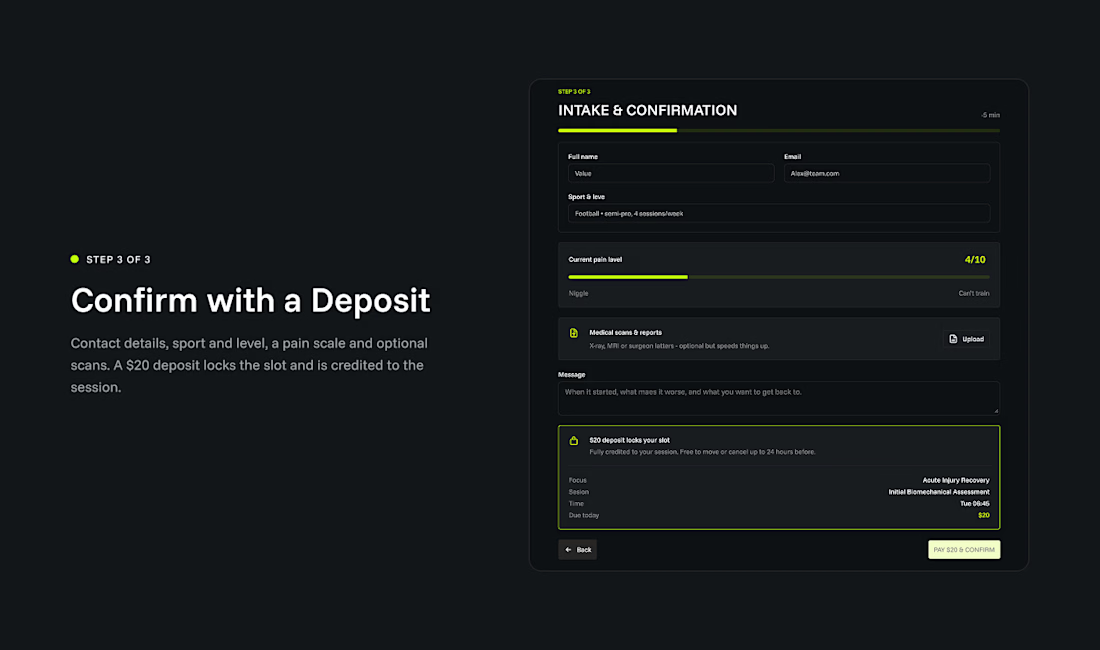
If booking an appointment feels like filing taxes, patients will drop off.Most sports physio clinics lose clients to phone tag, hidden pricing, and tedious paperwork.When designing APEX, my goal was simple: turn a complex clinical intake into a frictionless 4-step booking flow. Here is the UX architecture behind it:
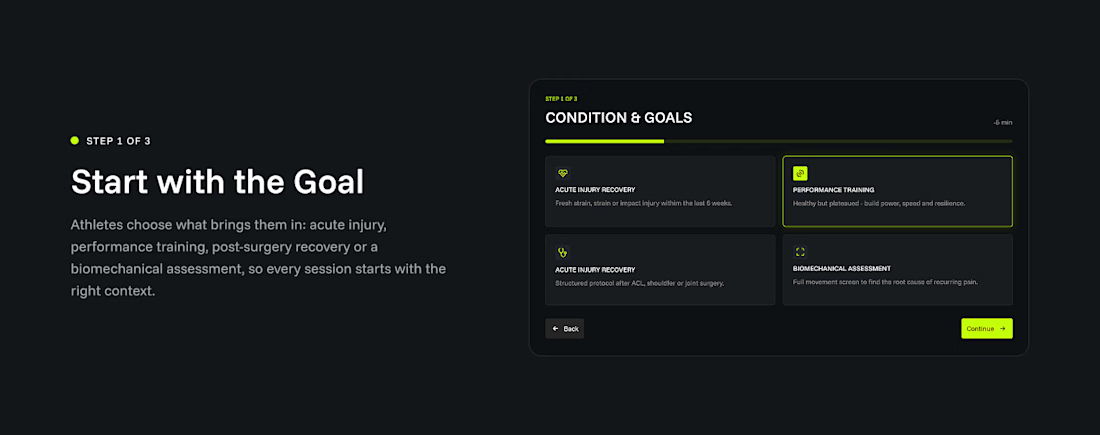
🔹 Intent Over Calendar Instead of forcing a calendar on day one, we start by categorizing the athletes goal—rehab, performance, or assessment. This builds trust and aligns the session with their specific physical needs.
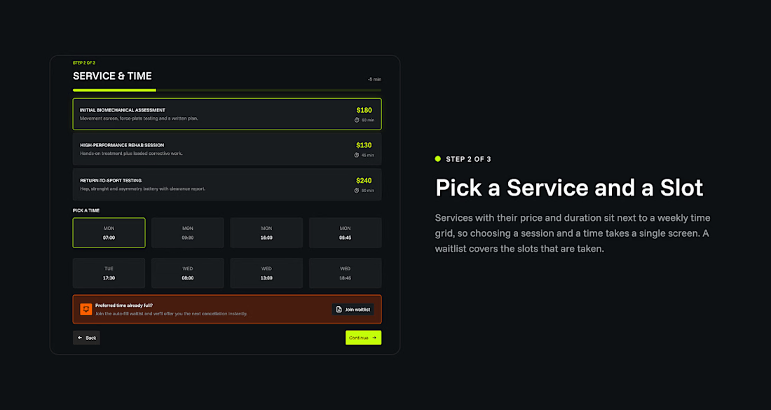
🔹 One Decision Per Screen To eliminate cognitive overload, every stage requires exactly one choice. Clean progression, zero friction.
🔹 Transparent Booking Clear pricing tiers, live weekly slot grids, and an automated waitlist—all in one place. No phone calls required.
🔹 High-Performance Aesthetic Dark-first canvas (#0D1013) to minimize eye strain, paired with vibrant electric-lime tokens (#C2FD0A) to guide high-intent actions.




phone tag and hidden pricing are exactly why i never book physio online

Totally agree, Benjamin! That's the classic symptom of unnecessary friction in the service.
The network for creativity
Join 1.25M professional creatives like you
Connect with clients, get discovered, and run your business 100% commission-free
Creatives on Contra have earned over $150M and we are just getting started

Challenges
View all


Related posts


In recent days I’ve been practicing designing around an image.
Sometimes an image can have great potential and reinforce the message we want to convey. I’m not saying this is the correct way to prepare a strategy, it’s simply an exercise. As a result, I created these three hero section designs, which I’ve published in the Figma community where they can be freely used for experimentation.
If you use them, I’d love to see the outcome, so make sure to tag me!

So beautiful

Same data, two different ways to experience it 🤔
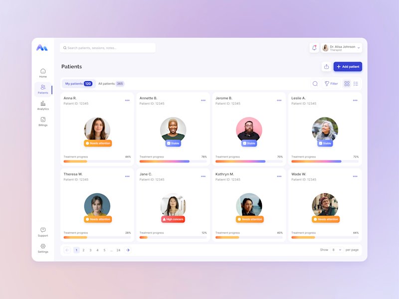
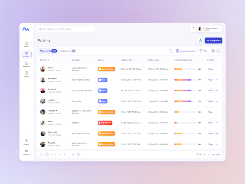
I explored two patient list layouts for a mental health platform: a card view and a table view.
Cards feel more visual and personal, but space is limited and adding more information can quickly make them crowded. For complex enterprise products, I often find tables more practical — they’re easier to scan, compare, sort, and can support more columns when users need greater visibility.
For this kind of workflow, I’m leaning toward the table view. Which would you choose — cards or table?
11 voted
55%
9 voted
45%
20 votes
Closed

For a mental-health patient list the choice isn't really card vs table — it's scan-speed vs context. The card wins the first meeting because the photo and name set the clinician's mental model before they touch the row, but the table is what holds up under the daily rhythm of...

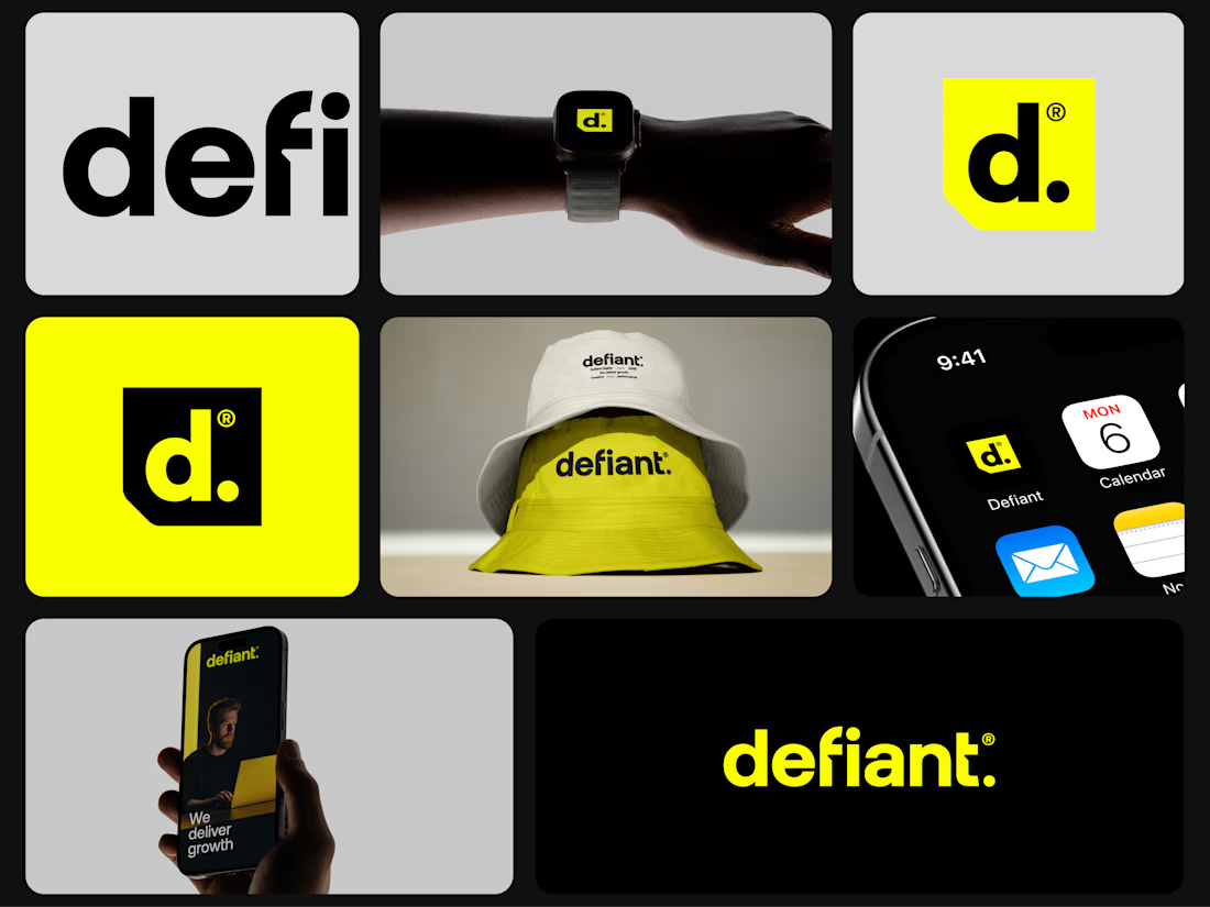
A little bit of the work I did for an agency in Australia some time ago.
I hope you like it.


Amazing