The network for creativity
Join 1.25M professional creatives like you
Connect with clients, get discovered, and run your business 100% commission-free
Creatives on Contra have earned over $150M and we are just getting started
Back to feedPost

In 2024, I was responsible for the redesign of Carvi, a menswear brand focused on basic t-shirts. The project involved everything from strategic direction to the creation of the naming and the entire visual identity.
The name “Carvi” was created by combining the first syllables of its co-founder’s name, Car-los Vi-eira.


The network for creativity
Join 1.25M professional creatives like you
Connect with clients, get discovered, and run your business 100% commission-free
Creatives on Contra have earned over $150M and we are just getting started



Related posts

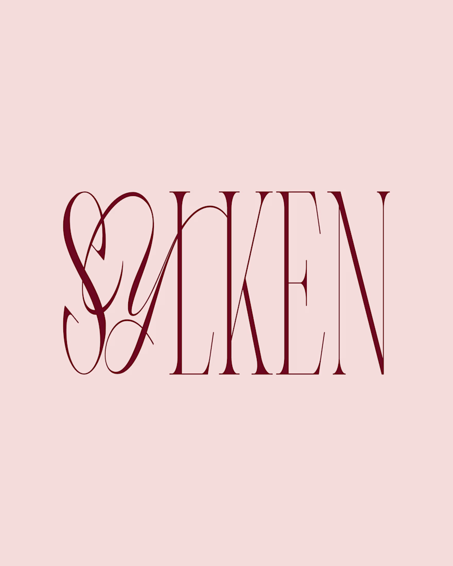
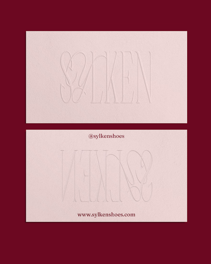
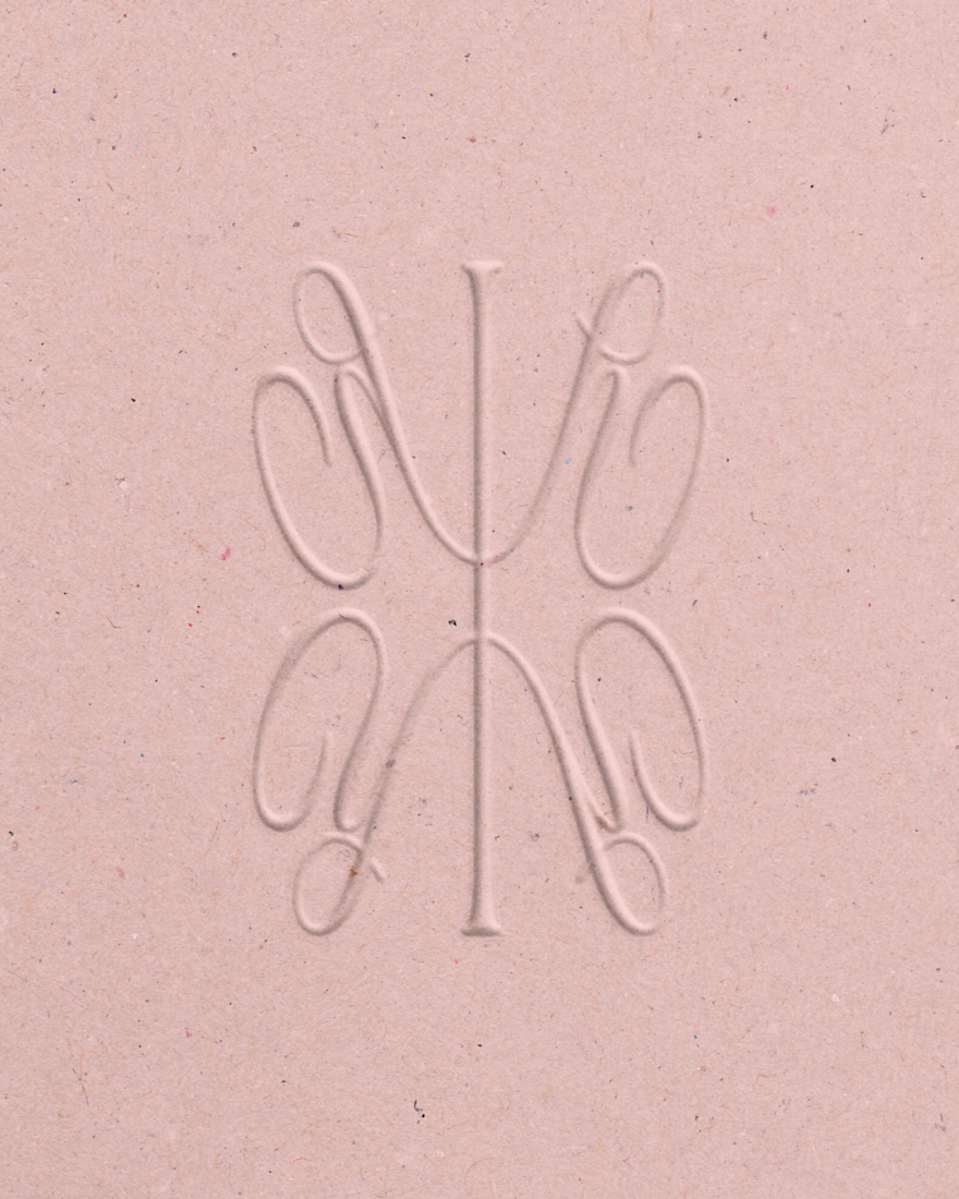
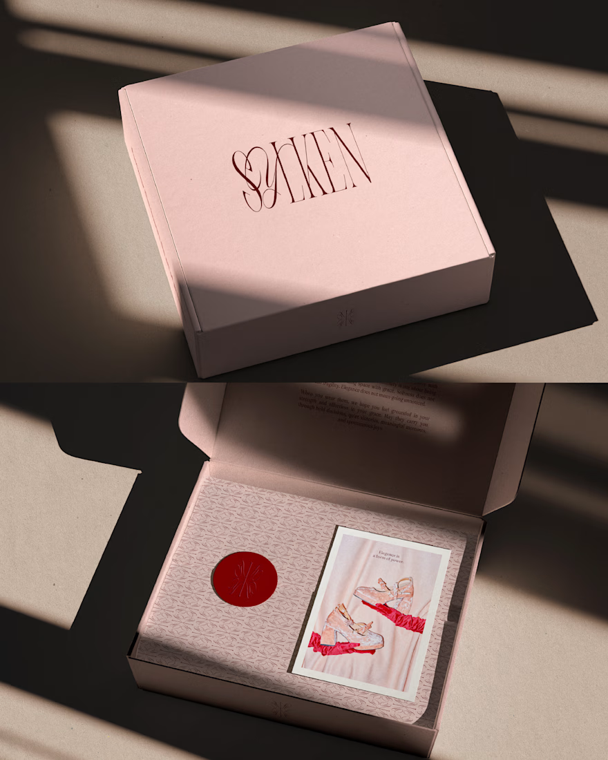
Sylken is a feminine silk footwear brand built around the balance between elegance, softness and confidence. The visual identity explores a contemporary interpretation of femininity, combining romantic elements with a refined and distinctive brand personality.
A palette of soft pink and rich red brings together warmth and sophistication, while the logo pairs classic serif typography with delicate handwritten details for a more personal touch. A custom brand symbol extends the identity beyond the wordmark, creating a recognisable visual element that reinforces the brand's character across its applications.

Wonderful work!

One pixel grid. A whole brand.
For Appy, a London product studio for impact-driven startups, the wordmark, icons, 3D smile and Appy Pixel, its custom typeface, all come from the same grid.
Appy Pixel won Typography at the Online Design Awards.
Type first or symbol first: where do you start a rebrand?



thats so nice, i loveee

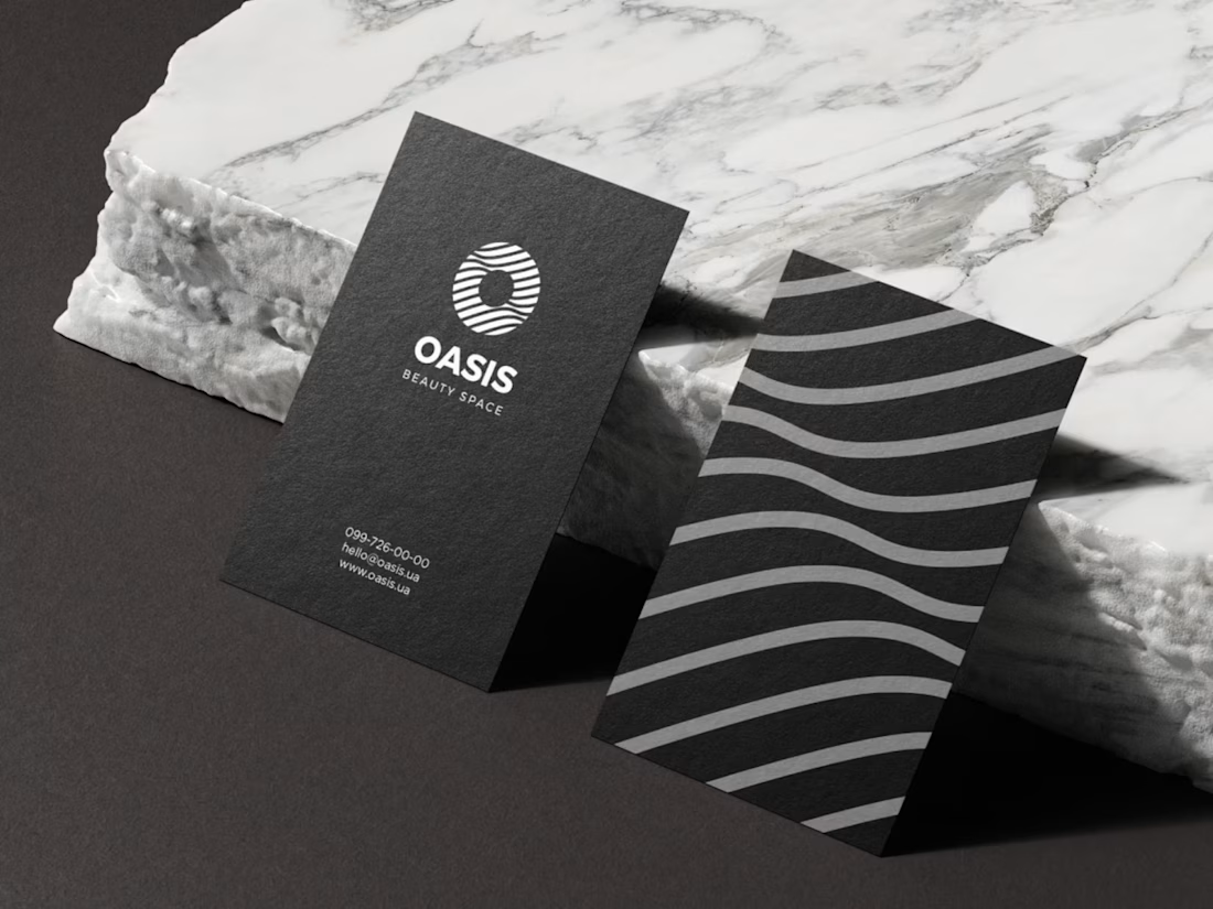
A minimalist visual identity created for Oasis, a modern beauty space.


Great work!