The network for creativity
Join 1.25M professional creatives like you
Connect with clients, get discovered, and run your business 100% commission-free
Creatives on Contra have earned over $150M and we are just getting started
Back to feedPost

Seven, two, then a cup.
New case study: Cafe Seventy Two, a brand identity for a coffee house, told as one day at the cafe, from doors open at 06:00 to last call at 23:00.
The name is a number, so the mark writes it. One monoline draws the 7, loops into the 2 and finishes as a cup with its handle. Beside it, a tall gold tab holds the word CAFE, like the label on a bag of beans.
Under the surface, the system is strict:
→ One line weight, round terminals. Nothing is filled; everything is drawn.
→ The tab is 1:3, the proportion of a bag label. Its top meets the centre of the 7, and the cup sits on its base.
→ Six colours, each sized by how much it’s used: Espresso Ink, Roast, Crema Gold, Travertine, Steamed Milk and Morning Sky.
→ Archivo for the working voice (times, prices, menus), Instrument Serif Italic for the human one.
Then we followed it through the day: takeaway cups and the barista’s apron in the morning rush; menus, ceramics and a painted mural at lunch; beans, a tote and a loyalty card that counts in sevens in the afternoon; and neon, a brass facade sign and bus-shelter posters after dark.
Scope: Logo, Identity System, Packaging, Signage, Motion
Studio: Theepa Studio, Dubai


The network for creativity
Join 1.25M professional creatives like you
Connect with clients, get discovered, and run your business 100% commission-free
Creatives on Contra have earned over $150M and we are just getting started





Related posts


Okaaaayy, new profile picture and a new project! 🥳
This is one i'm really proud of and shows the development in our studio. Not just a brand or a website, but 120+ app screens + full IOS development for Mercury 🌍
I'm super proud of this project! Please check it out :)) 👇


Huge congrats Chris! 🎉 120+ screens + full IOS dev for Mercury is massive! Love the growth of your studio - from brand to full product. The editorial typography card looks premium. Big inspiration for us building in the app space! Checking it out now 👏

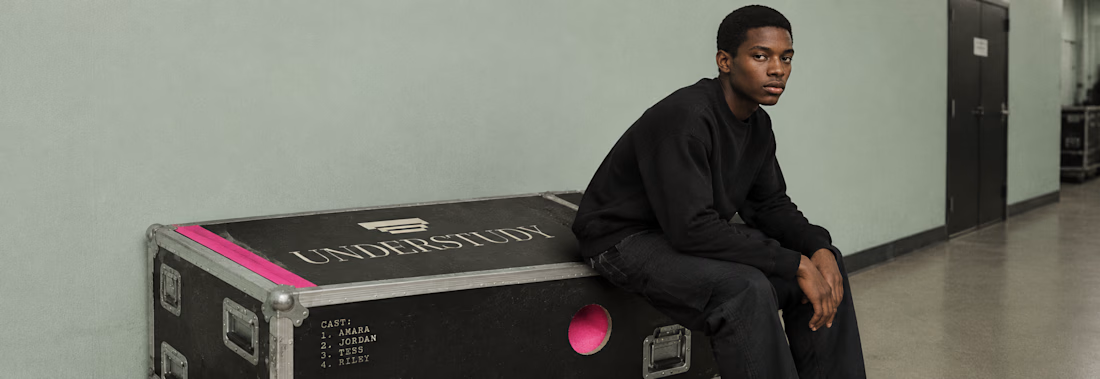
What happens when a brand’s best idea is a hole?
UNDERSTUDY is a theatre identity that opens circles onto doubled eyes, black voids and displaced cheeks, in hot pink Didone on pale sage, with the cast list as texture.
One cut, applied everywhere. Case study live Now.

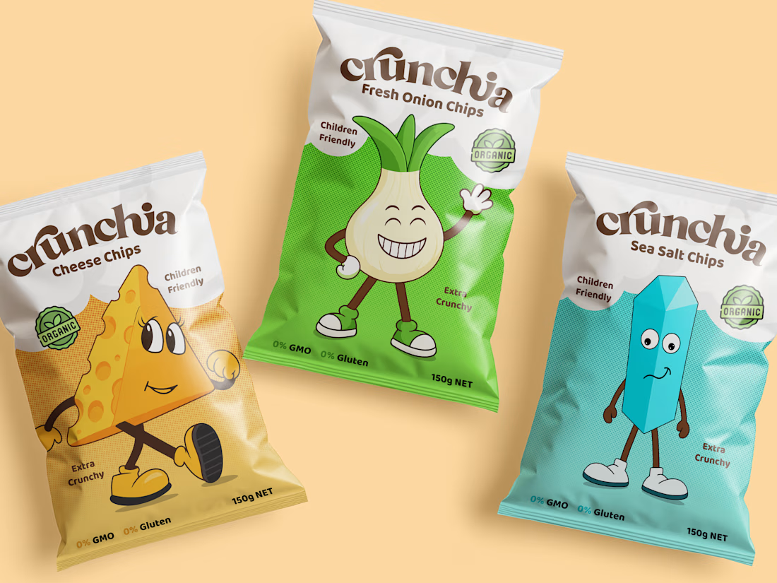
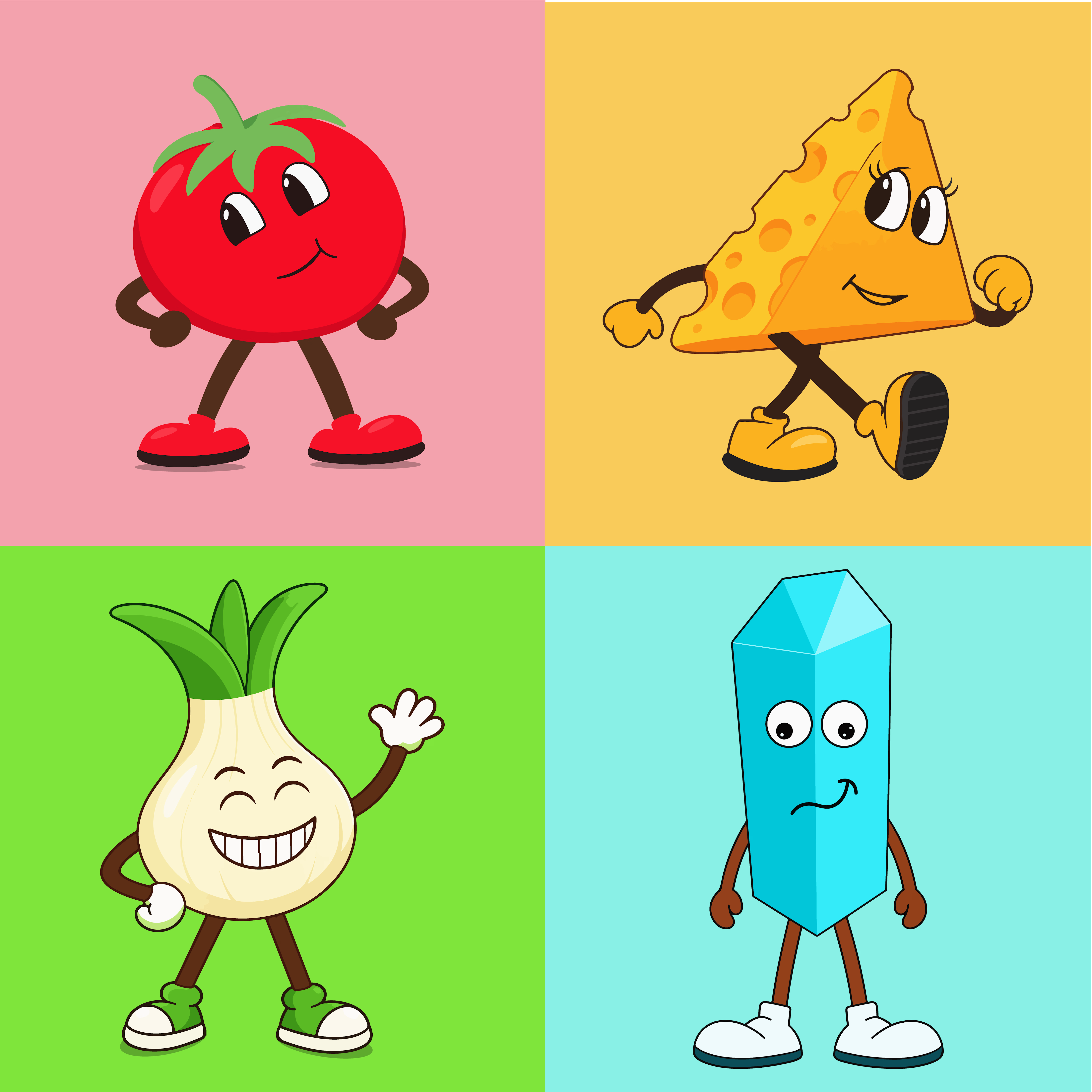
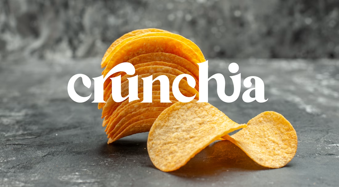
Crunchia – Brand Identity & Packaging Design
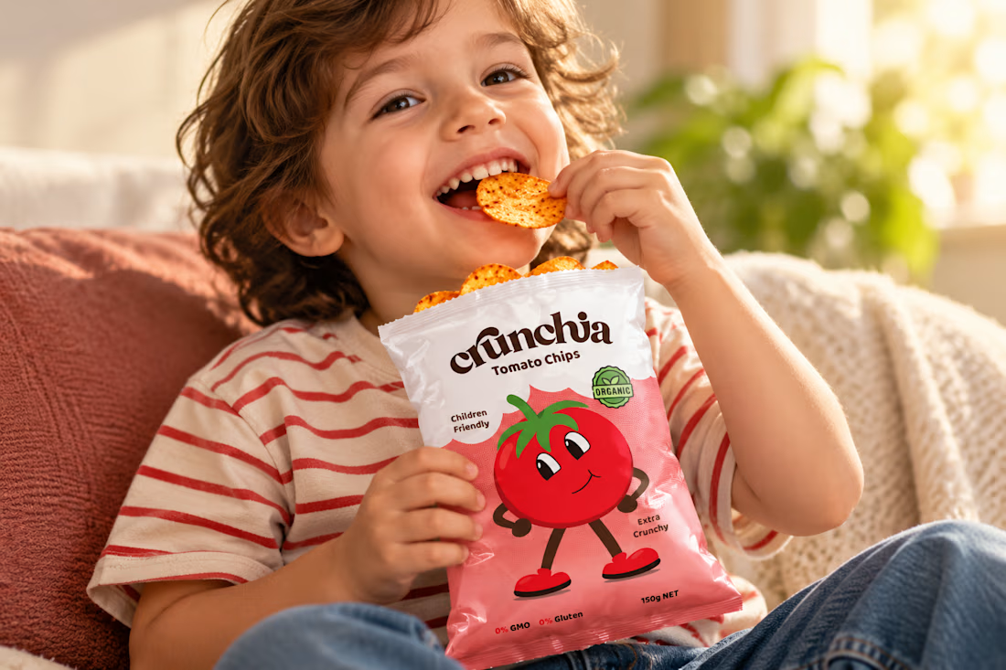
Developed a playful and eye-catching brand identity and packaging design for Crunchia, a tomato chips brand aimed at children and families. The project included a custom logo, vibrant packaging design, and a friendly tomato mascot to create a memorable and recognizable brand.
I also created realistic product mockups and lifestyle visuals to showcase the packaging and present the product in an engaging, market-ready way.