The network for creativity
Join 1.25M professional creatives like you
Connect with clients, get discovered, and run your business 100% commission-free
Creatives on Contra have earned over $150M and we are just getting started
Back to feedPost
Taste Test
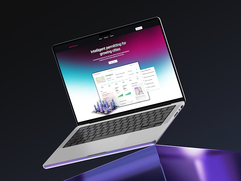
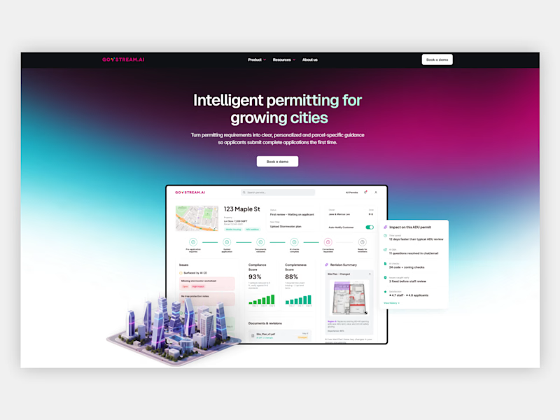

Going for the mockup version

Mockup for sure. The laptop context gives the interface a sense of scale and use, which helps the reader mentally place themselves in it before they even read a word.

I'm going for Mockup as well🔥

Screenshot for me.
For a case study cover, I want to understand the product as quickly as possible. The screenshot immediately shows the interface, layout, and complexity of the work, which creates more context at first glance.
The mockup looks more polished and visually striking,...
Thanks for sharing your opinion Bhaskar, Personally I focus on what looks the best to clients rather than fellow designer/developers.

Really clean and well-structured design 👏 Love the simplicity!

Mockup will do that!


My opinion as well 🔥

Option A: clean. Option B: also clean. My brain: error 💀

Mockup looks great

There's this elegance with the mockup

the mockup made it feel alive


Amazing

Mockup is nice

Option A

The network for creativity
Join 1.25M professional creatives like you
Connect with clients, get discovered, and run your business 100% commission-free
Creatives on Contra have earned over $150M and we are just getting started

Challenges
View all


Related posts

One brand, very different variety products. 👀
BASYX is one of my favorite projects because the packaging had to work across categories, from skincare to food, while still feeling like one cohesive brand.
That’s the fun challenge of multi-product brands: creating a visual system flexible enough to grow without losing its identity.

wow amazing


GoTeacher found our Sunbeam template and asked us to make it theirs.
GoTeacher is backed by Harvard Innovation Labs and helps 100+ K-12 school districts see every app they pay for and whether it's safe for student data.
We kept Sunbeam's structure and animations and built the rest: GoBot the 3D mascot, shader clouds, real product dashboards and five product pages. Live in one week.
Full case study on my profile. Want one of our templates turned into your own site? Message me.


The work is interesting


