The network for creativity
Join 1.25M professional creatives like you
Connect with clients, get discovered, and run your business 100% commission-free
Creatives on Contra have earned over $150M and we are just getting started
Back to feedPost

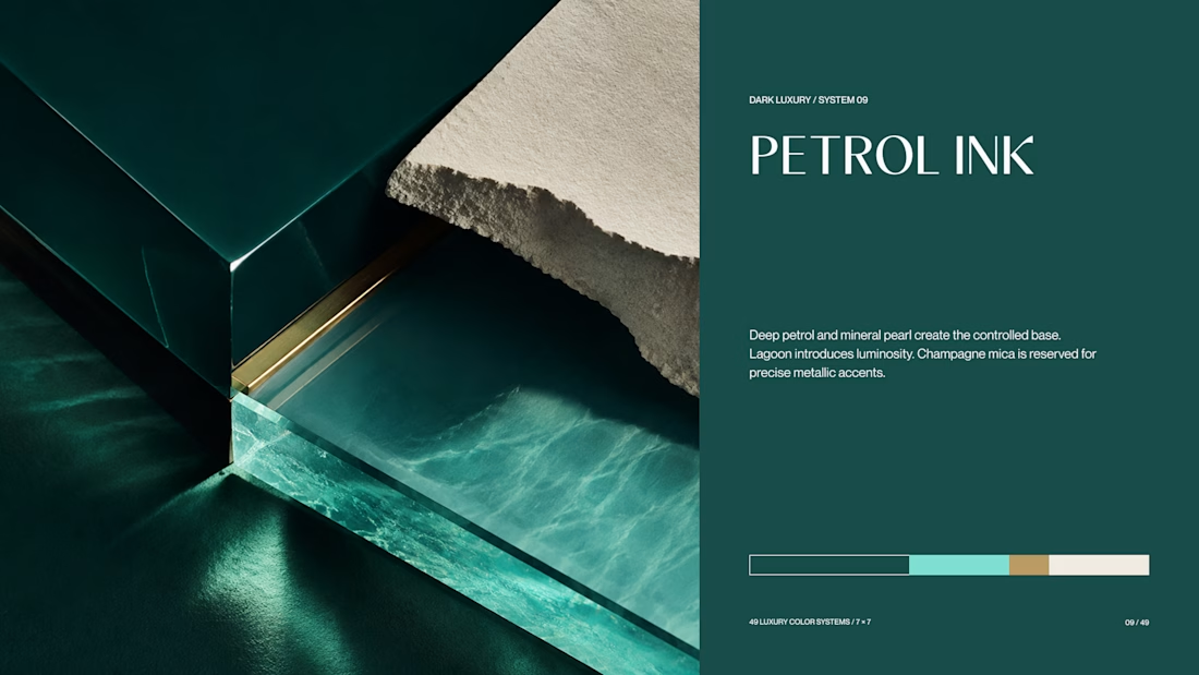
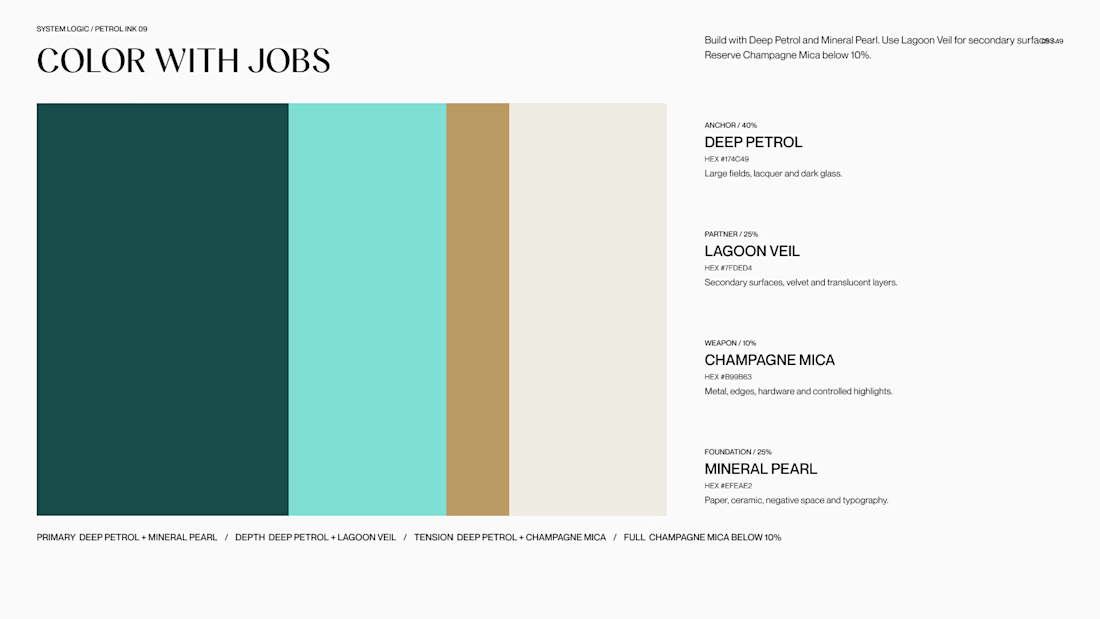
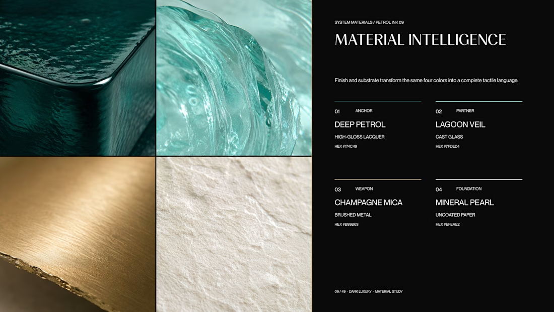
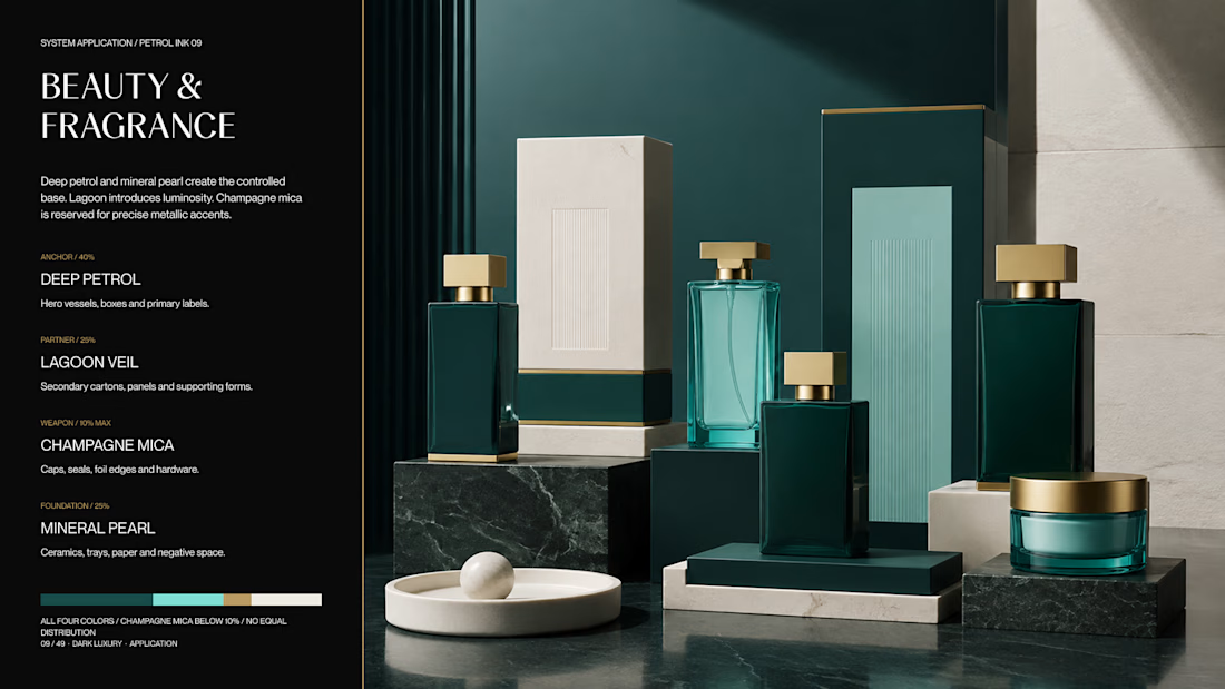
I would never use these four colors equally.
That is probably the most important thing about this system.
Petrol does most of the work. The lighter color gives it space. The red is there to interrupt it, not decorate everything.
This is Petrol Ink, one of the 49 systems I built for 49 Luxury Color Systems.
The full collection is now on Contra.
https://contra.com/products/zxUwjO8a-49-luxury-color-systems-for-brands-and-packaging


Thanks, Ganesh! I put a lot of effort to create something new and unexpected, while keeping it working for brand and packaging work, not just inspirational. :)
The network for creativity
Join 1.25M professional creatives like you
Connect with clients, get discovered, and run your business 100% commission-free
Creatives on Contra have earned over $150M and we are just getting started




Related posts

Orange vs. Blue
Two color directions. One hero section. Which one would you pick?
6 voted
32%

13 voted
68%

19 votes
Closed

I dont think every SaaS should have a blue tone, orange looks very more attractive while the message also stays clear. 🙌


Some logos try to say everything.
The best ones say just enough.
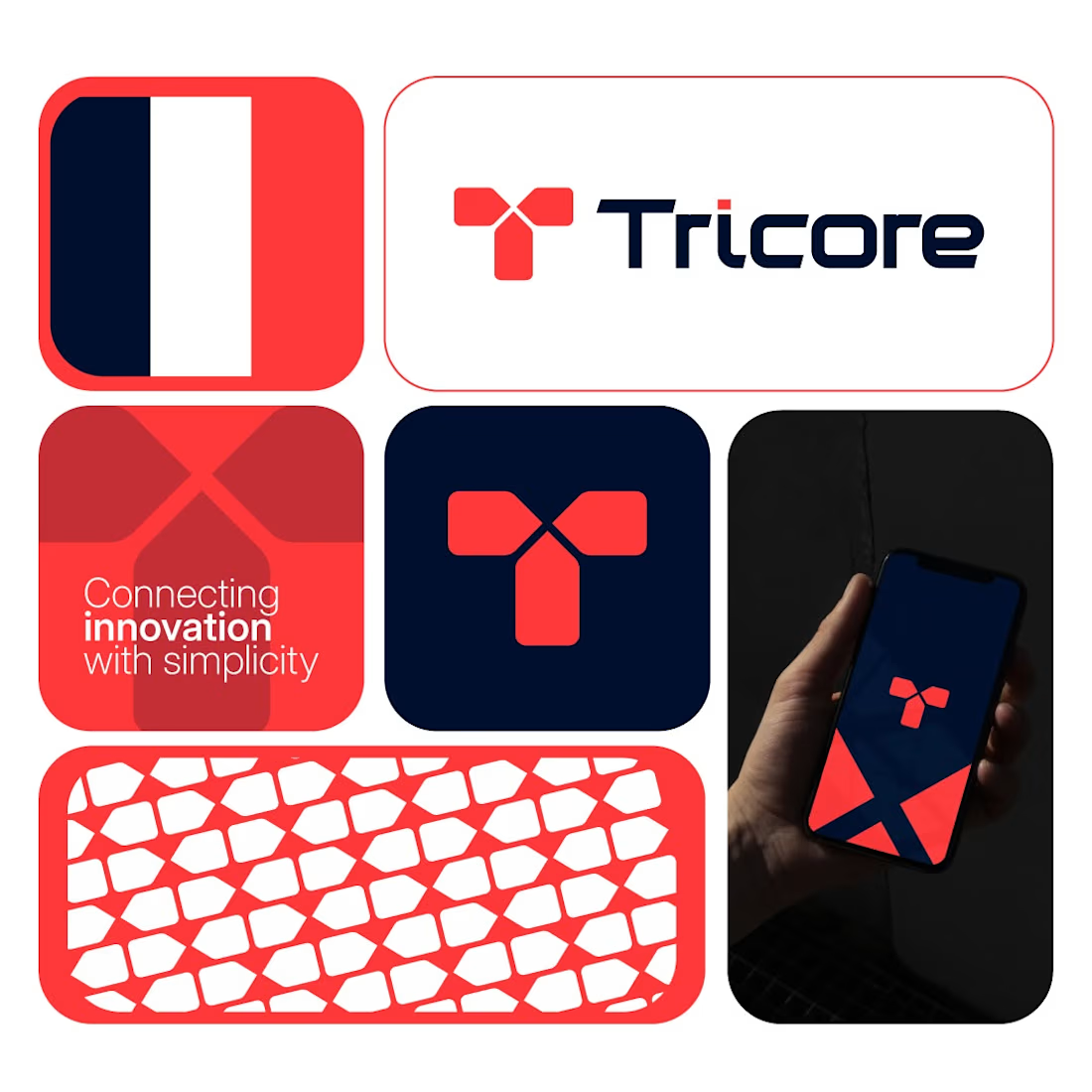
Tricore was built around a simple visual concept:
three connected elements working together as one system.
No unnecessary details.
No visual noise.
Just a clean identity designed to be memorable across screens, products, and future brand applications.
A strong logo should still be recognizable when:
• Scaled down
• Viewed quickly
• Seen from a distance
That's the standard I try to design for.
What's your first impression of this identity?
👇 One word only.



Cohesive.

Which color direction feels right for this digital payment app?
While designing a full digital payment app experience, from bills overview to payment confirmation, I explored two different color systems for the entire flow. Same screens, same functionality, just a different accent palette and personality.
Option 1 - Neon Green. Bold, high-energy, and gives a sharp, fintech-forward feel throughout the journey.
Option 2 - Cyan/Blue. Cool, modern, and leans more premium and trustworthy across the whole app.
Would love your honest UX/UI take, which direction feels more trustworthy, engaging, and appropriate for a digital payment app, and why? 👇
3 voted
38%
5 voted
62%
8 votes
Closed

Cyan/Blue