The network for creativity
Join 1.25M professional creatives like you
Connect with clients, get discovered, and run your business 100% commission-free
Creatives on Contra have earned over $150M and we are just getting started
Back to feedPost
Taste Test

Which color direction feels right for this digital payment app?
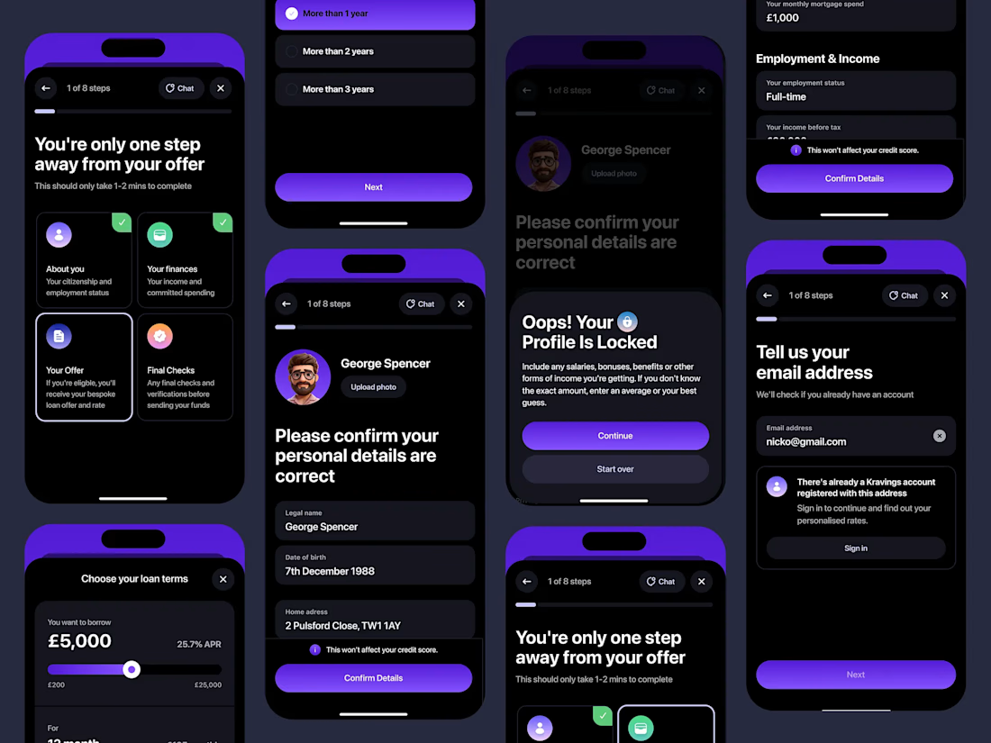
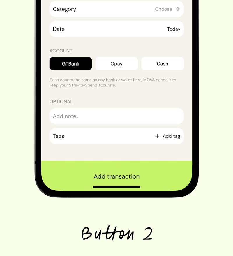
While designing a full digital payment app experience, from bills overview to payment confirmation, I explored two different color systems for the entire flow. Same screens, same functionality, just a different accent palette and personality.
Option 1 - Neon Green. Bold, high-energy, and gives a sharp, fintech-forward feel throughout the journey.
Option 2 - Cyan/Blue. Cool, modern, and leans more premium and trustworthy across the whole app.
Would love your honest UX/UI take, which direction feels more trustworthy, engaging, and appropriate for a digital payment app, and why? 👇
3 voted
38%
5 voted
62%
8 votes
Closed

Same bill list, only the accent changes, which makes the test fair. Green makes the amounts jump; the cyan chips on the right sit calmer for a payment flow.

Cyan Blue

Cyan/Blue
The network for creativity
Join 1.25M professional creatives like you
Connect with clients, get discovered, and run your business 100% commission-free
Creatives on Contra have earned over $150M and we are just getting started

Challenges
View all


Related posts

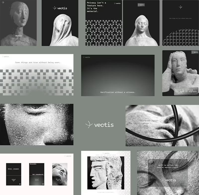
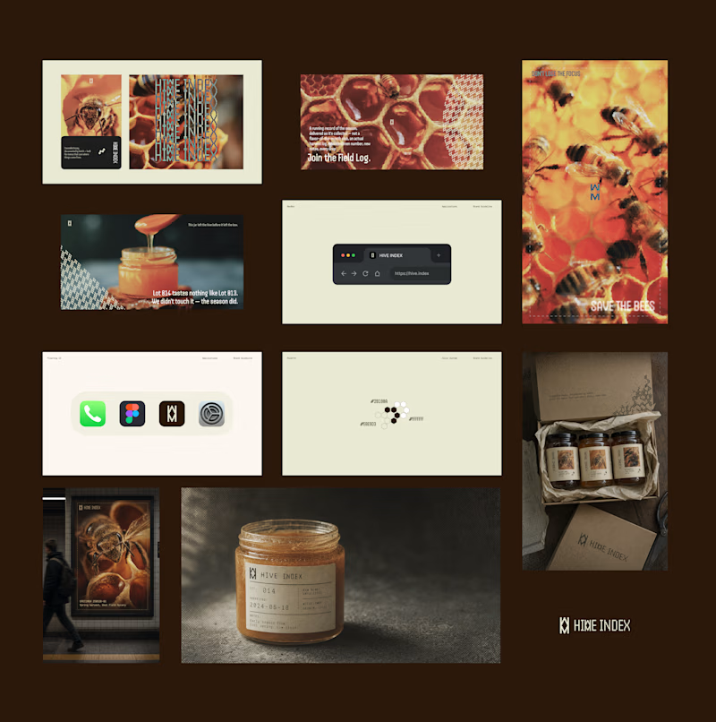
Two case studies, two totally opposite registers.
One is carved in stone and says nothing.
One drips off a spoon and won't shut up about which field it came from.
Which one do you want first?
vectis — zero-knowledge privacy, dithered like a forgotten statue
HIVE INDEX — raw honey with a paper trail. No two lots taste the same, and we don't correct for that.
45 voted
51%
43 voted
49%
88 votes
Closed

Vectis



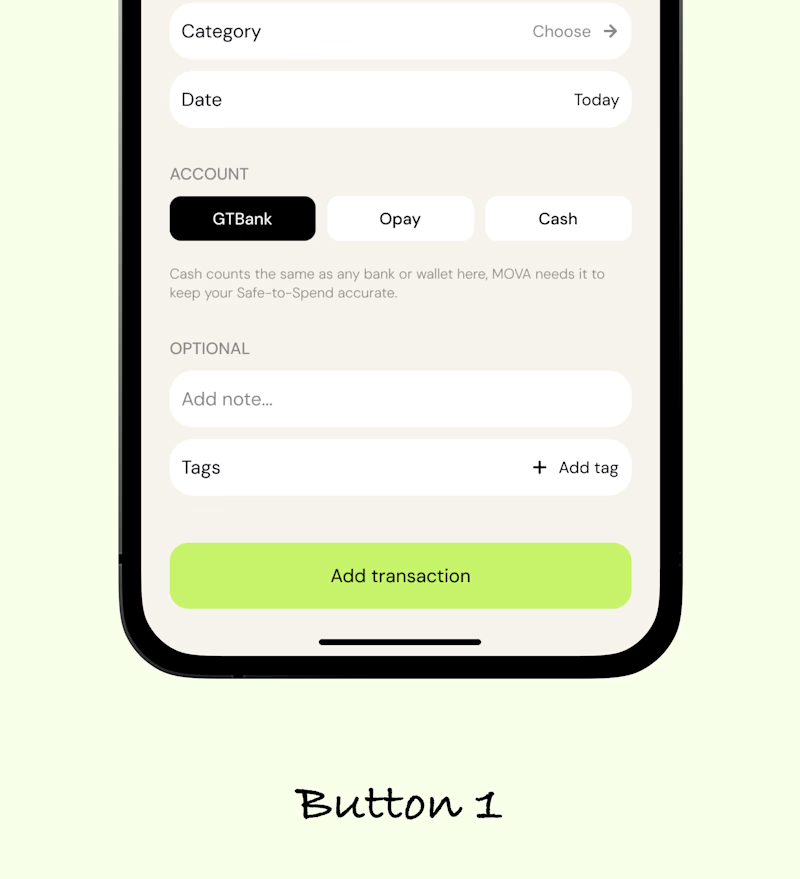

Button 1 does the work