The network for creativity
Join 1.25M professional creatives like you
Connect with clients, get discovered, and run your business 100% commission-free
Creatives on Contra have earned over $150M and we are just getting started
Back to feedPost
Taste Test

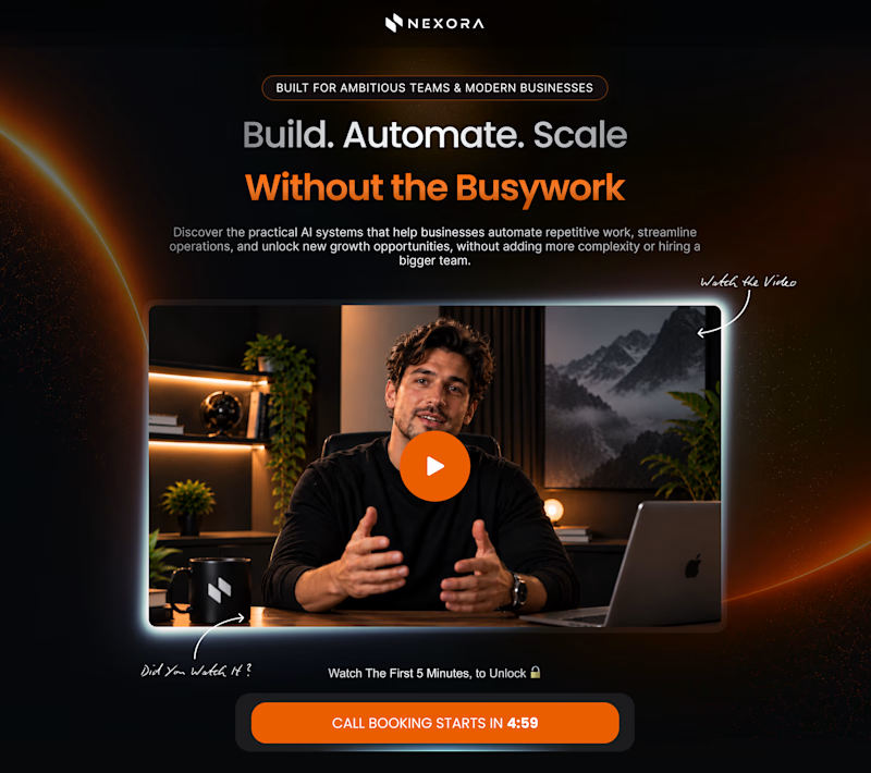
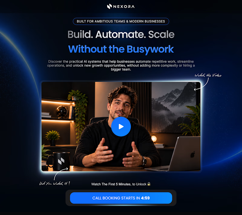
Orange vs. Blue
Two color directions. One hero section. Which one would you pick?


5 votes
Ends in 1d

Blue for me. The type stays readable and the booking button still owns the contrast, while the orange frame starts fighting that CTA.
Thanks for sharing your perspective!

Thanks for voting!

Blue feels more polished for a business SaaS, but Orange grabs attention instantly. Depends on the tone you want: Orange for energy and urgency, Blue for trust and authority.
The network for creativity
Join 1.25M professional creatives like you
Connect with clients, get discovered, and run your business 100% commission-free
Creatives on Contra have earned over $150M and we are just getting started
Challenges
View all


Related posts


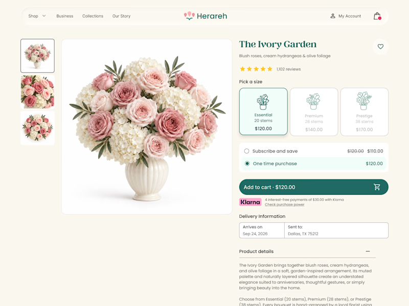
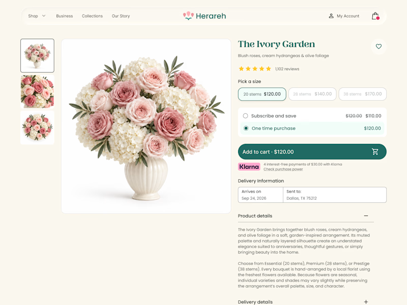

Icon cards for me, bouquets are such a visual purchase that a scannable icon beats reading "small/medium/large" every time. Did the compact chips version convert worse in testing, or are you still gathering data on that?


Creative work


wow the UI is insane and the presentation is mindblowing