The network for creativity
Join 1.25M professional creatives like you
Connect with clients, get discovered, and run your business 100% commission-free
Creatives on Contra have earned over $150M and we are just getting started
Back to feedPost
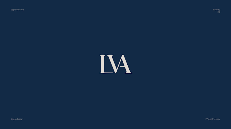
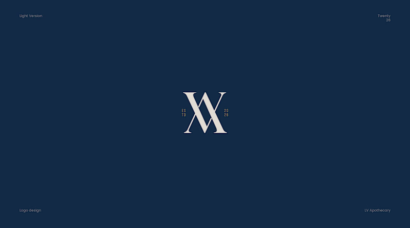
Taste Test
Two directions. One mark. Very different stories.✨
For Las Vegas Apothecary, I explored two paths with the monogram.
Which one says "luxury apothecary" to you the Standing Mark or the Woven Mark?
10 votes
Ends in 1d
nice work!
woven, absolutely. i think i'd associate even the word with apothecary by nature if asked. on top of that, there's a luxury feel about its true-to-the-roots (literally, if you want to go there) statement of self as something not everyone may have encountered before but are sure to find some intrigue in.
LVA woven mark
Thanks you so much for your POV 😊
You’re welcome
I prefer the Woven mark because it looks more creative
The standing mark for me
The network for creativity
Join 1.25M professional creatives like you
Connect with clients, get discovered, and run your business 100% commission-free
Creatives on Contra have earned over $150M and we are just getting started
Related posts
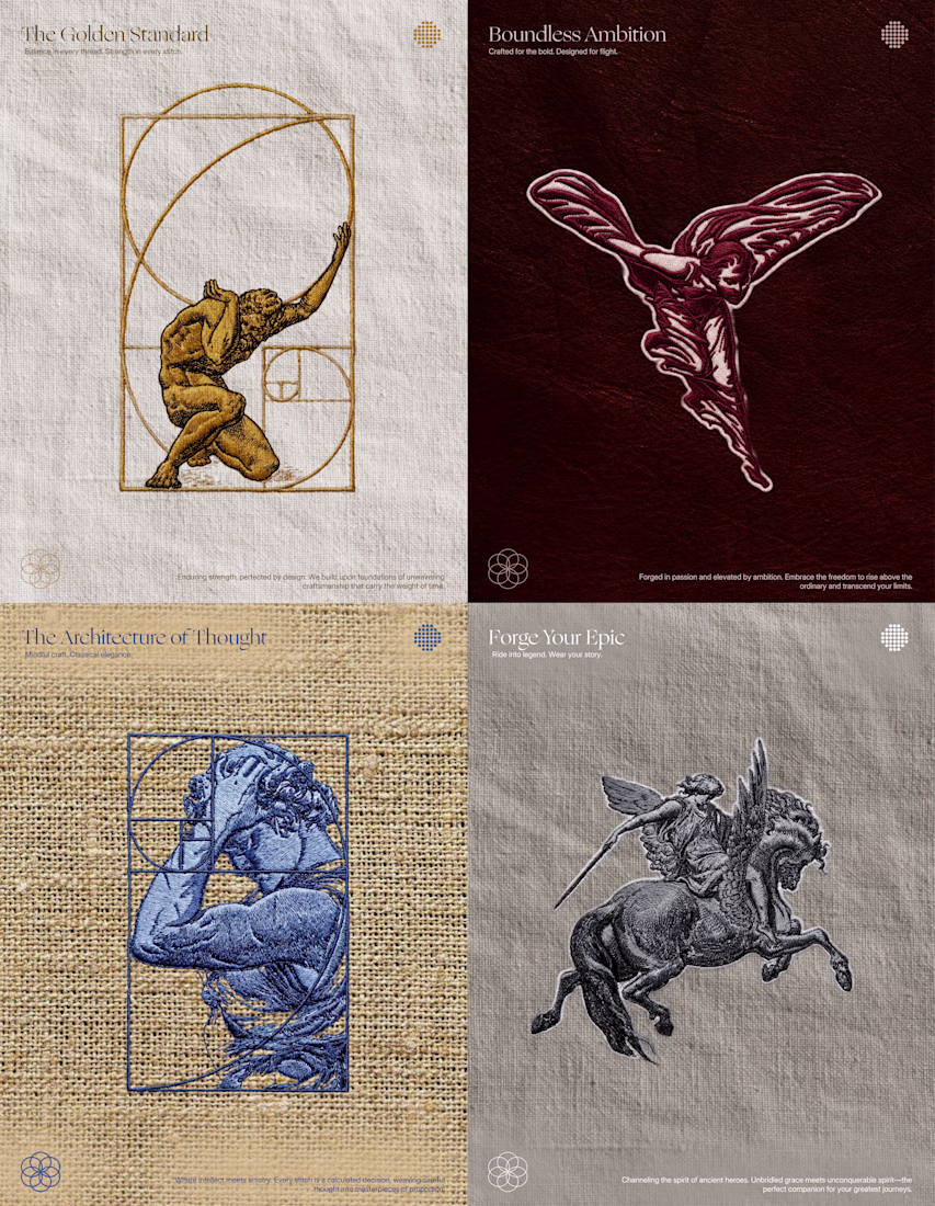
Embroidery branding design over different texture. This would look so cool with the right methods.
Great work 🔥
May was a busy one.
✓ 8 clients booked
✓ 5 logos delivered
✓ 5 projects delivered
✓ 3 projects still active
✓ 3 brandbooks delivered
✓ 6 packaging designs completed
June is already moving fast, but I’m starting to look ahead to the second half of the year and the new adventures, brands, and challenges that might come with it.
How is your 2026 looking so far?
I can’t wait to land my first gig🥹
Earlier this week, Timelaps, a brand designed and developed by BrightStudios has been featured on a billboard next to Nasdaq.
Always an incredible feeling
PS full case study is available over on our profile
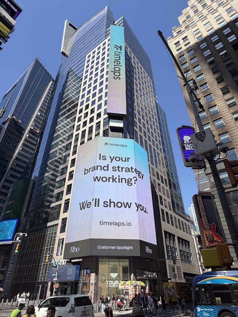
I saw this somewhere today (most likely on linkedin) and I knew I've seen this name/company somewhere.. now I remember. Well deserved! 🤘 🐐
Challenges
View allTrending
Claude
Claude has entered the design space. How are you using Claude Design?
Contra University
Learn from expert creatives how to earn more using next-gen AI tools.
MagicPath
The canvas is infinite, and exploration is becoming the workflow. How are you using MagicPath?
creativeaiflow
Creative AI workflows are evolving. What tools do you use, and what are their strengths and weaknesses?
freelancerlife
Freelancer life is wins, pivots, and everything in between. What’s yours right now?