The network for creativity
Join 1.25M professional creatives like you
Connect with clients, get discovered, and run your business 100% commission-free
Creatives on Contra have earned over $150M and we are just getting started
Back to feedPost

1M views in 3 days for OpusClip launch.
Obviously not just the video - it's the team, the timing, the distribution push. But I'm genuinely proud to be the part that moves that fast.
Delivered in 14 days.
Have a product launch coming up? Feel free to DM me.


Thanks!

The launch piece makes the product story feel tangible—the checkmark sequence and kinetic type build a clear sense of momentum without losing the human proof behind the result. Great example of motion carrying the narrative.
You're right! Thanks!

awesome work
Thanks man!

Congrats
🙌

This amazing work
I really appreciate it!

Crediting the team, timing, and distribution instead of just taking the win is the part worth noting, that kind of honesty about what actually drives a result is rare and it makes the case study more credible, not less.
Yeah, I don’t like it when video creators take all the credit for the results. It just doesn’t work that way.
The network for creativity
Join 1.25M professional creatives like you
Connect with clients, get discovered, and run your business 100% commission-free
Creatives on Contra have earned over $150M and we are just getting started







Related posts

Hey Contra, I disappeared for a bit. Not because I stopped caring about design, I just needed a breather 🫂
I continued to work, but couldn't bring myself to post something here. Burnout caught up with me, and honestly that “you’re not good enough” voice doesn’t make a comeback any easier. Funny how you can work hard for years and impostor syndrome still shows up like it pays rent.
But I’m back, easing into it this time. I’ve also been posting some design content on my Insta along the way.
If you’ve been in that spot too: you’re not behind. Anyway, good to be here again🎉 For now you can take a look at one of the key screens of my new project that I can't wait to finish and show y'all!
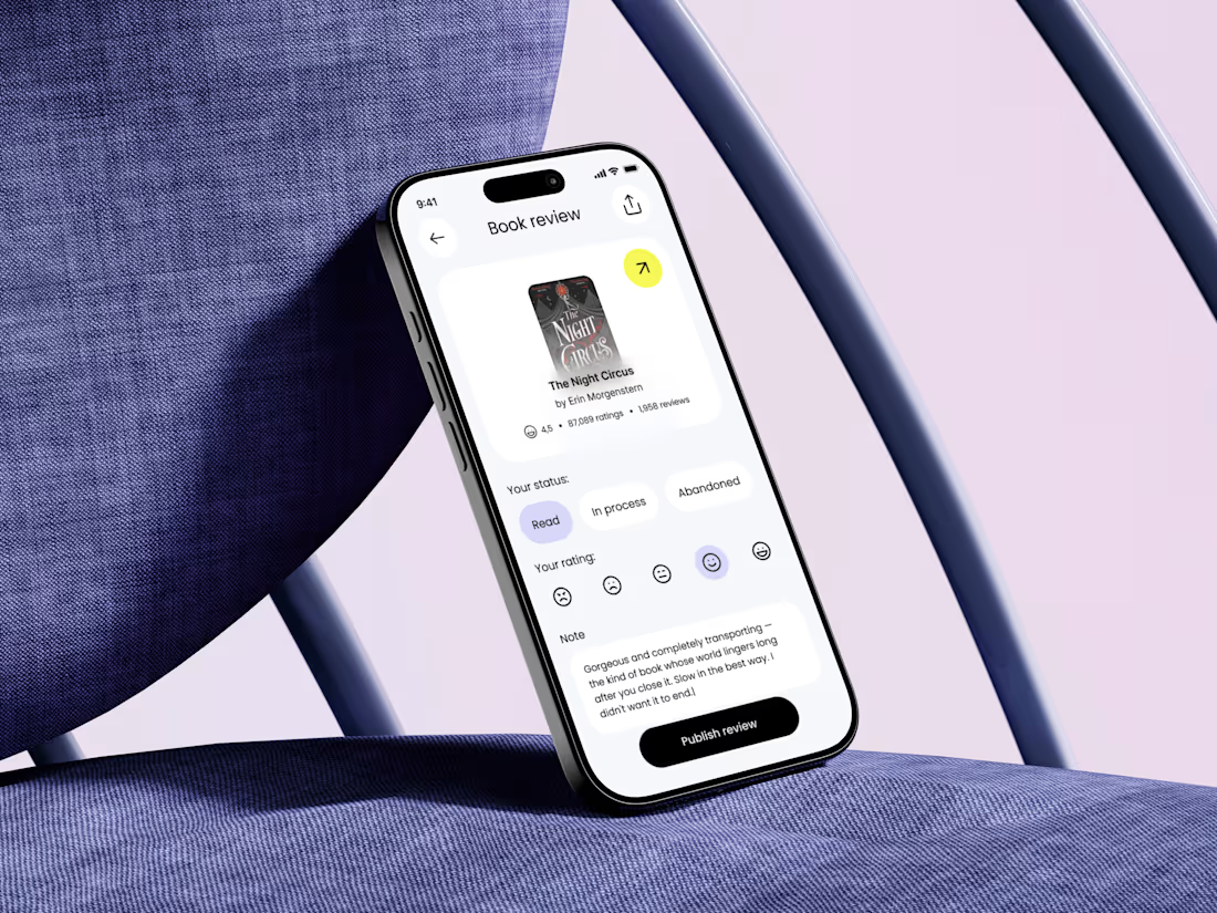

Nice to see you here again 🎉 I'm waiting for the project updates 🤗

Real eggs. No apologies 🥚
Spent the past week designing WHISK, an artisan mayonnaise brand built on one idea: even the most overlooked item in the fridge deserves a brand that takes it seriously.
No squeeze bottle, no label built to disappear into the shelf. Just a glass jar, a short ingredient list, and four flavors told apart by one accent color each. Classic, garlic and herb, smoked chili, vegan. 🫙
Sometimes the boldest thing a condiment can do is be particular about itself.


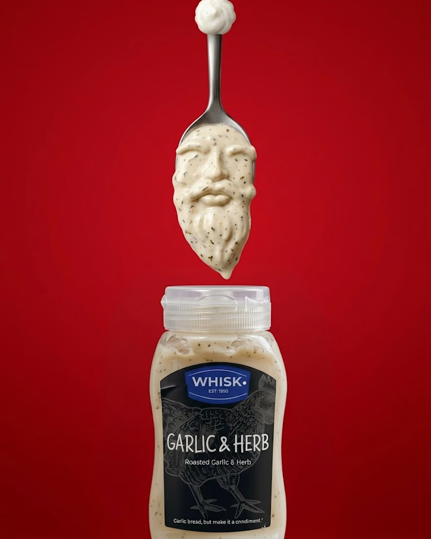
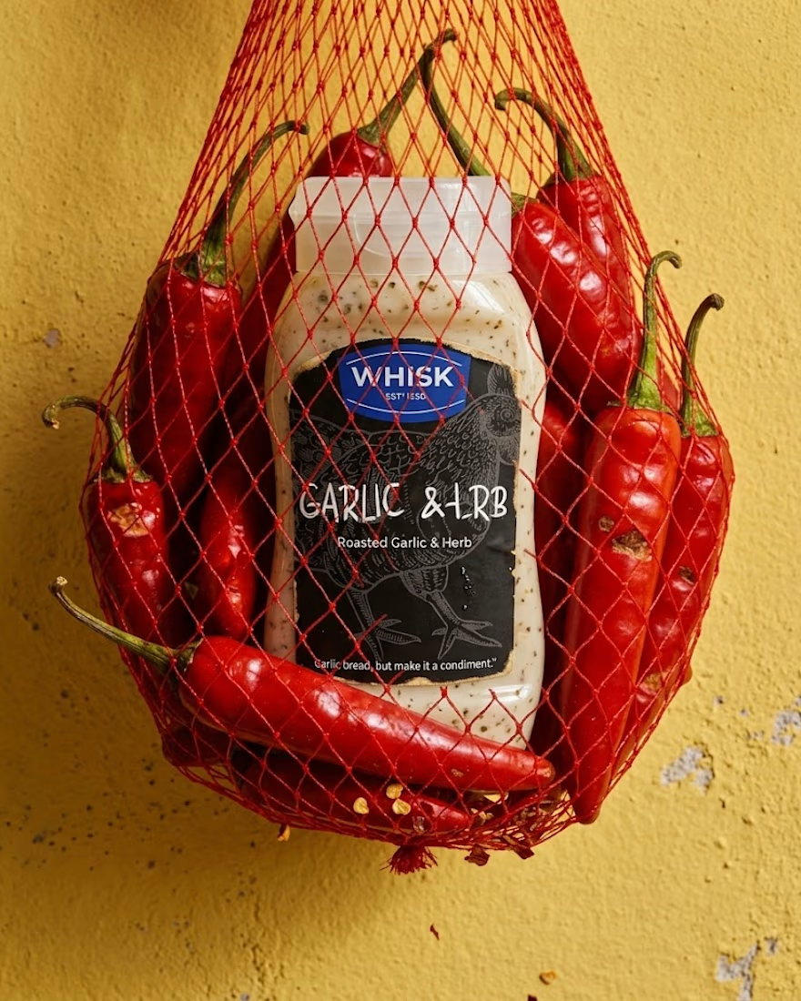
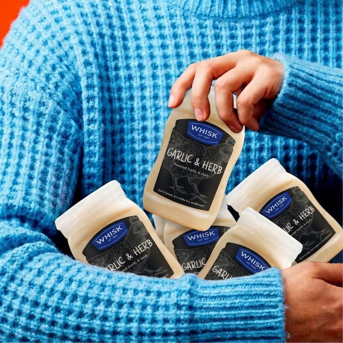

The animation looks top tier! Nice work

Thanks to everyone who weighed in on my last post.
The consensus was clear; healthcare apps need to feel human, not cold and transactional.
Now for the final polish.
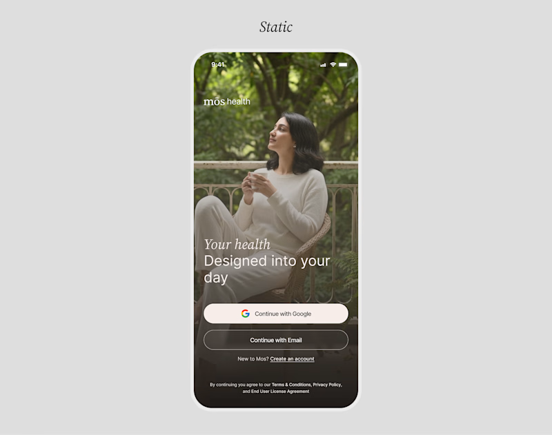
I put together a Motion version and a Static version of the redesign.
Motion can bring an interface to life, but static layouts often feel grounded and direct.
When it comes to building immediate user trust during sign-up, which direction do you think works best?
MOTION or
STATIC
12 voted
100%
0 voted
0%
12 votes
Closed

Motion make the UI alive. nice touch