The network for creativity
Join 1.25M professional creatives like you
Connect with clients, get discovered, and run your business 100% commission-free
Creatives on Contra have earned over $150M and we are just getting started
Back to feedPost
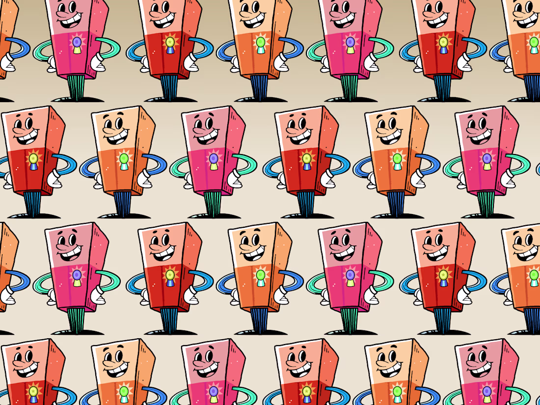
"Your packaging might be invisible. Not bad. Not ugly. Just... forgettable."
It's one of the more uncomfortable conversations to have with a client — when the work looks fine but strategically misses the mark. When it fits the category so well it disappears into it.
The shelf is a crowded place. Every category has a look, and most brands follow it. That's exactly the problem.
When I look at how well a package stands out, I focus on four things: color, shape, typography, and positioning. Not as design choices — as competitive advantages. The question isn't whether each element looks good. It's whether the combination is unmistakably theirs.
If you're working on a packaging project and want a second opinion on where it lands competitively — reach out.
The network for creativity
Join 1.25M professional creatives like you
Connect with clients, get discovered, and run your business 100% commission-free
Creatives on Contra have earned over $150M and we are just getting started
Related posts
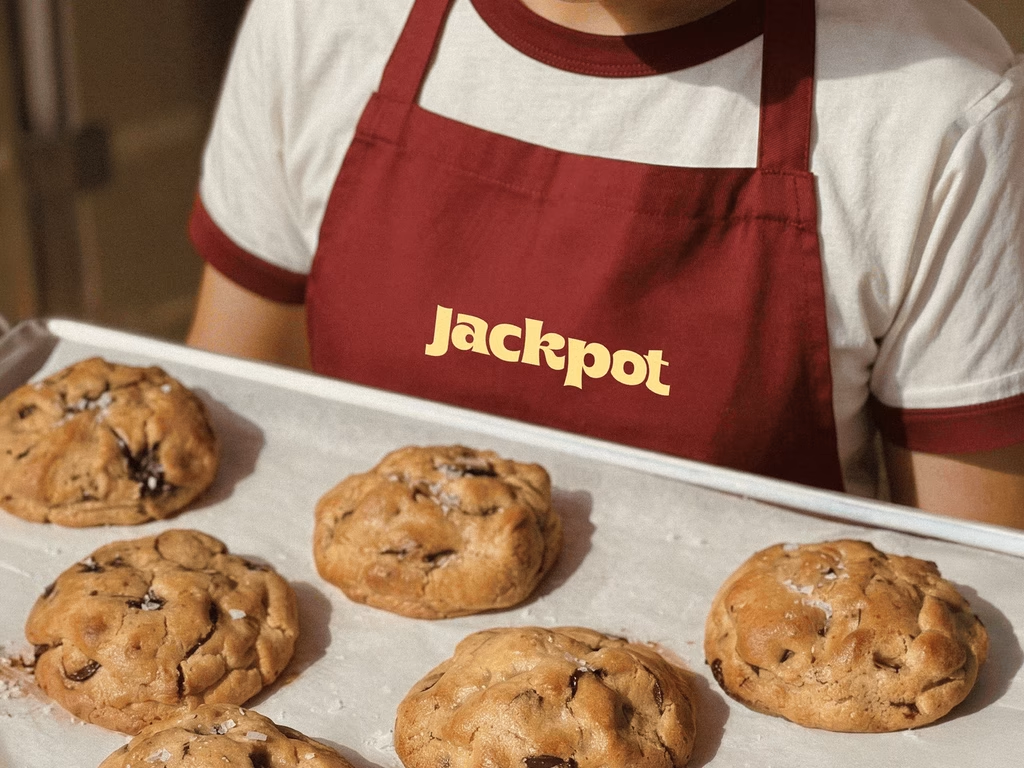
Added a new case study! This was such a fun project: a rebrand for a local cookie company.
Our goal was to transform the brand into something that felt like an everyday celebration through bold typography, playful details, and a fresh visual identity.
Brand DesignCreative DirectionGraphic DesignAdobe IllustratorAdobe Photoshopfoodandbeveragebrandrefreshbranddesigner
COol
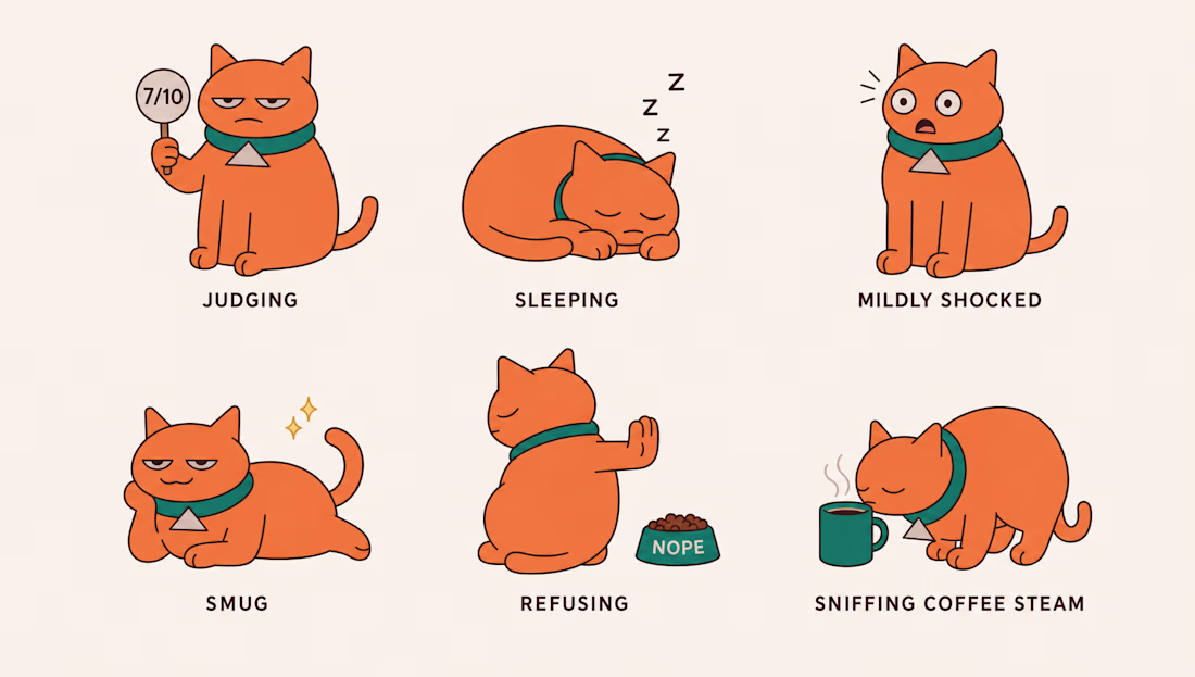
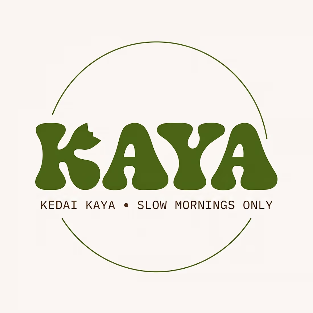
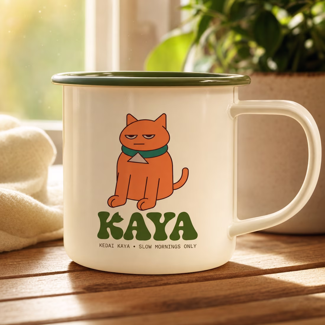
Meet KAYA, the self-appointed manager of a coffee that never hired him.
Kaya is a cat shaped like a jar of kaya (that is how I got the inspiration😉of the character), the coconut jam we love in Malaysia.
Round, orange, and permanently unimpressed, he guards the sacred ritual of the slow breakfast, coffee, half-boiled eggs, and toast done properly or not at all.
He judges anyone who orders takeaway, naps on the till during rush hour, and has never once moved for a customer.
In Malay, "kaya" means coconut jam, and also rich. He is both.
One cat, one wordmark, one rule: orange belongs only to him.
Built entirely in Recraft, character sheet, expression sheet, name-logo, jar label, poster, stickers, menu, merch, and his own cartoon show.
Same cat. Same judgment. Different assets.
Slow mornings only. ☕
Recraft Project URL: https://www.recraft.ai/project/d3778493-0e89-41d6-9971-4e9eed96b160
That's Amazing! 🔥
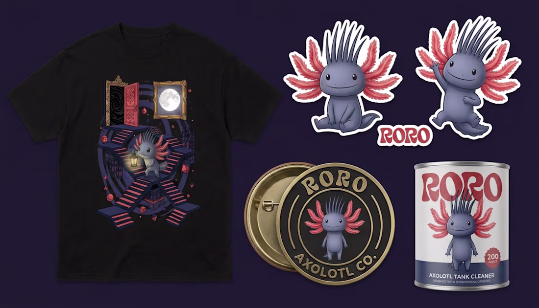
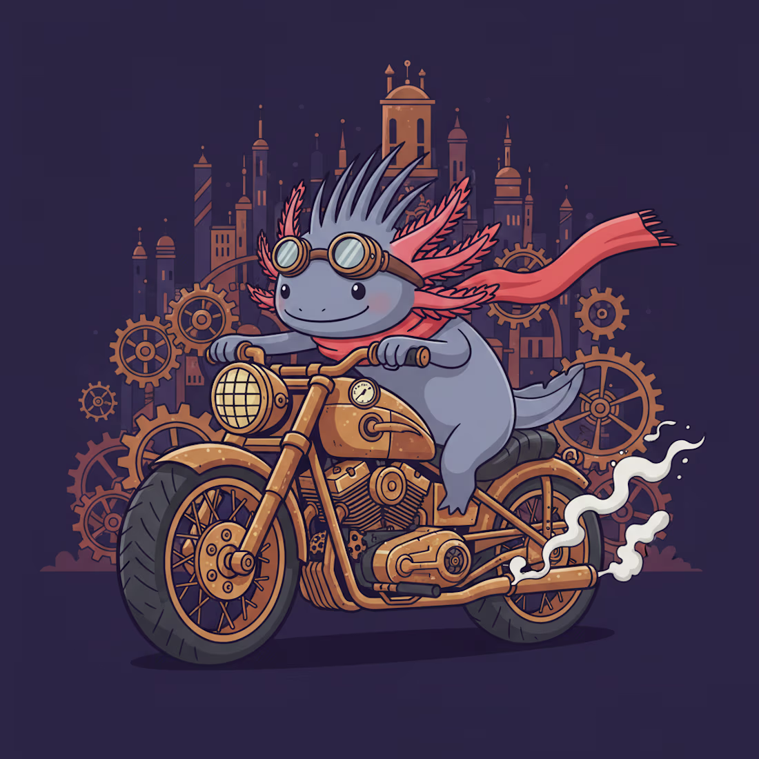
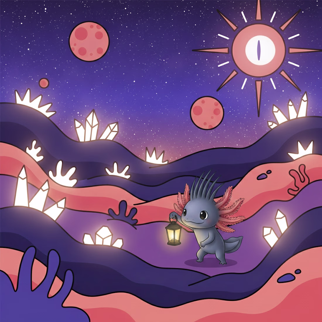
RORO is a small axolotl-like creature born in the underground world — curious, fearless, and always searching for what lies beyond the next doorway.
Armed with a lantern and endless wonder, RORO travels between dimensions without ever losing itself. That's the whole point.
This is the mascot for RORO — an imaginary t-shirt brand built around one character and infinite worlds.
THE CHARACTER RORO is slate blue with coral-red feathery gills and dark sharp spikes. Slightly mysterious. Slightly mischievous. Completely unafraid. The kind of character you'd recognize on a poster, a sticker, a packaging label, or a tiny thumbnail — and know immediately who it is.
TWO SERIES RORO BRAND:
1. WORLDS — each print places RORO inside a different dimension: ocean depths, crystal caves, alien landscapes, surrealist architecture. The world changes. The character never does.
2. RORO STATES — each print captures RORO mid-adventure: steampunk biker, monster fighter, underground cartographer, volcanic onsen dreamer. One character. Infinite sides.
Together the two series create a brand universe that can expand forever without losing coherence.
Every world has a story.
Such a fun character! I love how you built an entire brand world around one mascot. It feels memorable and full of personality👏
Trending
Claude
Claude has entered the design space. How are you using Claude Design?
Contra University
Learn from expert creatives how to earn more using next-gen AI tools.
fifaworldcup2026
The World Cup is here and the whole world's watching. How are you designing for the world stage?
creativeaiflow
Creative AI workflows are evolving. What tools do you use, and what are their strengths and weaknesses?
freelancerlife
Freelancer life is wins, pivots, and everything in between. What’s yours right now?