The network for creativity
Join 1.25M professional creatives like you
Connect with clients, get discovered, and run your business 100% commission-free
Creatives on Contra have earned over $150M and we are just getting started
Back to feedPost

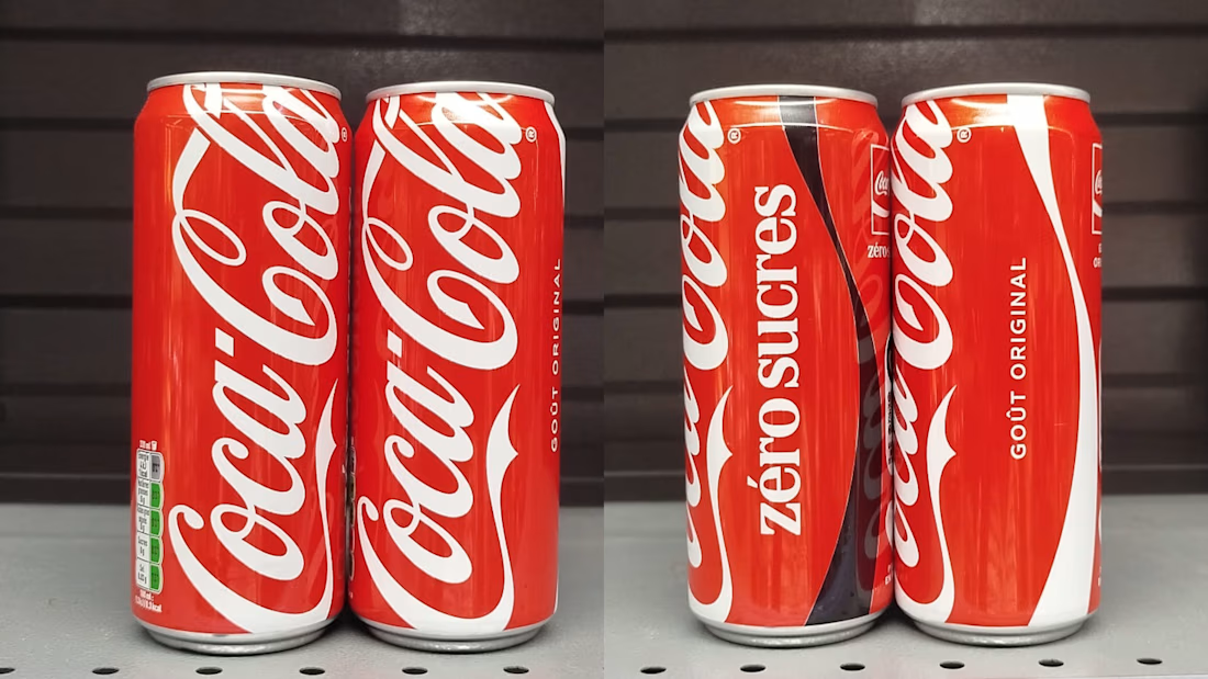
"why did coca cola ruin the difference between zero and normal?"
that's what someone asked me at a family lunch a few weeks ago.
trust me, as the brand designer, i wanted to have the solution on the tip of my tongue.
but the truth is, as a coke zero consumer myself, i've been making the mistake too - grabbing normal coke instead of zero.
why? because the difference between zero and normal is genuinely hard to catch now.
here's the thing i keep coming back to:
the coca-cola rebrand itself is genuinely good. the ribbon, the type, the wave - none of it is new, they just took what was already living in everyone's head and turned the volume up on it, and that's hard to do well. most rebrands try to invent something. this one just remembered what already worked.
but then i'm standing in front of the fridge trying to find my zero and it's taking longer than it used to. for a while i thought it was just me, until i went on reddit.
- "mixing them up is really easy now, i genuinely thought the store didn't have zero" - a shopper
- "i genuinely thought you were complaining that the only difference was the black text, then realised the one on the left was also zero" - another commenter
- "i work for a soda vending company... our operators are making so much more mistakes because of this, it's just really hard to tell when you're trying to work fast" - someone who restocks vending machines for a living
turns out i'm not the only one. a former coca-cola exec basically confirmed it's not an accident - she called it a portfolio strategy, said the company is deliberately blurring the line so zero can borrow more of classic's equity, so the brand becomes the hero instead of the sugar content.
okay... but also: people are getting mixed up, and mix-ups have gone up because it's genuinely harder to tell at speed.
diabetic people, and people avoiding sugar, really need this difference to be noticeable - in supermarkets, and at a distance.
as you can imagine, i'm a huge fan and supporter of smart, well thought out brand refreshes, branding etc... but if it doesn't pass the customer test, it's hard to defend.
what's your opinion? will we get used to it in 6 months and forget this miss? smart trade-off, or a real miss?
The network for creativity
Join 1.25M professional creatives like you
Connect with clients, get discovered, and run your business 100% commission-free
Creatives on Contra have earned over $150M and we are just getting started











Related posts

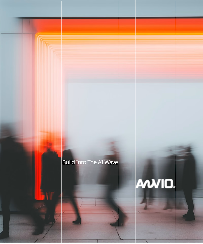
Which creative direction better communicates a Tech-Forward AI Brand Identity for anvio.online ?
25 voted
44%

32 voted
56%
57 votes
Closed

Fast vibrant energy gets my vote. The warm glow feels more human, which is nice for an AI brand.

VÉLLE - Minimal Luxury Fashion Brand Identity
A conceptual fashion brand built on quiet luxury and timeless essentials.
What I did:
→ Logo Design (Primary + Secondary)
→ Brand Identity & Color System
→ Product Mockups (T-Shirt, Cap, Tote Bag)
Concept: Less is more. Clean serif typography with subtle accent for premium feel.
Palette: Beige #E8DDD0 / Black #0A0A0A
Full case study on Behance: behance.net/gallery/257321557
Open for freelance projects - DM for fashion branding.


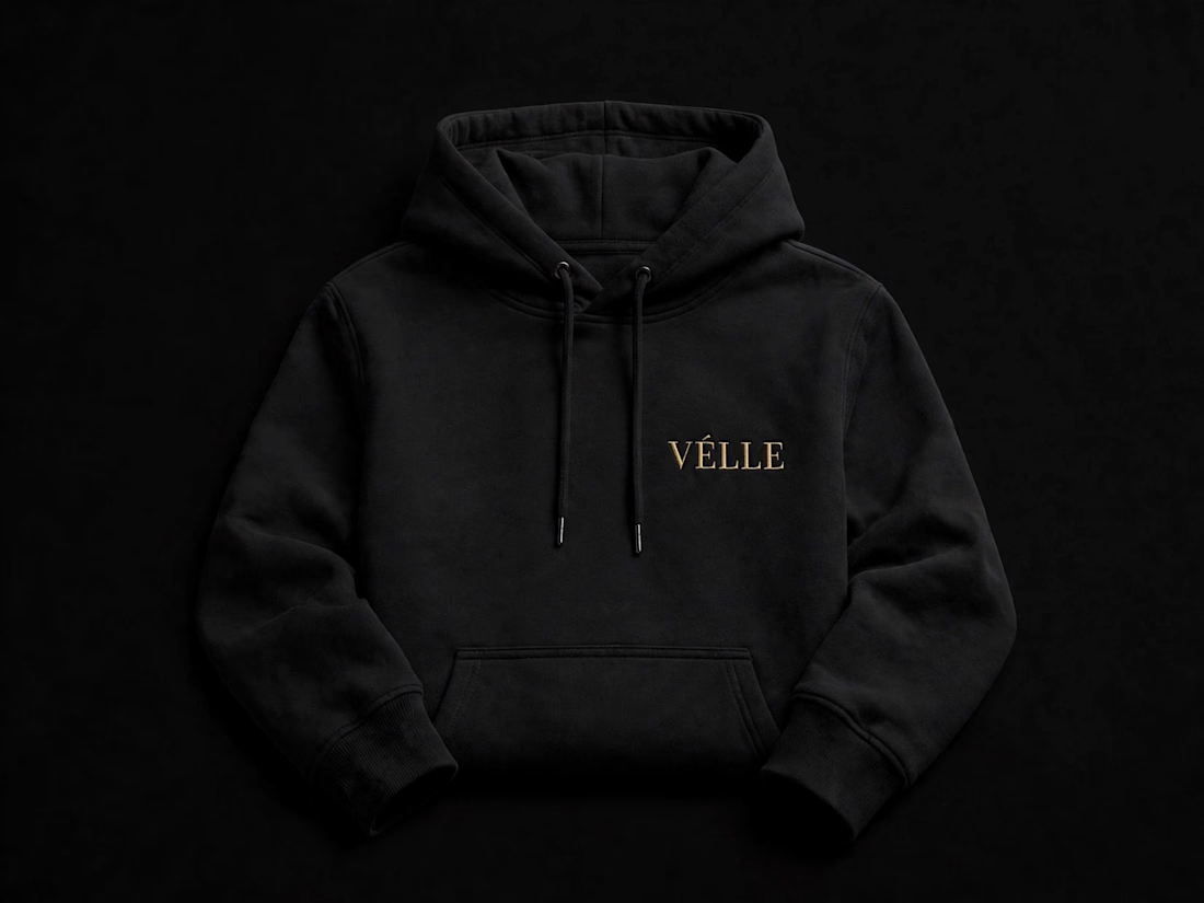
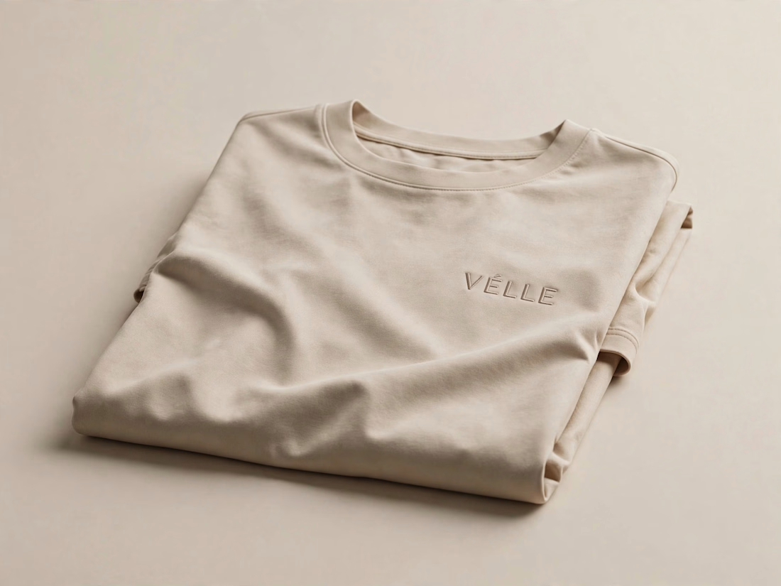
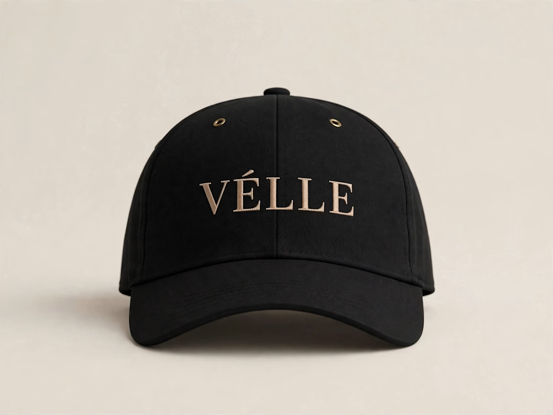
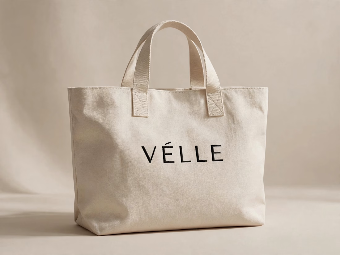

love the minimal direction on this. VÉLLE feels expensive but not loud, the tote and cap mockups are so good

Brand identity exploration
Which one do you think it fits better?
36 voted
77%

11 voted
23%

47 votes
Closed

Cobalt is great Gold is unique 🎉🎉🔥🔥