The network for creativity
Join 1.25M professional creatives like you
Connect with clients, get discovered, and run your business 100% commission-free
Creatives on Contra have earned over $150M and we are just getting started
Back to feedPost
Taste Test

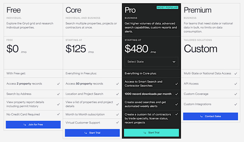
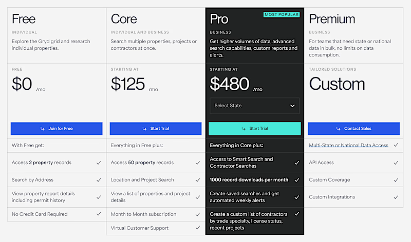
Hi, Contra Community! Designing a pricing page is never easy (especially if it's authentic content). How do you think we should position the buttons from a UX perspective?
30 voted
31%
67 voted
69%
97 votes
Closed

The middle placement in your Pro column really does pull the eye first, feels like it leans into that anchor pricing effect. Curious what tipped it for you, was this from a user test or more of a gut call based on past projects?
My experience and gut feeling told me that middle it would be best, but I also decided to check with Claude (added UX skill), and conduct a poll here. And the decision to center it became obvious :)
Checking with Claude and then validating with a live poll is a nice one-two, most people just pick one method and stop there. Did the poll numbers end up matching what Claude suggested, or did real votes overrule the model?
Yes, the answers totally matched

Below


Always in the middle. The other option just looks misaligned.
thanks, I agree with you!

I agree


Below

Totally agree with you!

the button in the middle creates a very nice structure that also highlights the price, while the buttons below feel chaotic and leave the body too text-heavy, making the content harder to scan
that would be my subjective take
both look good tho ✨
Yeah, I also think the buttons should be aligned...it seems easier on the eyes and less chaotic that way. Thanks for confirming my opinion! 😊

Middle.

In the middle seems more aligned to me

Middle easy to use

Go with 'In the middle'. The placement follows standard user patterns, making it feel familiar, balanced, and keeps the layout clean.

People should take action when they are done reading the package features.

middle works well for conversion.

Middle

In the middle

Middle is the best here

I choose on below

Having buttons in the same row makes comparison easier👍

Middle is Perfect
The network for creativity
Join 1.25M professional creatives like you
Connect with clients, get discovered, and run your business 100% commission-free
Creatives on Contra have earned over $150M and we are just getting started
Trending

Claude
Claude has entered the design space. How are you using Claude Design?

Contra University
Learn from expert creatives how to earn more using next-gen AI tools.
creativeaiflow
Creative AI workflows are evolving. What tools do you use, and what are their strengths and weaknesses?
freelancerlife
Freelancer life is wins, pivots, and everything in between. What’s yours right now?












Related posts


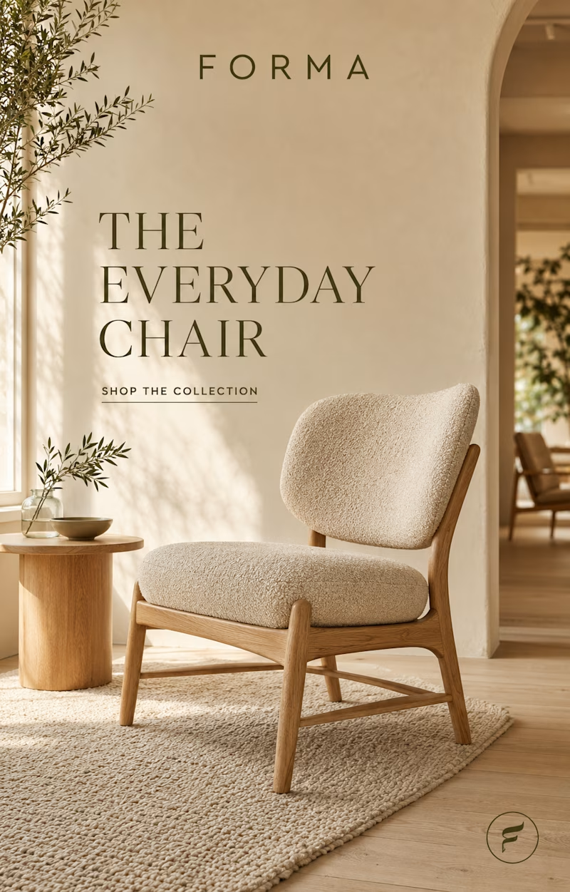
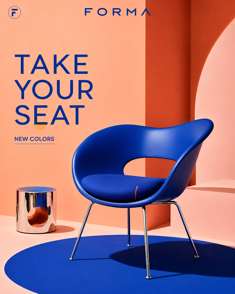
Same brand, two personalities.
One is calm — oak, bouclé, olive branches and warm plaster, sunlight moving slow across the floor. Furniture as quiet.
The other is loud — cobalt on coral, chrome legs, a sculpted shell against a bold arch.
Furniture as statement. Same logo, same category, opposite energy: one wants to disappear into your home, the other wants to be the first thing you see.
Quiet luxury or bold color — which Forma is yours? 👇
#furnituredesign #brandidentity #interiordesign
8 voted
38%
13 voted
62%
21 votes
Closed

Cobalt for me. Same logo, opposite energy is a genuinely strong brand exercise, most furniture brands are too scared to let one line go this loud.

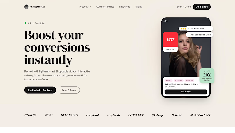
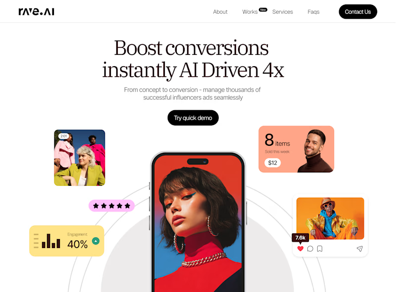
This started as a fully AI-generated website, but with a designer's eye and attention to detail, it became something far more refined.
Sometimes AI gives you a solid starting point, but the real magic is in the craftsmanship.
Which version do you prefer?
2 voted
12%
15 voted
88%
17 votes
Closed


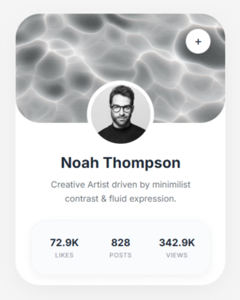
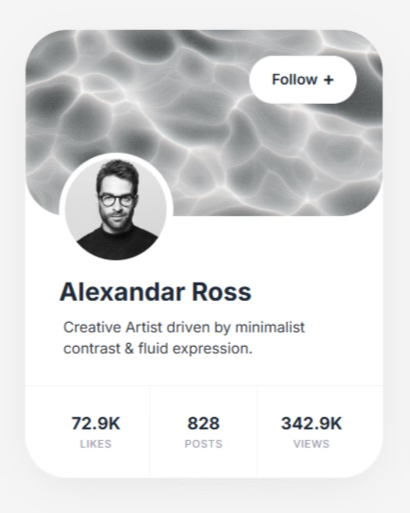
Went with B. An explicit "Follow +" label reads faster than a bare plus icon, especially for a social app where new users won't yet know what that icon means.